
Empfohlen
Empfohlen
Weitere ähnliche Inhalte
Was ist angesagt?
Was ist angesagt? (19)
Ähnlich wie Calendar, Linked Fields and Process Documentation Improve User Experience
Ähnlich wie Calendar, Linked Fields and Process Documentation Improve User Experience (20)
Calendar, Linked Fields and Process Documentation Improve User Experience
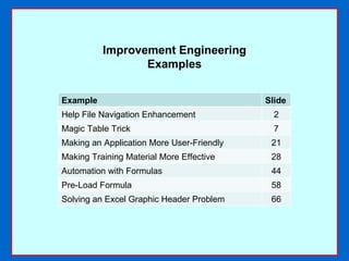
- 1. Improvement Engineering Examples Example Slide Help File Navigation Enhancement 2 Magic Table Trick 7 Making an Application More User-Friendly 21 Making Training Material More Effective 28 Automation with Formulas 44 Pre-Load Formula 58 Solving an Excel Graphic Header Problem 66
- 2. Help File Navigation Enhancement
- 3. PROBLEM #1 When I was hired to create the online help for a proprietary software application called GLOS (Global Logistics Order Service), I quickly discovered that clicking the HELP link displayed the help file only for the current screen. The client did not have a help authoring tool, which would have overcome this problem with indexing and search features. I had plans to write a lot of help files, including those that did not pertain directly to the transaction screens (such as a glossary, FAQ, etc.), but the available functionality was quite an obstacle. In lieu of a help authoring tool, I devised a means whereby one could easily access any help file from any screen.
- 4. SOLUTION #1 The solution was to create an index of links to the other help files, and to include a link to the index on all help screens. I created a template for the help files and added links to other standard help files in both the header and footer areas. These links are described on the following slide.
- 8. PROBLEM #2 Microsoft Word tables are very useful devices for formatting purposes. They have automatic word wrap and rows and columns to separate text and make it easier on the eye, as you can see in Figure 1. Figure 1 Figure 1
- 10. Unlike a text box, you cannot place more than one table in the same horizontal plane. You cannot add “loose” text to the left or the right of a table. Nor can you orient a table to the left or right side of the page without adjusting the margins. Before I go any further, let me state that I agree with the Microsoft Word experts out there that, yes, you can create a single table and make it appear as though it were two separate tables. This is done by creating at least three columns and removing the top and bottom lines (borders) of the middle column, as shown in Figure 3. Figure 3 This looks like two separate tables. This looks like two separate tables.
- 11. You can use a similar technique to create the appearance of placing text to the left or right of the table. You simply create a table with at least two columns, hide the borders of one of them, and enter the text in that column, as in Figure 4: Figure 4 Figure 5 But when it is highlighted, you can clearly see that this is one table with two columns: This looks like two separate tables. This is text that seems separate from the table.
- 12. Aside from highlighting, you can test whether a table is masquerading as separate tables or text boxes simply by adding enough text to one of the rows to make it wrap. This expands the rows in “both” tables, because it is actually the same row in a single table (Figures 6 and 7): Figure 6 Figure 7
- 13. SOLUTION #2 Not only is disguising one table to appear to be two separate tables an illusion, this method is not as flexible or effective as using two separate text boxes – or separate tables using my Magic Table Trick. Yes, you can actually place two or more Word tables in the same horizontal plane if you know the trick – and the result gives you all the advantages of tables AND text boxes without the disadvantages of both . This was something I “invented” while at U.S. Surgical because I was developing a new, professional format for their product manuals. Part of my approach was to take certain important sections of text and put them in a box to make them stand out.
- 14. The simplest way to do this is with a text box, as shown in Figure 8: Figure 8
- 15. Since Example 1 is a text box, I can move it anywhere on the page. I can create another text box (Example 2) and place it in the same horizontal plane as another text box. And I can create shadow and 3-D effects, as shown in Figure 9: Figure 9
- 16. Now, suppose you wanted the freedom of positioning tables anywhere on the page and applying shadow or 3-D effects to them, as though they were text boxes. For demonstration purposes, let’s say I wanted this effect: Figure 10
- 17. Examples 1 and 4 are text boxes; Examples 2 and 3 are my special tables. One obvious difference is that it’s easy to create a grid effect in a table simply by switching on the borders, but nearly impossible in a text box (unless you insert small text boxes inside, but even then you won’t be able to create a convincing grid effect). Figure 11
- 18. One less obvious difference is that, if you manually create a columnar effect in a text box as in Example 4, resizing the box will distort the alignment. But not so with a table. In Figure 12, Example 4 is wider than Example 3. In Figure 13, the width of Example 4’s box has been reduced to make it the same size as the smaller, but its “columns” are now distorted, because it is a text box and not a table, and the columnar alignment cannot be preserved: Figure 12 Figure 13
- 19. But with my “magic” table, Example 4 can easily be resized to match Example 3’s size: Figure 14
- 20. Note that the magic tables in Figure 11 overlap each other, and are even in nearly the same horizontal plane. They can be placed in the exact same plane just by dragging them (Figure 15). This is supposed to be impossible for Word tables to do. But I found a way to do it! Figure 15
- 21. Making an Application More User-Friendly
- 22. PROBLEM #3 For a project for which I had written the online help (among other duties), I took the opportunity of an Ad Hoc report enhancement to add more user-friendly features that were not part of the core application. The original application had numerous date fields, all of which accepted various date formats as long as the three elements were separated by a slash, dash or a space. But one always had to type in (or paste in) a date, instead of selecting it from a graphic calendar.
- 23. SOLUTION #3 I proposed that the developers use a calendar applet that would be accessible by clicking a small calendar icon next to the date field. Users would then have the option of entering the date manually or selecting it from the applet:
- 25. The calendar would default to the current date and allow users to select the date with the mouse instead of typing:
- 26. Another enhancement I proposed dealt with the selection of ad hoc report fields. I proposed that the developers code dynamically linked dropdown lists in adjoining columns. In this way, users could select one or more fields from one box and have them appear in another so they could see which fields would be on the report. The next slide shows one of the pages from the specification I wrote showing the design and functionality of these linked dropdowns for an admin view. It certainly made creating and managing ad hoc reports a lot easier!
- 28. Making Training Material More Effective
- 29. PROBLEM #4 My experience with a mainframe application was an example that simply having a user manual was not enough – it had to be useful . Training manuals are no exception. There was a tendency for the company’s training manuals to leave a lot up to the trainer, which meant that he or she not only had to be quite knowledgeable and impart that knowledge to the students, but the students had to take very good notes. If any one or more of these elements was missing, the training wouldn’t be very effective. And even with these elements, the manual itself was not a good reference. This particular application was called SUPM, and it was intended to automate the issuance of waybill corrections and supplemental billing. It was developed in London and was to be rolled out worldwide in 1997. Each country had its own accounting records and the SUPM system would therefore have to be used accordingly.
- 30. SOLUTION #4 A colleague had written a training manual that I thought was inadequate – I wanted to know more about the processes rather than presume that all the operators who were going to use the application automatically knew the accounting practices of the company. I interviewed the local accounting managers to learn about what they needed from this system on the back end, so I could instruct users how to enter data in the front end. I discovered that there were a number of limitations to SUPM that required manual “know-how” from the operators. I wanted to document these workarounds and all other actions they needed to take to interface properly with the accounting system. I revised and expanded the manual into a reference manual, including exercises. In this way, I could run training classes with hands-on exercises, and afterwards the users would have a manual to which they could refer for “how to” instructions, codes, and sample printed forms.
- 31. I started the manual at the beginning by documenting when to use the SUPM system, something that was missing from the original. What a concept, huh?
- 32. Another novel concept was to explain that some corrections cannot be handled by SUPM, and how to identify them:
- 33. To make it even easier, I created a flow chart so operators could understand their workflow. This was also omitted from the original manual.
- 34. Plus another flow chart for the different document types.
- 35. Want to know how the CORR/SUPP IND (C/S) works? So did I, so I documented that, too.
- 36. In my research and testing, I discovered that the system (Logis) did not maintain a running total of previous corrections to a waybill. So operators must keep track of them manually. I thought it would be nice to tell them that!
- 37. I also discovered a caveat about changing payment terms when preparing corrections.
- 38. So here is how to change from prepaid to collect.
- 39. And from collect to prepaid.
- 40. Oh, and by the way, even though one CAN change the billing account number on this screen, he should NOT do so here. No wonder there were so many errors before this manual came out…
- 41. Changing a billing account requires the issuance of TWO corrections (because each document is a standalone). I decided it would be prudent to document the steps for the first time. They had to be performed in a certain sequence:
- 42. I ended each class with a series of exercises so the students could get some hands-on experience.
- 43. I applied this philosophy – of creating manuals that served as training AND reference manuals – to other courses. We found through testing that comprehension and retention did improve by some 37%.
- 45. PROBLEM #5 Trainers at U.S. Surgical were spending an inordinate amount of time preparing their training course schedules because they were entering all the start and end times manually – and then having to change them each time they modified the segment duration.
- 46. My assignment at U.S. Surgical was to reformat the various product manuals for Autosuture and Syneture for the Professional Training Department, but one of trainers came to me with an Excel spreadsheet he and other trainers had been using to plan courses.
- 47. He asked me if I could improve the format. I said that I could, but also asked him why they had been using Excel for what seemed like a word processing activity. Knowing how the trainers were using it would tell me whether they should be using Word or Excel. As part of the process of working out their course schedules, each trainer was manually typing in the start and end times based on the program duration. They were also manually entering the week and day count numbers for each day. Since every course ran five days a week for five to seven weeks, there was not only a lot of manual entry initially, but a lot of manual re-entry , because each time a trainer needed to change the duration of even one segment for a single day, he had to change the start and end times for each segment following it . To properly “budget” the day’s session and make it end on time, this often meant adjusting several different segments – and this could happen for each day for 5-7 weeks’ worth of classes.
- 48. Week-Day counter - manually entered Duration - manually entered Start and End times - manually entered Imagine changing the duration of just one segment in the morning, and then having to manually re-calculate and retype the start and end times for each of the following segments for the rest of the day- and each course might run for 30 days or more!
- 49. SOLUTION #5 I could see that Excel was the appropriate application but that some automation was needed. Even though Word can be partially automated, I decided that the trainers’ workloads could be vastly reduced by adding some simple automation to the Excel file. This could be achieved by writing a few formulas; VBA was not necessary, nor were macros.
- 50. The trainer who originally approached me said that the end time wasn’t needed, so I proceeded to write logic that enabled anyone to enter the starting time once and the duration of each program part, so that the spreadsheet would automatically calculate the starting times for each succeeding segment – based on the duration – as well as the week and day numbers. I was also told that the starting time would be the same for each day, but suspecting that it could change, I added logic that enabled one to enter a different starting time for any one or more days, while still having a default starting time for all the others that needed to be entered only once.
- 51. I wrote a sheet of instructions and a separate sheet for most of the formulas and tables. So all one had to do for a new course was enter the main defaults on one sheet (start year, start month number, start date, first week number, and first day number). These were one-time entries: One-time entries for each course
- 52. One-time entry of start time With my version, trainers needed to enter the start hour and minute only once; these values would replicate down the START TIME column for every day of the entire course. The first START TIME cells for each day had a formula that gave trainers the option of setting a different start time for any one or more days over the course schedule. These values carry over from the defaults
- 53. By entering the duration in minutes, the START TIME column shows the starting time with AM or PM designations. Thus it is easy to see if the session will fit within the day; if not, any one or more durations could be modified. This value advances automatically from formula calculations
- 54. If any duration had to change, all start times would change in a second as soon as a new duration was entered:
- 55. Each worksheet repeated rows for each day, while the formulas would pick up the date and week and day counts from the default worksheet:
- 56. The formula sheet contained the formulas to determine the number of days in each month (with a leap year allowance), and automated calculations of the full date, week and day numbers that display on the schedule:
- 57. With this workbook, trainers could plan their courses and budget the session times much faster. The time and effort expended by the trainers was reduced by some 90%, so they could devote much more time to preparing the course material than wrestling with manually revising start times. A few hours’ work on my part – the “technical writer” who was hired to reformat the product manuals – saved the entire training staff endless hours of work.
- 58. Pre-Load Formula
- 59. PROBLEM #6 We didn’t find out until after numerous attempts at loading files that the archiving application used at Pfizer rejected "problem" files, and that the rejection criteria were not always defined. These were files with characters unacceptable to Windows and IIS (Internet Information Services), files with excessive names, invalid extensions, hidden files, duplicate names, and the like.
- 60. SOLUTION #6 I therefore co-created and tested pre-load and post-load iterative processes for archiving using a Visual Basic tool that identified and corrected known issues. I also created an Excel formula to address one of the issues, which was that IIS substituted spaces and 19 characters with two spaces and a % symbol. For each occurrence of one of these special characters, the filename length would therefore increase by two. The formula I wrote identified those special characters in each filename to which IIS adds two characters. This helped the archive staff know whether the filename length would be short enough to be uploaded after these characters were removed, because the maximum filename length was 107 characters. This formula was later added to the VB tool to enhance the pre-load functionality.
- 61. =(SUM(LEN(H13)-LEN(SUBSTITUTE(H13,"!","")),LEN(H13)-LEN(SUBSTITUTE(H13,"*","")),LEN(H13)-LEN(SUBSTITUTE(H13,"'","")),LEN(H13)-LEN(SUBSTITUTE(H13,"(","")),LEN(H13)-LEN(SUBSTITUTE(H13,")","")),LEN(H13)-LEN(SUBSTITUTE(H13,";","")),LEN(H13)-LEN(SUBSTITUTE(H13,":","")),LEN(H13)-LEN(SUBSTITUTE(H13,"@","")),LEN(H13)-LEN(SUBSTITUTE(H13,"&","")),LEN(H13)-LEN(SUBSTITUTE(H13,"=","")),LEN(H13)-LEN(SUBSTITUTE(H13,"+","")),LEN(H13)-LEN(SUBSTITUTE(H13,"$","")),LEN(H13)-LEN(SUBSTITUTE(H13,",","")),LEN(H13)-LEN(SUBSTITUTE(H13,"/","")),LEN(H13)-LEN(SUBSTITUTE(H13,"?","")),LEN(H13)-LEN(SUBSTITUTE(H13,"%","")),LEN(H13)-LEN(SUBSTITUTE(H13,"#","")),LEN(H13)-LEN(SUBSTITUTE(H13,"[","")),LEN(H13)-LEN(SUBSTITUTE(H13,"]","")),LEN(H13)-LEN(SUBSTITUTE(H13," ","")))*2)+LEN(H13) Each of the unacceptable characters was included in the formula, which determined the length of the entire filename string with these characters and the spaces added for each removed:
- 62. This formula was also used in the archivists’ Excel speadsheets to determine manually whether removing the unacceptable characters would reduce the filename length sufficiently enough for the archiving application, OpenLab, to load them:
- 63. Solving an Excel Graphic Header Problem
- 64. PROBLEM #7 An Excel file for creating training agendas that I enhanced with formulas was required to have two graphic logos in its header: Covidien and Autosuture. It was supposed to look like this: But the normal way of loading picture files into Excel headers was not working. Here’s what I originally did.
- 65. I loaded the two separate logos into the custom header box as below, with one log in the left section and the other in the right section.
- 66. This is how it looked in the Page Setup screen:
- 67. But this is how it looked in the Print Preview:
- 68. No amount of manipulating worked. I could have one of the logos but not both. Further testing showed that Excel allowed up to three sections of text in the header, as demonstrated by entering the “test1,” “test2,” and “test3” in the three header sections. But only one image could display:
- 69. SOLUTION #7 The problem was that my client’s requirement was to have two logos in the header. Finally I decided to combine the logos into one picture file. I did this using Paint and experimented with the spacing between the two logos until they looked right when applied to the Excel header.
- 70. I then loaded one picture file, which contained both logos pre-positioned a certain distance apart, into the Excel file header:
- 71. The result was that both logos appeared in the same header, one on the left and one on the right, as originally intended: