BESegal Linked In group Statistics display sample 9-11-13

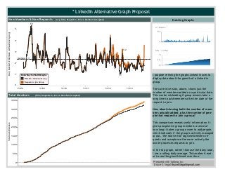
I propose refining the graphs Linked In uses to display data about the growth of a Linked In group. The current version, above, shows just the number of members added on a particular date. This can be misleading if group owners take a long time to add members after the date of the request to join. How about showing both the number of members actually added, plus the number of people that request to join a group? This comparison reveals useful information. It gives prospective group members a sense of how long it takes a group owner to add people, which indicates if the group is actively managed or not. The shorter the lag time between requests and acceptance the more actively the owner processes requests to join. In the top graph, rather than use the daily total, I use a rolling daily average. This makes it easier to see the growth trend over time. Data Viz Prepared with Tableau
Empfohlen

Empfohlen
Weitere ähnliche Inhalte
Kürzlich hochgeladen
Kürzlich hochgeladen (20)
Empfohlen
Empfohlen (20)
BESegal Linked In group Statistics display sample 9-11-13
- 1. *LinkedInAlternativeGraphProposal 1/1/08 1/1/09 1/1/10 1/1/11 1/1/12 1/1/13 0 1 2 3 4 5 DailyNumberofMembers(2-WeekMovingAvg) 3.2 5.3 1.1 Average:2.3 NewMembers&NewRequests (Avg.DailyRequesttoJoinvs.MembersAccepted) 0 500 1,000 1,500 2,000 2,500 3,000 3,500 TotalCulmMembers TotalMembers (Culm.RequeststoJoinvs.MembersAccepted) ExistingGraphs IproposerefiningthegraphsLinkedInusesto displaydataaboutthegrowthofaLinkedIn group. Thecurrentversion,above,showsjustthe numberofmembersaddedonaparticulardate. Thiscanbemisleadingifgroupownerstakea longtimetoaddmembersafterthedateofthe requesttojoin. Howaboutshowingboththenumberofmem- bersactuallyadded,plusthenumberofpeo- plethatrequesttojoinagroup? Thiscomparisonrevealsusefulinformation.It givesprospectivegroupmembersasenseof howlongittakesagroupownertoaddpeople, whichindicatesifthegroupisactivelymanaged ornot.Theshorterthelagtimebetweenre- questsandacceptancethemoreactivelythe ownerprocessesrequeststojoin. Inthetopgraph,ratherthanusethedailytotal, Iusearollingdailyaverage.Thismakesiteasi- ertoseethegrowthtrendovertime. PreparedwithTableauby: BruceE.SegalBruceESegal@gmail.com ColorKeyforBothGraphs MembersAddedtoGroup RequeststoJoinGroup