
Empfohlen
Weitere ähnliche Inhalte
Was ist angesagt?
Was ist angesagt? (18)
Andere mochten auch
Andere mochten auch (16)
Ähnlich wie NME Contents Page Analysis
Ähnlich wie NME Contents Page Analysis (20)
Mehr von AmyLongworth
Mehr von AmyLongworth (20)
Kürzlich hochgeladen
Kürzlich hochgeladen (20)
NME Contents Page Analysis
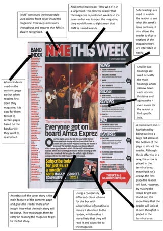
- 1. Also in the masthead, ‘THIS WEEK’ is in a large font. This tells the reader that Sub-headings are ‘NME’ continues the house style the magazine is published weekly so if a used to enable used on the front cover inside the new reader was to open the magazine, the reader to see magazine. This keeps continuity they would know straight away that what this week’s throughout and ensures that NME is NME is issued weekly. issue contains. It always recognised. also allows the reader to skip to sections of the magazine they are interested in easily. Smaller sub- headings are used beneath the main A band index is headings which used on the narrow down contents page each story in so that when this issue and readers first again make it open they even easier for magazine, it is the reader to easy for them find specific to skip to info. certain pages based on the A main cover line is band/artist highlighted by they want to being put into a read about. large red arrow at the bottom of the page to attract the reader. Although this is effective in a way, the arrow is placed in the terminal area, meaning it isn’t always the first place the reader will look. However, by making the Using a completely shape bright and An extract of the cover story is the stand out, it is different colour scheme main feature of the contents page more likely that the for the box with and gives the reader more of an subscription information in reader will look at insight into what the main story will it even though it is makes it stand out to the be about. This encourages them to placed in the reader, which makes it carry on reading the magazine to get more likely that they will terminal area. to the full story. read it and subscribe to the magazine.