SlideShare a Scribd company logo
1 of 47
Download to read offline
3 Common Web Usability Mistakes
   1   Registration Form


   2   Shopping Cart


   3   Product Comparison
1   Registration forms


                         Small text field length for middle name
                         Necessary to teach users how to enter address?


                         Instructions look cluttered
1   Registration forms


                         Separate pop-up windows to explain guidelines
                         or tips
1   Registration forms


                         Did not enter [Last Name]


                         Enter only 6 digits as password
1   Registration forms


                         It seems like a software error caused by the users


                         Error message does not appear beside the text
                         field that require rectification


                         Error message longer than the password
                         instructions?
1   Registration forms


                         Is clicking on the banner more important
                         than the [Join Flixster] button?
1   Registration forms
                         Displaying one error message at a
                         time
Good Example of Registration forms


                       Simple, clean registration form without any
                       other forms of distraction


                       Clear instructions on the criteria for each
                       input field
Good Example of Registration forms


                       Immediate text field verification and display
                       the error message
Good Example of Registration forms


                        Alert users when password don’t match
Good Example of Registration forms


                            Confirmation message when the
                            account is created successfully
Best Practices on Registration forms
•   Clearly communicate an error has occurred by visual contrast


•   Provide actionable remedies to correct error


•   Provide feedback in context of data submitted


•   Clearly communicate a data submission has been successful
3 Common Web Usability Mistakes
   1   Registration Form


   2   Shopping Cart


   3   Product Comparison
2   Shopping Cart


                    Find the offer attractive and
                    proceed to purchase
2   Shopping Cart


                    There is no call-to-action beside
                    the price information


                    Which one should the users click?


                    There seems to be many hyperlinks
                    within the same page, getting
                    confused on the focus of the page
2   Shopping Cart

                    It is not clear to users that step 1
                    has been completed


                    It seems like there are many small
                    steps in between and will take a
                    long time just to complete step 2
2   Shopping Cart


                    Again, it seems like step 3 is tedious
                    too
2   Shopping Cart


                    Should there be only one “Add to
                    cart” button to reduce confusion?
2   Shopping Cart


                    Small page real estate for the checkout
                    info and steps
2   Shopping Cart


                    Clear call-to-action
2   Shopping Cart


                    Could have use a visual cue to
                    indicate sold out items than just
                    using text that are difficult to scan


                    Cluttered page, call-to-action of
                    this page is not obvious
2   Shopping Cart


                    Unexpected behaviour with a pop-
                    up window when selecting the radio
                    button
2   Shopping Cart


                    Difficult to compare price plans in a
                    long scrolling page
2   Shopping Cart


                    Users do not seems to have the
                    option to omit certain phone
                    services and unsure if these services
                    have any additional charges
Good Example of Shopping Cart

                          Only one call-to-action in this page
Good Example of Shopping Cart


                         Product options are arranged in an
                         order for easy comparison
                         (incremental prices)
Good Example of Shopping Cart


                   Only one call-to-action in this page


                   Accessories add-ons are presented in a neat and
                   tidy format for easy scanning despite the long
                   scrolling page
Good Example of Shopping Cart


                           Provide useful recommendations
                           without distracting the users from
                           the main call-to-action of this page
Good Example of Shopping Cart


                        Easy to navigate and narrow down users’
                        selection with relevant product categories
Good Example of Shopping Cart


                           Subtle use of visual cues to
                           indicate exclusive deals
Good Example of Shopping Cart


                                Provide clear pricing
                                information
Good Example of Shopping Cart


                           Provide users with step-by-step
                           guidance throughout the
                           shopping journey


                           Subtle use of visual cues to reflect
                           the status of the shopping cart
Good Example of Shopping Cart


                     Price plans are arranged in a neat tabular
                     format for easy comparison
Good Example of Shopping Cart


                           Subtle use of visual cues to reflect
                           the status of the shopping cart
Good Example of Shopping Cart


                    Provide clear pricing information, indicating the
                    one-time and monthly subscription charges in
                    different columns
Best Practices on Shopping Cart Design
•   Draw user attention with size and contrasting colour


•   Use whitespace to detach call to actions from other elements


•   Keep the checkout interface simple


•   Don’t take the user out of the checkout process


•   Provide step-by-step guidance with progress indicators


•   Provide customers with the information of what is inside the
    shopping cart
3 Common Web Usability Mistakes
   1   Registration Form


   2   Shopping Cart


   3   Product Comparison
3   Price Comparison


                       Product model names did not
                       stand out


                       Difficult to consume product
                       information effective

                       - No pricing Info
                       - No [Add to Cart] button
                       - Difficult to compare products
3   Price Comparison


                       Overwhelmed by visual noise (red
                       hyperlinks everywhere)


                       The price did not stand out (same
                       font size as the listed price)


                       Should indicate the availability of
                       item upfront without users’ action
3   Price Comparison


                       Hyperlinks that look like body text


                       Difficult to compare products

                       Product model names did not
                       stand out


                       No [Add to Cart] button
3   Price Comparison

                       No [Add to Cart] button


                       Overwhelmed by visual noise (text
                       heavy)
                       Difficult to compare products


                       Long scrolling page, difficult to
                       compare products at a glance
Good Example of Price Plan page

                            Use of visual to communicate the
                            key differences (screen size)


                            Pricing info stands out from the
                            content


                            Clear call-to-action (“Buy Now”
                            button)
Good Example of Price Plan page

                            Use of visual to communicate the
                            key differences (screen size)


                            Product model names stands out
                            from the content


                            Clear call-to-action (“Buy Now”
                            button)
Good Example of Price Plan page


                            Use of visual to communicate the
                            key differences (colour)


                            Key features presented in
                            summarised format


                            Clear call-to-action (“Buy Now”
                            button)
Good Example of Price Plan page


Pricing info stands out from   Key features presented in   Use of visual to communicate
the content                    summarised format           the key differences


                                                                            Clear call-to-action
                                                                            (“Activate” button)
Best Practices on Price Plan page
•   Allow users to compare


•   Communicate not too much and not too little


•   Communicate differences, not similarities


•   Make the price stand out


•   Make sure you provide an “Add to Cart” button


•   Use visuals sparingly
Usability Evaluation conducted by


        Raven Chai
Founding Principal Consultant


     http://www.uxconsulting.com.sg

More Related Content

What's hot (6)

An innovative approach to retail in china
An innovative approach to retail in chinaAn innovative approach to retail in china
An innovative approach to retail in china
 
ShopperBoard Screenshots
ShopperBoard ScreenshotsShopperBoard Screenshots
ShopperBoard Screenshots
 
150723_New_From_Bose_B2B_Awards
150723_New_From_Bose_B2B_Awards150723_New_From_Bose_B2B_Awards
150723_New_From_Bose_B2B_Awards
 
eBags Journey to Record Sales w/ Improved Performance & Scalability
eBags Journey to Record Sales w/ Improved Performance & ScalabilityeBags Journey to Record Sales w/ Improved Performance & Scalability
eBags Journey to Record Sales w/ Improved Performance & Scalability
 
E-Commerce Models and Web 2.0 in Supply Chain
E-Commerce Models and Web 2.0 in Supply ChainE-Commerce Models and Web 2.0 in Supply Chain
E-Commerce Models and Web 2.0 in Supply Chain
 
Uniway compario-presentation-v2.1
Uniway compario-presentation-v2.1Uniway compario-presentation-v2.1
Uniway compario-presentation-v2.1
 

Similar to 3 common web usability mistakes

Virtual Shopping Mythbusters - Part 1
Virtual Shopping Mythbusters - Part 1Virtual Shopping Mythbusters - Part 1
Virtual Shopping Mythbusters - Part 1
vcuniversity
 
Care Day 130130 Apptus
Care Day 130130 ApptusCare Day 130130 Apptus
Care Day 130130 Apptus
cloudnine
 
Comparison Shopping is a Way of Life
Comparison Shopping is a Way of LifeComparison Shopping is a Way of Life
Comparison Shopping is a Way of Life
ЮниВеб
 
Zappos Usability Assessment - March 2011
Zappos Usability Assessment - March 2011Zappos Usability Assessment - March 2011
Zappos Usability Assessment - March 2011
Bibiana Nunes
 
Running head WEBSTORE LAYOUT DESIGN .docx
Running head WEBSTORE LAYOUT DESIGN                              .docxRunning head WEBSTORE LAYOUT DESIGN                              .docx
Running head WEBSTORE LAYOUT DESIGN .docx
rtodd599
 
Conversion optimisation Conversion Thursday Belfast
Conversion optimisation Conversion Thursday BelfastConversion optimisation Conversion Thursday Belfast
Conversion optimisation Conversion Thursday Belfast
Jill Robb
 

Similar to 3 common web usability mistakes (20)

Portfolio Idea 2_Modification for Pokevault.com
Portfolio Idea 2_Modification for Pokevault.comPortfolio Idea 2_Modification for Pokevault.com
Portfolio Idea 2_Modification for Pokevault.com
 
Sample heuristic final
Sample heuristic finalSample heuristic final
Sample heuristic final
 
Virtual Shopping Mythbusters - Part 1
Virtual Shopping Mythbusters - Part 1Virtual Shopping Mythbusters - Part 1
Virtual Shopping Mythbusters - Part 1
 
3rd Portfolio Development Idea: E commerce
3rd Portfolio Development Idea: E commerce3rd Portfolio Development Idea: E commerce
3rd Portfolio Development Idea: E commerce
 
Maximizing conversion with checkout optimization
Maximizing conversion with checkout optimizationMaximizing conversion with checkout optimization
Maximizing conversion with checkout optimization
 
[NET-A-PORTER] 9 Persuasive Principle Used by NET-A-PORTER to Boost their Con...
[NET-A-PORTER] 9 Persuasive Principle Used by NET-A-PORTER to Boost their Con...[NET-A-PORTER] 9 Persuasive Principle Used by NET-A-PORTER to Boost their Con...
[NET-A-PORTER] 9 Persuasive Principle Used by NET-A-PORTER to Boost their Con...
 
The Most Influential Persuasive Design Techniques
The Most Influential Persuasive Design TechniquesThe Most Influential Persuasive Design Techniques
The Most Influential Persuasive Design Techniques
 
Care Day 130130 Apptus
Care Day 130130 ApptusCare Day 130130 Apptus
Care Day 130130 Apptus
 
7 Inspiring Tests to Create High-Converting eCommerce Product Pages
7 Inspiring Tests to Create  High-Converting eCommerce Product Pages7 Inspiring Tests to Create  High-Converting eCommerce Product Pages
7 Inspiring Tests to Create High-Converting eCommerce Product Pages
 
Comparison Shopping is a Way of Life
Comparison Shopping is a Way of LifeComparison Shopping is a Way of Life
Comparison Shopping is a Way of Life
 
Varkul websoft pvt ltd -web site design for e-commerce
Varkul websoft pvt ltd -web site design for e-commerceVarkul websoft pvt ltd -web site design for e-commerce
Varkul websoft pvt ltd -web site design for e-commerce
 
Synapseindia web site design for E Commerce development
Synapseindia web site design for E Commerce developmentSynapseindia web site design for E Commerce development
Synapseindia web site design for E Commerce development
 
CrossView's "Working Together to Drive Optimization: Google's Universal Analy...
CrossView's "Working Together to Drive Optimization: Google's Universal Analy...CrossView's "Working Together to Drive Optimization: Google's Universal Analy...
CrossView's "Working Together to Drive Optimization: Google's Universal Analy...
 
10 ways to convert more orders - Etail East Address
10 ways to convert more orders - Etail East Address10 ways to convert more orders - Etail East Address
10 ways to convert more orders - Etail East Address
 
The Price Pros Company Intro
The Price Pros Company IntroThe Price Pros Company Intro
The Price Pros Company Intro
 
Increasing Conversions with Relevancy, Merchandising & Actionable Insights
Increasing Conversions with Relevancy, Merchandising & Actionable InsightsIncreasing Conversions with Relevancy, Merchandising & Actionable Insights
Increasing Conversions with Relevancy, Merchandising & Actionable Insights
 
Landing Pages Basics: What, Why and How
Landing Pages Basics: What, Why and HowLanding Pages Basics: What, Why and How
Landing Pages Basics: What, Why and How
 
Zappos Usability Assessment - March 2011
Zappos Usability Assessment - March 2011Zappos Usability Assessment - March 2011
Zappos Usability Assessment - March 2011
 
Running head WEBSTORE LAYOUT DESIGN .docx
Running head WEBSTORE LAYOUT DESIGN                              .docxRunning head WEBSTORE LAYOUT DESIGN                              .docx
Running head WEBSTORE LAYOUT DESIGN .docx
 
Conversion optimisation Conversion Thursday Belfast
Conversion optimisation Conversion Thursday BelfastConversion optimisation Conversion Thursday Belfast
Conversion optimisation Conversion Thursday Belfast
 

More from UX Consulting Pte Ltd

More from UX Consulting Pte Ltd (14)

Lean UX presentation (UXSG meetup #9)
Lean UX presentation (UXSG meetup #9)Lean UX presentation (UXSG meetup #9)
Lean UX presentation (UXSG meetup #9)
 
Service design for multi channel experiences workshop
Service design for multi channel experiences workshopService design for multi channel experiences workshop
Service design for multi channel experiences workshop
 
Designing branded service experience workshop
Designing branded service experience workshopDesigning branded service experience workshop
Designing branded service experience workshop
 
UX 在組織內外的推廣
UX 在組織內外的推廣UX 在組織內外的推廣
UX 在組織內外的推廣
 
Changing Cultures towards Design-Centric 改變- 塑造以設計為核心的文化
Changing Cultures towards Design-Centric 改變- 塑造以設計為核心的文化Changing Cultures towards Design-Centric 改變- 塑造以設計為核心的文化
Changing Cultures towards Design-Centric 改變- 塑造以設計為核心的文化
 
Embrace and Beyond Mobility: Design for the Ideal Dining Experience | 拥抱和超越移...
Embrace and Beyond Mobility:  Design for the Ideal Dining Experience | 拥抱和超越移...Embrace and Beyond Mobility:  Design for the Ideal Dining Experience | 拥抱和超越移...
Embrace and Beyond Mobility: Design for the Ideal Dining Experience | 拥抱和超越移...
 
How Startups May Build Your UX Competencies - Hire or Just a Myth?
How Startups May Build Your UX Competencies - Hire or Just a Myth?How Startups May Build Your UX Competencies - Hire or Just a Myth?
How Startups May Build Your UX Competencies - Hire or Just a Myth?
 
User friendly2013大会简介
User friendly2013大会简介User friendly2013大会简介
User friendly2013大会简介
 
UXSG Conference 2013 Welcome
UXSG Conference 2013 WelcomeUXSG Conference 2013 Welcome
UXSG Conference 2013 Welcome
 
Presentation at Plug N Work, Sao Paulo, Brazil
Presentation at Plug N Work, Sao Paulo, BrazilPresentation at Plug N Work, Sao Paulo, Brazil
Presentation at Plug N Work, Sao Paulo, Brazil
 
Lean UX Workshop
Lean UX WorkshopLean UX Workshop
Lean UX Workshop
 
iAxil Lunch Talk - Lean UX
iAxil Lunch Talk - Lean UXiAxil Lunch Talk - Lean UX
iAxil Lunch Talk - Lean UX
 
How's the "Little Red Dot" doing in embracing UX
How's the "Little Red Dot" doing in embracing UXHow's the "Little Red Dot" doing in embracing UX
How's the "Little Red Dot" doing in embracing UX
 
Digital ux strategy
Digital ux strategyDigital ux strategy
Digital ux strategy
 

Recently uploaded

Verified Trusted Call Girls Adugodi💘 9352852248 Good Looking standard Profil...
Verified Trusted Call Girls Adugodi💘 9352852248  Good Looking standard Profil...Verified Trusted Call Girls Adugodi💘 9352852248  Good Looking standard Profil...
Verified Trusted Call Girls Adugodi💘 9352852248 Good Looking standard Profil...
kumaririma588
 
infant assessment fdbbdbdddinal ppt.pptx
infant assessment fdbbdbdddinal ppt.pptxinfant assessment fdbbdbdddinal ppt.pptx
infant assessment fdbbdbdddinal ppt.pptx
suhanimunjal27
 
call girls in Dakshinpuri (DELHI) 🔝 >༒9953056974 🔝 genuine Escort Service 🔝✔️✔️
call girls in Dakshinpuri  (DELHI) 🔝 >༒9953056974 🔝 genuine Escort Service 🔝✔️✔️call girls in Dakshinpuri  (DELHI) 🔝 >༒9953056974 🔝 genuine Escort Service 🔝✔️✔️
call girls in Dakshinpuri (DELHI) 🔝 >༒9953056974 🔝 genuine Escort Service 🔝✔️✔️
9953056974 Low Rate Call Girls In Saket, Delhi NCR
 
Editorial design Magazine design project.pdf
Editorial design Magazine design project.pdfEditorial design Magazine design project.pdf
Editorial design Magazine design project.pdf
tbatkhuu1
 
Anamika Escorts Service Darbhanga ❣️ 7014168258 ❣️ High Cost Unlimited Hard ...
Anamika Escorts Service Darbhanga ❣️ 7014168258 ❣️ High Cost Unlimited Hard  ...Anamika Escorts Service Darbhanga ❣️ 7014168258 ❣️ High Cost Unlimited Hard  ...
Anamika Escorts Service Darbhanga ❣️ 7014168258 ❣️ High Cost Unlimited Hard ...
nirzagarg
 
Design Inspiration for College by Slidesgo.pptx
Design Inspiration for College by Slidesgo.pptxDesign Inspiration for College by Slidesgo.pptx
Design Inspiration for College by Slidesgo.pptx
TusharBahuguna2
 

Recently uploaded (20)

Booking open Available Pune Call Girls Kirkatwadi 6297143586 Call Hot Indian...
Booking open Available Pune Call Girls Kirkatwadi  6297143586 Call Hot Indian...Booking open Available Pune Call Girls Kirkatwadi  6297143586 Call Hot Indian...
Booking open Available Pune Call Girls Kirkatwadi 6297143586 Call Hot Indian...
 
UI:UX Design and Empowerment Strategies for Underprivileged Transgender Indiv...
UI:UX Design and Empowerment Strategies for Underprivileged Transgender Indiv...UI:UX Design and Empowerment Strategies for Underprivileged Transgender Indiv...
UI:UX Design and Empowerment Strategies for Underprivileged Transgender Indiv...
 
Verified Trusted Call Girls Adugodi💘 9352852248 Good Looking standard Profil...
Verified Trusted Call Girls Adugodi💘 9352852248  Good Looking standard Profil...Verified Trusted Call Girls Adugodi💘 9352852248  Good Looking standard Profil...
Verified Trusted Call Girls Adugodi💘 9352852248 Good Looking standard Profil...
 
Booking open Available Pune Call Girls Nanded City 6297143586 Call Hot India...
Booking open Available Pune Call Girls Nanded City  6297143586 Call Hot India...Booking open Available Pune Call Girls Nanded City  6297143586 Call Hot India...
Booking open Available Pune Call Girls Nanded City 6297143586 Call Hot India...
 
call girls in Vasundhra (Ghaziabad) 🔝 >༒8448380779 🔝 genuine Escort Service 🔝...
call girls in Vasundhra (Ghaziabad) 🔝 >༒8448380779 🔝 genuine Escort Service 🔝...call girls in Vasundhra (Ghaziabad) 🔝 >༒8448380779 🔝 genuine Escort Service 🔝...
call girls in Vasundhra (Ghaziabad) 🔝 >༒8448380779 🔝 genuine Escort Service 🔝...
 
infant assessment fdbbdbdddinal ppt.pptx
infant assessment fdbbdbdddinal ppt.pptxinfant assessment fdbbdbdddinal ppt.pptx
infant assessment fdbbdbdddinal ppt.pptx
 
HiFi Call Girl Service Delhi Phone ☞ 9899900591 ☜ Escorts Service at along wi...
HiFi Call Girl Service Delhi Phone ☞ 9899900591 ☜ Escorts Service at along wi...HiFi Call Girl Service Delhi Phone ☞ 9899900591 ☜ Escorts Service at along wi...
HiFi Call Girl Service Delhi Phone ☞ 9899900591 ☜ Escorts Service at along wi...
 
💫✅jodhpur 24×7 BEST GENUINE PERSON LOW PRICE CALL GIRL SERVICE FULL SATISFACT...
💫✅jodhpur 24×7 BEST GENUINE PERSON LOW PRICE CALL GIRL SERVICE FULL SATISFACT...💫✅jodhpur 24×7 BEST GENUINE PERSON LOW PRICE CALL GIRL SERVICE FULL SATISFACT...
💫✅jodhpur 24×7 BEST GENUINE PERSON LOW PRICE CALL GIRL SERVICE FULL SATISFACT...
 
Sector 104, Noida Call girls :8448380779 Model Escorts | 100% verified
Sector 104, Noida Call girls :8448380779 Model Escorts | 100% verifiedSector 104, Noida Call girls :8448380779 Model Escorts | 100% verified
Sector 104, Noida Call girls :8448380779 Model Escorts | 100% verified
 
call girls in Vaishali (Ghaziabad) 🔝 >༒8448380779 🔝 genuine Escort Service 🔝✔️✔️
call girls in Vaishali (Ghaziabad) 🔝 >༒8448380779 🔝 genuine Escort Service 🔝✔️✔️call girls in Vaishali (Ghaziabad) 🔝 >༒8448380779 🔝 genuine Escort Service 🔝✔️✔️
call girls in Vaishali (Ghaziabad) 🔝 >༒8448380779 🔝 genuine Escort Service 🔝✔️✔️
 
call girls in Dakshinpuri (DELHI) 🔝 >༒9953056974 🔝 genuine Escort Service 🔝✔️✔️
call girls in Dakshinpuri  (DELHI) 🔝 >༒9953056974 🔝 genuine Escort Service 🔝✔️✔️call girls in Dakshinpuri  (DELHI) 🔝 >༒9953056974 🔝 genuine Escort Service 🔝✔️✔️
call girls in Dakshinpuri (DELHI) 🔝 >༒9953056974 🔝 genuine Escort Service 🔝✔️✔️
 
Editorial design Magazine design project.pdf
Editorial design Magazine design project.pdfEditorial design Magazine design project.pdf
Editorial design Magazine design project.pdf
 
Case Study of Hotel Taj Vivanta, Pune
Case Study of Hotel Taj Vivanta, PuneCase Study of Hotel Taj Vivanta, Pune
Case Study of Hotel Taj Vivanta, Pune
 
Q4-W4-SCIENCE-5 power point presentation
Q4-W4-SCIENCE-5 power point presentationQ4-W4-SCIENCE-5 power point presentation
Q4-W4-SCIENCE-5 power point presentation
 
Anamika Escorts Service Darbhanga ❣️ 7014168258 ❣️ High Cost Unlimited Hard ...
Anamika Escorts Service Darbhanga ❣️ 7014168258 ❣️ High Cost Unlimited Hard  ...Anamika Escorts Service Darbhanga ❣️ 7014168258 ❣️ High Cost Unlimited Hard  ...
Anamika Escorts Service Darbhanga ❣️ 7014168258 ❣️ High Cost Unlimited Hard ...
 
Design Inspiration for College by Slidesgo.pptx
Design Inspiration for College by Slidesgo.pptxDesign Inspiration for College by Slidesgo.pptx
Design Inspiration for College by Slidesgo.pptx
 
8377087607, Door Step Call Girls In Kalkaji (Locanto) 24/7 Available
8377087607, Door Step Call Girls In Kalkaji (Locanto) 24/7 Available8377087607, Door Step Call Girls In Kalkaji (Locanto) 24/7 Available
8377087607, Door Step Call Girls In Kalkaji (Locanto) 24/7 Available
 
Sector 105, Noida Call girls :8448380779 Model Escorts | 100% verified
Sector 105, Noida Call girls :8448380779 Model Escorts | 100% verifiedSector 105, Noida Call girls :8448380779 Model Escorts | 100% verified
Sector 105, Noida Call girls :8448380779 Model Escorts | 100% verified
 
Top Rated Pune Call Girls Saswad ⟟ 6297143586 ⟟ Call Me For Genuine Sex Serv...
Top Rated  Pune Call Girls Saswad ⟟ 6297143586 ⟟ Call Me For Genuine Sex Serv...Top Rated  Pune Call Girls Saswad ⟟ 6297143586 ⟟ Call Me For Genuine Sex Serv...
Top Rated Pune Call Girls Saswad ⟟ 6297143586 ⟟ Call Me For Genuine Sex Serv...
 
Sweety Planet Packaging Design Process Book.pptx
Sweety Planet Packaging Design Process Book.pptxSweety Planet Packaging Design Process Book.pptx
Sweety Planet Packaging Design Process Book.pptx
 

3 common web usability mistakes

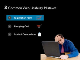
  • 1. 3 Common Web Usability Mistakes 1 Registration Form 2 Shopping Cart 3 Product Comparison
  • 2. 1 Registration forms Small text field length for middle name Necessary to teach users how to enter address? Instructions look cluttered
  • 3. 1 Registration forms Separate pop-up windows to explain guidelines or tips
  • 4. 1 Registration forms Did not enter [Last Name] Enter only 6 digits as password
  • 5. 1 Registration forms It seems like a software error caused by the users Error message does not appear beside the text field that require rectification Error message longer than the password instructions?
  • 6. 1 Registration forms Is clicking on the banner more important than the [Join Flixster] button?
  • 7. 1 Registration forms Displaying one error message at a time
  • 8. Good Example of Registration forms Simple, clean registration form without any other forms of distraction Clear instructions on the criteria for each input field
  • 9. Good Example of Registration forms Immediate text field verification and display the error message
  • 10. Good Example of Registration forms Alert users when password don’t match
  • 11. Good Example of Registration forms Confirmation message when the account is created successfully
  • 12. Best Practices on Registration forms • Clearly communicate an error has occurred by visual contrast • Provide actionable remedies to correct error • Provide feedback in context of data submitted • Clearly communicate a data submission has been successful
  • 13. 3 Common Web Usability Mistakes 1 Registration Form 2 Shopping Cart 3 Product Comparison
  • 14. 2 Shopping Cart Find the offer attractive and proceed to purchase
  • 15. 2 Shopping Cart There is no call-to-action beside the price information Which one should the users click? There seems to be many hyperlinks within the same page, getting confused on the focus of the page
  • 16. 2 Shopping Cart It is not clear to users that step 1 has been completed It seems like there are many small steps in between and will take a long time just to complete step 2
  • 17. 2 Shopping Cart Again, it seems like step 3 is tedious too
  • 18. 2 Shopping Cart Should there be only one “Add to cart” button to reduce confusion?
  • 19. 2 Shopping Cart Small page real estate for the checkout info and steps
  • 20. 2 Shopping Cart Clear call-to-action
  • 21. 2 Shopping Cart Could have use a visual cue to indicate sold out items than just using text that are difficult to scan Cluttered page, call-to-action of this page is not obvious
  • 22. 2 Shopping Cart Unexpected behaviour with a pop- up window when selecting the radio button
  • 23. 2 Shopping Cart Difficult to compare price plans in a long scrolling page
  • 24. 2 Shopping Cart Users do not seems to have the option to omit certain phone services and unsure if these services have any additional charges
  • 25. Good Example of Shopping Cart Only one call-to-action in this page
  • 26. Good Example of Shopping Cart Product options are arranged in an order for easy comparison (incremental prices)
  • 27. Good Example of Shopping Cart Only one call-to-action in this page Accessories add-ons are presented in a neat and tidy format for easy scanning despite the long scrolling page
  • 28. Good Example of Shopping Cart Provide useful recommendations without distracting the users from the main call-to-action of this page
  • 29. Good Example of Shopping Cart Easy to navigate and narrow down users’ selection with relevant product categories
  • 30. Good Example of Shopping Cart Subtle use of visual cues to indicate exclusive deals
  • 31. Good Example of Shopping Cart Provide clear pricing information
  • 32. Good Example of Shopping Cart Provide users with step-by-step guidance throughout the shopping journey Subtle use of visual cues to reflect the status of the shopping cart
  • 33. Good Example of Shopping Cart Price plans are arranged in a neat tabular format for easy comparison
  • 34. Good Example of Shopping Cart Subtle use of visual cues to reflect the status of the shopping cart
  • 35. Good Example of Shopping Cart Provide clear pricing information, indicating the one-time and monthly subscription charges in different columns
  • 36. Best Practices on Shopping Cart Design • Draw user attention with size and contrasting colour • Use whitespace to detach call to actions from other elements • Keep the checkout interface simple • Don’t take the user out of the checkout process • Provide step-by-step guidance with progress indicators • Provide customers with the information of what is inside the shopping cart
  • 37. 3 Common Web Usability Mistakes 1 Registration Form 2 Shopping Cart 3 Product Comparison
  • 38. 3 Price Comparison Product model names did not stand out Difficult to consume product information effective - No pricing Info - No [Add to Cart] button - Difficult to compare products
  • 39. 3 Price Comparison Overwhelmed by visual noise (red hyperlinks everywhere) The price did not stand out (same font size as the listed price) Should indicate the availability of item upfront without users’ action
  • 40. 3 Price Comparison Hyperlinks that look like body text Difficult to compare products Product model names did not stand out No [Add to Cart] button
  • 41. 3 Price Comparison No [Add to Cart] button Overwhelmed by visual noise (text heavy) Difficult to compare products Long scrolling page, difficult to compare products at a glance
  • 42. Good Example of Price Plan page Use of visual to communicate the key differences (screen size) Pricing info stands out from the content Clear call-to-action (“Buy Now” button)
  • 43. Good Example of Price Plan page Use of visual to communicate the key differences (screen size) Product model names stands out from the content Clear call-to-action (“Buy Now” button)
  • 44. Good Example of Price Plan page Use of visual to communicate the key differences (colour) Key features presented in summarised format Clear call-to-action (“Buy Now” button)
  • 45. Good Example of Price Plan page Pricing info stands out from Key features presented in Use of visual to communicate the content summarised format the key differences Clear call-to-action (“Activate” button)
  • 46. Best Practices on Price Plan page • Allow users to compare • Communicate not too much and not too little • Communicate differences, not similarities • Make the price stand out • Make sure you provide an “Add to Cart” button • Use visuals sparingly
  • 47. Usability Evaluation conducted by Raven Chai Founding Principal Consultant http://www.uxconsulting.com.sg