
Empfohlen
Weitere ähnliche Inhalte
Was ist angesagt?
Was ist angesagt? (20)
Ähnlich wie Poster Textual Analysis - Unit G324
Ähnlich wie Poster Textual Analysis - Unit G324 (20)
Mehr von tj_salango
Mehr von tj_salango (20)
Kürzlich hochgeladen
Kürzlich hochgeladen (20)
Poster Textual Analysis - Unit G324
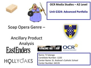
- 1. Soap Opera Genre – Ancillary Product Analysis Name: TJ Salango Candidate Number: 1220 Center Name: St. Andrew’s Catholic School Center Number: 64135 OCR Media Studies – A2 Level Unit G324: Advanced Portfolio
- 2. Tagline: The tagline states ‘Walford will change. Forever.’. It is typed in all capital letters and uses a font color that fades from white to grey from left to right, giving it the effect that it appears to be fading into the darkness. The use of a one word sentence, ‘Forever.’ creates a sense of extreme suspense and intensity as it exaggerates how the future of the series will change because of this particular episode. The font style is cleverly chosen, a thick blocked font is used to support the statement as it is firm and bold. Main Image: The main image on this poster features a girl who is presumably the main character of EastEnders. The shot type is a medium close-up of her face and shoulders, and her body position is twisted, as if she’s looking backwards. The facial expression presented connotes fear and shock, which is anchored by the consuming darkness that takes up the majority of the poster and surrounds her. A faint red overlay filter has been applied over her to establish a sense of horror and alarm, which she is unfortunately anticipating. Synergy with social media: The #hashtag’s purpose is to make it easier for people to stay updated with EastEnders news and events. This allows for easier searching on social media such as Instagram and Facebook. The #hashtag also allows people to give their own opinions or post their own thoughts on social media to share with other viewers. Institution Logo Brand Identity
- 3. Main Image: The main image in this poster is a long shot of who are presumably the main protagonists of the program. There is a lot of photo manipulation that has been done to the image as the characters appear to be on fire; this connotes the intensity of the series and the foreboding danger. Their facial expressions appear to be concerned, fearful, tense and confronting. The characters are surrounded with a black border, giving the illusion that they are emerging from the darkness, which may be foreshadowing events in the series. Institution Logo Tagline: Like the previous poster, the tagline on this Hollyoaks poster is very intense and dramatic because of the vocabulary used. The adverb, ‘forever’ signifies the importance of this series. Unlike the EastEnders poster, the font is typed in a simple black font, in normal case letters. A white border surrounds the lettering to contrast it against the background. The verb ‘change’ implies that nothing will ever be the same again for the characters, dramatizing the program. Brand Identity
- 4. Student Exemplar Work – Textual Analysis Main Image: The non-verbal code of the main image consists of 3 characters who have all been photographed at a medium distance shot. They are surrounded with a black background which takes up the majority of the poster, which connotes mystery and dark or depressing themes; this is anchored by the blank and sorrowful facial expressions shown on the character’s faces. The man in the back is particularly important as his dark clothing and enlarged size may be foreshadowing his actions in the series, perhaps he’s the antagonist. Tagline: The verbal code of the tagline of this poster features a white font with a slight shadow effect, and is presented in all upper caps letters. The tagline is clever in the way that the noun ‘Sunshine’ has a glow effect applied to it, not only does this signify the verbal code, but it adds more impact. It stands out from the dark background, which connotes the depressing nature of the series. Institution Logo Synergy with social media: the use of popular social media networking sites, Facebook and Twitter, are good ways to advertise a brand new soap opera as there are millions of different people to advertise to. By creating official Facebook and Twitter pages, audiences and interested viewers can visit the pages to keep up with the soap opera updates..
- 5. ‘Repeat’ (Steve Neale - 1980) In order to create a successful poster for my own soap opera, it must look clean and professional, I felt that the exemplar work could’ve been improved. I preferred the EastEnders poster over the Hollyoaks poster mainly because of the minimal use of CGI. I feel that as a student I would not be able to repeat the same photo manipulative effects shown on the Hollyoaks poster. The main image on both the posters are conventions I could repeat in terms of shot types as they are very simple and up front. I also feel that the tagline on the EastEnders poster is far more effective than the Hollyoaks tagline as it is bolder, clearer and creates more of an impact considering how many words, or lack thereof, have been used.