Top Rated Pune Call Girls Pimpri Chinchwad ⟟ 6297143586 ⟟ Call Me For Genuin...
Hs eval
1. In what ways does your media product use, develop or challenge forms and
conventions of real media products?
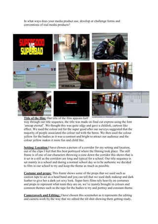
Title of the film: Our title of the film appears half
way through our title sequence, the title was made on final cut express using the font
‘amcap eternal’. We thought this was quite edgy and gave a childish, cartoon like
effect. We used the colour red for the super good after our surveys suggested that the
majority of people associated the colour red with the heros. We then used the colour
yellow for the badies as it was a contrast and bright to attract our audience and the
colour yellow makes it more fun and child like.
Setting/ Location:I have chosen a picture of a corridor for my setting and location,
out of the clips I feel that this best portrayed where the filming took place. The still
frame is of one of our characters throwing a cone down the corridor this shows that is
it set in a still as the corridors are long and typical for a school. Our title sequence is
set mainly in a school and during a normal school day so to be authentic we decided
to film in our school to try and keep the theme as much as possible.
Costume and props: This frame shows some of the props that we used such as
caution tape to act as a head band and you can tell that we used dark makeup and dark
leather to give her a dark yet sexy look. Super hero films rely heavily on costumes
and props to represent what team they are on, we’ve mainly brought in colours and
common themes such as the tape for the badies to try and portray and constant theme.
Camerawork and Editing: I have chosen this screenshot as it represents the editing
and camera work by the way that we edited the tilt shot showing them getting ready,
2. instead of it being slow on there own we decided to use a jump cut and increased the
speed of the shot in order to increase pace.
Title font and Style: This frame shows a RMH film and by watching the title
sequence you can see that we have changed the colourfrom white to black to try and
show the contrast from the two teams, we used the ‘amcap eternal’ font, which shows
character and has relevance to our genre, as it is a comical font.
Story and how the opening sets it up: This frame shows how after the title has been
introduced how the films starts a the two teams walking past each other in the corridor
and glaring as each other. It shows rivalry in the two sides and the audience has got
the impression that they are enemies.
Genre and how the opening suggests it: The beginning of our title sequence first is
the marvel ident this straight away informs the audience that’s its going to be based
on super heroes as they have funded, spider man, x-men and Iron man. Then you can
tell by the frame of Kyle wearing the mask that the film is going to be based on
dressing up and superheroes the mask shows a hidden identity and maybe he has a
different side to him.
How characters are introduced: The frame shows that after we show each character
their name and their characters name is shown in a colour that is specific for their side
for example good and bad. However the audience knows straight away who is who
and what their names are in the film.
Special FX: We have used many special effects in our title sequence only one of
them is that we changed the colour and brightness after we poterized each clip so that
they could look like cartoons and make it look like a comic strip. We had to change
the brightness on each shot as some were darker than others and you couldn’t see
them. This was one of the few special effects we used that contributed to our final
piece.
2. How does your media product represent particular social groups?
I think our media product represents certain social
groups as we used 2 males who had defined
muscles this is a stereotype of what superheroes
and superbadies look like their muscles show
strength and that they may over power the other
team. This is very typical in social groups as the
popular, cool groups are normally ones they ay be
part of a sports team and are usually physically fit.
The makeup we used on Bella was very dark and
mysterious making her look quite gothic again this
is very much associated with social groups as
people sometimes see Goths as strange or out of
the ordinary. However the makeup we used on
Sophie the supergoodie was very natural making
3. her face look pure and that she has natural beauty and innocence about her.
3. What kind of media institution might distribute your media product and why?
The media institution we have chosen
to distribute out media product is
marvel, by looking into what marvel
produce and the productions they fund
we think that our product fits in with
this best. They have funded films such
as Captain American, Spider man and
X-men all these films have similar
qualities to what our film does. Marvel
is the most likely production company
to distribute super hero films. We
decided to put our film as a 12 as there
is some shot where the characters are not wearing
many clothes so we think this would be most
appropriate.
4. Who would be the audience of your media product?
The audience for our product who be mainly
teenagers that can relate to school life and know
that there is some bullying going on an every
day basis. It’s a 12 rating as some parts may
show body parts that some young viewers may
find offensive and some characters may be
represented in a sexual way. Anyone ages 12
and above could be interested in our film as it a
light hearted comedy that can attract a wide
range of viewers. In our surveys it became clear
that younger audience are more attracted to
comedy and animated films.
My Audience Profile
Name: Savannah Hasler
Age: 16
4. School: Ravenswood School
Where they live: Bromley, Kent
She’s an average 16 year old female, she wears a mixture of clothes ranging from
indie items brought from Camden and items brought from the high street fashion such
as Top shop, New look and H & M. She tries to dress different in wearing clothes that
suit her personality and the look she is trying to go for different more individual look.
She enjoys watching cartoon, animated films as well as action films. Her music taste
included Paramore, You me at six and All American rejects.
How did you attract/address your audience?
We tried to make our title sequence interesting and pace to attract our viewers and
persuade them to carry on watching the film. We’ve used indie /rock music to fit in
with the pace and the style of the title sequence. The fact that our font and title of the
film will attract younger people straight away because it looks childish and younger
people are interested in animated and carton like films. The 25-word pitch is quick
and edgy giving and I want to know more’ feel so that they will go out and watch the
film. Our product appeals to my audience profile by fitting the criteria that she enjoys
and listens to rock, indie music so we’ve tried to contribute these into ur main project.
6. What have you learnt about technologies from the process of constructing this
product?
I have learnt how to use a camera effectively and get steady shots from using a tripod
and using tilts to get a full body shot. By using final cut express and editing on there
by changing certain things to make our final piece look as affective as it could be, i've
learnt how to edit and crop down shots and jump cut and bind them together to create
5. a creative, imaginative piece. After getting the hang of final cut express it made it
easier to change the order of things so it was less boring.
Final Cut Express- Editing
Google – Finding images
Copy right free music- We got the soundtrack of this
Using a camera and tripod- Filming
Vimeo- Transporting work so we can upload it to our blog
Blogger- Ti keep track of our progress and updating our final work
Looking back at your preliminary task (the continuity editing task), what do you feel
you have learnt in the progression from it to full product? I feel that I have leant a lot
from doing the preliminary task. At the time when editing the preliminary idea I think
our group felt like we had done a good job. This may have been because we hadn’t
experienced any other form of filming or editing. Whilst we were filming our main
task I think we understood that it was going to be a lot harder than we thought, but we
had planned it before which made it run smoothly. I feel that we didn’t really have
enough time to plan for our preliminary project and went into it not really knowing
what was involved, we planned our main project with costumes, props and story
boards so we knew exactly what we had to do. We even took test pictures in the
locations we may use to make sure lighting was ok and availability to the area. So I
think we prepared more for it and knew how long it was going to take us to edit it all
and I feel that our skills and knowledge over this period of time improved so our final
piece was far better than our preliminary.
7. Looking back at your preliminary task (the continuity editing task), what do you
feel you have learnt in the progression from it to full product? I feel that I have leant a
lot from doing the preliminary task. At the time when editing the preliminary idea I
think our group felt like we had done a good job. This may have been because we
hadn’t experienced any other form of filming or editing. Whilst we were filming our
main task I think we understood that it was going to be a lot harder than we thought,
but we had planned it before which made it run smoothly. I feel that we didn’t really
have enough time to plan for our preliminary project and went into it not really
knowing what was involved, we planned our main project with costumes, props and
story boards so we knew exactly what we had to do. We even took test pictures in the
locations we may use to make sure lighting was ok and availability to the area. So I
think we prepared more for it and knew how long it was going to take us to edit it all
and I feel that our skills and knowledge over this period of time improved so our final
piece was far better than our preliminary.