How to Design and Love Your Content
•
185 gefällt mir•20,587 views

A slightly long winded presentation about designing presentations, dealing with the dirty word in deck design: Content.

Empfohlen
Empfohlen
Weitere ähnliche Inhalte
Was ist angesagt?
Was ist angesagt? (20)
Andere mochten auch
Andere mochten auch (20)
Ähnlich wie How to Design and Love Your Content
Ähnlich wie How to Design and Love Your Content (20)
Mehr von Stinson
Mehr von Stinson (16)
Kürzlich hochgeladen
Kürzlich hochgeladen (20)
How to Design and Love Your Content
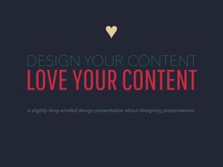
- 1. ♥ DESIGN YOUR CONTENT LOVE YOUR CONTENT a slightly long winded design presentation about designing presentations.
- 2. In short, it’s a love story.
- 3. About not being afraid of how much content your client provided you, making peace with the fact that you have to use all of it, and paying attention to the little details.
- 4. ( And I mean every, single, little detail. )
- 5. But don’t worry, there’s a happy ending.
- 6. You get a great looking presentation. And all your content gets to stay.
- 7. Most of the tips and guides about presentations talk about design, without really talking about content.
- 8. So let’s talk about content.
- 9. How to unpack it.
- 10. How to break it apart.
- 11. And reassemble the pieces Into something that satisfies both you the designer and has all the charts and information and all of the words you want.
- 12. First.
- 13. KNOW YOUR AIM and your audience. You’re speaking to a certain demographic, designing with a certain client in mind. There are different ways to appeal and present different products.
- 14. There’s appealing to designers.
- 15. And appealing to customers of a company who are targeting a specific look.
- 16. AND APPEALING TO CORPORATIONS who have a brand to uphold but also plenty of content that they need on their presentations. The moral of the story is, one kind of design doesn’t apply to everything, read the content, know what it’s about, and find a look that suits the company as well as the audience. MAKE IT HAPPEN INC.
- 17. After that...
- 18. BREAK IT DOWN to the most important aspects. What are your clients trying to say? What’s necessary and what’s unnecessary?
- 19. If it’s a long spiel like the one that was going to go on and on on the last slide, don’t be afraid to take some info to another slide.
- 20. See? It’s simple. And while we’re at it, extract info and make them bite-sized. VISUALIZE SIMPLIFY ORGANIZE
- 21. And finally.
- 22. LESS IS MORE... ...but sometimes more can be more too. If there’s a chunk of information that you absolutely cannot cut up, don’t be afraid to lay it out and let it fill up the page. But remember to emphasize what’s important.
- 23. Because let’s face it, sometimes there’s text that you’ve been told that you absolutely can’t cut and meddle with. Doesn’t mean you can’t let the people who don’t want to read a mountain of text know what’s going on in the text. Show people what’s important. Summarize on a separate layout, illustrate what’s going on in the text, emphasize with size, color. And of course that old stand-by, call outs. SHOW PEOPLE WHAT’S IMPORTANT ( Make the text work for you, and on a similar note... )
- 24. Show, don’t tell. Grab all those numbers and make it cool.
- 25. Engage the audience. Like we’re hopefully doing here with you.
- 26. Just to recap... KNOW YOUR AIM BREAK IT DOWN LESS IS MORE Don’t panic and... Relax if you can’t exactly do...
- 27. ( I swear this is the last slide. )
- 28. Do what you’d want to see. Have fun with the design. Love your content. ♥
- 29. OW D A LO N HIS DT K EC D YOU MIGHT ALSO WANT TO CHECK OUT CLICK TO VIEW CLICK TO VIEW GET IN TOUCH WITH US! www.stinsondesign.com @stinsondesign 1.888.960.9851 Icon credits to: Sergi Delgado, hatayas, Dmitriy Lagunov, Simple Icons of The Noun Project Photos credits to: M_Kinchloe, Clappstar from Flickr