↑Top Model (Kolkata) Call Girls Howrah ⟟ 8250192130 ⟟ High Class Call Girl In...
Steph E1
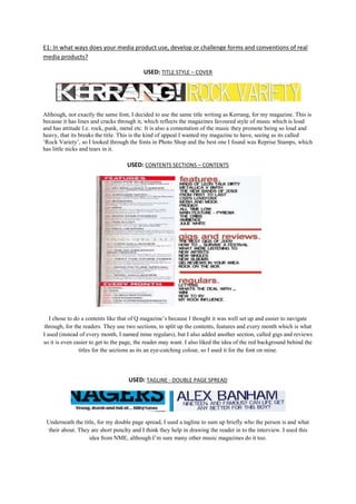
1. E1: In what ways does your media product use, develop or challenge forms and conventions of real media products? USED: TITLE STYLE – COVER Although, not exactly the same font, I decided to use the same title writing as Kerrang, for my magazine. This is because it has lines and cracks through it, which reflects the magazines favoured style of music which is loud and has attitude I.e. rock, punk, metal etc. It is also a connotation of the music they promote being so loud and heavy, that its breaks the title. This is the kind of appeal I wanted my magazine to have, seeing as its called ‘Rock Variety’, so I looked through the fonts in Photo Shop and the best one I found was Reprise Stamps, which has little nicks and tears in it. USED: CONTENTS SECTIONS – CONTENTS I chose to do a contents like that of Q magazine’s because I thought it was well set up and easier to navigate through, for the readers. They use two sections, to split up the contents, features and every month which is what I used (instead of every month, I named mine regulars), but I also added another section, called gigs and reviews so it is even easier to get to the page, the reader may want. I also liked the idea of the red background behind the titles for the sections as its an eye-catching colour, so I used it for the font on mine. USED: TAGLINE - DOUBLE PAGE SPREAD Underneath the title, for my double page spread, I used a tagline to sum up briefly who the person is and what their about. They are short punchy and I think they help in drawing the reader in to the interview. I used this idea from NME, although I’m sure many other music magazines do it too. DEVELOPED: ACCENTUATED WORDS – COVER Like NME magazine, I have added a headline about gigs, seeing as it’s a music magazine. However to develop it further, I accentuated the words, by changing colours fonts and styles to help make it stand out more. In this case I made the word ‘most’ red, with the rest of it being black. DEVELOPED: CAPTIONS UNDER THE PICTURE – CONTENTS I decided to use a caption underneath my pictures in the contents, like most other music magazines do. However instead of putting in a quote from their interview, like Q magazine have, I put an anecdote underneath it, to inject a sense of humour and light heartedness into the magazine. DEVELOPED: REPETITION OF MODEL – DOUBLE PAGE SPREAD I developed on the idea of repetition of the model in my magazine from this magazine. Although its not exactly the same (seeing as the other members are different), there is still a technique of shadowing them out, so that the main object stands out. That’s what I’ve done with mine, however its just the same person. CHALLENGED: POSTER TECHNIQUE – COVER The idea of this poster was my own idea because although most magazines show posters on their cover, I have edited my one so that she is in a different location to where it was shot. I have also put the poster in black and white, because I believe it gave the picture a cooler feel. It also contrasts with the rest of the cover. I then added her name above in a different style font to the rest of the covers to show that she is her own label. CHALLENGED: OWN FEATURES – CONTENTS I added my own features instead of just taking the same old stuff from other magazines. By doing this makes the magazine more unique, and gives off a different appeal. So to coincide with my magazines name, I put a feature called ‘new to rv’ and ‘my rock influence’ which ties in with the music genres I’m trying to sell. CHALLENGED: POSE AND EXPRESSION – DOUBLE PAGE SPREAD I took a shot of the model sitting down on the chair with a serious expression. This is because I wanted the picture to reflect what the interview will be like. However you cannot tell he’s sitting on a chair because I took it out when editing, the repetition. I also added shadow and lighting over his face to give a more mysterious look. By doing this, it gives off the appeal that we don’t know something about him.