1. Alternative rock magazine - Kerrang!
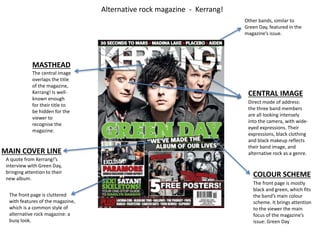
CENTRAL IMAGE
Direct mode of address:
the three band members
are all looking intensely
into the camera, with wide-eyed
expressions. Their
expressions, black clothing
and black makeup reflects
their band image, and
alternative rock as a genre.
MASTHEAD
The central image
overlaps the title
of the magazine,
Kerrang! Is well-known
enough
for their title to
be hidden for the
viewer to
recognise the
magazine.
The front page is cluttered
with features of the magazine,
which is a common style of
alternative rock magazine: a
busy look.
The front page is mostly
black and green, which fits
the band’s main colour
scheme. It brings attention
to the viewer the main
focus of the magazine’s
issue: Green Day
MAIN COVER LINE
A quote from Kerrang!’s
interview with Green Day,
bringing attention to their
new album.
Other bands, similar to
Green Day, featured in the
magazine’s issue.
COLOUR SCHEME
2. COLOUR SCHEME
The colour scheme is red, black, white and blue – this
brings attention to the main member of the band, as
it matches his clothes in the main image.
MAIN IMAGE
The main image of the double page spread overtakes the
entirety of the two pages: the entire double page spread is
dedicated to the band.
The members are all
looking in different
directions, with serious
expressions.