2. Goals: To provide tools and resources to individuals who
are designing a website.
Audience: Individuals who are overwhelmed with their
website project.
Message: There are resources that can help you design
your website
Planning
3.
4. This week I reworked my message to include what I
wanted my audience to “know”, “feel”, and “do”.
I changed my block text to reflect this new message.
I changed the subtitle to reflect this message.
I also changed the image to reflect what my target
audience is feeling.
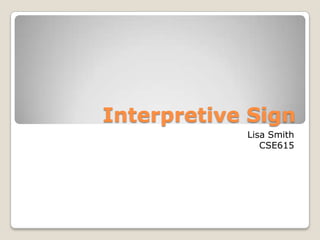
Week 4
5.
6. This week I looked at proximity and alignment.
I widened my image to create separation between the Title
and the subtitle for proximity.
I used a center alignment on both the heading,
subheading, and remaining text.
I changed the background color and included shading to
give the design depth and balance.
Week 5
7.
8. This week I looked at Repetition and Contrast.
I enlarged the first letter of the title and the subtitle for
repetition.
I pulled color from the image into the background to bring
contrast.
I right aligned the text against the shapes in the
background.
Week 6
9.
10. This week I looked at Color and Style. The next slide
represents the changes I made using color.
I experimented with a secondary triad with the colors
yellow-orange, aqua, and violet.
I left aligned the title, subtitle, and remaining text.
Week 7
11.
12. This week I looked at typography.
I changed the title and subtitle to the modern typeface of
Bodoni MT Poster Compressed.
I changed the remaining text body to the slab serif
typeface of Century Schoolbook.
These typefaces contrast by size and weight moving toward
a modern style.
Week 8
13.
14. For my final design I continued with the Complementary
colors. I chose a deeper shade of the blue and changed the
variation of the orange to a orange-yellow.
I flipped the blue background to the top.
I used a sans serif typeface for the Title and subtitle and
used a slab serif for the remaining text. I contrasted by
weight, size, and variation in the typeface.
I used right alignment and the elements are in proximity
by body of text and balanced by white space around the
image.
Final Design