1. Media evaluation
In what way does your media product use, develop or challenge forms and conventions of
real media products?
Question 1: In what way does your media product use, develop or challenge forms and
conventions of real media products?
Before I started to construct my magazine front cover, contents and double page spread I
looked and analysed real front covers, content pages and double page spreads as my
product research. I looked at a range of different magazines including NME, billboard, vibe,
Q these are some of the magazines I analysed. I looked at a variety of things from my
product research like the way the editor has used the mastheads and the different colours
to attract the audience. Also looked at the text used and the cover lines the editor has used
on the front covers, contents page and double page spreads. The layout also had a big
influence on designing my magazine pages, as I looked at the layouts and gathered ideas for
the layouts for my magazine pages. I also looked if the editor used the design principle and
Guttenberg principle correctly. By analysing these magazine pages it helped me to get a
better understanding and idea of how a magazine should look professionally. For my
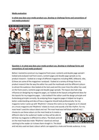
magazine name I came up with ‘Rhythmic’ I choose this name as my magazine as it is based
on a music magazine and ‘Rhythmic’ relates to music and sounds a lot like rhythm. For my
mast head I used the colours black and red. The mast head was half black and half red; I
choose to use these colours on the mast head as it creates a
different vibe to the audience/ reader as they will be able to
tell that my magazine is different to others. The black and red
on the mast head also make ‘Rhythmic’ stand out and eye
catching to the reader so it draws them straight in. The black
and red also used are basic colours which can appeal to a male and female audience. In my
2. magazine I have also used white, so I have three basic colours which a bright, bold and eye
catching to the audience. From what I gathered from my product research magazines used
bold clear and eye catching fonts which were mostly formal. For my magazine I used clear
formal font which was using red, black or white as the text. As I have used formal text it
makes my magazine look more professional and more trustworthy as it doesn’t use informal
text. For my main cover line like which I have analysed in my product research I have made
sure my cover line is big and bold. This has worked successfully as when you firstly look at
my front cover it stands out and is eye catching towards the audience. The effect by having
the black outline make it more eyes catching and successful so that the audience can be
drawn straight to it as it is the main focus. Most of my house style was influenced by my
product research which has made my house style look professional. I took different ideas
and then came up with my own ideas for my magazine. The images I took were based on my
product work and also the genre of my magazine. I made sure when taking my images that I
was influenced by the rule of thirds to get a good image which would go great on my
magazine pages. For my images on photo shop for the band image of the boys I changed
their clothes colour to all grey so they would all merge together as a band and look more
professional. I did this by using Photoshop and colour replacement. This has been very
successful as it has made my magazine look more professional and not out of place. By
changing the colour it has also made it eye catching as they look like a real boy band. I also
have created a double page spread with an article which I wrote to go on the double page
spread. I firstly looked at other double page spreads in a variety of
different magazines so it would influence my ideas on what type of
article I should write and put on my double page spread. The double
page spread examples I looked at were mostly question and answered
based of artists or bands which were featured in the magazine. These
magazine articles influenced me to write a question and answer article.
This has been done successfully as I have able to write an article which looks and reads
professionally. For my double page spread I also used kicker and pull quotes which I noticed
are used frequently in my product research. This has been done successfully as I have been
able to draw important information out of the article and highlight them so they are eye
catching and the reader can be drawn in.
Question two: How does your media product represent particular social groups?
My magazine is focused upon the pop genre of music, I choose this genre as it can relate to
a lot of people as it is a well-known genre and most people listen to the music. Different
social groups are represented for my music magazine for example age, gender and social
class is represented. Age is represented for my magazine as it can relate to most
ages but I think it appeals more to the younger teenage generation as it includes
young artist on the front cover like Rihanna and Katy Perry which most young
3. people listen too. The type of music which my magazine is relates to the younger generation
as they listen to the charts more than the older generation. My magazine also
relates to a much younger generation as the colours used and the images used
are more appealing to them. Bright colours are used and high contrast images
which attract the younger generation of mostly teenagers. The front cover is
very eye catching and includes more images than words which the young
generation like as they don’t like to read much. The three bold colours black,
red and white also attract the younger generation as the magazine is simple
and not complicated so it will attract them to buy the magazine. Gender is also another
social group which will be attracted by my magazine. I think that both boys and girls
(teenage years) will be attracted to my magazine as the text used is simple and easy to see
and understand, it also includes a variety of different things for both
genders to like. It also includes the latest gossip of celebrities and
musicians for them to read. The colours used are also neutral colours
which could relate to both genders as they aren’t really gender pacific.
The images used are also not just male images there are also female
images used on the contents page. I have used the same colours
throughout the magazine to keep it formal and simple so the audience
does not get confused or lose interest with the amount of colour changes. The colours used
could attract more males than females as there are dark colours used like black and red but
the colours used don’t base on one gender as I want to attract both female and male to take
an interest in my magazine. Another social group my magazine could represent is social
class. This includes working class, middle class and upper class. I think my magazine relates
to any audience which like pop music which are maybe working class and middle class. But I
think my magazine can relate to most social groups as it doesn’t base itself on one. Also pop
music can relate to most people as everyone has heard it and most people take an interest
in it. I think all social classes can relate/ read my magazine.