Beginners Guide to TikTok for Search - Rachel Pearson - We are Tilt __ Bright...
S Kamal Portfolio
1.
2. Surface Print Design - Textiles
Grey’s Anatomy
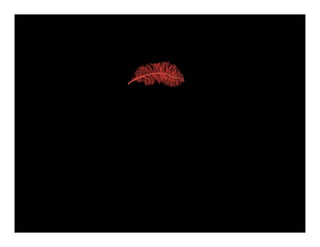
Variation on a single color and color schemes occurring in nature was the
inspiration for this project. Texture mapping was used to apply the designs in
an apparel context.
RedFeatherDesign shahirakamal@gmail.com
9. Natural Dye Process - Textiles
Experiments With Red
A group project where we each experimented with different natural dyes. My
specific three goals were: 1. to achieve a particular red on silk/hemp blend
fabric using natural dyes; 2. to make a garment of the undyed fabric; and
3. to dye the garment with an ombré technique. The process of dyeing was so
extensive and the results so far from the original idea, to dye the garment
proved to be too far out of reach within the time frame (the un-dyed garment
is shown at the end of this series). The dyeing process was an invaluable
learning experience which required extensive research and discussion with a
local master dyer, who also procures environmentally friendly silk and silk blend
fabrics. Please visit Cheryl Kolander at www.aurorasilk.com
RedFeatherDesign shahirakamal@gmail.com
12. Sustainable Fabric Line - Apparel
Natural Defense
It was important with this line to embrace the neutral colors
of the natural fibers - almost exclusively hemp/silk blends, plus 100% silk
fabrics - and play up the colors and textures with lots of style lines,
transparency, and the use of raw edges and selvages. Fabric piecework and
metal works of armor were very influential.
RedFeatherDesign shahirakamal@gmail.com
19. 1970’s Re-do - Apparel
A Simpler Time
The menswear look of Annie Hall was the primary inspiration, perhaps
especially the hat. During the 1970’s our society felt nostalgia for the 1930’s,
which extended to ‘70’s fashions.
20.
21.
22.
23.
24. Technical Sketching - Apparel
Snowboarding Jumpsuit
This garment was designed in a group, then each group member interpreted
the design separately. We worked towards achieving as much practicality and
protection as possible in the one-piece design, and in the position of the pockets.
RedFeatherDesign shahirakamal@gmail.com
27. Apparel Graphic - Dragon Boat Jersey
Komochin Dragons
Jersey graphic designed for my previous employer’s Dragon Boat team
for the Portland Rose Festival Dragon Boat Races. Colleagues who chose the final
design felt strongly it was necessary to use a dragon in the design; I also wanted to
explore images that reflected the commitment of the people to the team effort.
While designing the graphic it was not known which ink colors or jersey colors
would be available. I advised it would be best to use only two ink colors, black plus
an accent color, letting the jersey be the third color. The accent color could then
be swapped out for any other, depending on the final jersey color that became
available.
RedFeatherDesign shahirakamal@gmail.com