1. Poster Evaluation
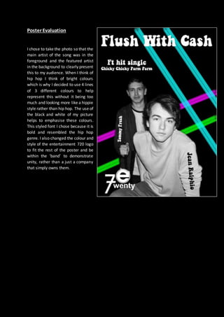
I chose to take the photo so that the
main artist of the song was in the
foreground and the featured artist
in the background to clearly present
this to my audience. When I think of
hip hop I think of bright colours
which is why I decided to use 4 lines
of 3 different colours to help
represent this without it being too
much and looking more like a hippie
style rather than hip hop. The use of
the black and white of my picture
helps to emphasise these colours.
This styled font I chose because it is
bold and resembled the hip hop
genre. I also changed the colour and
style of the entertainment 720 logo
to fit the rest of the poster and be
within the ‘band’ to demonstrate
unity, rather than a just a company
that simply owns them.