2. Branding the Name
Monday, January 24, 2011 2
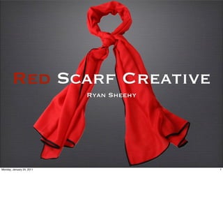
Red scarf creative is a name that I choose for a few reasons. First of all I choose the color Red. The color red is bold and it symbolizes Passion, Love, beauty, and
sacrifice. We apply these emotions and feelings into all of our work. Red is also a very attention getting color. Red sticks out there and will intrigue our clients to
come a little bit closer, and even get a taste of our work.
3. Branding the Name
Monday, January 24, 2011 3
A scarf is warm. It keeps you from the cold during the winter. I think of a scarf as comforting. You can also wear a scarf for a nice classy style. Style is very important
with “Red Scarf Creative” because our content will have style that will intrigue the consumers of our clients. One thing About scarfs that I want to be presented in my
business is that one size fits all. A scarf can fit anybody. The same goes with my business. We can produce videos for a very wide variety of clients.
4. Back Story
Love the color RED
Scarfs
Love / Beauty
Film = Passion
Monday, January 24, 2011 4
Film is a passion of mine. This is the reason why I chose red as the color to represent my company. Scarfs are something else that I really like.
Scarfs are comforting and warm. I used to wear scarfs in the winter, back home in New England. Love and Beauty are huge interests of mine. I love
the work that I do and have loved it for a long time. I have been doing film since I was 10 years old.
5. Strengths / Weaknesses
Arbitrary General
Easy to say Not trademarked
Memorable Not Brand specific
Flows Opinionated
Bold Colors Misleading
Monday, January 24, 2011 5
I will start with the weaknesses. Red Scarf is a pretty general name. It is not brand specific so some clients may not realize that we are a production
company. Red scarf can be opinionated. People may not like the color red and people may not like scarfs.
Some good things are the name is Arbitrary. I will be able to trademark this name as an original in the film industry eventually. The name is very
easy to say and is quite memorable. The letters R and S are next to each other in the alphabet. This creates a nice flow in the title. Finally the bold
colors I use will get attention from clients.
6. LOGO
Letter Form Logo Must Signify
Includes Title Flexibility
Includes Red Scarf Passion
title and Scarf Boldness
intertwined.
Monday, January 24, 2011 6
I want my Logo to be a letter form Logo. I want a picture of a scarf to be incorporated in the title. I want a scarf to be intertwined with the text of
the logo. I think this will signify flexibility in my brand. I want to offer my service to a wide variety of clients. I want my Text to be a classy Font.
Something similar to Times New Roman or Garamond font. I want my Logo to also signify Passion as well as boldness with out having a Bold font.
7. LOGO
Red for a Reason
Clean Classy Font
Esthetically pleasing
Simple words Turn
Unique
Monday, January 24, 2011 7
Easy to read. Must Be horizontal for reading purposes. Red is an attention getter. Like the
content in our videos Our logo will be remembered. We want our Brand to be flexible. Having
the Scarf wrapping around the text could show that we are willing to do what ever it takes to
please out clients. The words Red Scarf are simple words. Simplicity in a way is artistic and
fascinating to many people. With a mix of attracting colors and simple memorable words
people will be intrigued by this production company and demand out services.
8. Inspiration
Monday, January 24, 2011 8
Very simple. One word, not brand specific but Tells a story. I think of a summit as a
challenge. Something to concur, like every project yet to be completed. This brand is in my
industry and I would consider them one of my main competitors in the future for red scarf
creative.
9. Inspiration
Monday, January 24, 2011 9
RED Classy simple delicious. This is a great attention getting logo. The text is a classy cursive style font with the bold colors and a bottle of coke to
shown for the product. The is an effective logo for all of those reasons. The main difference between my logo and this logo is that cokes logo is
brand specific. It is a soft drink and they include the bottle. I do not wish to add cameras to my logo.
10. Corporate Culture
Creativity
Happy Clients
Fun.
Professional
Family
Monday, January 24, 2011 10
Trend setters, Provide content that out clients will love. Have a fun experience with our
productions. Be professional. Fun with out dangerous horse play. Constant team of hard
working crew. Family that works very well together. Morels ... no porn
11. Mission / Tag line
Memorable Content
“Working efficiently Red Scarf Creative is
committed to providing unique and
promotional content for every client.”
Monday, January 24, 2011 11
I want to get the message across to my clients that this content will be remembered. Being remembered will not only keep my business going, but
keep my clients products or services in the heads of the audiences.