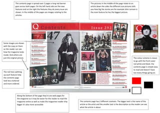
1. The contents page is spread over 2 pages a long red banner The pictures in the middle of the page relate to an
goes across both pages. On the left hand side are the new article down the sides the different size pictures tells
features and on the right the features they do every issue are you how big the stories are for example John Lennon is
shown. In the middle of the pages are images relating to the the main feature he has the biggest picture.
articles.
Some images are shown
with the copy on them
so the reader can see
how the magazine looks
inside. And others are
just the original picture. The colour scheme is classic
to go with the front cover
red white and black. the
contents page is simple easy
to read and doesn’t have
The red lines splitting too many things going on.
up each feature help
the contents page
look less cluttered
and more ordered.
Along the bottom of the page they’re are web pages for
the magazine so it may be easier for the reader to read the
magazine online as well as make the magazines reader ship The contents page has 2 different sizetexts. The bigger text is the name of the
bigger it’s also more accessible article or the artist and the smaller text is the description so the reader can see
what the article is about.