1. This is the first stage of creating my double page spread, here I have inserted the two separate
pages of A4 size and merged them together to create an A3 size. The page numbers and the small
versions of my logos next to the page numbers are on each page at the opposite sides.
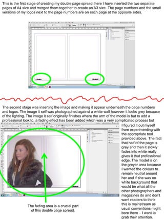
The second stage was inserting the image and making it appear underneath the page numbers
and logos. The image it self was photographed against a white wall however it looks grey because
of the lighting. The image it self originally finishes where the arm of the model is but to add a
professional look to, a fading effect has been added which was a very complicated process but
I figured it out myself
from experimenting with
the appropriate tool
provided above. The fact
that half of the page is
grey and then it slowly
fades into white really
gives it that professional
edge. The model is on
the greyer area because
I wanted the colours to
remain neutral around
her and if she was on
white background that
would be what all the
other photographers and
magazines do and don’t
want readers to think
this is mainstream as
The fading area is a crucial part
usual conventions might
of this double page spread.
bore them – I want to
grab their attention.
2. The third stage was inserting the head line. The first line “All you need to know about Brooke
Taylor” is the above line and it spreads across the whole of the two pages as this is the main
message that has to primarily get across to the audiences. The line below “the next big star” is 2x
larger as this provides the rest of the message of the head line and further reinforces
the meaning
of the article.
The text is in
black
because I
want to keep
it classy and
conventional
– attractive
to both
sexes.
Here, I have inserted my article from Microsoft word into in design to start creating my double page
spread article professionally. I have used the technique above to separate my article into 4 columns
of equal width and font size. By doing this I am ensuring that my magazine looks professional
and so that the readers stay focused and don’t get distracted, this is especially important with
younger people who find many things boring and have problems with concentration.