
Recommended
More Related Content
What's hot
What's hot (19)
Similar to Media colour scheme and fonts
Similar to Media colour scheme and fonts (20)
More from niltiachplar
Recently uploaded
Recently uploaded (20)
Media colour scheme and fonts
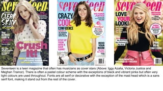
- 1. Seventeen is a teen magazine that often has musicians as cover stars (Above: Iggy Azalia, Victoria Justice and Meghan Trainor). There is often a pastel colour scheme with the exceptions of black and vibrant pinks but often very light colours are used throughout. Fonts are all serif or decorative with the exception of the mast head which is a sans serif font, making it stand out from the rest of the cover.
- 2. Grazia goes against what the majority of magazines around at the moment do because it uses a large variety of fonts including serif, sans serif and decorative fonts that somehow work very well together. Overall, white is a continued colour scheme however, the accompanying colours differ from issue to issue to work with the cover image and season that it is released as it is mainly a fashion magazine.
- 4. Font TypesSans Serif Sans Serif fonts are fonts which don’t have the flicks , called ‘serifs’ at the end of them. They are usually considered to be a more modern font style and are widely used in advertising. Examples of sans serif fonts are: •Calibri •Adobe Gothic •Arial •Franklin Gothic Serif Serif fonts are fonts with flicks (serifs). They are considered an older style of font and are widely used in newspapers. Examples of serif fonts are: •Century •Georgia •Times New Roman •Mongolian Bait i Script Script fonts are based on handwriting and the fluidity/movement of handwriting. Script fonts are often used in fashion and art to create slogans. Examples of script fonts are: •Comic Sans •Bradley Hand •Freestyle Script •Lucinda Handwriting Decorative Decorative fonts are, as the name suggests, embellished lettering. They are often used on posters and other media such as album artwork. Decorative fonts include: •AR BONNIE •AR DARLING •AR DESTINE •AR DELANEY Heavy/Light Fonts can also be categorised into heavy and light fonts. Heavy fonts have a thicker line where as light fonts are thinner in form Heavy Light
- 5. Masthead Fonts After looking through a wide variety of different fonts for my masthead, I settled upon using Budmo Jiggler which is decorative font. It contains small circles which are reminiscent of large lit signs which I feel really reflects the image of the pop genre. I also thought that it would draw attention to the masthead and make it more obvious than any of the other fonts I looked at.
- 6. Cover line and contents page fonts Having looked at many different font options, I have chosen to use Impact as my cover line font as it is very bold and eye catching and is often used by teen pop magazines like mine. I have decided upon using Arial Narrow as the font for my contents page because, as a sans serif font, it is modern looking and still within keeping with the simplicity of my magazine’s appearance.
- 7. Double Page Spread and Pull Quote fonts I have chosen to use Arial as my Double Page Spread font because it is easily readable and because it is a sans serif font, it keeps within the modern design of my magazine. I really wanted to use a script font for my pull quote font as I wanted to give the impression of hand written answers within my interview to make it seem more personal to the reader. I eventually chose to use Freestyle Script as I felt that it looked the most genuine of all the script fonts whilst remaining readable.
- 8. Masthead font 21st Century-AR ChristY21st Century – AR BONNIE (Bold) 21st Century-MV Boli 21st Century- Times New Roman Pop’s New Princess-AR Delaney 21st Century-Monotype Corsiva 21st Century-AR JULIAN Cover line font Pop’s New Princess- Aharoni 21st Century- Arial Black Pop’s New Princess-AR DESTINE Pop’s New Princess-Impact Pop’s New Princess-Calibri (Body) Pop’s New Princess-Veranda Contents Page font Page 5-Arial Narrow Page 5-Century Gothic Page 5-Corbel Page 5- Kalinga Page 5-Raavi DPS font Molly Barren-Calibri (Body) Molly Barren-Arial Molly Barren-Century Gothic Molly Barren-Meiryo Pull Quote font “I love my fans”- Bradley Hand ITC “I love my fans”- Kristen ITC “I love my fans”- Freestyle Script “I love my fans”- Lucinda Handwriting “I love my fans”- Pristina t Century-Budmo Jiggler
- 9. I used the complementary setting on kuler.com to create these colour schemes. Complementary colours are opposite on the colour wheel. I don’t really like these because they look a bit mismatched. I used the analogous setting on kuler.com to create these colour schemes. Analogous colours are next to each other on the colour wheel. I really like the blues and would like to mix them with the pinks I chose to create my own custom colour scheme because I wanted to mix the blues and pinks to fit with my photographs and the genre of my magazine.
- 10. I used the complementary setting on kuler.com to create these colour schemes. Complementary colours are opposite on the colour wheel. I don’t really like these because they look a bit mismatched. I used the analogous setting on kuler.com to create these colour schemes. Analogous colours are next to each other on the colour wheel. I really like the blues and would like to mix them with the pinks I chose to create my own custom colour scheme because I wanted to mix the blues and pinks to fit with my photographs and the genre of my magazine.