
Empfohlen
Weitere ähnliche Inhalte
Was ist angesagt?
Was ist angesagt? (19)
Andere mochten auch
Andere mochten auch (9)
Ähnlich wie Contents creation
Ähnlich wie Contents creation (20)
Mehr von niltiachplar
Kürzlich hochgeladen
Kürzlich hochgeladen (20)
Contents creation
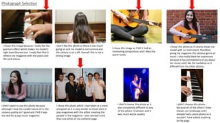
- 1. Photograph Selection I chose this image because I really like the aperture effect which makes my model’s right hand blurred out. I really feel that it reflects my magazine with the piano and the pink sleeve. I don’t like this photo as there is too much going on and my model is not centred and the camera is on a tilt. Overall, this is not a strong image. I chose this image as I felt it had an interesting composition and I liked the warm tones. I chose this photo as it clearly shows my model with an instrument, therefore giving my magazine the obvious genre of music. I also really liked her expression because it has connotations of joy about her music and I like the backdrop as it differed from my other photos. I didn’t want to use this photo because although I love the candid nature of it, the camera quality isn’t good and I felt it was too dull for a pop music magazine. I chose this photo which I had taken at a meet and greet as it is very similar to those seen in pop magazines with the editor meeting the people in the magazine. I also wanted more than one artist on my contents page. I didn’t choose this photo as it was completely different to any of the others I’d chosen and it was much worse quality. I didn’t choose this photo because all of the others I have chosen are landscape and I already had a piano photo so it wouldn’t have added anything to the page
- 2. I used the spot heal tool to remove any imperfections on my model’s face. I then used the burn tool to darken her eyebrows, lash line and hair to match my other images. I altered the brightness and contrast of my image so that it doesn’t look so dark and gloomy but more alive. I then played with the shadow to again make it lighter.
- 3. For these two photographs, I changed the brightness and contrast as both were quite dark and my magazine is quite bright so I wanted it to match more closely. This also gave them more clarity so that they are clearer. Later on, I added a gradient to all of my images to create uniformity.
- 4. I placed a white box around the images to make them look like a film strip. I also added a gradient to the page to make it more interesting. I put my masthead onto the page in size 90 to brand my page. I wrote my heading in Orator size 60 (underlined) to make it clear what the page’s purpose was. I used the place tool to arrange my images on a blank document.
- 5. For the editorial pillars I used orator std size 30 to create a house style and had my article titles in calibri size 18 bold which is both modern,easy to read and reflects the font on my DPS. I added in the issue number and date in the top left corner-calibri size 18, in white box created using the marquee tool.
- 6. I went on to make my editorial pillars orange like my model’s guitar to make them stand out even further and to unite the images and the text.