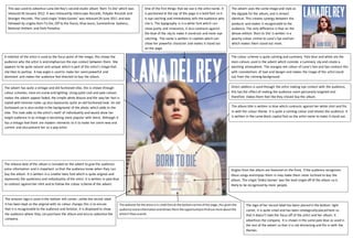
1. This was used to advertise Lana Del Rey’s second studio album ‘Born To Die’ which was
released 30 January 2012. It was released by Interscope Records, Polydor Records and
Stranger Records. The Lead single ‘Video Games’ was released 29 June 2011 and was
followed by singles Born To Die, Off to the Races, Blue Jeans, Summertime Sadness,
National Anthem and Dark Paradise.
One of the first things that we see is the artist name. It
is positioned at the top of the page in a bold font so it
is eye catching and immediately tells the audience who
she is. The typography is in a white font which can
show purity and innocence, it also contrasts against
the blue of the sky to make it stand out and more eye
catching. The name is written in capitals which can
show her powerful character and makes it stand out
on the page.
The album title is written in blue which contrasts against her white shirt and fits
in with the colour theme. It is quite a calming colour and relaxes the audience. It
is written in the same block capital font as the artist name to make it stand out.
The colour scheme is quite calming and summery. Pale blue and white are the
main colours used in the advert which connote a summery sky and create a
warming atmosphere. The orangey red colour of Lana’s hair and lips contrast this
with connotations of love and danger and makes the image of the artist stand
out from the calming background.
Direct address is used through the artist making eye contact with the audience,
this has the effect of making the audience seem personally targeted and
therefore makes them feel like they should buy the album.
A midshot of the artist is used as the focus point of the image, this shows the
audience who the artist is and emphasises the eye contact between them. She
appears to be quite natural and unique which is part of the artist’s image that
she likes to portray. A low angle is used to make her seempowerful and
dominant and makes the audience feel directed to buy the album.
The release date of the album is included on the advert to give the audience
extra information and is important so that the audience know when they can
buy the album. It is written in a smaller italic font which is quite original and
represents the quirkiness and individuality of the artist. It is written in pale blue
to contrast against her shirt and to follow the colour scheme of the advert.
The website forthe artistisin small fontat the bottomcentre of the page,this givesthe
audience extrainformationandallowsthemthe opportunitytofindoutmore aboutthe
artistif theysowish.
The advert uses the same image and style as
the digipak for the album, and is almost
identical. This creates synergy between the
products and makes it recognisable to the
audience. The only difference is that on the
deluxe edition ‘Born to Die’ is written in a
peachy colour similar to Lana’s lips and hair
which makes them stand out more.
Singles from the album are featured on the front, if the audience recognises
these songs and enjoys them in may make them more inclined to buy the
album. The single ‘Video Games’ was the lead single off of the album so is
likely to be recognised by more people.
The logo of her record label has been placed in the bottom right
corner, it is quite small and has been strategically placed here so
that it doesn’t take the focus off of the artist and her album. It
advertises the company. It is shown in the same pale blue as used in
the rest of the advert so that it is not distracting and fits in with the
themes.
The amazon logo is used in the bottom left corner, unlike the record label
it has been kept as the original with no colour change; this is to ensure
that it is recognisable to the audience and familiar. It is displayed to show
the audience where they can purchase the album and also to advertise the
company.
The advert has quite a vintage and old fashioned vibe, this is shown through
colour schemes, mise-en-scene and lighting. Using quite cool and pale colours
makes the advert appear faded, the simple white blouse and the way her hair is
styled with minimal make up also represents quite an old fashioned look. An old
fashioned car is also visible in the background of the photo which adds to the
vibe. This look adds to the artist’s motif of individuality and would draw her
target audience in as vintage is becoming more popular with teens. Although it
has a vintage feel there are modern elements to it to make her seem new and
current and also present her as a pop artist.