1. Data is not neutral:
visions of data
1julie@translatingnature.org | @misslake | www.translatingnature.org
Media & Arts Technology, School of Electronic Engineering & Computer Science
14. Current PhD research
14
How can we elicit a form of biological motion,
which results in empathy and compassion,
through this technological interface of data?
Through visualisation, sculpture,
sound and animation
22. 23
Data is not neutral:
visions of data
julie@translatingnature | @misslake | www.translatingnature.org
http://rat.systems
23
Editor's Notes
I want to talk about data and it’s lack of neutrality.
Is data fact? Is it information? (re: translatingdata.org)
Almost every data set is biased from the start by the person that decided it should be collected in the first place.
Who decides WHAT is measured?
Who decides HOW the data is analysed?
Who decides WHICH results we see (and there can be many results)?
And who decides HOW we see it?
I’m going to start with a story from 80 years ago…
The presidential election of 1936 was between Alfred Landon, the Republican governor of Kansas, and the incumbent President, Franklin D. Roosevelt.
from: https://www.math.upenn.edu/~deturck/m170/wk4/lecture/case1.html
The Literary Digest was a respected magazine of the time and had a history of accurately predicting the winners back to 1916. For the 1936 election, the Literary Digest prediction was that Landon would get 57% of the vote against Roosevelt's 43%. The actual results of the election were 62% for Roosevelt against 38% for Landon. The sampling error in the Literary Digest poll was a whopping 19%, the largest ever in a major public opinion poll. Practically all of the sampling error was the result of sample bias.
The irony of the situation was that the Literary Digest poll was also one of the largest and most expensive polls ever conducted, with a sample size of around 2.4 million people!
Bad sampling methods cannot be cured by increasing the size of the sample, which in fact just compounds the mistakes. The critical issue in sampling is not sample size but how best to reduce sample bias.
There are many different ways that bias can creep into the sample selection process. Two of the most common biases crept into the Literary Digest's method.
They sent a list of 10 million people pulled from telephone directories and magazine subscriptions a mock ballot. This resulted in a selection bias- most people that owned a phone in 1936 were middle upper class, lower income families were excluded. With regard to economic status was NOT representative cross-section of the population.
The tide of marked ballots was triple-checked, verified, five-times cross-classified and totalled.
Of the 10 million people sent a ballot, only about 2.4 million responded to the survey. A quarter. This is nonresponse bias. Many people assumed the mock ballot was junk mail.
We can't force people to participate in a survey, and paying them is hardly ever a solution since it can introduce other forms of bias. There are ways, however, of minimizing nonresponse bias. For example, the Literary Digest survey was conducted by mail. This approach is the most likely to magnify nonresponse bias because people often consider a mailed questionnaire just another form of junk mail. Of course, considering the size of the mailing list, the Literary Digest really had no other choice. Here again is an illustration of how a big sample size can be more of a liability than an asset.
Now almost all legitimate public opinion polls are conducted either by telephone or by personal interviews. But asking for volunteers is also problematic.
So we learnt the lesson, yes?
No. Of course not.
In 1948 a similar thing happened. Again, the phone book was used to select participants at random, but this biased the results because one political group were more likely to be rich and own a phone and be listed in the phone directory. The Chicago Tribune was so convinced of the result they run the newspaper print run early, only for it to be completely wrong. Truman defeated Dewey. Truman: “Ain’t what I heard”
Surely we learnt from this very public mess up?
No. We didn’t.
Fast forward to 2016 and maybe we could assume that the addition of computing could solve some of the statistic biases that occur in data analysis… but no. We are still making huge mistakes. And some exactly the same (non-response bias).
Data is NOT fact. Big data is not better. Analyses are often biased.
Big Data does not lead to better deductions.
A simple example of how easy it is to get it wrong:
A bank is interested in determining how best to loan money to applicants. It collects a bunch of data about its past customers, such as age, sex, education, and whether or not they ever defaulted on their loans. A simple analysis shows that of all people it has loaned money to, those of age 18 have never defaulted. So one rule the bank makes is that if an applicant is 18, they can get a loan.
The data does not give the complete picture. Age is not the cause of their lack of defaulting, but instead the lack of time to default, or their willingness to ask parents to step in, or the lack of complication or unpredictability or external responsibility in their young lives enables prioritising of repayment.
Why are we still getting it wrong? These repeated mistakes have become normal…
Use example of The Bell Curve – mathematical visualisation
Binominal distribution (this is just just one form of statistical analysis) only plotted *100* years after its discovery in 1738 (over 200 years ago). Once it was visualised it was taken up widely by other mathematicians and scientists. An excellent example of data vis making a huge difference to a wider understanding.
Became widely used… but most notably in eugenics (using statistical norms for people) :( boo.
We don’t do that anymore though, do we?
This study of automated inference on criminality based solely on still face images. Via supervised machine learning, we build four classifiers (logistic regression, KNN, SVM, CNN) using facial images of 1856 real persons controlled for race, gender, age and facial expressions, nearly half of whom were convicted criminals.
System produces evidence for the validity of automated face-induced inference on criminality
They find some discriminating structural features for predicting criminality, such as lip curvature, eye inner corner distance, and the so-called nose-mouth angle.
The variation among criminal faces is significantly greater than that of the non-criminal faces.
In other words, “the faces of general law-biding public have a greater degree of resemblance compared with the faces of criminals, or criminals have a higher degree of dissimilarity in facial appearance than normal people.”
Chinese study of Chinese people - cultural skew.
Is this a problem? We know we get it [data analysis] wrong, history has proved that so why do we assume we can now get it right?
machine learning is a form of AI that uses datasets to learn certain things about that data set. In the previous example the researchers used a set of photographs to look for similarities and ‘norms’.
But we know from repeated examples that predicting things based on norms from data sets isn’t always correct.
There are people behind the machines. There always is.
(ref artwork We Need Us (2014) which is about social machines.
If all the data analysis isn’t working why should be be worried about the amount of personal data collection happening at state level? The Investigatory Powers Bill was given Royal Assent last week.
According to the gov, the bill: “Protects the privacy and security of the public.”
Including “tough sanctions” for those misusing the power…
https://www.gov.uk/government/news/investigatory-powers-bill-receives-royal-assent
In this report from Verge, the angle is slightly different. It’s all about power. The UN’s privacy chief says this is “Worse that scary”
One years worth of internet and phone metadata will be stored for every citizen.
Already some of these databases have been used by government officials to check family info and postal addresses. Will tough sanctions be placed on those data abusers?
And when, not if, will this information be hacked?
http://www.theverge.com/2016/11/23/13718768/uk-surveillance-laws-explained-investigatory-powers-bill
It’s all pretty dark.
because people are unreliable.
and algorithms they write are unreliable.
and datasets they train AI systems with are not neutral.
But it’s a GREAT MATERIAL!
A time-based material to add dynamic to artwork (imagine clay that shifted of it’s own accord! Or a paint that morphed it’s colour!)
It’s abundant
You can make it yourself - use sensor to collect your own data
Set-up systems and then switch the data - replace your core material
This is GOOD.
So let’s lighten up and talk about data as an art material. Where I think it is really interesting. A time-based material.
I’m exploring how we can represent real-time living data (data from a living thing) through through a variety of techniques - visualisation, animation, sound, and soft robotic objects.
Naked mole-rats are the source of the data. Real-time animal data is not easy to access, so I set my own data up with collaboration from Dr Chris Faulkes in the biology dept at Queen Mary. The animals have their eyes redacted for data privacy reasons.
This is the nest with the sensors that gather real-time location data using an RFID system. The naked mole-rats are chipped internally.
(no experiments are done on these animals except behavioural studies).
Data mapping to movement is at the heart of the research - where does the artistic line sit? How much can I intervene to create the aesthetic experience I want whilst being ‘true’ to the data? In fact, how true is the data? Does a truth even exist?
This is upstairs in the exhibition at Watermans part of Technology is Not Neutral, and is available at http://RAT.systems (Rodent Activity Transmission Systems).
Uses data as a dynamic in the system, as an influence on form and a method behind the composition and rhythm of the soundscape.
Recently exhibited at Somerset House as party of a Naked mole-rat Eutopia which features screen-based data visualisations and a portrait gallery. (RAT.systems)
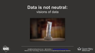
This is object is square with graphic markings to distance the object from looking like an organism. The concept is to elicit the appearance of life through movement not form.
The three objects used data from the queen, and aggregated data from the females and the males to determine their motion.
The triangular form represented the queen data from the naked mole-rat colony.
The mapping (data to movement choreography) is still in development, and is at the heart of being able to question whether we can detect the life within a stream of data from a living thing - whether we can connect to nature in this way. Whether we can somehow remove the mechanical processes (that underlie many robot forms) from the human gaze by using soft robotic techniques.
(video clip - no audio)