1. GCSE Art and Design: Graphic
Design and Communication
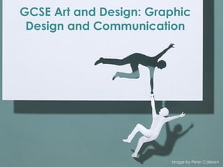
Image by Peter Callesen
2.
3.
4.
5. What will I study in GCSE Graphics?
Illustration
Typography
Advertising
Packaging
6. AO1 Develop: studying work by other artists or
designers
AO2 Refine: doing experiments to find out what
works best for your ideas
AO3 Recording: making sketchbook drawings,
notes, photographs and presentations
AO4 Present: offering a final outcome
How will my work be marked?
7.
8. What is it typography?
Arranging letterforms to produce printed
matter.
9. Helvetica was invented in 1957
by Eduard Hoffmann, Director
of Haas Type Foundry in
Münchenstein, Switzerland, with
the help of Max Miedinger. The
original typography was called
Neue Haas Grotesk and it
aimed to embody a no-frills
style. Hoffmann wanted Neue
Haas Grotesk to form a
contemporary version of an
older typeface known as
Akzidenz Grotesk. This new
design would allow the
typeface to be featured in a
variety of situations without ever
seeming inappropriate.
Eduard Hoffmann
10. Task 1
Grungvetica
Project yourself far into the future.
Linotype GmbH has been chosen to
create the seventieth anniversary
edition of Helvetica – a modern
update of the font composed of
destroyed letterforms. What would
the twenty-six characters of this new
font look like? How would you
associate your work to the legacy of
the original face?
1.Complete your Grunvetica alphabet
2.Research Eduard Hoffmann. Bring in facts and information
Home Learning: Due Wednesday 12th
June
12. 1. Choose to work in lower or
upper case.
2. Keep the same shape and
work in black and white.
3. Now change and distort the
alphabet. You can collage,
use fine liners and work on
a variety of different papers.
What to do…
13. Task 2
Artist Research
Your second task it to research one
of the following Artists who have
used text and/or numbers in their Art.
Once you have chosen your Artist
you must:
1.Write facts and opinions in rough in
your own words (use the How To
Write About Artists sheet for support)
2.Create a transcription of the Artist’s
work.
Complete transcription and writing in rough
Home Learning: Due Wednesday 19th
June
14. Michael Craig-Martin is one of the most
influential British Artists of recent decades.
He was a key figure for the YBA
generation of Artists, whom he taught in
his capacity as tutor at Goldsmiths
College of Art. In his recent series,
Alphabet, he has produced 26 screen-
prints in which the letters of the alphabet
are overlaid with everyday objects such
as a book, a glass of water or an
umbrella.
Michael Craig-Martin
15. American painter and
printmaker, forerunner of Pop
Art, who uses commonplace
emblematic images such as
flags or numbers as the
starting-point for works of great
richness and complexity
Jasper Johns
16. Rob Ryan
Rob Ryan is a British
paper cutter Artist who
specializes in paper
cutting, screen-printing,
drawing and painting.
He is most famous for his
detailed paper cut out
and he often uses text in
his artwork.
17. Task 3
Easy as ABC
Design a typeface that will be
composed from elements in the
world around you. Assemble your
twenty-six-character alphabet using
only objects. Letters must be
documented through photography.
Avoid examples of computer
typefaces and elements of existing
writing or signage. Have fun and be
creative!
Home Learning: Due 10th
July
1.Complete your alphabet (photographed and printed)
2.Research a designer who has photographed an alphabet (bring in facts
and images)
18. 5-A-Day Type, by Jimmy Smith
I was interested in how 5-a-day could
become less lecturing. I responded initially
with a font based around this, which then
grew to become a whole list of recipes
established by the NHS.
I wanted the font to become light hearted
but still maintain its authority, which is why I
chose to base the font on Times. This
stopped the font from becoming too
jokey. I also considered how I could make
each recipe seem interesting through the
layout.
http://www.behance.net/gallery/5-A-Day-Type/220919
19.
20. Display typeface
constructed from
a personal tie
collection. A large
amount of the
collection was
acquired from my
dad, the rest
bought at flea
markets, thrift
stores with a few
brand new
purchases
sprinkled
throughout. I
hope to soon
extend this project
to add alternates,
numbers and
ligatures as the
collection grows.
Tie-pography, by Ed Nacional
http://www.behance.net/gallery/Tie-pography/227637
21.
22.
23. Shoestring Alphabet, by Mark Notermann
An
alphabet
made from
shoestrings
drapped
into a
cursive
pattern,
24. Stuart Whitton is a rising Welsh freelance
illustrator and visual artist based in London
who enjoys nothing more than creating
imagery for
personal and commercial clients globally.
An advocate of the traditional he utilises
media to create meticulously hand drawn
ethereal illustrations, many of which have
been included
in a number of international publications and
exhibitions.
With a growing client list and ongoing projects
Stuart is focused on making his artwork known
to the world.
Alphabet, by Stuart Whitton
http://www.stuartwhitton.co.uk/filter/Typography/About
25. Stefan Sagmeister
Sagmeister is a New York-based
Graphic Designer and
Typographer. He has his own
Design fim – Sagmeister and
Walsh inc
26.
27.
28.
29. Task 4
Putting it all together
You should now have the
following:
1. Grungvetica and information on
Eduard Hoffmann
2. A transcription and images and writing (in
rough) about an Artist who uses text and/or
numbers.
3. A photographic alphabet and designer
research with facts and information
Your final task is to display all of
your work on an A1 board. You
should make sure all the writing is
in your own words with facts and
opinions
All A1 board complete and well presented
Home Learning: Due Thursday 18th
July