
Recommended
More Related Content
What's hot
What's hot (18)
Viewers also liked
Viewers also liked (20)
Similar to Contents drafting
Similar to Contents drafting (20)
More from mickyb96
More from mickyb96 (14)
Contents drafting
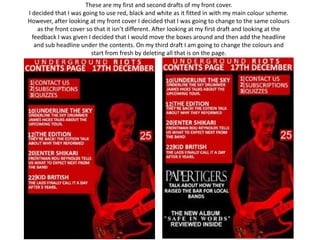
- 1. These are my first and second drafts of my front cover. I decided that I was going to use red, black and white as it fitted in with my main colour scheme. However, after looking at my front cover I decided that I was going to change to the same colours as the front cover so that it isn’t different. After looking at my first draft and looking at the feedback I was given I decided that I would move the boxes around and then add the headline and sub headline under the contents. On my third draft I am going to change the colours and start from fresh by deleting all that is on the page.
- 2. These are my third and fourth drafts of my front cover. After looking at my last drafts I decided that I would have a complete change around and start from fresh. I think that now I have changed the colours and added more boxes for content that it looks a lot better and that the final project will look a lot better than what I originally had planned. In my next drafts I will add my other content and add an image so that it doesn’t have any dead space.
- 3. These are my fifth and sixth drafts of my front cover. After looking at my last drafts I decided that I would place images in the black area, I also said that I would add more content. I have done this but think that it still needs more contents adding to the bar underneath the content and space for images. On the sixth draft I decided to try and make the bottom bar bigger. I think that this doesn’t really work and will be looking to add other content in the bar. I will also be looking to change some of the images around.
- 4. These are my seventh and eighth drafts of my front cover. After looking at my last drafts I decided that I read the bar underneath the images and content. I have done this and separated the sections. On the sixth draft I have added some text but I decided that I needed to place more text to fill out the space. I also added more images and in a layout that is close to the layout I chose on the layout design slide that I placed on the blog. I think that the way these images are laid out is probably the best way to place them so I have decided to keep them like that. In the eighth draft I added more text into the box under the images and content. I am happy with how it looks and decided to do no more drafts.
- 5. FINAL PRODUCT This is my final product. I have decided to use this as it is the most attractive on the eye. I also decided to use this as it fits in with the colour scheme as it uses the purple, black, white and yellow. The yellow and black used fits in well with the name “Underground Riots” as these colours as used when there is danger and riots are dangerous. Another reason why I chose this product is that the images link to the main headline as it has all the artists in instead of just the one. Furthermore, there is no dead space whereas the other drafts either had dead space or didn’t fit in with the colour scheme. The final reason to why I chose this product is because it has the conventions due to the cramped page with many different stories, images and the way that the page is structured.