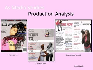
1. As Media Studies Production Analysis Front cover Contents page Double-page-spread Preeti Jandu
2.
3.
4.
5.
6.
7. Draft front cover Final front cover Banner has been added as it looks more realistic with font going over the banner. ‘ Bass’ masthead has been enlarged and stands out more. Colours have been changed to red, black, white and blue for a more consistent look. Price and barcode has been added on the right-hand side so the image is not overlapped as much. Font sizes have been changed to big, medium and small to create again a realistic look. I think my first draft was a good attempt as it looks like a magazine although it does not look professional and realistic. The final one is much better as it has matching colours, masthead stands out just like other magazines and my magazine includes a banner, barcode and price as this makes it look professional and real. I used different fonts on my draft front cover to try and make it look like a real magazine however using the blending options on Photoshop helped me achieve a stylish and unique look on my final front cover. When I was planning my magazine I researched what kind of images ‘Vibe’ magazines have on their front covers. I realised that the images are usually centred in the middle with text coming down along the sides. In addition the women artists are looking very girly e.g. hair styled with make-up on.
8. I used this photo as it is girly as my target audience is aimed at teenage girls. Most teenagers like fashion and style. In addition most ‘Vibe’ magazines include model’s with make-up on. I used this photo as the model is posing with a hat which relates to R&B/Hip-hop as magazines with these genres either hold hats or chains which they are wearing or have no crops and stand looking directly at the camera.
9.
10.
11.
12.
13. Looking back at your preliminary task, what do you feel you have learnt in the progression from it to the full product? Preliminary Task. Media production. By looking at my preliminary task and my media production I can see I have learnt a lot of new skills and techniques. I have learnt how to cut out the background from the images by using the lasso tool on Photoshop and that all magazines articles are in columns. I have also learnt how to make my magazine look more professional by using blending options on the Photoshop cs4. The colours on my preliminary task are not very appealing than on my media production, this tells me I have also learnt how to contrast colours together to make magazines look more professional and realistic. Lastly I have learnt how to relate my product to a specific target audience. I also know what forms and convention to use when attracting a certain target audience.
![[object Object],[object Object],[object Object],[object Object]](data:image/gif;base64,R0lGODlhAQABAIAAAAAAAP///yH5BAEAAAAALAAAAAABAAEAAAIBRAA7)