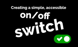
Creating a Simple, Accessible On/Off Switch
•
2 likes•2,378 views

Have you ever tried to style checkboxes or radio buttons and ended up pulling your hair out? This presentation will explore a few simple tricks that can be used to style checkboxes and radio buttons. In this case, we will make them look like an on/off switch.

Recommended
More Related Content
What's hot
What's hot (20)
Viewers also liked
Viewers also liked (20)
Similar to Creating a Simple, Accessible On/Off Switch
Similar to Creating a Simple, Accessible On/Off Switch (20)
More from Russ Weakley
More from Russ Weakley (20)
Recently uploaded
Recently uploaded (20)
Creating a Simple, Accessible On/Off Switch
- 1. Creating a simple, accessible on/off switch
- 2. Intro
- 3. This presentation is based on a simple GitHub Repo and page available here:
- 4. Checkbox and radio button switch: https://russmaxdesign.github.io/switch-checkbox/ Github: https://github.com/russmaxdesign/switch- checkbox
- 5. During this presentation, I’m going to ask you some questions - which you can answer in the chat window.
- 6. I'll be giving away three SitePoint Premium annual memberships as prizes to the best/quickest answers.
- 7. That gives you unrestricted access to over $20,000 worth of SitePoint books and courses! https://www.sitepoint.com/ premium/
- 8. I want to start with a couple of accessibility-related questions.
- 9. And yes, these are incredibly easy, “prize-winnable” questions.
- 10. Question 1: What is the easiest and most effective way of identifying common accessibility problems in your site/ app?
- 11. Answer
- 12. Unplug the mouse The easiest and most effective way to check your site is using keyboard-only.
- 13. A large number of users rely on key-strokes (TAB, ARROW, ENTER, SPACE) or the equivalent of these keystrokes in order to navigate and interact with sites/apps.
- 14. If you cannot navigate or interact with your site/app using keystrokes only, then your site is potentially inaccessible to a large number of users.
- 15. Question 2: Why is this one of the most evil CSS rules you could ever write? *:focus { outline: none; }
- 16. Answer
- 17. Because this rule make it hard, if not impossible, for keyboard-only users to see which element is in focus and therefore very hard to navigate and interact with your site/app.
- 18. Time to explore how to style a simple radio button or checkbox!
- 20. Web designers and developers have always struggled with how to customise radio buttons and checkboxes.
- 22. The main issue is that radio buttons and checkboxes are notoriously hard to style - especially across multiple browsers and devices.
- 23. In the past, some developers resorted to JavaScript-based solutions to solve this problem.
- 24. In some cases this involved using JavaScript to remove the original radio or checkbox element making the end result inaccessible for a wide range of assistive technologies.
- 25. A solution
- 26. It is possible to style these elements without having to use JavaScript. And more importantly, we can make the end result accessible.
- 27. Let’s take a simple example of an on/off switch that can be applied to either radio or checkbox elements:
- 29. The solution I’m about to demo, has five key accessibility features.
- 30. Well… many of these are not really features, they are just default behaviours that should not be overridden.
- 31. Feature 1: We will use the appropriate semantic elements - input and label elements. We will explicitly associate these elements using matching “for" and "id" values.
- 32. Feature 2: The label content can be used to describe the purpose of each switch for screen readers. This content is hidden off-screen.
- 33. Feature 3: We will make the two different states (“on” and “off”) clearly distinguishable using a tick icon for the “on” state. This will aid colour- blind users and some types of cognitive-impaired users.
- 34. (Keeping in mind that we should never use “color alone” to signal important information.)
- 36. Feature 4: Because we are using native elements, the default keyboard behaviour will still be available. (Users can select a radio button or checkbox using the SPACE bar).
- 37. Feature 5: We will make the focus and hover states clearly visible. The focus state is especially important for keyboard only users.
- 39. The markup
- 40. <div class="switch"> <input class="switch__control" type="radio" name="example01" id="example01"> <label class="switch__label" for="example01"> <span class="switch__content">Label content</span> </label> </div> input label
- 41. <div class="switch"> <input class="switch__control" type="radio" name="example01" id="example01"> <label class="switch__label" for="example01"> <span class="switch__content">Label content</span> </label> </div> radio
- 42. <div class="switch"> <input class="switch__control" type="checkbox" name="example01" id="example01"> <label class="switch__label" for="example01"> <span class="switch__content">Label content</span> </label> </div> checkbox
- 43. <div class="switch"> <input class="switch__control" type="radio" name="example01" id="example01"> <label class="switch__label" for="example01"> <span class="switch__content">Label content</span> </label> </div> id for
- 44. The class names
- 45. We will use BEM-like class names as these allow us to see the relationship between the parent element, descendant elements and modifiers.
- 46. /* parent module */ .switch { } /* parent modifiers */ .switch-‐-‐xl { } .switch-‐-‐lg { } .switch-‐-‐md { } .switch-‐-‐sm { } .switch-‐-‐xs { }
- 47. /* parent module */ .switch { } /* descendants of parent module */ .switch__control { } .switch__label { } .switch__content { }
- 48. How does it work
- 49. We can use the parent container (“switch”) to create the overall dimensions of the switch.
- 51. The radio button or checkbox control (“switch__control”) is then positioned on top of the parent. It will be given the same dimensions as the parent.
- 53. The label (“switch__label”) is placed on top of the radio button and also given the same dimensions as the parent. We are hiding the control under the label.
- 54. We will then style the background of the label to look like a switch - including adding rounded corners and our background icon.
- 56. And finally, the label content (“switch__content”) is hidden off screen so that it is available for screen readers, but does not clutter the visual appearance of the switch.
- 57. Adding states
- 58. Checkbox and radio button elements can be manually changed by users - from unchecked to checked etc.
- 59. These elements can also be given predefined boolean “checked” and “disabled” attributes.
- 60. <!-‐-‐ no additional attributes -‐-‐> <input type="checkbox"> <!-‐-‐ boolean checked attribue -‐-‐> <input type="checkbox" checked> <!-‐-‐ boolean disabled attribute -‐-‐> <input type="checkbox" disabled>
- 61. However, for this solution, most of the styling is applied to the label element, rather than the input.
- 62. Unfortunately, the label element has no checked, unchecked or disabled state of its own.
- 63. We can get around this using adjacent sibling selectors, which target any label element that is adjacent to (comes directly after) the input.
- 64. /* unchecked input */ .switch__control + label { } /* checked input */ .switch__control:checked + label { } /* disabled input */ .switch__control[disabled] + label { }
- 66. We also want to style the :focus and :hover states of the switch, which can also be done using adjacent-sibling selectors.
- 67. /* unchecked input */ .switch__control:hover + label { } .switch__control:focus + label { } /* checked input */ .switch__control:checked:hover + label { } .switch__control:checked:focus + label { }
- 68. unchecked hover unchecked focus unchecked checked checked hover checked focus disabled
- 69. SASS variables
- 70. Time for our final “prize-winnable” question (and yes, this one is also super-easy to answer)…
- 71. Question 3: Why would we want to be able to control all of the dimensions of our switch using one master SASS variable?
- 72. Answer
- 73. Because this makes it easier to maintain and to scale as needed.
- 74. We can define this one master variable by dividing our switch into scalable units.
- 75. 12x 6x 4x 1x
- 76. So, we have four different variables for the dimensions: - switch width - switch height - toggle width/height - gutter (space) around the toggle
- 77. $switch-‐width: 3em; $switch-‐height: ($switch-‐width / 2); /* 1.5em */ $toggle-‐width: ($switch-‐width / 3); /* 1em */ $toggle-‐gutter: ($switch-‐width / 12); /* .25em */
- 78. Now it becomes easy to create a range of size variations, just by resetting the font-size.
- 79. $switch-‐xl: 1.6em; $switch-‐lg: 1.4em; $switch-‐md: 1.2em; $switch-‐sm: 1em; $switch-‐xs: .8em;
- 80. We can also set some quick variables for each of the background-colors used in different states.
- 81. $color-‐toggle: #fff; $color-‐unchecked-‐static: #aaa; $color-‐unchecked-‐hover: #777; $color-‐checked-‐static: #00a000; $color-‐checked-‐hover: #006e00; $color-‐disabled: #ddd;
- 82. Transitions
- 83. I’m generally not a fan of transitions or animations unless they are being used to help “tell the story” of a UI component - help users understand what is happening.
- 84. Transitions should not draw attention to themselves. Ideally they should be simple and subtle.
- 85. For the checkbox, we could do a very simple transition to animate the switch from unchecked to checked - to help users understand what has happened.
- 86. We can do this by transitioning the “left” property as it changes from unchecked to checked.
- 88. .switch__label:after { left: $toggle-‐gutter; transition: left .04s; } .switch__control:checked + label:after { left: $switch-‐height + $toggle-‐gutter; }
- 89. We can also softly animate the background-color to avoid a jarring change.
- 90. .switch__label { background: $color-‐unchecked-‐static; transition: background .2s; } .switch__control:hover + label, .switch__control:focus + label { background: $color-‐unchecked-‐hover; }
- 91. Demos
- 92. Checkbox and radio button switch: https://russmaxdesign.github.io/switch-checkbox/ Github: https://github.com/russmaxdesign/switch- checkbox
- 93. A simple, accessible language switcher module: https://russmaxdesign.github.io/language- switcher/ Github: https://github.com/russmaxdesign/language- switcher
- 94. Upvote - downvote module: https://russmaxdesign.github.io/upvote-downvote/ Github: https://github.com/russmaxdesign/upvote- downvote
- 95. Russ Weakley Max Design Site: maxdesign.com.au Twitter: twitter.com/russmaxdesign Slideshare: slideshare.net/maxdesign Linkedin: linkedin.com/in/russweakley