Gomito brand proposition and Guidelines
•
0 likes•777 views

This brand and its manual and were built to the discipline of Design Practice 2 at Anglia Ruskin University, taught by Will Hill, with the goal of generating an understanding of what is a Visual Identity, which composes and how to build it and other elements that it involves. Project developed by Marina Alves Teixeira.

Recommended
More Related Content
Similar to Gomito brand proposition and Guidelines
Similar to Gomito brand proposition and Guidelines (20)
Recently uploaded
Recently uploaded (20)
Gomito brand proposition and Guidelines
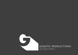
- 1. G O M I T O P R O D U C T I O N S G U I D E L I N E S
- 2. This brand and its manual and were built to the discipline of Design Practice 2 at Anglia Ruskin University, taught by Will Hill, with the goal of generating an understanding of what is a Visual Identity, which composes and how to build it and other elements that it involves. Project developed by Marina Alves Teixeira.
- 3. C O N T E N T introduction basic concepts gomito productions the logo versions chromatic scheme exclusion area typography application 4 5 6 7 8 9 10 12 13
- 4. 4 I N T R O D U C T I O N The visual identity system is the vehicle for visual transmission of values for an Instituion. An integrated and well-structured graphic identity has the potential to strengthen and consolidate the presence of an service or product in the market. It is, therefore, one of its main assets and should be used in a uniform and consistent manner. This manual comes in order to standardize and manage the use of the visual identity of the brand Gomito by presenting the technical specifications and demonstration of proper applications. It is essential that the standards presented here are followed so that your goal of contributing to the consolidation of the project image is achieved.
- 5. 5 B A S I C C O N C E P T S Visual Identity A unified and coherent visual system of elements and graphic applications that follows normative standards and represents an Institution, service or product. This set basically consists in a graphic sign and its possibilities of reproduction in visual media. Logotype Nominal representation of the brand, based in a existing typeface or a lettering. Simbol Graphic sign that synthesizes the brand concepts in a way that facilitates its assimilation and recognition. Brand Simbolic representation of a product, service or Institution, that embraces its name, conduct and provided experiences as well as all the concepts and look that make it distinctive.
- 6. 6 G O M I T O P R O D U C T I O N S Gomito, formed in 2001 in Cambridge, is a collaboration of artists making new visual theatre.The company is an ever-changing family of performers, designers, directors, musicians and writers who want to share stories in a certain way; with creativity, entertainment, humour, emotion, liveness and homespun roughness; with theatricality at its simplest. Gomito makes theatre for everyone who enjoys a good story told with all of the above. Gomito Mission Gomito brings together creative artists to tell new stories with visual theatre. Gomito creates theatrical worlds where audiences can escape the everyday and delight in emotions, playfulness and imagination. Gomito Vision By testing the possibilities of theatre for a universal audience Gomito will carve out a unique place in the British arts scene.The Gomito name will be understood as a mark of high quality, creative, surprising, popular theatre for all
- 7. 7 T H E L O G O Theatre experience and its elements The logo was inspired by the theatre experience given by the performances, approaching on of theatre important elements: the light. Stage lighting has multiple functions, including: selective visibility; revelation of form; focus, directing the audience’s attention to an area of the stage or distracting them from another; setting the atmosphere of a scene and composition. Brand elements It was chosen simplicity and geometrical features to the brand in order to contrast to the fantastical, magical and unique world created by the Theatre Company.The flat “G” is placed in three-dimensional environment and illuminated on its left up part, creating a shadow that reveals the letters forms, that mixes with the background.This created silhouette is frame with the aim of metaphoric exemplifies that scenes are decoupages of the show as hole. The colour palette was selected based on RGB (light colour, additive system): White as the presence of all colour spectrum. Black as the absence of light. Both, together create contrast and drama.
- 8. 8 V E R S I O N S H o r i z o n t a l v e r s i o n s S i m b o l The logo vertical version consists in the main version. It best represents the concepts of the project and therefore is the most recommended. However, for situations where you can not use it should be aware of the rules that direct its application in other versions. The logo, in all its versions and signatures, must be applied in the context of highest contrast. Horizontal version This version must be used when the composition demands a horizontal orientation. Simbol This version is applied in case of space restriction or there is the necessity of emphasize the symbol (using it as a signature). This manual does not cover all circumstances for the application of the logo. Each situation must be analysed so that the appropriate version is applied. Ve r t i c a l v e r s i o n s
- 9. 9 C H R O M AT I C S C H E M E Colours play an important role in the proper functioning of a visual identity system.The unit of the original colour code must be maintained in case that, for example, changes are caused by different printing processes. Chromatic scheme of branding is based in percentage variations of pure black in C M Y K code ranging from 0% (white) to 100% (black). Follow the colour codes of the original colours in CMYK standards used for printed materials; RGB used for digital viewing, and hexadecimal code used for placement on the web. RGB 245 245 245 CMYK 0 0 0 5 #F5F5F5 RGB 255 255 255 CMYK 0 0 0 0 #FFFFFF RGB 60 60 59 CMYK 0 0 0 90 #3C3C3B RGB 60 60 59 CMYK 0 0 0 90 #3C3C3B RGB 255 255 255 CMYK 0 0 0 0 #FFFFFF
- 10. 10 E X C L U S I O N Z O N E The exclusion zone aims to ensure readability, recognition and brand integrity, protecting it from interference from external elements.This is a minimal margin between the brand and other visual elements positioned nearby.
- 11. 11 E X C L U S I O N Z O N E
- 12. 12 T Y P O G R A P H Y In order to preserve the recognition and exclusivity of the logotype, a Typographic family was chosen to be used within different purposes. Futura Std and its family This typeface is used for writing texts in virtual platforms ,such as virtual banners or website, or short printed texts used in posters, for examples. Title is the only situation where the typeface used in the logo (Futura Sd Medium) is applied, always in uppercase. Adobe Caslon Pro and its family This typeface is used for writing texts long texts in material platforms such as stationery or invatations. Futura Std Light////abcdefghijkl mnopqrstuvwxyz ABCDEFGHI JKLMNOPQRSTUVWXYZ 1 234567890 £&@?!/+(.,:;) Book////abcdefghijkl mnopqrstuvwxyz ABCDEFGHI JKLMNOPQRSTUVWXYZ 1 234567890 £&@?!/+(.,:;) Medium////abcdefghijkl mnopqrstuvwxyz ABCDEFGHI JKLMNOPQRSTUVWXYZ 1 234567890 £&@?!/+(.,:;) Adobe Caslon Pro regular///abcdefghijkl mnopqrstuvwxyz ABCDEFGHI JKLMNOPQRSTUVWXYZ 1 234567890 £&@?!/+(.,:;) italic///abcdefghijkl mnopqrstuvwxyz ABCDEFGHI JKLMNOPQRSTUVWXYZ 1 234567890 £&@?!/+(.,:;) semibold///abcdefghijkl mnopqrstuvwxyz ABCDEFGHI JKLMNOPQRSTUVWXYZ 1 234567890 £&@?!/+(.,:;) semibold italic///abcdefghijkl mnopqrstuvwxyz ABCDEFGHI JKLMNOPQRSTUVWXYZ 1 234567890 £&@?!/+(.,:;) bold///abcdefghijkl mnopqrstuvwxyz ABCDEFGHI JKLMNOPQRSTUVWXYZ 1 234567890 £&@?!/+(.,:;)
- 13. 13 A P P L I C AT I O N S Applications of visual identity to make clear its use. Elements derived from the logo may be used in the visual composition as shown in the following examples. v e r t i c a l p o s t e r
- 16. s t a t i o n e r y : l e t t e r h e a d a n d e n v e l o p e c/o Greenwich Theatre, Crooms Hill, Londo n, United Kingdo m ww w.gomitoproductions.co.uk ADRESS APARTMENT NUMBER STREET CITY POSTCODE COUNTRY NAME MIDDLE SURNAME
- 17. 17 f a c e b o o k c o v e r