SlideShare ist ein Scribd-Unternehmen logo
1 von 8
Downloaden Sie, um offline zu lesen
Dot Plots


A dot plot graphically records variable data in such a way that it forms a picture of the
combined effect of the random variation inherent in a process and the influence of any special
causes acting on it. To understand the power of dot plots as a basic tool, it first helps to
visualize how variation occurs.

Sometimes, statisticians explain random variation by using a device called a quincunx.

                                                                 A quincunx is a box with a
                                                                 series of pins arranged in
                                                                 such a way that a ball
                                                                 dropped in the top will
                                                                 bounce randomly down the
                                                                 pins until it comes to rest in
                                                                 one of the channels at the
                                                                 bottom.

                                                                 By varying the entry point of
                                                                 the balls, it is possible to
                                                                 show how adding special
                                                                 causes to random variation
                                                                 would affect the distribution
                                                                 of produced values.

                                                                 A funnel is used to ensure
                                                                 that the balls start at the
                                                                 same place. The pins then
                                                                 act    like    the    essential
                                                                 variation inherent in any
                                                                 process. After enough balls
                                                                 have been dropped through
                                                                 the     funnel,    the    filled
                                                                 channels begin to resemble
                                                                 a standard distribution curve
                                                                 or a histogram of a uniform
                                                                 distribution.
If, for example, the position of the
funnel were moved systematically
around a central point (+1, +2, +3, +3,
+1, 0, -1, -2, -3, -2, -1, 0, etc.), the
distribution of the balls in the channels
would widen and flatten.


                                            If the position of the funnel were
                                            alternated from side to side (+5, -5,
                                            +5, -5, etc.), the balls would
                                            eventually show a bi-modal or two-
                                            humped distribution. This is what a
                                            mixed     lot   of   characteristics
                                            produced by two different suppliers,
                                            machines or workers might look
                                            like.
If the position of the funnel is
                                       moved steadily in one direction,
                                       then restarted and moved again
                                       in the same direction (0, +1, +2,
                                       +3, +4, 0, +1, +2, +3, +4, etc.),
                                       the distribution of the balls would
                                       form a plateau, a flat mountain
                                       with sloping sides. This may
                                       mimic what happens when a tool
                                       wears uniformly and then is
                                       replaced again and again.


If the position of the funnel is
moved every now and then to a
distant, off-center position, then
returned to center (0, 0, 0, 0, 0, -
7, 0, 0, 0, -7, 0, 0, 0, 0, 0, 0, 0,
etc.), a group of outlying,
disconnected balls would form.
This could be like random,
special-causes of variation, such
as voltage spikes, that change
process parameters.
Dot plots are the converse of quincunx experiments. To create a dot plot, each data point is
recorded and placed as a dot on a graph. As additional data points with the same value as the
first one occur, they are stacked like the balls in the quincunx channels. After many values
have been recorded as dots, the resulting pattern can tell you something about the variation in
your process.

What can it do for you?
      A dot plot can give you an instant picture of the shape of variation in your process.
       Often this can provide an immediate insight into the search strategies you could use to
       find the cause of that variation.

      Dot plots can be used throughout the phases of Lean Six Sigma methodology. You will
       find dot plots particularly useful in the measure phase.

How do you do it?
1. Decide which Critical-To-Quality characteristic (CTQ) you wish to examine. This CTQ must
   be measurable on a linear scale. That is, the incremental value between units of
   measurement must be the same. For example, time, temperature, dimension and spatial
   relationship are usually able to be measured in consistent incremental units.

2. Measure the characteristic and record the results. If the characteristic is continually being
   produced, such as voltage in a line or temperature in an oven, or if there are too many
   items being produced to measure all of them, you will have to sample. Take care to ensure
   that your sampling is random.

3. Count the number of individual data points.

4. Determine the highest data value and the lowest data value. Subtract the lower number
   from the higher. This is the range. Use this range to help determine a convenient scale. For
   example, if the range of your data points was 6.7, you may want to use an interval of 8 or
   10 for your scale.

5. Determine how many subdivisions or columns of dots your scale should have. To make an
   initial determination, you can use this table:
                           Data points            Subdivisions
                             under 50                5 to 7
                            50 to 100                6 to 10
                            100 to 250              7 to 112
                         over 250 10 to 20          10 to 20
6. Divide the range by the number of subdivisions. You may round or simplify this number to
   make it easier to work with, but to get the best picture of the distribution of data points, the
   total number of subdivisions should be close to those shown above. You may want to
   increase the number of measurements, if that is possible, to provide a convenient scale. In
   determining the number of subdivisions, also consider how you are measuring data.
   Increase or decrease the number of subdivisions until there is essentially the same number
   of measurement possibilities in each one.
7. Divide the scale you have
   chosen by the appropriate
   number of subdivisions. Draw
   a horizontal line (x axis) and
   label it with the scale and the
   subdivisions.

8. Make a dot above the scale
   subdivision for each data
   point that falls in that
   subdivision. For subsequent
   data points in a subdivision,
   place a dot on top of the
   previous one. Make all the
   dots the same size and keep
   the columns of dots vertical.

9. If there are specification limits
   for the characteristic you are
   studying, indicate them as
   vertical lines.

10. Title and label your dot plot.

Now what?
The shape that your dot plot takes tells a lot about your process. In a symmetric or bell-shaped
dot plot, the frequency is high in the middle of the range and falls off fairly evenly to the right
and left.

                                                                    This shape occurs most
                                                                    often. If your dot plot takes
                                                                    other shapes, you should
                                                                    look at your process for
          Example of a multi-modal dot plot                         otherwise unseen causes of
                                                                    variation.

                                                                    In a comb or multimodal type
                                                                    of    dot    plot,   adjacent
                                                                    subdivisions alternate higher
                                                                    and lower in frequency. This
                                                                    usually indicates a data
                                                                    collection    problem.   The
                                                                    problem may lie in how a
                                                                    characteristic was measured
                                                                    or how values were rounded
                                                                    to fit into your dot plot. It
                                                                    could also indicate a need to
                                                                    use different subdivision
                                                                    boundaries.
If the distribution of frequencies is
shifted noticeably to either side of
the center of the range, the
distribution is said to be skewed.         Example of a skewed dot plot
When a distribution is positively
skewed, the frequency decreases
abruptly to the left but gently to the
right. This shape normally occurs
when the lower limit, the one on the
left, is controlled either by
specification or because values
lower than a certain value do not
occur for some other reason.


                                                     If the skewness of the distribution
          Example of an asymmetric dot plot          is even more extreme, a clearly
                                                     asymmetrical, precipice-type dot
                                                     plot is the result.


                                         Example of an asymmetric dot plot
This shape frequently occurs
when a 100% screening is being
done for one specification limit.
If the subdivisions in the center of
                                                  the distribution have more or less
                                                  the same frequency, the resulting
           Example of a plateau dot plot          dot plot looks like a plateau. This
                                                  shape occurs when there is a
                                                  mixture of two distributions with
                                                  different mean values blended
                                                  together. Look for ways to stratify
                                                  the data to separate the two
                                                  distributions. You can then produce
                                                  two separate dot plots to more
                                                  accurately depict what is going on
                                                  in the process.


If two distributions with widely
different means are combined in
                                        Example of a twin peak dot plot
one data set, the plateau splits to
become twin peaks. Here, the
two      separate       distributions
become much more evident than
with     the    plateau.       Again,
examining the data to identify the
two different distributions will help
you understand how variation is
entering the process.


                                                If there is a small, essentially
        Example of a isolated peak dot plot     disconnected peak along with a
                                                normal, symmetrical peak, this is
                                                called an isolated peak. It occurs
                                                when there is a small amount of data
                                                from a different distribution included in
                                                the data set. This could also represent
                                                a short-term process abnormality, a
                                                measurement error or a data
                                                collection problem.
Some final tips
     A dot plot is an easy way to make a picture of the statistical variation in your process.

     Dot plots can quickly give you a comparative feel of sets of data, but they do have
      limitations. Because of the rounding of measured data to fit into created subdivisions,
      the resulting shape of the dot plot may be somewhat arbitrary. A slight adjustment in
      defining the subdivisions may produce a slightly different picture.

     If specification limits are involved in your process, the dot plot can be an especially
      valuable indicator for corrective action.

     A dot plot can show you not only if your process is in control, but also if it is relatively
      centered on your target value and if the variation in your process is within the specified
      tolerances.

     Not only can dot plots help you see which processes need improvement, by comparing
      initial dot plots with subsequent ones, they can also help you track that improvement.


                   Steven Bonacorsi is the President of the International Standard for Lean Six
                   Sigma (ISLSS) and Certified Lean Six Sigma Master Black Belt instructor and
                   coach. Steven Bonacorsi has trained hundreds of Master Black Belts, Black
                   Belts, Green Belts, and Project Sponsors and Executive Leaders in Lean Six
                   Sigma DMAIC and Design for Lean Six Sigma process improvement
                   methodologies.
                                                 Author for the Process Excellence Network (PEX
                                                 Network / IQPC). FREE Lean Six Sigma and BPM
                                                 content

                    International Standard for Lean Six Sigma
                    Steven Bonacorsi, President and Lean Six Sigma Master Black Belt
                    47 Seasons Lane, Londonderry, NH 03053, USA
                    Phone: + (1) 603-401-7047
                    Steven Bonacorsi e-mail
                    Steven Bonacorsi LinkedIn
                    Steven Bonacorsi Twitter
                    Lean Six Sigma Group

Weitere ähnliche Inhalte

Mehr von Kevin Egan

Pc Shipping Improvement Six Sigma Case Study
Pc Shipping Improvement Six Sigma Case StudyPc Shipping Improvement Six Sigma Case Study
Pc Shipping Improvement Six Sigma Case StudyKevin Egan
 
Serrver Imaging Six Sigma Case Study
Serrver Imaging Six Sigma Case StudySerrver Imaging Six Sigma Case Study
Serrver Imaging Six Sigma Case StudyKevin Egan
 
Sms Integration Six Sigma Case Study
Sms Integration Six Sigma Case StudySms Integration Six Sigma Case Study
Sms Integration Six Sigma Case StudyKevin Egan
 
Ticket Accuracy Six Sigma Case Study
Ticket Accuracy   Six Sigma Case StudyTicket Accuracy   Six Sigma Case Study
Ticket Accuracy Six Sigma Case StudyKevin Egan
 
Qaa paul nelson
Qaa   paul nelsonQaa   paul nelson
Qaa paul nelsonKevin Egan
 
Pharma iq mediakit1
Pharma iq mediakit1Pharma iq mediakit1
Pharma iq mediakit1Kevin Egan
 
Jack Welch Speak - PEXN
Jack Welch Speak - PEXNJack Welch Speak - PEXN
Jack Welch Speak - PEXNKevin Egan
 
ISLSS Offerings
ISLSS OfferingsISLSS Offerings
ISLSS OfferingsKevin Egan
 

Mehr von Kevin Egan (8)

Pc Shipping Improvement Six Sigma Case Study
Pc Shipping Improvement Six Sigma Case StudyPc Shipping Improvement Six Sigma Case Study
Pc Shipping Improvement Six Sigma Case Study
 
Serrver Imaging Six Sigma Case Study
Serrver Imaging Six Sigma Case StudySerrver Imaging Six Sigma Case Study
Serrver Imaging Six Sigma Case Study
 
Sms Integration Six Sigma Case Study
Sms Integration Six Sigma Case StudySms Integration Six Sigma Case Study
Sms Integration Six Sigma Case Study
 
Ticket Accuracy Six Sigma Case Study
Ticket Accuracy   Six Sigma Case StudyTicket Accuracy   Six Sigma Case Study
Ticket Accuracy Six Sigma Case Study
 
Qaa paul nelson
Qaa   paul nelsonQaa   paul nelson
Qaa paul nelson
 
Pharma iq mediakit1
Pharma iq mediakit1Pharma iq mediakit1
Pharma iq mediakit1
 
Jack Welch Speak - PEXN
Jack Welch Speak - PEXNJack Welch Speak - PEXN
Jack Welch Speak - PEXN
 
ISLSS Offerings
ISLSS OfferingsISLSS Offerings
ISLSS Offerings
 

Kürzlich hochgeladen

Top 10 Hubspot Development Companies in 2024
Top 10 Hubspot Development Companies in 2024Top 10 Hubspot Development Companies in 2024
Top 10 Hubspot Development Companies in 2024TopCSSGallery
 
Tampa BSides - The No BS SOC (slides from April 6, 2024 talk)
Tampa BSides - The No BS SOC (slides from April 6, 2024 talk)Tampa BSides - The No BS SOC (slides from April 6, 2024 talk)
Tampa BSides - The No BS SOC (slides from April 6, 2024 talk)Mark Simos
 
Long journey of Ruby standard library at RubyConf AU 2024
Long journey of Ruby standard library at RubyConf AU 2024Long journey of Ruby standard library at RubyConf AU 2024
Long journey of Ruby standard library at RubyConf AU 2024Hiroshi SHIBATA
 
React Native vs Ionic - The Best Mobile App Framework
React Native vs Ionic - The Best Mobile App FrameworkReact Native vs Ionic - The Best Mobile App Framework
React Native vs Ionic - The Best Mobile App FrameworkPixlogix Infotech
 
Assure Ecommerce and Retail Operations Uptime with ThousandEyes
Assure Ecommerce and Retail Operations Uptime with ThousandEyesAssure Ecommerce and Retail Operations Uptime with ThousandEyes
Assure Ecommerce and Retail Operations Uptime with ThousandEyesThousandEyes
 
Microsoft 365 Copilot: How to boost your productivity with AI – Part two: Dat...
Microsoft 365 Copilot: How to boost your productivity with AI – Part two: Dat...Microsoft 365 Copilot: How to boost your productivity with AI – Part two: Dat...
Microsoft 365 Copilot: How to boost your productivity with AI – Part two: Dat...Nikki Chapple
 
Email Marketing Automation for Bonterra Impact Management (fka Social Solutio...
Email Marketing Automation for Bonterra Impact Management (fka Social Solutio...Email Marketing Automation for Bonterra Impact Management (fka Social Solutio...
Email Marketing Automation for Bonterra Impact Management (fka Social Solutio...Jeffrey Haguewood
 
Digital Tools & AI in Career Development
Digital Tools & AI in Career DevelopmentDigital Tools & AI in Career Development
Digital Tools & AI in Career DevelopmentMahmoud Rabie
 
Microservices, Docker deploy and Microservices source code in C#
Microservices, Docker deploy and Microservices source code in C#Microservices, Docker deploy and Microservices source code in C#
Microservices, Docker deploy and Microservices source code in C#Karmanjay Verma
 
Glenn Lazarus- Why Your Observability Strategy Needs Security Observability
Glenn Lazarus- Why Your Observability Strategy Needs Security ObservabilityGlenn Lazarus- Why Your Observability Strategy Needs Security Observability
Glenn Lazarus- Why Your Observability Strategy Needs Security Observabilityitnewsafrica
 
Decarbonising Buildings: Making a net-zero built environment a reality
Decarbonising Buildings: Making a net-zero built environment a realityDecarbonising Buildings: Making a net-zero built environment a reality
Decarbonising Buildings: Making a net-zero built environment a realityIES VE
 
Infrared simulation and processing on Nvidia platforms
Infrared simulation and processing on Nvidia platformsInfrared simulation and processing on Nvidia platforms
Infrared simulation and processing on Nvidia platformsYoss Cohen
 
MuleSoft Online Meetup Group - B2B Crash Course: Release SparkNotes
MuleSoft Online Meetup Group - B2B Crash Course: Release SparkNotesMuleSoft Online Meetup Group - B2B Crash Course: Release SparkNotes
MuleSoft Online Meetup Group - B2B Crash Course: Release SparkNotesManik S Magar
 
Kuma Meshes Part I - The basics - A tutorial
Kuma Meshes Part I - The basics - A tutorialKuma Meshes Part I - The basics - A tutorial
Kuma Meshes Part I - The basics - A tutorialJoão Esperancinha
 
Design pattern talk by Kaya Weers - 2024 (v2)
Design pattern talk by Kaya Weers - 2024 (v2)Design pattern talk by Kaya Weers - 2024 (v2)
Design pattern talk by Kaya Weers - 2024 (v2)Kaya Weers
 
Bridging Between CAD & GIS: 6 Ways to Automate Your Data Integration
Bridging Between CAD & GIS:  6 Ways to Automate Your Data IntegrationBridging Between CAD & GIS:  6 Ways to Automate Your Data Integration
Bridging Between CAD & GIS: 6 Ways to Automate Your Data Integrationmarketing932765
 
Testing tools and AI - ideas what to try with some tool examples
Testing tools and AI - ideas what to try with some tool examplesTesting tools and AI - ideas what to try with some tool examples
Testing tools and AI - ideas what to try with some tool examplesKari Kakkonen
 
2024 April Patch Tuesday
2024 April Patch Tuesday2024 April Patch Tuesday
2024 April Patch TuesdayIvanti
 
How to Effectively Monitor SD-WAN and SASE Environments with ThousandEyes
How to Effectively Monitor SD-WAN and SASE Environments with ThousandEyesHow to Effectively Monitor SD-WAN and SASE Environments with ThousandEyes
How to Effectively Monitor SD-WAN and SASE Environments with ThousandEyesThousandEyes
 
Accelerating Enterprise Software Engineering with Platformless
Accelerating Enterprise Software Engineering with PlatformlessAccelerating Enterprise Software Engineering with Platformless
Accelerating Enterprise Software Engineering with PlatformlessWSO2
 

Kürzlich hochgeladen (20)

Top 10 Hubspot Development Companies in 2024
Top 10 Hubspot Development Companies in 2024Top 10 Hubspot Development Companies in 2024
Top 10 Hubspot Development Companies in 2024
 
Tampa BSides - The No BS SOC (slides from April 6, 2024 talk)
Tampa BSides - The No BS SOC (slides from April 6, 2024 talk)Tampa BSides - The No BS SOC (slides from April 6, 2024 talk)
Tampa BSides - The No BS SOC (slides from April 6, 2024 talk)
 
Long journey of Ruby standard library at RubyConf AU 2024
Long journey of Ruby standard library at RubyConf AU 2024Long journey of Ruby standard library at RubyConf AU 2024
Long journey of Ruby standard library at RubyConf AU 2024
 
React Native vs Ionic - The Best Mobile App Framework
React Native vs Ionic - The Best Mobile App FrameworkReact Native vs Ionic - The Best Mobile App Framework
React Native vs Ionic - The Best Mobile App Framework
 
Assure Ecommerce and Retail Operations Uptime with ThousandEyes
Assure Ecommerce and Retail Operations Uptime with ThousandEyesAssure Ecommerce and Retail Operations Uptime with ThousandEyes
Assure Ecommerce and Retail Operations Uptime with ThousandEyes
 
Microsoft 365 Copilot: How to boost your productivity with AI – Part two: Dat...
Microsoft 365 Copilot: How to boost your productivity with AI – Part two: Dat...Microsoft 365 Copilot: How to boost your productivity with AI – Part two: Dat...
Microsoft 365 Copilot: How to boost your productivity with AI – Part two: Dat...
 
Email Marketing Automation for Bonterra Impact Management (fka Social Solutio...
Email Marketing Automation for Bonterra Impact Management (fka Social Solutio...Email Marketing Automation for Bonterra Impact Management (fka Social Solutio...
Email Marketing Automation for Bonterra Impact Management (fka Social Solutio...
 
Digital Tools & AI in Career Development
Digital Tools & AI in Career DevelopmentDigital Tools & AI in Career Development
Digital Tools & AI in Career Development
 
Microservices, Docker deploy and Microservices source code in C#
Microservices, Docker deploy and Microservices source code in C#Microservices, Docker deploy and Microservices source code in C#
Microservices, Docker deploy and Microservices source code in C#
 
Glenn Lazarus- Why Your Observability Strategy Needs Security Observability
Glenn Lazarus- Why Your Observability Strategy Needs Security ObservabilityGlenn Lazarus- Why Your Observability Strategy Needs Security Observability
Glenn Lazarus- Why Your Observability Strategy Needs Security Observability
 
Decarbonising Buildings: Making a net-zero built environment a reality
Decarbonising Buildings: Making a net-zero built environment a realityDecarbonising Buildings: Making a net-zero built environment a reality
Decarbonising Buildings: Making a net-zero built environment a reality
 
Infrared simulation and processing on Nvidia platforms
Infrared simulation and processing on Nvidia platformsInfrared simulation and processing on Nvidia platforms
Infrared simulation and processing on Nvidia platforms
 
MuleSoft Online Meetup Group - B2B Crash Course: Release SparkNotes
MuleSoft Online Meetup Group - B2B Crash Course: Release SparkNotesMuleSoft Online Meetup Group - B2B Crash Course: Release SparkNotes
MuleSoft Online Meetup Group - B2B Crash Course: Release SparkNotes
 
Kuma Meshes Part I - The basics - A tutorial
Kuma Meshes Part I - The basics - A tutorialKuma Meshes Part I - The basics - A tutorial
Kuma Meshes Part I - The basics - A tutorial
 
Design pattern talk by Kaya Weers - 2024 (v2)
Design pattern talk by Kaya Weers - 2024 (v2)Design pattern talk by Kaya Weers - 2024 (v2)
Design pattern talk by Kaya Weers - 2024 (v2)
 
Bridging Between CAD & GIS: 6 Ways to Automate Your Data Integration
Bridging Between CAD & GIS:  6 Ways to Automate Your Data IntegrationBridging Between CAD & GIS:  6 Ways to Automate Your Data Integration
Bridging Between CAD & GIS: 6 Ways to Automate Your Data Integration
 
Testing tools and AI - ideas what to try with some tool examples
Testing tools and AI - ideas what to try with some tool examplesTesting tools and AI - ideas what to try with some tool examples
Testing tools and AI - ideas what to try with some tool examples
 
2024 April Patch Tuesday
2024 April Patch Tuesday2024 April Patch Tuesday
2024 April Patch Tuesday
 
How to Effectively Monitor SD-WAN and SASE Environments with ThousandEyes
How to Effectively Monitor SD-WAN and SASE Environments with ThousandEyesHow to Effectively Monitor SD-WAN and SASE Environments with ThousandEyes
How to Effectively Monitor SD-WAN and SASE Environments with ThousandEyes
 
Accelerating Enterprise Software Engineering with Platformless
Accelerating Enterprise Software Engineering with PlatformlessAccelerating Enterprise Software Engineering with Platformless
Accelerating Enterprise Software Engineering with Platformless
 

Dot plots

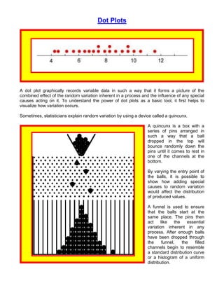
  • 1. Dot Plots A dot plot graphically records variable data in such a way that it forms a picture of the combined effect of the random variation inherent in a process and the influence of any special causes acting on it. To understand the power of dot plots as a basic tool, it first helps to visualize how variation occurs. Sometimes, statisticians explain random variation by using a device called a quincunx. A quincunx is a box with a series of pins arranged in such a way that a ball dropped in the top will bounce randomly down the pins until it comes to rest in one of the channels at the bottom. By varying the entry point of the balls, it is possible to show how adding special causes to random variation would affect the distribution of produced values. A funnel is used to ensure that the balls start at the same place. The pins then act like the essential variation inherent in any process. After enough balls have been dropped through the funnel, the filled channels begin to resemble a standard distribution curve or a histogram of a uniform distribution.
  • 2. If, for example, the position of the funnel were moved systematically around a central point (+1, +2, +3, +3, +1, 0, -1, -2, -3, -2, -1, 0, etc.), the distribution of the balls in the channels would widen and flatten. If the position of the funnel were alternated from side to side (+5, -5, +5, -5, etc.), the balls would eventually show a bi-modal or two- humped distribution. This is what a mixed lot of characteristics produced by two different suppliers, machines or workers might look like.
  • 3. If the position of the funnel is moved steadily in one direction, then restarted and moved again in the same direction (0, +1, +2, +3, +4, 0, +1, +2, +3, +4, etc.), the distribution of the balls would form a plateau, a flat mountain with sloping sides. This may mimic what happens when a tool wears uniformly and then is replaced again and again. If the position of the funnel is moved every now and then to a distant, off-center position, then returned to center (0, 0, 0, 0, 0, - 7, 0, 0, 0, -7, 0, 0, 0, 0, 0, 0, 0, etc.), a group of outlying, disconnected balls would form. This could be like random, special-causes of variation, such as voltage spikes, that change process parameters.
  • 4. Dot plots are the converse of quincunx experiments. To create a dot plot, each data point is recorded and placed as a dot on a graph. As additional data points with the same value as the first one occur, they are stacked like the balls in the quincunx channels. After many values have been recorded as dots, the resulting pattern can tell you something about the variation in your process. What can it do for you?  A dot plot can give you an instant picture of the shape of variation in your process. Often this can provide an immediate insight into the search strategies you could use to find the cause of that variation.  Dot plots can be used throughout the phases of Lean Six Sigma methodology. You will find dot plots particularly useful in the measure phase. How do you do it? 1. Decide which Critical-To-Quality characteristic (CTQ) you wish to examine. This CTQ must be measurable on a linear scale. That is, the incremental value between units of measurement must be the same. For example, time, temperature, dimension and spatial relationship are usually able to be measured in consistent incremental units. 2. Measure the characteristic and record the results. If the characteristic is continually being produced, such as voltage in a line or temperature in an oven, or if there are too many items being produced to measure all of them, you will have to sample. Take care to ensure that your sampling is random. 3. Count the number of individual data points. 4. Determine the highest data value and the lowest data value. Subtract the lower number from the higher. This is the range. Use this range to help determine a convenient scale. For example, if the range of your data points was 6.7, you may want to use an interval of 8 or 10 for your scale. 5. Determine how many subdivisions or columns of dots your scale should have. To make an initial determination, you can use this table: Data points Subdivisions under 50 5 to 7 50 to 100 6 to 10 100 to 250 7 to 112 over 250 10 to 20 10 to 20 6. Divide the range by the number of subdivisions. You may round or simplify this number to make it easier to work with, but to get the best picture of the distribution of data points, the total number of subdivisions should be close to those shown above. You may want to increase the number of measurements, if that is possible, to provide a convenient scale. In determining the number of subdivisions, also consider how you are measuring data. Increase or decrease the number of subdivisions until there is essentially the same number of measurement possibilities in each one.
  • 5. 7. Divide the scale you have chosen by the appropriate number of subdivisions. Draw a horizontal line (x axis) and label it with the scale and the subdivisions. 8. Make a dot above the scale subdivision for each data point that falls in that subdivision. For subsequent data points in a subdivision, place a dot on top of the previous one. Make all the dots the same size and keep the columns of dots vertical. 9. If there are specification limits for the characteristic you are studying, indicate them as vertical lines. 10. Title and label your dot plot. Now what? The shape that your dot plot takes tells a lot about your process. In a symmetric or bell-shaped dot plot, the frequency is high in the middle of the range and falls off fairly evenly to the right and left. This shape occurs most often. If your dot plot takes other shapes, you should look at your process for Example of a multi-modal dot plot otherwise unseen causes of variation. In a comb or multimodal type of dot plot, adjacent subdivisions alternate higher and lower in frequency. This usually indicates a data collection problem. The problem may lie in how a characteristic was measured or how values were rounded to fit into your dot plot. It could also indicate a need to use different subdivision boundaries.
  • 6. If the distribution of frequencies is shifted noticeably to either side of the center of the range, the distribution is said to be skewed. Example of a skewed dot plot When a distribution is positively skewed, the frequency decreases abruptly to the left but gently to the right. This shape normally occurs when the lower limit, the one on the left, is controlled either by specification or because values lower than a certain value do not occur for some other reason. If the skewness of the distribution Example of an asymmetric dot plot is even more extreme, a clearly asymmetrical, precipice-type dot plot is the result. Example of an asymmetric dot plot This shape frequently occurs when a 100% screening is being done for one specification limit.
  • 7. If the subdivisions in the center of the distribution have more or less the same frequency, the resulting Example of a plateau dot plot dot plot looks like a plateau. This shape occurs when there is a mixture of two distributions with different mean values blended together. Look for ways to stratify the data to separate the two distributions. You can then produce two separate dot plots to more accurately depict what is going on in the process. If two distributions with widely different means are combined in Example of a twin peak dot plot one data set, the plateau splits to become twin peaks. Here, the two separate distributions become much more evident than with the plateau. Again, examining the data to identify the two different distributions will help you understand how variation is entering the process. If there is a small, essentially Example of a isolated peak dot plot disconnected peak along with a normal, symmetrical peak, this is called an isolated peak. It occurs when there is a small amount of data from a different distribution included in the data set. This could also represent a short-term process abnormality, a measurement error or a data collection problem.
  • 8. Some final tips  A dot plot is an easy way to make a picture of the statistical variation in your process.  Dot plots can quickly give you a comparative feel of sets of data, but they do have limitations. Because of the rounding of measured data to fit into created subdivisions, the resulting shape of the dot plot may be somewhat arbitrary. A slight adjustment in defining the subdivisions may produce a slightly different picture.  If specification limits are involved in your process, the dot plot can be an especially valuable indicator for corrective action.  A dot plot can show you not only if your process is in control, but also if it is relatively centered on your target value and if the variation in your process is within the specified tolerances.  Not only can dot plots help you see which processes need improvement, by comparing initial dot plots with subsequent ones, they can also help you track that improvement. Steven Bonacorsi is the President of the International Standard for Lean Six Sigma (ISLSS) and Certified Lean Six Sigma Master Black Belt instructor and coach. Steven Bonacorsi has trained hundreds of Master Black Belts, Black Belts, Green Belts, and Project Sponsors and Executive Leaders in Lean Six Sigma DMAIC and Design for Lean Six Sigma process improvement methodologies. Author for the Process Excellence Network (PEX Network / IQPC). FREE Lean Six Sigma and BPM content International Standard for Lean Six Sigma Steven Bonacorsi, President and Lean Six Sigma Master Black Belt 47 Seasons Lane, Londonderry, NH 03053, USA Phone: + (1) 603-401-7047 Steven Bonacorsi e-mail Steven Bonacorsi LinkedIn Steven Bonacorsi Twitter Lean Six Sigma Group