SlideShare a Scribd company logo
1 of 29
Julie Fritz MAT Candidate September, 2009
My name is Julie Fritz.  I grew up leading a bit of a sheltered life in the small town of Carterville Illinois, and though my parents had exposed my sister and I to a variety of theatre, historical sights and travel experiences, I had never done anything truly independent of my family.  I even lived at home through my college years.  Upon graduating Southern Illinois University in 1997, I moved to Nashville TN to take a position as an Elementary Art teacher.  This amazed my family because up until that point, I had not lived away from my family, and moving to Nashville meant that I would live alone, and not have family close.  It proved to be a wonderful experience.  I met a great group of art teachers who are my very best friends and I still teach in the same school, 13 years later.  In 2005, I was challenged by the priest at my Church to go with a group to Canterbury England on Pilgrimage.  My gut reaction was NO!  First of all pilgrimage brought to mind camping in the field with only one’s backpack, and I am not “outdoorsy”.  Also, having never been overseas, I had images in my head of rustic facilities, and unrecognizable food.  But, he kept talking, and my mom thought it was important enough that she helped to finance it.  I imagined her foot on my backside pushing me onto the plane.  My artwork attempts to explore the ideas behind pilgrimage.  The people with which I travel, the sights and sounds, the feelings, and the idea of pilgrimage being a journey.
 
Pilgrims on the Way  was my first attempt at capturing the togetherness and adventure of my experiences overseas.  I wanted to show the intensity of the sky, but more importantly my goal was to hint at how large the world is compared to us.  When I went to England, I couldn’t shake the feeling that I was so small compared to the large buildings that had been built not by machinery but by people moving stones.  And they had been standing longer that my country had been in existence.  My priest and I go back and forth over the two figures over the hill.  My intent was to show that one never walks alone on pilgrimage.  Someone always lends an arm, a hand, or helps to carry something.  But he says it must be me, and my 70 year old cohort, heading over the hill to find either ice cream or something to climb on.  My priest actually loved this work, and ended up buying it.  It hangs in his office.  To me, while it is bright, and the start of an idea, it’s too easy.  I felt the need to push the idea further.  Explore imagery more.  So, my exploration continued from here.  I do however consider this to be an important work, because it served as a catalyst.  It got me thinking about how I could reflect pilgrimage in my work.
For  Welcome , I began by playing with the idea of layers.  The background is a simple line painting representing the Crypt in Canterbury Cathedral.  I then photo transferred some of the pilgrimage sights of the Cathedral over it.  I was still learning the best possible photo transfer method at this point, and this one is o.k.  I chose to use a purple wash for 2 reasons.  It would contrast nicely with the yellow,  giving a joyful intensity to the work, but also because purple is the color that represents the Bishop.  The idea behind this work was to have a layered, or scrapbook type look, but in a higher art way, so I felt that words or script lent importance.  And, the crosses along the top and bottom were for a variety of reasons.  The repetition of them brings unity to the work in my opinion, the negative space between them is an interesting use of space, and as a symbol, it is the Canterbury Cross.  I carved it into an eraser, and stamped it.  It is not my most effective piece, but I learned a lot in doing this one.  I focused the intent of my art, and I honed my photo-transferring skills.
 
One of my favorite places in all of England is a little white church called All Saints, which is in Tudeley; outside of Canterbury.  It is the only church to have a full set of Chagall windows.  When you visit in the afternoon, and the sun is shining, the colors reflect on the walls like a rainbow.  You cannot sit inside that church and not be inspired.  So, the background of  Pilgrims Together  reflects the idea of the stained glass.  I particularly like the corners.  In this piece, I did not transfer the photos, rather I used tissue paper over the top in attempt to alter them and make them more a part of the piece.  I was trying to reflect the idea of togetherness, so the photos I chose were groupings.  The people at the bottom were sculpted from tissue paper and gel medium, and built up on the canvas.  Again, there were things I loved about this piece and things I would change.  Given a chance, I would work the photos into the canvas more, making them perhaps part of the stained class images, rather than squares and rectangles.  But overall, the warmth of the colors, and the whimsy of the corners, and the pink center make this a piece that I enjoy.
 
In this version of Welcome, I  was focusing on the idea of Canterbury Cathedral being the home church.  There are 2 statues that stick out in my memory.  One is the Welcome Jesus at the West Gates into the Cathedral common area.  I refer to it as the scary Jesus, because though his arms are open in the welcome pose, he is green, and his face is rather intimidating to me.  The other is a carved wood Jesus that is found as one enters the main area of the Cathedral.  I think it is the warmth of the wood, but it is much more safe and welcoming in my opinion.  I love the textures in this piece.  The green is meant to bring attention to the Welcoming Jesus in the Center of the large photo transfer.  Even though the color choices seem odd, I was attempting to use colors that were rich and eye catching.
In this close up, you can see the photo transfers better.  Here was where I began to use the method of a blender pen to transfer photos.  This left a very clear transfer, and also allowed me to use colored pencils and chalks to alter the transfer.  The limitation is that you can are limited in the size of photo that transfers well.  The other nice thing about this close up view is that you may see the writing along the gates…. It is “welcome” in many languages.
Dryburgh Abbey reflects a pilgrimage to the border Abbeys of Scotland.  And, this is my favorite of the Abbeys, Dryburgh.  I painted the background as a full color image of the arch, with the steps.  I then layered sunset colored tissue over the top.  I liked the effects of tissue over the painting.  I made “mini-transfers onto much smaller canvases, painting frames around them, and acrylic washes for color over the top.  Those are the pictures in the corners.  In the center is a montage of photos for which I used a blender pen to photo transfer.  The layering of canvas on top of canvas worked well in my opinion, as did the intensity of color.
This is a close up of the mini-canvas to which I transferred a photo.  After the transfer, I used color washes over the top, and acrylic paint to make the frame. One thing that I found out is that when I transfer photos using gel medium, it works much better on smaller canvases.  So, I transferred a few to mini-canvases, and attempted to incorporate a variety of canvases into one larger piece.
 
I pulled my inspiration for  Normandy  from my pilgrimage to Normandy.  In my opinion, it is one of my most successful pieces.  I think I achieved the effect of having the feel of a scrapbook, in a higher art way.  The texture of the blue and brown background was very pleasing to me, and I liked the whimsy of the picture frames.  I didn’t want it to look perfectly edged.  I wanted some distortion of the blue… is it water or sky?  And, the fact that a couple of the photos blend into the blue is pleasing to me.  The crosses have interesting meaning to me.  The ones in the top left side are from the American Cemetery in Normandy.  The ones in the bottom right are from the La Cambe German Cemetery in Normandy.  It moved me as a pilgrim, to hear the story of how even though there was so much hurt and anger over what the Germans had done in WWII, they still had families who needed to grieve, and so these German Cemeteries were created.  As an artist, to look at the rows of crosses at the American Cemetery and Contrast it with the groupings of crosses, at the German Cemetery was visually interesting.  As a side note, there are a few German Cemeteries.  The one we visited had the crosses grouped in 5’s.  And, there was a list at each grouping of who was buried there.  In the center of the cemetery was  a large mass grave, with a monument on top.
The Color of Love is pulled from the idea of the Chagall Windows.  The curator said that Chagall was known to have said that red is the color of joy, and blue is the color of love.  This stuck with me.  There is not a lot of deep meaning in this work.  It is more that I wanted to explore some layering, photo application, and painting techniques.  It ended up being a nice piece.  I painted the background, then layered tissue over the paint.  The center trio of pictures are photo transfers of my pictures from the Chagall windows, with paint washes over them.
 
Forever With the Lord  begins my exploration with pilgrimage symbols, and integrating them into my artwork.  I have begun to realize that transferring the photos isn’t as important as having them be an integral part of my work.  So in some instances I transfer, and in others I wash, or collage over them.  This was another piece where I painted the background, and built on top.  The photos are from Canterbury, and mix between the architecture and the people.  I LOVED taking the image of the Canterbury cross and abstracting it slightly.  I kept the shape,  but changed the design.  I think it lends a bit of whimsy, and gives a focal point; maybe too much of a focal point.  I could never shake the feeling that this work was needing something… more.  That being said, the intensity of the color and the simplified symbol of the Canterbury Cross makes this piece successful.
One of the symbols I wanted to use was the Compass from the floor of Canterbury Cathedral.  So, it seemed only fitting that the images around it would be images from Canterbury.  I painted the compass, and transferred the photos onto smaller canvases, painting over the top.  That way, some depth was achieved.  The words say “The Truth Will Set You Free” because that is written on the floor around the compass.  I think I probably could have used the space in a more interesting way, but I love the colors and images that are working together here.
This piece marks the place where I began to incorporate other objects into my work.  Since I was using the seashells as a symbol, I began to experiment with ways I might incorporate the shell into my work.  I felt that the texture of the grey and blue was particularly nice, as was were the purple shells layered into the collage.  The actual shells frame the bottom nicely, and add some balance to the work, since the bulk of the content is on the top.  Rather than write sentences or quotes, as I had in previous works, I used words that could evoke meaning, hoping that those words themselves were a symbol to be interpreted as the viewer looked at the work.
 
Feeling a need to play with depth, and pushing myself on the idea of imagery, I decided to attempt a box sculpture.  It would allow me to segment my space, which I seemed to be doing on my canvases, and I could move into more 3-D imagery.  This piece focuses on my pilgrimage to the Border Abbeys of Scotland.  I used the symbol of the seashell which is a pilgrimage symbol.  While we were standing at St. Ninian’s Cave, my priest told me that tradition holds that in days of old, the youngest person on a pilgrimage would pick up a seashell, and would promise to return at a later date, to represent the group.  There are a mixture of photo transfers and altered photos.  One major idea that I had was to use the photos as the back ground, and build the images of the symbols on top of them.  I was very pleased with this piece.  I loved the seashells.  Wire was introduced in the sculpting of the sheep, and I loved the whimsy of that.
[object Object]
[object Object]
One  of my professors upon seeing my box sculpture (Scotland- previous slides), made a comment that the boxes were an interesting connection to luggage, which was a nice analogy to travel.  This got me thinking.  What if I could make a box sculpture that on the outside, looked ordinary, and the surprise would be the sculpture on the inside.  I found a plastic purple make up kit, and was intrigued by the shape of the box.  It resembled an old fashioned carrying case.  And, on the inside were compartments that expanded upon opening.  I felt it was a good shape to start with, and since I found it at the local GoodWilll store, if I completely messed it up, it wasn’t a huge investment, so I was freed by the idea of no limitations.
[object Object]
[object Object]
I used a wire sculpture to add a praying man, since my focus is Pilgrimage and aside from the Pizza Hut, we were mainly visiting places with religious meaning.  The box allowed me to mix 3-D and 2-D elements.  I loved the idea of this so much, that I am continuing in the direction of box sculpture.
We Are A Pilgrim People
My artwork is going in the direction of box sculpture.  I feel it is a worthwhile medium to explore, and fits with the direction I seem to be going in my work.  Pilgrimage is still an important topic for me, and one that I do not feel ready to leave yet.  But, rather than explore places, I’d like to explore the people of pilgrimage.  I have been so lucky to develop deep and meaningful friendships with a group of “Pilgrims”, each of whom having distinct personalities that have become a source of comfort and humor to me.  I’d like to create a series of boxes that show the distinct personalities of some of my favorite pilgrims, similar to the Canterbury Tales, only in sculpture form, rather than written form.  The boxes would stand on their own as individual pieces, but join together as well.  I plan to achieve that unity by using the same sized boxes, and similar colors on the exteriors.  I do not plan to make literal dioramas however.  There will not be little people acting out scenes.  Rather, each box will be like a memory box.

More Related Content

What's hot

Dana Nehdaran_Esther's Children Catalogue, Dubai 2013
Dana Nehdaran_Esther's Children Catalogue, Dubai 2013Dana Nehdaran_Esther's Children Catalogue, Dubai 2013
Dana Nehdaran_Esther's Children Catalogue, Dubai 2013Dana Nehdaran
 
Diana Al Hadid - past work
Diana Al Hadid - past workDiana Al Hadid - past work
Diana Al Hadid - past workkozakartclass
 
Final art project
Final art projectFinal art project
Final art projectmcchudy25
 
ANTHEA MISSY PORTFOLIO 2015 PART 1/2 - STREET ART GRAFFITI MURALS
ANTHEA MISSY PORTFOLIO 2015 PART 1/2 - STREET ART GRAFFITI MURALSANTHEA MISSY PORTFOLIO 2015 PART 1/2 - STREET ART GRAFFITI MURALS
ANTHEA MISSY PORTFOLIO 2015 PART 1/2 - STREET ART GRAFFITI MURALSAnthea Missy
 
ANTHEA MISSY PORTFOLIO 2014 - STREET ART GRAFFITI MURALS
ANTHEA MISSY PORTFOLIO 2014 - STREET ART GRAFFITI MURALSANTHEA MISSY PORTFOLIO 2014 - STREET ART GRAFFITI MURALS
ANTHEA MISSY PORTFOLIO 2014 - STREET ART GRAFFITI MURALSAnthea Missy
 
Bruce Black's Beautiful Abstract Art
Bruce Black's Beautiful Abstract ArtBruce Black's Beautiful Abstract Art
Bruce Black's Beautiful Abstract ArtBruce Black Art
 
Event presentation[5378]
Event presentation[5378]Event presentation[5378]
Event presentation[5378]kaleeoglesby
 
2021 Tateos - Score 3
2021 Tateos - Score 32021 Tateos - Score 3
2021 Tateos - Score 3Brenda Robson
 
Catalog for Temporal Shifts
Catalog for Temporal ShiftsCatalog for Temporal Shifts
Catalog for Temporal Shiftsannier
 
Painting the portrait from start to finish
Painting the portrait from start to finishPainting the portrait from start to finish
Painting the portrait from start to finishCarolyn Hancock
 

What's hot (16)

Dana Nehdaran_Esther's Children Catalogue, Dubai 2013
Dana Nehdaran_Esther's Children Catalogue, Dubai 2013Dana Nehdaran_Esther's Children Catalogue, Dubai 2013
Dana Nehdaran_Esther's Children Catalogue, Dubai 2013
 
Diana Al Hadid - past work
Diana Al Hadid - past workDiana Al Hadid - past work
Diana Al Hadid - past work
 
Final art project
Final art projectFinal art project
Final art project
 
ANTHEA MISSY PORTFOLIO 2015 PART 1/2 - STREET ART GRAFFITI MURALS
ANTHEA MISSY PORTFOLIO 2015 PART 1/2 - STREET ART GRAFFITI MURALSANTHEA MISSY PORTFOLIO 2015 PART 1/2 - STREET ART GRAFFITI MURALS
ANTHEA MISSY PORTFOLIO 2015 PART 1/2 - STREET ART GRAFFITI MURALS
 
ANTHEA MISSY PORTFOLIO 2014 - STREET ART GRAFFITI MURALS
ANTHEA MISSY PORTFOLIO 2014 - STREET ART GRAFFITI MURALSANTHEA MISSY PORTFOLIO 2014 - STREET ART GRAFFITI MURALS
ANTHEA MISSY PORTFOLIO 2014 - STREET ART GRAFFITI MURALS
 
Bruce Black's Beautiful Abstract Art
Bruce Black's Beautiful Abstract ArtBruce Black's Beautiful Abstract Art
Bruce Black's Beautiful Abstract Art
 
Edmund present
Edmund presentEdmund present
Edmund present
 
Practice DP65
Practice DP65Practice DP65
Practice DP65
 
Event presentation[5378]
Event presentation[5378]Event presentation[5378]
Event presentation[5378]
 
Drawing
DrawingDrawing
Drawing
 
2021 Tateos - Score 3
2021 Tateos - Score 32021 Tateos - Score 3
2021 Tateos - Score 3
 
Sayre woa ch05_lecture-243768
Sayre woa ch05_lecture-243768Sayre woa ch05_lecture-243768
Sayre woa ch05_lecture-243768
 
Lyrical analysis
Lyrical analysisLyrical analysis
Lyrical analysis
 
Watercolours whitewriting
Watercolours whitewritingWatercolours whitewriting
Watercolours whitewriting
 
Catalog for Temporal Shifts
Catalog for Temporal ShiftsCatalog for Temporal Shifts
Catalog for Temporal Shifts
 
Painting the portrait from start to finish
Painting the portrait from start to finishPainting the portrait from start to finish
Painting the portrait from start to finish
 

Viewers also liked

2012 olympic action
2012 olympic action2012 olympic action
2012 olympic actionjulesobart
 
H R At A Crossroads
H R At A  CrossroadsH R At A  Crossroads
H R At A Crossroadsguest3e74e6
 
Comunidades Virtuales Tpfinal[1]
Comunidades Virtuales Tpfinal[1]Comunidades Virtuales Tpfinal[1]
Comunidades Virtuales Tpfinal[1]natymed
 
Brickstone Education Limited
Brickstone Education LimitedBrickstone Education Limited
Brickstone Education Limitedbrickstoneedu
 
ReliefWeb | DevSeed Meeting | 03 Sep 2010
ReliefWeb | DevSeed Meeting | 03 Sep 2010ReliefWeb | DevSeed Meeting | 03 Sep 2010
ReliefWeb | DevSeed Meeting | 03 Sep 2010ReliefWeb
 

Viewers also liked (6)

2012 olympic action
2012 olympic action2012 olympic action
2012 olympic action
 
H R At A Crossroads
H R At A  CrossroadsH R At A  Crossroads
H R At A Crossroads
 
Comunidades Virtuales Tpfinal[1]
Comunidades Virtuales Tpfinal[1]Comunidades Virtuales Tpfinal[1]
Comunidades Virtuales Tpfinal[1]
 
Brickstone Education Limited
Brickstone Education LimitedBrickstone Education Limited
Brickstone Education Limited
 
Angela Schultz
Angela SchultzAngela Schultz
Angela Schultz
 
ReliefWeb | DevSeed Meeting | 03 Sep 2010
ReliefWeb | DevSeed Meeting | 03 Sep 2010ReliefWeb | DevSeed Meeting | 03 Sep 2010
ReliefWeb | DevSeed Meeting | 03 Sep 2010
 

Similar to MAT Art507 (20)

Summer Assignment and Self Review
Summer Assignment and Self ReviewSummer Assignment and Self Review
Summer Assignment and Self Review
 
Kilve evaluation update
Kilve   evaluation update Kilve   evaluation update
Kilve evaluation update
 
Kilve evaluation slide presentation
Kilve   evaluation slide presentationKilve   evaluation slide presentation
Kilve evaluation slide presentation
 
Nature man made powerpoint print
Nature man made powerpoint printNature man made powerpoint print
Nature man made powerpoint print
 
Photo Essay (ICA)
Photo Essay (ICA)Photo Essay (ICA)
Photo Essay (ICA)
 
Moore Vs Hlobo
Moore Vs HloboMoore Vs Hlobo
Moore Vs Hlobo
 
Asian Art And Art Analysis
Asian Art And Art AnalysisAsian Art And Art Analysis
Asian Art And Art Analysis
 
Art Analysis
Art AnalysisArt Analysis
Art Analysis
 
Humanities 1302 Event Presentation
Humanities 1302 Event PresentationHumanities 1302 Event Presentation
Humanities 1302 Event Presentation
 
Landscape Portraits Exhibition
Landscape Portraits ExhibitionLandscape Portraits Exhibition
Landscape Portraits Exhibition
 
Blog midterm
Blog midtermBlog midterm
Blog midterm
 
Particle-Wave Photographs by Leslie Parke
Particle-Wave Photographs by Leslie ParkeParticle-Wave Photographs by Leslie Parke
Particle-Wave Photographs by Leslie Parke
 
The Painting Essay
The Painting EssayThe Painting Essay
The Painting Essay
 
Images 2012 2013 slideshow(2)
Images 2012 2013 slideshow(2)Images 2012 2013 slideshow(2)
Images 2012 2013 slideshow(2)
 
Jimwarrenpeisaje 100413175326-phpapp02
Jimwarrenpeisaje 100413175326-phpapp02Jimwarrenpeisaje 100413175326-phpapp02
Jimwarrenpeisaje 100413175326-phpapp02
 
Aesthetic Ed. Culminating Project
Aesthetic Ed. Culminating ProjectAesthetic Ed. Culminating Project
Aesthetic Ed. Culminating Project
 
Km final-web
Km final-webKm final-web
Km final-web
 
'Place in Question' Art powerpoint
'Place in Question' Art powerpoint'Place in Question' Art powerpoint
'Place in Question' Art powerpoint
 
COMMON DRAWING
COMMON DRAWINGCOMMON DRAWING
COMMON DRAWING
 
Art Critique Essay
Art Critique EssayArt Critique Essay
Art Critique Essay
 

MAT Art507

  • 1. Julie Fritz MAT Candidate September, 2009
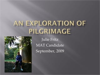
  • 2. My name is Julie Fritz. I grew up leading a bit of a sheltered life in the small town of Carterville Illinois, and though my parents had exposed my sister and I to a variety of theatre, historical sights and travel experiences, I had never done anything truly independent of my family. I even lived at home through my college years. Upon graduating Southern Illinois University in 1997, I moved to Nashville TN to take a position as an Elementary Art teacher. This amazed my family because up until that point, I had not lived away from my family, and moving to Nashville meant that I would live alone, and not have family close. It proved to be a wonderful experience. I met a great group of art teachers who are my very best friends and I still teach in the same school, 13 years later. In 2005, I was challenged by the priest at my Church to go with a group to Canterbury England on Pilgrimage. My gut reaction was NO! First of all pilgrimage brought to mind camping in the field with only one’s backpack, and I am not “outdoorsy”. Also, having never been overseas, I had images in my head of rustic facilities, and unrecognizable food. But, he kept talking, and my mom thought it was important enough that she helped to finance it. I imagined her foot on my backside pushing me onto the plane. My artwork attempts to explore the ideas behind pilgrimage. The people with which I travel, the sights and sounds, the feelings, and the idea of pilgrimage being a journey.
  • 3.  
  • 4. Pilgrims on the Way was my first attempt at capturing the togetherness and adventure of my experiences overseas. I wanted to show the intensity of the sky, but more importantly my goal was to hint at how large the world is compared to us. When I went to England, I couldn’t shake the feeling that I was so small compared to the large buildings that had been built not by machinery but by people moving stones. And they had been standing longer that my country had been in existence. My priest and I go back and forth over the two figures over the hill. My intent was to show that one never walks alone on pilgrimage. Someone always lends an arm, a hand, or helps to carry something. But he says it must be me, and my 70 year old cohort, heading over the hill to find either ice cream or something to climb on. My priest actually loved this work, and ended up buying it. It hangs in his office. To me, while it is bright, and the start of an idea, it’s too easy. I felt the need to push the idea further. Explore imagery more. So, my exploration continued from here. I do however consider this to be an important work, because it served as a catalyst. It got me thinking about how I could reflect pilgrimage in my work.
  • 5. For Welcome , I began by playing with the idea of layers. The background is a simple line painting representing the Crypt in Canterbury Cathedral. I then photo transferred some of the pilgrimage sights of the Cathedral over it. I was still learning the best possible photo transfer method at this point, and this one is o.k. I chose to use a purple wash for 2 reasons. It would contrast nicely with the yellow, giving a joyful intensity to the work, but also because purple is the color that represents the Bishop. The idea behind this work was to have a layered, or scrapbook type look, but in a higher art way, so I felt that words or script lent importance. And, the crosses along the top and bottom were for a variety of reasons. The repetition of them brings unity to the work in my opinion, the negative space between them is an interesting use of space, and as a symbol, it is the Canterbury Cross. I carved it into an eraser, and stamped it. It is not my most effective piece, but I learned a lot in doing this one. I focused the intent of my art, and I honed my photo-transferring skills.
  • 6.  
  • 7. One of my favorite places in all of England is a little white church called All Saints, which is in Tudeley; outside of Canterbury. It is the only church to have a full set of Chagall windows. When you visit in the afternoon, and the sun is shining, the colors reflect on the walls like a rainbow. You cannot sit inside that church and not be inspired. So, the background of Pilgrims Together reflects the idea of the stained glass. I particularly like the corners. In this piece, I did not transfer the photos, rather I used tissue paper over the top in attempt to alter them and make them more a part of the piece. I was trying to reflect the idea of togetherness, so the photos I chose were groupings. The people at the bottom were sculpted from tissue paper and gel medium, and built up on the canvas. Again, there were things I loved about this piece and things I would change. Given a chance, I would work the photos into the canvas more, making them perhaps part of the stained class images, rather than squares and rectangles. But overall, the warmth of the colors, and the whimsy of the corners, and the pink center make this a piece that I enjoy.
  • 8.  
  • 9. In this version of Welcome, I was focusing on the idea of Canterbury Cathedral being the home church. There are 2 statues that stick out in my memory. One is the Welcome Jesus at the West Gates into the Cathedral common area. I refer to it as the scary Jesus, because though his arms are open in the welcome pose, he is green, and his face is rather intimidating to me. The other is a carved wood Jesus that is found as one enters the main area of the Cathedral. I think it is the warmth of the wood, but it is much more safe and welcoming in my opinion. I love the textures in this piece. The green is meant to bring attention to the Welcoming Jesus in the Center of the large photo transfer. Even though the color choices seem odd, I was attempting to use colors that were rich and eye catching.
  • 10. In this close up, you can see the photo transfers better. Here was where I began to use the method of a blender pen to transfer photos. This left a very clear transfer, and also allowed me to use colored pencils and chalks to alter the transfer. The limitation is that you can are limited in the size of photo that transfers well. The other nice thing about this close up view is that you may see the writing along the gates…. It is “welcome” in many languages.
  • 11. Dryburgh Abbey reflects a pilgrimage to the border Abbeys of Scotland. And, this is my favorite of the Abbeys, Dryburgh. I painted the background as a full color image of the arch, with the steps. I then layered sunset colored tissue over the top. I liked the effects of tissue over the painting. I made “mini-transfers onto much smaller canvases, painting frames around them, and acrylic washes for color over the top. Those are the pictures in the corners. In the center is a montage of photos for which I used a blender pen to photo transfer. The layering of canvas on top of canvas worked well in my opinion, as did the intensity of color.
  • 12. This is a close up of the mini-canvas to which I transferred a photo. After the transfer, I used color washes over the top, and acrylic paint to make the frame. One thing that I found out is that when I transfer photos using gel medium, it works much better on smaller canvases. So, I transferred a few to mini-canvases, and attempted to incorporate a variety of canvases into one larger piece.
  • 13.  
  • 14. I pulled my inspiration for Normandy from my pilgrimage to Normandy. In my opinion, it is one of my most successful pieces. I think I achieved the effect of having the feel of a scrapbook, in a higher art way. The texture of the blue and brown background was very pleasing to me, and I liked the whimsy of the picture frames. I didn’t want it to look perfectly edged. I wanted some distortion of the blue… is it water or sky? And, the fact that a couple of the photos blend into the blue is pleasing to me. The crosses have interesting meaning to me. The ones in the top left side are from the American Cemetery in Normandy. The ones in the bottom right are from the La Cambe German Cemetery in Normandy. It moved me as a pilgrim, to hear the story of how even though there was so much hurt and anger over what the Germans had done in WWII, they still had families who needed to grieve, and so these German Cemeteries were created. As an artist, to look at the rows of crosses at the American Cemetery and Contrast it with the groupings of crosses, at the German Cemetery was visually interesting. As a side note, there are a few German Cemeteries. The one we visited had the crosses grouped in 5’s. And, there was a list at each grouping of who was buried there. In the center of the cemetery was a large mass grave, with a monument on top.
  • 15. The Color of Love is pulled from the idea of the Chagall Windows. The curator said that Chagall was known to have said that red is the color of joy, and blue is the color of love. This stuck with me. There is not a lot of deep meaning in this work. It is more that I wanted to explore some layering, photo application, and painting techniques. It ended up being a nice piece. I painted the background, then layered tissue over the paint. The center trio of pictures are photo transfers of my pictures from the Chagall windows, with paint washes over them.
  • 16.  
  • 17. Forever With the Lord begins my exploration with pilgrimage symbols, and integrating them into my artwork. I have begun to realize that transferring the photos isn’t as important as having them be an integral part of my work. So in some instances I transfer, and in others I wash, or collage over them. This was another piece where I painted the background, and built on top. The photos are from Canterbury, and mix between the architecture and the people. I LOVED taking the image of the Canterbury cross and abstracting it slightly. I kept the shape, but changed the design. I think it lends a bit of whimsy, and gives a focal point; maybe too much of a focal point. I could never shake the feeling that this work was needing something… more. That being said, the intensity of the color and the simplified symbol of the Canterbury Cross makes this piece successful.
  • 18. One of the symbols I wanted to use was the Compass from the floor of Canterbury Cathedral. So, it seemed only fitting that the images around it would be images from Canterbury. I painted the compass, and transferred the photos onto smaller canvases, painting over the top. That way, some depth was achieved. The words say “The Truth Will Set You Free” because that is written on the floor around the compass. I think I probably could have used the space in a more interesting way, but I love the colors and images that are working together here.
  • 19. This piece marks the place where I began to incorporate other objects into my work. Since I was using the seashells as a symbol, I began to experiment with ways I might incorporate the shell into my work. I felt that the texture of the grey and blue was particularly nice, as was were the purple shells layered into the collage. The actual shells frame the bottom nicely, and add some balance to the work, since the bulk of the content is on the top. Rather than write sentences or quotes, as I had in previous works, I used words that could evoke meaning, hoping that those words themselves were a symbol to be interpreted as the viewer looked at the work.
  • 20.  
  • 21. Feeling a need to play with depth, and pushing myself on the idea of imagery, I decided to attempt a box sculpture. It would allow me to segment my space, which I seemed to be doing on my canvases, and I could move into more 3-D imagery. This piece focuses on my pilgrimage to the Border Abbeys of Scotland. I used the symbol of the seashell which is a pilgrimage symbol. While we were standing at St. Ninian’s Cave, my priest told me that tradition holds that in days of old, the youngest person on a pilgrimage would pick up a seashell, and would promise to return at a later date, to represent the group. There are a mixture of photo transfers and altered photos. One major idea that I had was to use the photos as the back ground, and build the images of the symbols on top of them. I was very pleased with this piece. I loved the seashells. Wire was introduced in the sculpting of the sheep, and I loved the whimsy of that.
  • 22.
  • 23.
  • 24. One of my professors upon seeing my box sculpture (Scotland- previous slides), made a comment that the boxes were an interesting connection to luggage, which was a nice analogy to travel. This got me thinking. What if I could make a box sculpture that on the outside, looked ordinary, and the surprise would be the sculpture on the inside. I found a plastic purple make up kit, and was intrigued by the shape of the box. It resembled an old fashioned carrying case. And, on the inside were compartments that expanded upon opening. I felt it was a good shape to start with, and since I found it at the local GoodWilll store, if I completely messed it up, it wasn’t a huge investment, so I was freed by the idea of no limitations.
  • 25.
  • 26.
  • 27. I used a wire sculpture to add a praying man, since my focus is Pilgrimage and aside from the Pizza Hut, we were mainly visiting places with religious meaning. The box allowed me to mix 3-D and 2-D elements. I loved the idea of this so much, that I am continuing in the direction of box sculpture.
  • 28. We Are A Pilgrim People
  • 29. My artwork is going in the direction of box sculpture. I feel it is a worthwhile medium to explore, and fits with the direction I seem to be going in my work. Pilgrimage is still an important topic for me, and one that I do not feel ready to leave yet. But, rather than explore places, I’d like to explore the people of pilgrimage. I have been so lucky to develop deep and meaningful friendships with a group of “Pilgrims”, each of whom having distinct personalities that have become a source of comfort and humor to me. I’d like to create a series of boxes that show the distinct personalities of some of my favorite pilgrims, similar to the Canterbury Tales, only in sculpture form, rather than written form. The boxes would stand on their own as individual pieces, but join together as well. I plan to achieve that unity by using the same sized boxes, and similar colors on the exteriors. I do not plan to make literal dioramas however. There will not be little people acting out scenes. Rather, each box will be like a memory box.

Editor's Notes

  1. I pulled my inspiration for this piece from my pilgrimage to Normandy. In my opinion, it is one of my most successful pieces. I think I achieved the effect of having the feel of a scrapbook, in a higher art way. The texture of the blue and brown background was very pleasing to me, and I liked the whimsy of the picture frames. I didn’t want it to look perfectly edged. I wanted some distortion of the blue… is it water or sky? And, the fact that a couple of the photos blend into the blue is pleasing to me. The crosses have interesting meaning to me. The ones in the top left side are from the American Cemetery in Normandy. The ones in the bottom right are from the La Cambe German Cemetery in Normandy. It moved me as a pilgrim, to hear the story of how even though there was so much hurt and anger over what the Germans had done in WWII, they still had families who needed to grieve, and so these German Cemeteries were created. As an artist, to look at the rows of crosses at the American Cemetery and Contrast it with the groupings of crosses, at the German Cemetery was visually interesting. As a side note, there are a few German Cemeteries. The one we visited had the crosses grouped in 5’s. And, there was a list at each grouping of who was buried there. In the center of the cemetery was a large mass grave, with a monument on top.
  2. The Color of Love is pulled from the idea of the Chagall Windows. The curator said that Chagall was known to have said that red is the color of joy, and blue is the color of love. This stuck with me. There is not a lot of deep meaning in this work. It is more that I wanted to explore some layering, photo application, and painting techniques. It ended up being a nice piece. I painted the background, then layered tissue over the paint. The center trio of pictures are photo transfers of my pictures from the Chagall windows, with paint washes over them.
  3. I like the mixture of images and colors. I felt it was important to echo some blue throughout the piece, since one of the canvases had a very intense painted shell, that I didn’t want to overtake the piece. The use of tissue paper to make the assorted papers have cohesion proved important as well.
  4. My artwork is going in the direction of box sculpture. I feel it is a worthwhile medium to explore, and fits with the direction I seem to be going in my work. Pilgrimage is still an important topic for me, and one that I do not feel ready to leave yet. But, rather than explore places, I’d like to explore the people of pilgrimage. I have been so lucky to develop deep and meaningful friendships with a group of “Pilgrims”, each of whom having distinct personalities that have become a source of comfort and humor to me. I’d like to create a series of boxes that show the distinct personalities of some of my favorite pilgrims, similar to the Canterbury Tales, only in sculpture form, rather than written form. The boxes would stand on their own as individual pieces, but join together as well. I plan to achieve that unity by using the same sized boxes, and similar colors on the exteriors. I do not plan to make literal dioramas however. There will not be little people acting out scenes. Rather, each box will be like a memory box.