SlideShare ist ein Scribd-Unternehmen logo
1 von 100
Downloaden Sie, um offline zu lesen
P R E M I E R G I M P U S E R S M A G A Z I N E . I S S U E # 4 . S E P T E M B E R 2 0 1 3
REFLECTIONS
PHOTOGRAPHY
WANT TO CONTRIBUTE? VISIT OUR WEBSITE HTTP://GIMPMAGAZINE.ORG
Master Class by
Christopher Mark Perez
THE HUNT FOR
WILBER
BASIC GIMP
TUTORIALS
CCHHRRIISSTTOOPPHHEERR
MMAARRKK PPEERREEZZ
PPHHOOTTOOGGRRAAPPHHEERR
ISSN: 1929-6894
DIGITAL VERSION
NEW DESKTOP PUBLISHING COURSE NOW
AVAILABLE AS A DIGITAL DOWNLOAD. LEARN
DESKTOP PUBLISHING USING FREE AND OPEN
SOURCE SCRIBUS FROM THE MANAGING EDITOR OF
GIMP MAGAZINE, STEVE CZAJKA.
COMPLETE YOUR DIGITAL ARTS EXPERIENCE BY
LEARNING GIMP AND INKSCAPE. VIEW STEVE'S
PORTFOLIO AT: HTTP://FLICKR.COM/STEVECZAJKA.
BOTH COURSES ARE AVAILABLE AT
HTTP://GIMPMAGAZINE.ORG/COURSES
M A G A Z I N E C O N T E N T S
FEATURE
36
AN INTERVIEW WITH CHRISTOPHER
MARK PEREZ
After a long career in software engineering and
being an active promoter of open source software
since RedHat 5.0, Christopher Perez, photographer
of the outré, is now retired and living his dream in
Paris, France.
7 LETTER FROM THE EDITOR
53 THE HUNT FOR WILBER
A graphic novel created by David Lepek and illustrated by Yeshua Nel.
REFLECTIONS PHOTOGRAPHY BY IAN
MUTTOO
A photography article by Ian Muttoo, a regular contributor.
Incorporating reflections into your photography can provide
you with an interesting, alternative view on mundane
scenes.
10
4
gimpmagazine.org
90 MASTER CLASS: PORTRAITURE BY CHRISTOPHER
MARK PEREZ
96 BOOK REVIEW BY OMA DIAL: INSTANT GIMP
STARTER
23 TUTORIAL: CREATION OF A TRIPTYCH
A Basic GIMP Tutorial By Steve Czajka.
30 GIMP MAGAZINE - OUR FIRST YEAR BY STEVE CZAJKA
In this article, the Managing Editor for GIMP Magazine looks back at this amazing journey and also takes a peek into the future of
GIMP Magazine.
60 PHOTOGRAPHY GALLERY
68 DESIGN GALLERY
80 TUTORIAL: VIGNETTING
BY CHRISTOPHER MARK PEREZ AND DEBI DALIO
5
gimpmagazine.org
84 TUTORIAL: CREATING THE LOOK OF A VINTAGE PHOTOGRAPH BY
CHRISTOPHER MARK PEREZ AND DEBI DALIO
6
gimpmagazine.org
LETTERFROMTHEEDITOR
Welcome to Issue #4 of GIMP Magazine. This is quite possibly the best issue of GIMP Magazine thus
far. And this is due to the outstanding contributions from so many people from all over the world.
Featured in this issue are: Reflections Photography by Ian Muttoo; The Hunt for Wilber graphic novel
by Dave Lepek, illustrated by Yeshua Nel; some GIMP Tutorials by Debi Dalio; a book review by Oma
Dial; and our cover story by Christopher Mark
Perez. I would also like to thank everyone who
contributed to our galleries and of course Debi
Dalio and Sandra Livingston, who work so hard on
writing and editing this magazine. This magazine
would simply not be possible if not for the efforts
of all these people.
As the managing editor for this magazine, I am
absolutely blown away by the breadth and
outstanding quality of the submissions from
everyone. And this is only our fourth issue—we
are just getting started. The potential here is
incredible. Issue #4 also marks the one-year
anniversary for GIMP Magazine. We have come so
far from just an idea and a blank sheet of paper.
And we have accomplished our initial goal of
producing four issues within one year. We have
crushed our early estimates by hitting over a half-
million impressions on Issuu.com alone, and we
have grown to over 10,000 followers. Read about
our journey and the future of GIMP Magazine on
page 30.
We have had some struggles along the way,
notably the delay of Issue #4 from June to
September. Some of our contributors (including
myself) were simply unable to hit our internal
deadlines. Given the excellence in content for this issue, I didn’t want to rush it and compromise the
quality in any way so I made the decision to delay the publication by a few months. I hope that this
delay did not suggest that our publication was fading in any regard. GIMP Magazine is back, and
stronger than ever. We are actively working on Issue #5 (tentatively planned for December) and we
are already planning out and writing for Issue #6 (tentatively planned for March 2014).
Thank you for being a part of this amazing journey with us. So now that we have achieved 10,000
followers let’s make a new challenge to double our group to 20,000. Please help us by spreading the
word about GIMP Magazine. Follow us by: email subscription (on our website), on Twitter, on
Google+, and on Issuu. Tell your friends and family about GIMP and, of course, GIMP Magazine. They
will be forever in your debt. And please consider submitting your work for the next issue of GIMP
Magazine, or joining our team. We are always looking for creative and talented people to help make
our magazine better.
Enjoy!
Cheers
Steve
http://twitter.com/steveczajka
http://flickr.com/steveczajka
7
gimpmagazine.org
ISSUU
HTTP://WWW.ISSUU.COM/GIMPMAGAZINE
FREELY VIEW THE PDF ONLINE
EMAIL NEWSLETTER
FOLLOW US VIA EMAIL SUBSCRIPTION
HTTP://GIMPMAGAZINE.ORG (CLICK SUBSCRIBE)
TWITTER
HTTP://WWW.TWITTER.COM/GIMPMAGAZINE
GOOGLE+
FOLLOW +GIMP MAGAZINE
BIT TORRENT
PLEASE SHARE THIS PDF ON BIT TORRENT!
WEBSITE
HTTP://GIMPMAGAZINE.ORG
YOUTUBE
HTTP://WWW.YOUTUBE.COM/STEVECZAJKA
8
gimpmagazine.org
FLICKR GROUP
HTTP://WWW.FLICKR.COM/GROUPS/2173220@N23/
ISSUE #4 . SEPTEMBER 2013
EDITORIAL TEAM:
Steve Czajka, Managing Editor
Design & Desktop Publishing
Dave Lepek, Contributing Writer / Editing Assistance
Oma Dial, All things Product Reviews
Rolf Steinort, All things Web
Sandra Livingston, All things Proof / Editing
Debi Dalio, Contributing Writer / Editing / Submissions
Ian Muttoo, Contributing Writer / Photography
Yeshua Nel, Contributing Writer / Illustrator
LEGAL:
GIMP Magazine does not take any responsibility, express
or implied, for the material and its nature or accuracy of the
information which is published in this magazine. All the
materials presented in this magazine have been produced
with the express permission of their respective
authors/owners.
GIMP Magazine and the contributors disclaim all
warranties, express or implied, including but not limited to
implied warranties of merchantability or fitness for a
particular purpose. All images and materials presented in
this document are printed/reprinted with express
permission from the authors and/or writers. The content
responsibility lies completely with the contributing writer or
the author of the article, and may not be representative of
the views of the publisher.
This PDF magazine is free and available from the GIMP
Magazine website. GIMP Magazine is made available under
Creative Commons "Attribution-Share Alike 2.5" license.
GIMP Magazine trademark logo is copyright by the owner
Steve Czajka. All advertisements are copyright by the
respective owners.
ADVERTISING:
Please visit our website to view our advertising rate card
and policies at http://gimpmagazine.org/about .
HOW TO CONTACT GIMP MAGAZINE:
Email: GIMPMagazine at hotmail dot ca
Website: http://gimpmagazine.org
Twitter: www.twitter.com/GIMPMagazine
Google+: +GIMP Magazine
Publication Origin: Mississauga, Ontario, Canada
PRODUCTION NOTES:
GIMP Magazine was created using Scribus 1.4.1, GIMP
2.6/2.8, Inkscape 0.47. Biondi was used for headlines,
Open Sans and Open Sans Condensed for house
typography. And we can't forget "the coolest mascot" ever,
Wilber, adorning the front cover and various locations! ISSN
1929-6894 (online), ISSN 1929-8498 (print).
A SPECIAL THANKS TO...
HTTP://GIMP.ORG
HTTP://GOOGLE+ GIMP
HTTP://BLOG.MEETTHEGIMP.ORG
HTTP://OPENSOURCE.COM
HTTP://ISSUU.COM
HTTP://GIMPUSERS.COM
HTTP://IHEARTUBUNTU.COM
HTTP://GIMPUSERS.DE
HTTP://OPENSOURCE.ABOUT.COM
HTTP://GIMPFR.ORG
HTTP://OPENNET.RU
HTTP://TUXMACHINES.ORG
HTTP://GIMPOLOGY.COM
HTTP://FLICKR.COM
HTTP://GOOGLE.COM
HTTP://ILOVEUBUNTU.NET
HTTP://ABCLINUXU.CZ
HTTP://LINUXZASVE.COM
HTTP://TODOGIMP.COM
HTTP://MAX3D.PL
HTTP://HUP.HU
HTTP://LIBREGRAPHICSWORLD.ORG
HTTP://BLOG.DESDELINUX.NET
HTTP://CHIP.DE
HTTP://RAMONMIRANDA.COM
HTTP://PHOTOGRAPHY-ON-THE.NET
HTTP://EN.WIKIPEDIA.ORG
HTTP://OMGUBUNTU.CO.UK
HTTP://GRAPHICSPLANET.ORG
HTTP://RU.WIKIPEDIA.ORG
9
gimpmagazine.org
HTTP://GIMPMAGAZINE.MAGCLOUD.COM
GIMP Magazine
is now
available in
high quality
print format.
REFLECTIONS PHOTOGRAPHY
by Ian Muttoo, Edited by Sandra Livingston
Incorporating reflections into your photography can provide you with an interesting, alternative view on mundane scenes.
Reflections can also serve as a catalyst, freeing you to think and compose more creatively.
Reflection photography incorporates any reflective surface into your photograph. It might be shooting into a mirror, mixing the
reflections on a shop window with the display within, reflections on water, or even reflections in polished building materials like
marble or granite. Reflection shots can also create recursive, multiple images of your subject—for example, the effect you can get
in a mirrored elevator.
Composing reflection shots opens up new possibilities for visual effects, but remember to compose your photos in a way
you’re comfortable with, a way that pleases you. The rules (or non-rules) of composition are the same. Reflections are just
another tool in your toolkit.
14
gimpmagazine.org
MIRRORS
Keep an eye out for mirrors around you—the rearview mirror in your car, convex security mirrors near parking garage exits,
even mirrors in stores that you frequent. There are good photo opportunities to be found by shooting directly into a mirror, or by
juxtaposing what is reflected with the mirror’s surroundings. Mirrors also provide you with an opportunity to shoot a self-portrait
once in a while!
http://www.flickr.com/photos/imuttoo/6145293093/
http://www.flickr.com/photos/imuttoo/5642478532/
http://www.flickr.com/photos/imuttoo/4940809684/
PARALLEL UNIVERSES
A photographer friend of mine came up with the term
“parallel universes” to describe shots that include
reflections on glass and objects behind the glass. Keep
an eye out for this type of shot, and try to juxtapose the
reflection with the portion of the image that is visible
behind glass in a visually interesting way.
http://www.flickr.com/photos/imuttoo/6066349127/
http://www.flickr.com/photos/imuttoo/4478171438/
http://www.flickr.com/photos/imuttoo/4816218853/
http://www.flickr.com/photos/imuttoo/5141355834/
http://www.flickr.com/photos/imuttoo/9130038703/
15
gimpmagazine.org
16
gimpmagazine.org
PUDDLES AND WET PAVEMENT
Water can be an amazing reflective surface, transforming the everyday into the extraordinary. Shoot into puddles for
interesting effects and different, distorted views of normal life. Also, shoot in or after the rain, especially at night, and take
advantage of wonderful, colorful reflections on pavement and concrete.
http://www.flickr.com/photos/imuttoo/6688061231/
http://www.flickr.com/photos/imuttoo/5034572275/
http://www.flickr.com/photos/imuttoo/8662264822/
http://www.flickr.com/photos/imuttoo/4814179384/
VANISHING POINTS
Keep an eye out for vanishing points, especially those that are bounded by a wall of glass or another reflective surface. Shoot
reflected vanishing points as you would normally, but take advantage of the reflected, repeated elements in your composition.
Color can be a very strong element in these photos.
http://www.flickr.com/photos/imuttoo/8641874848/
http://www.flickr.com/photos/imuttoo/4769936068/
http://www.flickr.com/photos/imuttoo/5460030776/
http://www.flickr.com/photos/imuttoo/3568746196/
http://www.flickr.com/photos/imuttoo/8025460454/ 17
gimpmagazine.org
SYMMETRY
Showing the “real” beside the reflected can produce good results. Look out for
opportunities to bring these two elements together, especially in portraits. Good
lighting can be key in this type of shot, as you will usually get less light reflected
from the reflective surface than from your subject. Consider including a shot like
this the next time you shoot portraits.
http://www.flickr.com/photos/imuttoo/5688630615/
http://www.flickr.com/photos/imuttoo/8155191410/
http://www.flickr.com/photos/imuttoo/8526077954/
18
gimpmagazine.org
ARCHITECTURE
A lot of modern architecture includes a great deal of glass or mirrored glass reflective surfaces. Look out for opportunities to
include reflections of nearby buildings, blue sky, and clouds or even sunrises and sunsets in your architecture photography.
http://www.flickr.com/photos/imuttoo/7816360080/
http://www.flickr.com/photos/imuttoo/5388390547/
http://www.flickr.com/photos/imuttoo/5042884933/
http://www.flickr.com/photos/imuttoo/5689204096/
http://www.flickr.com/photos/imuttoo/8078852498/
http://www.flickr.com/photos/imuttoo/7835432318/
http://www.flickr.com/photos/imuttoo/6297408292/
http://www.flickr.com/photos/imuttoo/5967849409/
http://www.flickr.com/photos/imuttoo/7680764854/
19
gimpmagazine.org
RECURSION
Shooting inside a mirrored elevator can create a neat
multiplicity effect. Take care with subject and camera
placement and try to emphasize, as much as possible, the
recursive effect.
http://www.flickr.com/photos/imuttoo/2406768216/
SILHOUETTE
Reflections can sometimes create a nifty effect where a
portion of the image is reflected through a silhouette.
http://www.flickr.com/photos/imuttoo/5763041507/
http://www.flickr.com/photos/imuttoo/5731994852/
20
gimpmagazine.org
STRAIGHT REFLECTIONS
Often, depending on the surface that is reflective, the
reflected image can be distorted or “filtered” by the reflective
material. Granite, especially when wet, can produce an
interesting reflective effect. Similarly some plastics, tiles, or
even water can produce interesting and compelling results.
http://www.flickr.com/photos/imuttoo/6043437500/
http://www.flickr.com/photos/imuttoo/4864537561/
http://www.flickr.com/photos/imuttoo/8222588128/
I hope that this article has provided you with some ideas
to expand and enhance your reflection photography. Happy
shooting.
Join the GIMP Magazine flickr group that Ian moderates at
http://www.flickr.com/groups/2173220@N23/
Ian can be reached at:
http://flickr.com/imuttoo ■
21
gimpmagazine.org
TUTORIAL: CREATION OF A TRIPTYCH
A Basic GIMP Tutorial
By Steve Czajka, Edited by Debi Dalio
This artwork was done by Chris Davis. It is a charcoal sketch of a girl named Amber. The likeness of Amber is
incredible, and from the instant I viewed this artwork, I knew I had to work with it. I asked Chris if I could use this in
combination with my calligraphy. She agreed, and now this piece, which was tucked away in her portfolio, has been
seen by thousands of people, even being featured on Pinterest.
INTRODUCTION
A triptych ( /ˈtrɪptɪk/ trip-tik; Greek: τρίπτυχο, from tri- "three" + ptychē "fold") is a work of art (usually a panel painting) which is
divided into three sections, or three carved panels which are hinged together and folded. It is therefore a type of polyptych, the
term for all multi-panel works. The middle panel is typically the largest and is flanked by two smaller related works, although there
are triptychs of equal-sized panels. This tutorial is loosely based on this idea.
WATCH THE ACCOMPANYING 12 MINUTE VIDEO TUTORIAL
FIRST
http://youtu.be/kE4dNZ2yGXc
DIFFICULTY LEVEL: NOVICE TO INTERMEDIATE
TOOLS: GIMP (VERSION 2.6.8+)
23
gimpmagazine.org
STEP 1 — PLANNING AND SETUP
I recommend that you first take some time to plan out the
final image in advance. I wanted to ultimately create a 1920 x
1080 px high-definition wallpaper image. I knew that I wanted
three images, with the name in a watermark effect along with
circular calligraphy in the middle. For your artwork, try
sketching out your ideas on paper first before you start
working on the image.
When you're ready to begin, start GIMP. Open the File
Manager on your computer and locate your base image. This
can be a charcoal sketch, a photograph of someone, an
illustration, or any other type of image. Once located, drag the
image file into GIMP. Did you know that GIMP supports the
drag and drop feature, which is much faster than using File >
Open?
Crop the image with the Crop Tool, which is located in GIMP's
Toolbox, where many icons for frequently used tools are
displayed. The Crop Tool's icon is a small pen knife. One of the
options in the Crop Tool's options dialog is a crop ratio. Click
on Fixed, select Aspect ratio, and enter 5.3:9 to ensure that
the final triptych image has a 16:9 widescreen ratio. (We want
three images with a final aspect ratio of 16:9; therefore, we
divide the width of 16 by 3 images giving 5.3 as a width for
each image.) Use a Guide — Rule of Thirds, Center Lines, or
whichever one works best — to achieve a pleasing crop.
I used an image that required some color processing as
shown in the video. For the purpose of this exercise, I
recommend that you use the Colors > Desaturate function
and pick any of the three options to remove all color from
your image. I used the Luminosity option. This is an important
step that you must take to get the desired end result.
HINT:
I NORMALLY WORK AT A MUCH HIGHER RESOLUTION, THEN, AT THE LAST
STEP, SCALE DOWN THE IMAGE TO 1920 X 1080 PX. THIS GIVES ME THE
FLEXIBILITY OF RE-USING THE ORIGINAL IMAGE FOR PRINT, WHICH
REQUIRES A HIGH IMAGE RESOLUTION. AFTER THIS, I ALSO TYPICALLY ADD
THE IMAGE INTO A STANDARD WALLPAPER SIGNING BLOCK (NOT SHOWN)
THAT INCLUDES MY SIGNATURE, WEBSITE ADDRESS, AND PHOTO CREDIT.
IT’S FASTER THIS WAY. I ALWAYS KEEP THE ORIGINAL SIZE IMAGE AS A
MASTER .XCF FILE.
24
gimpmagazine.org
STEP 2 — CREATING A WIDER CANVAS
We need to create a wider canvas size so that we can fit all
three images. This step will be different for each person since
it depends on the original image size.
Select Image > Canvas Size to open the Set Image Canvas Size
dialogue. Because the image will not be scaled proportionally,
unlock the chain beside the Width and Height boxes by
clicking on it until it shows a broken chain. Multiply the width
of your cropped image by 3, type this new measurement into
the Width box, and click the Resize button.
STEP 3 — CREATING THREE IMAGES
Since this is a triptych, we need three copies of the primary
image. To create two more copies, duplicate the primary
image twice using the Duplicate Layer icon found at the
bottom of the Layers dialogue. Alternatively, you can right-
click on the primary image and choose Duplicate Layer.
Arrange the three images in a row side by side, using the
Alignment Tool for perfect placement as follows. Click on the
icon for the Alignment Tool to activate it (the square with four
arrows in the Toolbox). Click on one of the image layers that
you want to align (you should see a box appear at each corner
of the selected image), then click on an alignment method in
the Align options dialogue — either Align left edge of target,
Align center of target, or Align right edge of target. Repeat this
step for each image, each time choosing an alignment
method that hasn't been used yet, until all three images abut
each other and span the width of the canvas.
HTTP://FLICKR.COM/STEVECZAJKA
STEP 4 — ADDING COLOR
Now it's time to add color to each of the three images. First
we need to select the color we're going to use for the first
image. I specifically use Hue Saturation Value (HSV) color
mode to ensure consistency between colors. To set a color,
click on the color palette (found below the icons in the
Toolbox). Set the Hue to 240, the Saturation to 78, and the
Value to 40.
Create a new transparent layer either by clicking on the paper
icon at the bottom of the Layers dialogue or by right-clicking
in the Layers dialogue and selecting New Layer. Name it “blue”
and choose the Transparency option in the dialogue box.
Make sure this new layer is above the image layer(s) that it's
going to color.
Right click on the first (left) image and choose Alpha to
Selection to create a selection around that image. This will
ensure that color is added to only that image and not all
three. Click on the “blue” layer in the Layers dialogue to make
it active, then use the Bucket Fill Tool to fill the selected area.
Finally, change the Layer Mode of the “blue” layer to Color.
This allows the image below to show through the color layer.
Optionally, you can fade this color-washed image by reducing
the layer opacity. Do this by selecting the color layer and
adjusting the opacity slider (found above the Layers list) to
around 50%.
Repeat the above steps for the other two layers, choosing
green for the middle layer and red for the right layer. You can
create a separate color layer for each separate image layer, or
you can put all three colors on the same color layer. If you put
the colors on separate layers, make sure that all three color
layers have the same opacity setting.
SUGGESTED COLOR VALUES:
(COLOR - H, S, V)(LEFT IMAGE - BLUE - 240, 78, 40)(MIDDLE IMAGE -
GREEN - 118, 78, 40)(RIGHT IMAGE - RED - 8, 78, 40) YOU CAN USE ANY
COLORS YOU LIKE, BUT MAKE SURE YOU USE IDENTICAL SATURATION AND
VALUE SETTINGS. THIS WILL ENSURE THAT THE COLOR, SATURATION, AND
VALUE OF YOUR OVERALL IMAGE IS BALANCED.
ALTERNATE METHOD:
THERE ARE MANY WAYS YOU COULD ACHIEVE THIS IMAGE. I SOMETIMES
USE COLORS > COLOR TINT (A SCRIPT I DOWNLOADED FROM
WWW.GIMP.ORG) AND DUPLICATE THE TINTED IMAGE TO GIVE IT MORE
DEPTH. TRY THIS IF YOU ARE A MORE ADVANCED USER OF GIMP.
26
gimpmagazine.org
STEP 5 — ADDING AMBER'S NAME
The next step is to add some artwork, in my case Amber's
name, over the entire image. The calligraphy used in this piece
was over 10 years old, yet it is reusable in this digital
environment, which is why I never destroy my artwork.
Artwork in the digital environment is completely reusable.
Drag and drop your artwork onto your image, making sure it's
at the top of the Layers list. Change the Mode of this new
layer to Overlay.
Change the layer opacity to about 80%, high enough to read,
but not so high as to overpower the base images. Do this by
making sure your artwork layer is selected, then sliding the
opacity slider above the Layers list to adjust the percentage of
opacity. This gives a washed appearance.
If your artwork is black writing on white paper, do two
additional steps. First, choose Colors > Color to Alpha to
remove the white background. Second, choose Colors > Invert
to change the writing from black to white.
HINT:
NEVER THROW AWAY ANY OF YOUR ART! YOU CAN ALWAYS DIGITIZE IT,
EVEN REPAIR IT, AND YOUR ART CAN LIVE A NEW LIFE IN THE DIGITAL
ENVIRONMENT. ALSO, IT'S A GOOD IDEA TO PROPERLY PHOTOGRAPH YOUR
HAND-DRAWN OR PAINTED WORKS. I ALMOST LOST ONE OF MY
PORTFOLIOS DURING A MOVE. LUCKILY I DIDN'T! NOW, ALL OF MY WORKS
ARE PHOTOGRAPHED AND BACKED UP — YOU NEVER KNOW IF YOU ARE
GOING TO HAVE A FIRE, WATER DAMAGE, OR EVEN THEFT. ART IS
SOMETHING THAT IS SO DIFFICULT TO REPLACE. ONE LAST THING —
REMEMBER TO BACK UP YOUR BACKUP COPY OFFSITE. PICK UP A PORTABLE
DRIVE (1TB+) AND STORE IT IN A SAFE PLACE.
27
gimpmagazine.org
STEP 6 — ADDING A CALLIGRAPHY CIRCLE
As a final embellishment, I added a calligraphy circle over the
center of the image. You don't need calligraphy for this step.
You can use any other artwork or lettering you may have.
Simply scan this artwork and drag and drop the image into
GIMP, making sure it's the top layer. Scale this image using the
Scale Tool (found in the Toolbox as an icon of a small
rectangle stretching to a larger one), then center this artwork
using the Alignment Tool.
Use File > Save As to save your master .xcf file with an
appropriate name. This will be the high resolution file that you
can reuse later if you want to print the artwork.
STEP 7 — SCALING THE IMAGE
As a final step we'll create some wallpaper. 1920 x 1080 is a
popular desktop wallpaper size and it is also 16:9 ratio. To
scale down this image, choose Image > Scale Image and set
the Width to 1920 and the Height to 1080.
Now use image export (File > Export in v2.8.2) to save your
image to a .jpg or .png format.
Congratulations! You just learned how to crop, desaturate,
align, and scale images; adjust the image size; fill an area with
color; set layer modes and layer opacity; and work with
transparency.
MY THOUGHTS
I like this piece. I like the texture of the paper on the charcoal
sketch, I like the faint, almost watercolor effect of the
calligraphy (Amber's name) washed over the image. I also like
how the circle adds the final artistic touch. A special thanks to
Chris Davis for allowing us to use her incredible charcoal
sketch.
ABOUT STEVE CZAJKA
Be sure to watch this video tutorial and others on YouTube at
http://www.youtube.com/user/steveczajka. Want to learn
GIMP and Inkscape from Steve Czajka, the Managing Editor of
GIMP Magazine? Try out the Digital Arts Course DVD. A 5hr
27min course that teaches various concepts using videos and
exercises. There are 14 folders of GIMP and Inkscape project
files (.xcf / .svg) and images that come with the DVD as
exercises. $39.99 for a digital download. Visit
http://gimpmagazine.org/courses to purchase your copy
online via PayPal or Credit Card.
Steve Czajka's digital art and calligraphy can be found at :
http://flickr.com/steveczajka or at
http://torontocalligraphyguild.org ■
SHARE YOUR TRIPTYCH:
CREATE A TRIPTYCH OF YOUR OWN DESIGN AND SEND US A SUBMISSION.
WE WOULD LOVE TO FEATURE IT IN AN UPCOMING GALLERY. OR SHARE
YOUR ARTWORK ON OUR GIMP MAGAZINE FLICKR GALLERY AT
HTTP://WWW.FLICKR.COM/GROUPS/2173220@N23/.
28
gimpmagazine.org
Meet The GIMP!
A Videopodcast
about
Free and Open Source Graphics
Software
http://meetthegimp.org
30
gimpmagazine.org
OUR GOAL
Issue #4 of GIMP Magazine marks a very significant milestone for our team.
We set out to make the coolest GIMP Magazine ever. This included:
• Promoting GIMP and related open source software
• Promoting art and photography created using open source software
• Providing this in a magazine
with a high design value and
visual interest
• Appealing primarily to GIMP
users, photographers, graphic
designers, and artists
Our goal, which was circulated
as an original proposal to our team members, also communicated that we
would give this a shot over four issues, then re-assess how to move forward. I
felt that it would take this many issues to sort out and streamline our processes
and workflows, and to learn from that. And now that we have reached our goal,
it is time for the assessment to begin.
OUR BEGINNING
This magazine started from nothing. It began with an idea, and a
conversation. And it has grown to this:
• We have produced four very cool issues ranging from 50 to 100 pages in
length that have been viewed well over a half-million times world-wide.
• There are 10,000 followers of GIMP Magazine on Twitter, Google+, Issuu, and
our website, gimpmagazine.org.
• Our website has been visited several hundred thousand times in the first
year alone. It has about 1,000 regular daily visits, reaching well over 10,000
visits on any magazine launch day.
• In addition to a free magazine, we have extended into print-on-demand, and
even tablet products such as a reader on the iPad.
• Our donations fund helps cover our costs of running a free magazine.
• We've produced a graphic novel spin-off titled "The Hunt for Wilber".
• We've received thousands of blog posts, comments, and engagement from
people of all languages.
• We've had a TV appearance that has been shown in syndication all over the
world.
• A survey we did told us that 27% of our readers rated GIMP Magazine as 5
Stars, and that GIMP Magazine was rated 4 Stars (or above) by 70% of our
readers surveyed.
• And finally, through our efforts, we have generated a new awareness,
appreciation, and enthusiasm for open source software, particularly GIMP. I
hear this over and over again when people say I didn't realize GIMP could do
that.
GIMP MAGAZINE - OUR FIRST YEAR
Written by Steve Czajka, Edited by Debi Dalio
In this article, the Managing Editor for GIMP Magazine looks back at this amazing journey and also takes a peek
into the future of GIMP Magazine.
WE SET OUT TO MAKE
THE COOLEST GIMP
MAGAZINE EVER.
31
gimpmagazine.org
OUR REACH
The reach of GIMP Magazine has been far greater than any of us on our team
ever expected. I remember sitting with Dave the day before the launch of Issue
#1. I slipped him a piece of paper and asked him to write three numbers on it.
His estimated first day views, first week views, and first year views. I did the
same and we compared notes. While Dave was closer to reality than I was, both
of our estimates were very far off. The first day launch of GIMP Magazine blew
past both of our estimations, and this caught us by surprise, considering that
GIMP Magazine is free and a community submissions-based magazine with zero
advertising budget. So, in other words, our reach was (and still is) based on
word of mouth from our community.
OUR CONTENT
Our team is really happy with the content submissions, some of which are
jaw-dropping and incredibly inspirational, while others make it easy for new
users of GIMP to get started. I feel that we have proudly displayed some of the
most creative and innovative examples of what GIMP software is capable of
worldwide. It is a balance of content that showcases the greatest works, as well
as explaining basic concepts to new users, and I think this is a nice blend. This
blend is at the heart of the goal of our publication. We are also open to
anything. We very much encourage our readers to submit anything, however
wild or bizarre.
OUR COMMUNITY
Our followers have grown from zero to about 10,000. This is significant for
us, and the engagement on our website, Google+, Twitter and via email has
been excellent. We had so many great comments from Issue #1 that we did a
two page spread in Issue #2 about all of our comments from Issue #1. Our
community rocks, and you drive us to do more.
OUR QUALITY
The quality of submissions has been improving. More and more people are
becoming aware of GIMP Magazine and this is increasing the number of and
quality of submissions. We have also been working hard to improve the quality
of the magazine itself. In issue #2 we introduced a new writing style guide and
typography style guide, and we have been refining the overall look of the
magazine as we progress. We think this is important in meeting our goal.
OUR ADS
Magazine ads have not been performing as well as I'd like. Ad revenue would
reduce or eliminate the need to request donations, and could potentially move
us towards a level of commitment to produce more issues on a regular basis.
There are operating costs for running a free magazine, even though we proudly
utilize open source software to create the magazine, and the magazine is done
completely by volunteers. Beyond operating costs, I would like to eventually
reach more readers to better promote GIMP Magazine and open source
software, and this also requires resources. My philosophy, which admittedly is
different from the norm, is that if an individual or company wants to reach a
32
gimpmagazine.org
large audience who use GIMP and related software, and they are willing to pay a
fair price for this advertising, then I welcome the opportunity.
Our team members are currently using this magazine ad-space to promote
their own initiatives, and this is a
way to give back to team
members who contribute so
much voluntarily. We also give
back to each contributor by
having an about statement that
can promote their works. I
believe that the magazine itself
should remain free, and I will
personally do everything I can to
keep it this way. Having said all this, we have NOT actually spent any effort on
going after ad sales, and we would entertain exploring sales relationships for
people who want to sell our magazine ad-space.
OUR PROCESSES
We have made significant improvement in our internal processes. Everything
from utilizing our web form for submissions, to our style guides and internal
systems, to our editing and layout processes and workflows have been
improved. This streamlining effort helps to focus more on great content and
less on process. We are now at a point where we can sustain producing a 100
page magazine four times a year with exceptional quality.
OUR TEAM
We have a very strong team of committed people who genuinely care about
making a great magazine. And this team
has a mix of experiences that fit well with
our needs to deliver. We have writers,
editors, subject matter experts in
photography, GIMP, PS, other open
source software, operating systems,
illustration, design, art, curation, graphic
novels, and so much more. It is a great
balance of expertise where we can
answer just about any question that
comes our way. And these people deliver
every issue. Their commitment is
outstanding.
OUR FUN
When starting this project, fun was the
most important criteria for me. While
there have been several technical
challenges (and even illness and injury)
that our team endured over the year, the feedback I continually get from team
members is that this is fun to work on and they look forward to the next issue.
This is so important for me, and I absolutely feel the same way.
When we completed Issue #1, I wondered if we would ever be able to do
WHEN STARTING THIS
PROJECT, FUN WAS THE
MOST IMPORTANT
CRITERIA FOR ME.
From left to right, Ian Muttoo, Dave Lepek, Steve Czajka, Sandra Livingston, Oma Dial. Not shown are Rolf
Steinort, Yeshua Nel, and Debi Dalio. Photo Credit: Nico Muttoo.
33
gimpmagazine.org
such a great issue again. Then Issue #2 came along and I felt
that it was better than Issue #1. Then three, then four. It
amazes me that this is getting better and better each time a new
issue comes out. And I do find it fun to see this evolve and
improve over time.
There are three parts of this project that I enjoy the most.
First, opening each and every submission. I look forward to this
every day. I love the role of curator for this magazine. A difficult
role, although it is just so much fun. Second, design and layout.
I absolutely love creating the design and layout for GIMP
Magazine. It is an honor for me to have such talented artists
from all over the world trust me with the layout of their art —
this is important to them, and I take a great deal of care in this
area. And third, magazine launch days. We have melted a
server on each launch day and this amazes us. Well over 10,000
people visit us on each launch day alone, and I am amazed this
happens. Our community is so awesome!
I would also add that I love the flexibility of GIMP Magazine.
Dave Lepek reminded me of my quote in the Directors Cut /
Commentary of Issue #2 where I said, "There are no rules at
GIMP Magazine — well actually there are rules, but we break
them regularly and that's OK." I love this level of flexibility
around what we do and this free environment enhances our
creative expression. Dave, "the idea man", ran this crazy idea by
me about how he wanted to create a comic strip inside of GIMP
Magazine. While we had one problem — no one to illustrate it,
we eventually found a way to develop the idea from a comic strip into a graphic
novel with a complete story arc, planned ending, and high level premise and
beautiful illustrations. That's the beauty of this creative environment that we
work in at GIMP Magazine.
OUR FUTURE
Many people have asked if we will move to a monthly magazine. Personally I
would love to hit this goal eventually, but many things need to happen before
we consider this, including:
• Increased reach (we would need millions of viewers to get here)
• Increased submissions and larger group of regular contributors
• A significantly larger team (writers, editors, designers, and layout people)
and more complex processes to manage it
• Increased funding to help support the increase in traffic,
staff dedication, and other services that we would naturally
consume with a higher volume monthly magazine
And the above assumes that we would keep to the same
level of quality, design, and professionalism that I feel is the
hallmark of our publication.
We have also been asked to produce this magazine in
many different languages. This goal is also very far away for
us. Our vision for internationalization is very different than
simply distributing a 1 GB Scribus publishing project to a
group of translators. If we were to internationalize GIMP
Magazine, we would want to get it right, and this would
require a much larger investment in time and effort to
achieve our goals. We will announce this if we choose to
34
gimpmagazine.org
proceed along these lines, but there are no immediate plans to do this.
We do, however, plan to continue GIMP Magazine into the foreseeable future
with our quarterly publication, and to do our best to hit those quarterly dates
more or less. We don't release a magazine until it is ready. In addition to our
quarterly magazine, we may also do special editions. Say, for example, if the
core GIMP team wanted us to do an in-depth story on GIMP 3.0, we would pull
together a special edition around 3.0. That is possible and we would like to
become more connected with the core GIMP team.
MY THOUGHTS
I vividly remember sitting back
in my chair last spring when
reading the response from Jorden
(our former editor), when I asked
"Is there a magazine for GIMP?"
Jorden's response was "Why don't
we create one?" My first thoughts
were “Wow. No way. To do this
well would be a huge task.” But
with an incredible team and a
great community it has happened.
I have learned so much over
this past year, but the lesson that
stands out the most is "there is no
such thing as failure." The largest
shoe company in the world prides
itself on and openly admits to the fact that they fail 120 shoe models for each
model that makes it to production. This isn't to suggest that we at GIMP
Magazine haven't made mistakes along the way (we have). Rather, that the fear
of failure should never be a reason to not try a new project, provided the
necessary research was reasonable. A perceived failure of one project can only
lead to the success of another and this is what learning is all about.
Thank you so much for riding along with us on this journey. I look forward to
producing many more wonderful issues of GIMP Magazine for your enjoyment
and ours.
OUR NEXT GOAL
We want to continue to grow our awareness, attract great content, and
present this content in the most amazing way. We would like to work closer
with the core GIMP development team to help them communicate key stories
about future versions of GIMP and the road ahead. We would like to look into
grant applications, as well as advertising arrangements and publishing
arrangements, to better promote open source software, GIMP, and, of course,
GIMP Magazine. And we want to do all of this while having some fun and
learning along the way.
ABOUT STEVE CZAJKA
Steve Czajka can be found at http://twitter.com/steveczajka ■
THE LESSON THAT
STANDS OUT THE MOST
IS "THERE IS NO SUCH
THING AS FAILURE." THE
FEAR OF FAILURE
SHOULD NEVER BE A
REASON TO NOT TRY A
NEW PROJECT,
PROVIDED THE
NECESSARY RESEARCH
WAS REASONABLE.
35
gimpmagazine.org
AA NN II NN TT EE RR VV II EE WW WW II TT HH
Edited by Debi Dalio
After a long career in software engineering and being an active
promoter of open source software since RedHat 5.0,
Christopher Perez, photographer of the outré, is now retired
and living his dream in Paris, France.
So, Christopher, how do you get the ideas for your work?
I have used photography as a balance to the sometimes crazy-
making culture of the job. Working first in aerospace, and later in high
technology, I always found pleasure in creating an image. It was
calming to the mind and spirit.
Ten years ago I studied William Mortensen’s “Pictorial Lighting,”
c.1931. It helped me realize that lighting a subject is very, very
important, and the book gave me the tools I needed to manipulate
light in a way that I found pleasing. William Mortensen also wrote a
book on posing a model. The things he wrote about remain
fundamental, useful, and important in the creative process.
Other sources of ideas came from my reading (Terry Pratchett, Iain
Banks, and Neil Gaiman), my wife’s belly-dancing lessons, and my
occasional travels to India on business. To cap the list of influences, I
learned that the city I was living in at the time (Portland, Oregon) had
several steam locomotives, so I started making images of them, too.
Ideas of history, time travel, living in a multiverse, steam power,
people in period costume, and humans engaging in alternative
histories all seemed to impress themselves on me in similar time. It
was then that I fortunately discovered our richly populated creative
community. I started to experience the excitement that comes from
turning ideas into finished art.
Who or what were the biggest influences for you?
Early on, the photography of Edward Weston, Morley Baer, and Ansel
Adams strongly influenced my thinking about image making. My family
would go to Yosemite Valley each year, so it was hard not to be
influenced by the Western Masters in the art of image making.
In the past 10 years, I have moved away from the cold landscape
styles, as I discovered I enjoy working with people. Stumbling across
the images and instruction books of William Mortensen, I realized
there could be a lot more to making images than hauling around very
large format cameras (sometimes taking film as large as 12 x 20 inches)
and praying the chemistry would work its magic during processing in
the darkroom. People are a lot more fun to work with than landscapes.
Standing out in the middle of an empty field somewhere, shivering as I
waited for the sun to rise and be “just right” had grown old.
I found I love themes of Steam, Noir Victorian Gothic, Time Travel,
Tribal Fusion, and Historic Reenactment. When my wife and I lived in
Portland, the creative community around us was incredible. They
touched on nearly every theme I was interested in. Once we built
mutual trust, we were able to pursue ideas and images and creativity
C H R I S T O P H E R
P E R E Z
38
gimpmagazine.org
the likes of which I’m having a difficult time finding again.
I continue to look for creative people to work with, but
where we live now (Paris, France), it seems like these kinds of
folk are more difficult to access. So I have begun talking with
artists, actors, and neighbors. I have started reading books
about the mysteries of the cathedrals, alchemy, sorcerers, and
the danse macabre. I remain hopeful that some new image-
making theme will emerge and that interesting people will be
happy to come along for the ride.
Have you ever taken formal lessons or are you self-
taught?
I wish I could say I was self-taught, but that’s not entirely
correct. I took a few classes at the local community college
even as I was at the university working on a Bachelor of
Science degree in molecular biology and, later, computer
science. I worked for a few years as a black-and-white print
technician in Hollywood, and then in Irvine, California. For a
short time I contributed photo illustrations to a motorcycle
magazine and worked as an assistant to wedding
photographers.
My recent education in digital image manipulations has
come through practical experience and reverse engineering
images I like. There are some good online resources for
learning how specific styles can be achieved. I’ve studied the
ones that seem most useful to me and then adapted the
processes or techniques to suit my needs.
What is your process for creating an image?
When I’m reading, I’m continually open to ideas or themes
that make me stand up and take notice. The kinds of things
that pique my interest probably could be filed under the
heading of “odd” or “different.” I then search for people to
work with who might express some or most of the idea that
I’m looking to create.
My wife and I then take my lighting equipment and
backdrops into a room (it could be a dance studio, or
someone’s living room, or just about any space that has an
electrical outlet), where the primary images are made. It
usually takes two to three hours of working a theme to feel
like I get everything I want.
For the textures I’m constantly wandering the world looking
for something that interests me—weathered metal, concrete,
tiles, clouds, timeworn glass, paper. From these I’ve built up a
library of textures that I select from when processing an
image. Presently, my favorite source for the textures I use are
European cemeteries.
As I work an image, I may have up to 30 layers in play at the
same time. Each layer can be responsible for a specific effect
or provide just the right hint of variation. Blend modes are
very important to me and I am constantly working the
combinations to drive toward the desired effects.
When I manipulate a work into a state where things are
looking good, I save a copy, then return to manipulating the
blend modes to come up with another look. I quickly realized
that if I don’t save something immediately, that I find it
impossible to find my way back to an earlier image style. Many
times I save 20 or 30 variations of a work.
What kind of support team do you have?
My wife, Judith, provides important support to me in the studio.
Since she, too, is an artist, she is very good at keeping an eye on
costuming, make-up, and posture, and helps with the setup and
teardown. With her aid, attending to the backdrop system, lights, light
modifiers, and power takes only 10 to 15 minutes. During a shoot, she
sometimes suggests things, particularly after seeing how a shoot is
proceeding. We “chimp” the shots from time to time to see how we’re
doing. [“Chimping” means looking at the LCD display on a camera to
review images.—Ed.] Judith reviews the images with the model and me,
where we confirm things are looking good, or discuss setting a new
image direction or changing a detail of the overall setup.
For hair, makeup, clothing, and props I have relied heavily on the
models who came out of the creative performance community to
which I was fortunate enough to have access. In fact, I became quite
used to my models coming pre-equipped. Though, in truth, I had a
small collection of interesting things to choose from, too (like hats,
goggles, silk gauze, skulls, bones, and the like). I have been more than a
little surprised that creative people elsewhere are not quite as well
stocked in fun image-enhancing talents or big boxes of wonderful
things. It seems, instead, that I now have the opportunity to develop a
deeper support team in our new home as I continue to work on the
kinds of images I like.
Each photoshoot must be a big event. How do you plan for one?
Planning consists of working from a theme or core idea. I research
art to see how other people have expressed these kinds of themes or
ideas. This gives me a place to start and I know, having spent years
engaged in these kinds of activities, that even though I may see
something I like and borrow something, that the end product is always
very unlike the inspiration. In this way, art easily becomes a very
personal expression.
I contact the performing arts community to see who might have
something along the lines of what I'm looking for. It could be a simple
request like setting up a shoot with “black on black” [a black(ened)
subject on a black background—Ed.], or it could be something a bit
more complex, say, of following a time traveller from across the seam
between the multiverse.
We typically book time in a dance studio. I've found these kinds of
spaces are large enough to hold all the things that go into a
photoshoot, including all the props and make-up kits, lights, backdrops,
and, of course, humans. Sometimes we’ve worked in smaller spaces
(like someone’s living room) when the need has arisen. Ten x 20 feet is
a workable space much of the time. Ten x 10 feet can be a little
cramped, but it’s workable.
Being mobile means that I need to load the Elinchrom lights, stands,
umbrellas, backdrop system, and cameras into a large sports duffel
bag and strap it to a heavy-duty dolly that I can wheel around town. An
older, sometimes kilted, many times top hatted, gentleman pushing
around a dolly, accompanied by his photographer’s assistant wife, is
quite the sight!
We usually shoot for two or three hours. With this kind of time I’m
able to get perhaps 1500 images “in the can” to choose from.
ONLINE RESOURCES
I FEEL THAT LIGHTING AND COMPOSITION ARE VERY
IMPORTANT. AS SUCH, I TRY TO GET AS MUCH AS I CAN IN-
CAMERA BEFORE CONTINUING TO WORK WITH GIMP. IT
SPEEDS THE PROCESS.
FOR LIGHTING, I’VE FOLLOWED DAVID HOBBY’S “STROBIST”
BLOG AND FLICKR PAGES:
HTTP://STROBIST.BLOGSPOT.FR/
HTTP://WWW.FLICKR.COM/GROUPS/STROBIST/
THESE KINDS OF GROUPS ON FLICKR REQUIRE PEOPLE TO
REVEAL A LITTLE ABOUT WHAT PEOPLE DO TO MAKE AN IMAGE.
IN THIS CASE, THE LIGHTING SETUP THAT PEOPLE USE.
SOME OF MY FAVORITE ARTISTS INCLUDE:
EUGENIO RECUENCO:
HTTP://WWW.EUGENIORECUENCO.COM/
JOEL GRIMES (HE GIVES CLASSES AND HAS SOME ONLINE
RESOURCES THAT CAN BE USEFUL):
HTTP://WWW.FLICKRIVER.COM/PHOTOS/JOELGRIMESPHOTO
GRAPHY/POPULAR-INTERESTING/
KIRSTY MITCHELL:
HTTP://WWW.FLICKRIVER.COM/PHOTOS/KIRSTY841/POPULAR
-INTERESTING/
PAOLO ROVERSI:
HTTP://WWW.PAOLOROVERSI.COM/DIAPORAMA/PHOTOGRAP
HS.HTML
SIMILARLY, HERE’S A LINK TO A GROUP DEVOTED TO THE
BRENIZER METHOD (BOKEH PANORAMA), WHICH CAN BE
USEFUL:
HTTP://WWW.FLICKR.COM/GROUPS/BRENIZERMETHOD/
HDR (HIGH DYNAMIC RANGE) WORK:
HTTP://WWW.FLICKRIVER.COM/GROUPS/HDR/POOL/INTERES
TING/
COUPLED WITH FLICKR’S INTERESTINGNESS ALGORITHM, A
PERSON CAN QUICKLY FIND SOME PRETTY INTERESTING
IMAGE STYLES TO CONSIDER.
HTTP://WWW.FLICKRIVER.COM/GROUPS/STROBIST/POOL/INT
ERESTING/
HTTP://WWW.FLICKRIVER.COM/EXPLORE/INTERESTING/24HO
URS/
FOR WORKING WITH GIMP, THE TRADITIONAL TUTORIAL SITES
ARE A GREAT PLACE TO START (THOUGH I’M SURE OTHERS
HAVE COVERED THIS, TOO):
HTTP://WWW.GIMP.ORG/TUTORIALS/
HTTP://GIMP-TUTORIALS.NET/
HTTP://WWW.GIMPOLOGY.COM/
Do you ever use a green screen, or do you always use a textured
background?
I do not use green screens. It takes a careful lighting setup—that is,
way too complex, with too many lights, and requiring far too much
space to implement, particularly when using chiaroscuro or classic
iconic lighting setups—to avoid bleeding the backdrop colors onto the
main subject. I’ve tried using pure white backdrops, like those used by
Joel Grimes. While the pure white is easily dropped out of a scene
(GIMP makes this very easy indeed), I feel that it wraps too much light
around the edges of my subject. I found I needed finer control than the
green screened or pure white backdropped photos provide.
Working with darker textured backdrops, I sometimes will enlarge an
image to 200 per cent and carefully, with a 4 to 9 pixel diameter
feathered brush, remove unwanted elements from an image layer. I do
this sparingly since I like the way texture layers blend with the
backgrounds I use.
Do you pay your models? Do they get to use the images you
create of them? And do you sell those images?
When I’m desperate, I’ll post a request for models, and I’ve been
known to pay for someone’s time. In those situations, though, I’ve
found that models expect that I will provide the costuming, make-up,
and hair stylist. Such things take time to organize and space to store
props in. The older I get, the fewer of these I tend to have—time and
space, that is.
Instead, I prefer to find creative, expressive people with whom to
work. I look for subjects who have deep wardrobes already, and
sometimes have great boxes filled with fun goodies that can be used
as props. These people express who they are by simply living as they
are. They wear what they like. They look as they want. They live as they
choose. I find these kinds of subjects very helpful, incredibly creatively
fun, and many times excited to trade time for images. Their time. My
images.
I like it when both parties can agree to use the results of our photo
sessions as we please. And I prefer situations where mutual credit is
given. Taking this approach, much of our work together has been used
on websites, published in international magazines, featured in blogs,
and shown in international and rather traditional galleries.
Which brings me to my goal for working in this manner. For me, it’s
art for art beauty’s sake. Pure and simple. Though, of course, I’m open
to paid opportunities to share my images where my style fits the needs
of a client. To this end, I am constantly on the lookout for creative
situations where two or more parties could benefit from diving into the
studio for a few hours to make, hopefully, a few wonderful images
together.
My work is not typically for sale, though it has been in the past, when
I sold a fair number of my hand-coated palladium prints. If someone
wants an image, I’m happy to accept money for it. Though, again, my
preferred approach is to find creative shared situations where money
does not change hands.
TOOLS IN PEREZ’S WORKFLOW
CAMERAS AND EQUIPMENT:
CANON FULL FRAME AND APS-C DSLRS
CANON L-SERIES AND SIGMA EX HSM LENSES
SONY NEX MIRRORLESS (RECENTLY PRESSED INTO SERVICE
FOR COLLECTING INTERESTING TEXTURE IMAGES)
ELINCHROM MONOLIGHTS WITH UMBRELLAS AND SOFTBOXES
(PORTABLE)
BACKDROP SYSTEM (PORTABLE)
SOFTWARE:
GIMP (USUALLY THE LATEST STABLE VERSION)
CANON DIGITAL PHOTO PROFESSIONAL (DPP) FOR CANON
RAW FILES
HUGIN - PANORAMA PHOTO STITCHER (FOR STITCHING LARGE
WORKS, WHEN APPROPRIATE)
QTPFSGUI / LUMINANCE HDR (FOR HDR, WHEN APPROPRIATE.
I DON’T KNOW WHAT’S HAPPENED TO THIS PROJECT, BUT IT
SEEMS TO HAVE BECOME UNSTABLE AND UNPREDICTABLE, SO
I STICK TO USING THE PRE-LUMINANCE QTPFSGUI SOFTWARE
FOR CERTAIN FUNCTIONS.)
Do you shoot in RAW mode? If so, which software do you use to
process RAW files?
With the Canon DSLRs I shoot RAW (Canon Raw 2 - CR2). I found that
the processing of JPG files in-camera in the Canon EOS 5D Mark II
smeared skin tones and made something of a mess of an otherwise
nice portrait. Yet processing a RAW image outside of the camera
worked great and did not limit the information stored in an image file.
Add to this that UFRAW was a little slow in supporting the 5D Mark II
and I had few choices. I use Canon’s DPP, the software that came with
the camera. It does a fine job of converting RAW into JPG or whichever
format I want.
These problems have been corrected with the introduction of the 5D
Mark III and 6D cameras, but I don’t own either one. Further, since I
was shooting RAW in the 5D Mark II, I figured it couldn’t hurt when
shooting the 7D, too. So, it’s RAW for me when I use the Canon
cameras. Once DPP was part of my process flow, I had no desire to
change to other software.
When shooting the Sony NEX cameras, I shoot JPG, since the
conversion engine in-camera does a fairly decent job of keeping the
kinds of image details that are important to me.
Why did you choose to use GIMP and which features do you use
the most?
I chose GIMP first and foremost because I’ve been a strong advocate
of open source software and the Free Software Foundation’s General
Public Licence v2.0 and Lesser General Public Licence v2.0. I have
encouraged the deployment of OSS works for much of my professional
career in software development and managing software engineers, as
well as managing projects and product development.
The reasons went well beyond cost and were based on the desire to
free up common foundational functionality of things like the UNIX
operating system, and, of course, network connectivity, libraries of
functions, and software applications. This has freed developers to
concentrate on developing intellectual property that adds to the vast
body of knowledge and work. In other words, a team of developers can
avoid reinventing the wheel with every product turn or software
release while using common standards such that plug-and-play
becomes possible across much of the computer-based universe.
From a creative perspective, I use GIMP because it is, for the most
part, more stable than competing for-profit, for-sale product offerings.
Friends who use pay-for-play software seem to fight product licensing
protection schemes when they upgrade to a new computer or simply
try to reload the same software to an existing machine. They also
complain a lot about being unable to control the pay-for-play offerings
in a way that matches their workflow. It seems that people have had to
adapt to the enforced workflow models instead. For me, these things
are, as the French would say, insupportable.
GIMP provides a rich set of tools from which a creative person can
draw. For myself, I make heavy use of layers, masks, opacity, sample
colorize, canvas size, layer size, and the layer blend modes. My favorite
blend modes include multiply, overlay, divide, difference, hard light,
grain merge, and grain extract. Additionally, I use dodge and burn tools
as well as clone and healing.
A short comment about brushes—they have been important to me
to understand and manipulate. Before v2.8, I used to build my own
brushes. Now I simply resize a single brush to the dimensions I need. I
make heavy use of soft brushes where the hardness is set to 0.50. This
gives me the control I need to blend the edges of masked layers, which
helps make the transitions in an image appear seamless. This
approach also helps make clone and healing tools easier to control.
I can’t emphasize enough, however, the value of having a solid
understanding of art, art history, lighting, composition, and pre-digital
age fine art photography methods. In this way I have learned what I
like, why I like it, and when and how to break the rules.
Which features would you most want to see in upcoming versions
of GIMP?
I look forward to seeing how the 16- and 32-bit color depth
processing works. I’d like the curves to not be so blocky when I work
with the colors and contrast in an image.
If you could go back in time, what advice would you give
yourself?
I wish I hadn’t gotten so wound up about darkroom processes and
arcane camera equipment. I still shake my head at all the exotic
equipment and specific knowledge I had of film, chemistry, optical
design, and camera systems. No topic was too broad or too deep to
pursue and understand.
It took me a very long time to realize that tools are just that, tools.
They typically lend no useful magic to a final image, and, in my case,
distracted from the goal of photography, which is to make an image. I
wish I had realized sooner that the vision of the nut behind the
eyepiece was the most important aspect in making a pleasing image.
Here’s a true story. I was packing my bags for yet another business
trip to India. I intended to haul a 4 x 5 inch Speed Graphic, Kodak
Readyload film holder, six boxes of T-MAX 100 Readyloads, Polaroid
Type 55 film, three small lenses, and tripod. Into the suitcase they
went, only to leave me knowing there was no way I could carry the
equipment and my clothes on the same trip. There was an obvious gap
between desire and reality. The cameras were not that important
because my business was in technology, not photography. All I was
looking to do was to come back with a few nice images from having
made the very long trek halfway around the world. So I went to the
store and bought my first digital camera. The rest, as they say, is
history, and with it went any hope of registering the domain name
“nodigitalforever.com”.
What are your future plans?
After 30 years in making and managing software and software
engineers, I was laid off. The company I worked for had been acquired
by an aggressive roll-up company that knew the best way to “improve”
near-term stock option performance for their executives was to
downsize, downsize, downsize their
acquired businesses. So, I was out the
door and on the street faced with the
options of either moving out of the area
in search of work (an image from The
Grapes of Wrath comes to mind) or
retiring early (the image of a beggar on
the sidewalk toting a sign that read “Will
Craft Software for Food” was what I
wanted to avoid).
Believing that when the opportunity
arises we should respond accordingly,
my wife and I recently did something
rather big with our lives. My wife
suggested that we sell the house, put
the money in the bank, and go live One
Last Dream. We are now firmly installed
in our favorite city on Planet Earth.
Paris. You know the one. Baguettes, the
likes of which are impossible to make
anywhere else. Butter that just can’t be
missed (there is a very special variety
here that is very simply the nectar of
the gods). Cheese that, as someone
once said on Rick Steves’ Europe,
smells like the feet of angels. Wine that
need not cost much, but is
biodynamic/organic, widely available,
and so, so tasty. Food that has real
honest-to-the-gods knock-your-socks-
off flavor. Belgian beer brewed by
Trappist or Benedictine monks that is
strong enough to fuel rocket ships.
Great people who love to talk about
politics the way Americans like to talk
about sports. Museums that provide
lavish, sometimes decadent,
voluminous sources of inspiration for
my next art projects. A city where great
passions and big things to do are only
limited to how large a person can
dream.
In this way, our future was presented
to us. Perhaps some might say it was
presented on a silver platter? Now that
we’re here, I’m looking forward to
restarting the creative process. I want
to make a few more images from ideas
and themes that sneak out from
around the edges of culture and life
and living, which would give me a good
reason to haunt the catacombs,
medical museums, old bookstores,
cathedrals, and taxidermy shops.
I WISH I HAD REALIZED SOONER THAT THE VISION OF THE NUT
BEHIND THE EYEPIECE WAS THE MOST IMPORTANT ASPECT IN
MAKING A PLEASING IMAGE.
Where can your work be found?
My current portfolio is on Flickr:
http://www.flickr.com/photos/christophersoddsandsods/sets/72157624879973554/
My images have been published worldwide in the following locations and publications:
1000 Steampunk Creations: Neo-Victorian Fashion, Gear, & Art, curated and presented by Dr. Grymm, with Barbe Saint John,
copyright 2011 by Quarry Books, pages 60 and 61 (USA)
“Victorian Gothic,” images published across 16 pages of Silvershotz Magazine, January 2011 (Great Britain)
“In the Railyard,” selections from a larger work published in The Center for Fine Art Photography’s Portfolio Showcase, Volume 3
(USA)
“Age of Steam” - New Visions, published in November 2009, Photo Life Magazine (Canada)
“In the Railyard,” LensWork Magazine, extended issue #78 (USA)
I have a video on YouTube showing how a photo session proceeds:
http://www.youtube.com/watch?v=IMeT-MyANdQ
And one showing the kinds of results we get: http://www.youtube.com/watch?v=dVPEZDkwogk
I run a photography blog: http://photosketchpad.blogspot.fr/
Having retired outside of America, I also run a blog about living in Paris, France: http://beinginparisfrance.blogspot.fr/ ■
FOLLOW DAVE LEPEK ON TWITTER @ACCORDING2DAVE
G I M P P H O T O G R A P H Y G A L L E R Y
60
gimpmagazine.org
IF YOU’D LIKE TO HAVE YOUR WORK CONSIDERED FOR THE NEXT ISSUE OF GIMP MAGAZINE, SEND YOUR
SUBMISSIONS TO HTTP://GIMPMAGAZINE.ORG/SUBMISSIONS
A Gallery of Works from our GIMP
User Community
61
gimpmagazine.org
Calligraphy: Steve Czajka
ROLF STEINORT
Title for the series: Access Control
About: I am a science teacher in Berlin, trying to be a photographer in my spare time and to promote Free and Open Source Software. I am the
producer of the "Meet the GIMP!" Video tutorial series (http://meetthegimp.org) and also involved with GIMP Magazine.
Description: This is part of a series of images of "technical measures to control the access to something", mostly locks of any kind. I set myself some
rules for this project, always keep the same perpective and aspect ratio and get rid of the context as much as possible.
62
gimpmagazine.org
64
gimpmagazine.org
65
gimpmagazine.org
ROLF STEINORT
Title for the series: Traces of use
About: I am a science teacher in Berlin,
trying to be a photographer in my spare
time and to promote Free and Open
Source Software. I am the producer of the
"Meet the GIMP!" Video tutorial series
(http://meetthegimp.org) and also
involved with the GIMP Magazine.
Description: This is part of a series of
images of graffiti on walls and other urban
things. I close in so much that the context
is lost on the graffiti and the wall. Only
structure, light and color remains.
For those who need context: These were
simple, crude spray tags on walls in the
former GDR State Security Headquarters
compound in East Berlin.
66
gimpmagazine.org
67
gimpmagazine.org
G I M P D E S I G N G A L L E R Y
68
gimpmagazine.org
69
gimpmagazine.org
IF YOU’D LIKE TO HAVE YOUR WORK CONSIDERED FOR THE NEXT ISSUE OF GIMP MAGAZINE, SEND YOUR
SUBMISSIONS TO HTTP://GIMPMAGAZINE.ORG/SUBMISSIONS
A Gallery of Works from our GIMP
User Community
69
gimpmagazine.org
Calligraphy: Steve Czajka
MARIJA MAROSEVIC
Title: The Ambiguous Siblings
About: I am a self-taught digital artist and photographer based in Croatia. In
2008 I switched to Linux and have been working with GIMP ever since. Most of
my work is dark, symbolic and surreal. I use my own photographs and
resources exclusively.
Website: http://www.bloodpaperink.com
Description: This artwork was made in GIMP 2.6.12 using my own photographs
and custom-made brushes.
70
gimpmagazine.org
BARBARA NINES
Title: Dreamsleep
About: I am a self-taught artist who was turned on to the GIMP a few years ago.
I use version 2.2.17.
I am 53 and bought my first computer at age 46. I was thrilled to find I could
use it to create images! It has been an adventure.
Description: This began as a line drawing of a skull. I used Kward's glass script
and airbrush to highlight the form. I layered this over a scaled and blurred
flame image after which I applied smudging, swirl brushes, sparkle brushes and
soft glow effects. I was pleased with the results!
71
gimpmagazine.org
YESHUA NEL
Title: Big Foot
About: I'm Yeshua Nel, a digital artist from South Africa.
Contact:
DeviantArt: http://yeshuanel.deviantart.com/
Twitter: https://twitter.com/unnamedArt
Facebook: https://www.facebook.com/pages/Unnamed-Art/155739901112016?ref=hl
Youtube: http://www.youtube.com/user/unnamedArt/
Website: http://www.unnamed.co.za/
Description: A Big Foot type ape drawn with GIMP.
72
gimpmagazine.org
YESHUA NEL
Title: HD Face
About: A hobbyist artist from South Africa.
Contact:
DeviantArt: http://yeshuanel.deviantart.com/
Twitter: https://twitter.com/unnamedArt
Facebook: https://www.facebook.com/pages/Unnamed-Art/155739901112016?ref=hl
Youtube: http://www.youtube.com/user/unnamedArt/
Website: http://www.unnamed.co.za/
Description: This image was made a little while ago. I decided to crop the face and add some detail to it. I
used GIMP 2.8 with stock brushes.
73
gimpmagazine.org
MR.BLACK
About: I am digital artist come from Taiwan , and i alaways use GIMP to do my any artwork, examples of which are illustration , surreal painting,
poster design, T-shirt design, and CD cover design
Contact: https://www.facebook.com/pages/Black-Cross-studio/283052425067094
Titles: Deceased of Wandering, Memories of Vernicia fordii, Temple of Time, and Fantasy Creature
Description: I always use GIMP 2.6.11 to do my artwork and surreal painting. I used GIMP 2.6.11 with the colorize filter to create this artwork.
75
gimpmagazine.org
76
gimpmagazine.org
STELA CANGA
Title: Art by Stela Canga including: Too Shy, Sweet Candy, Meeting Hearts, and Dreams of Real Feelings
About: I'm an Albanian illustrator and mangaka. I started by writing poems and stories when I was little (around 8-9 years old) and illustrating them
using traditional methods. Started drawing/writing manga around 12 years old. In 1998 I also came third in a drawing competition (in Tirana,
Albania). Since 1998 I live in Athens, Greece.
I've worked as an illustrator in various positions (foreign language books, a manga-style magazine, etc). In 2006 I won the first prize for ages above
18 years old in the "Akasuki" manga/anime magazine (in Greece).
I've used GIMP since around 2000 and continue to use it in the majority of my digital works.
In 2012 I self-published two books: "Meeting Hearts", a collection of three one-shot manga stories, and "Dreams of Real Feelings" (a poetry
collection).
Description: All of these images are done 100% in GIMP (including sketching, coloring, effects). I use a (Wacom) tablet for most of my work.
77
gimpmagazine.org
JEREMY GOOCH
Title: Zero-K Battle
About: I created this Image using GIMP 2.6. I had a few submissions included in Issue 2, and I've completed this artwork since then. My blog is at
jeremygooch.blogspot.com, my deviantart page is jeremygooch.deviantart.com, and my cghub page is jeremygooch.cghub.com/images.
Description: RKA: Concept art created using GIMP 2.6.
Zero-K Battle: Full battle scene created for the free, open-source, rts game Zero-K.
79
gimpmagazine.org
TUTORIAL: VIGNETTING
by Christopher Mark Perez and Debi Dalio
The word “vignette” comes from French, originally meaning small vine, and coming from the use of vine tendrils in
decorative borders, such as those placed at the beginning or end of a book or chapter or along the border of a
page. The term has also come to be used for the effect where an engraving or photograph shades off gradually into
the surrounding paper or where the edges of an image are darker than the centre. Though often an unintended
and undesired effect caused by camera settings or lens limitations, this effect is sometimes used intentionally by
artists and photographers to direct the viewer’s eye to what they feel is important while muting less important
details. The result is that the emphasized subject is brought forward in the image.
INTRODUCTION
In this tutorial we’ll show how to direct the viewer’s eye toward
Fracture’s face, hair, and upper torso by using a very simple
vignetting technique involving layers and masks. While there
are several ways of achieving this effect, the one illustrated
here is a great way to get started. Note that the vignetting
effect need not be dramatic to be effective.
STEP 1 — CREATE THE VIGNETTE LAYER
All of the work for the vignette will be done on a separate
layer, so the first thing we’ll do after opening our image in
GIMP is duplicate the image. Select the Layers dialog [1] in the
Toolbox, then either right-click in the Layers dialog and select
Duplicate Layer [2] or left-click on the doubled image icon [3]
in the row of icons along the bottom of the Layers dialog. The
vignette layer will be added above the original image layer.
It is good practice to name each layer so you can keep track of
which layer is doing what. Double-click on the name of the
new layer and change it to “vignette”.
LEVEL OF DIFFICULTY: NOVICE
SOFTWARE VERSION: GIMP 2.8 (OR ANY
VERSION 2.X)
81
gimpmagazine.org
STEP 2 — ADD A MASK
Next, we’ll add a mask to the vignette layer to control how
much of the layer is visible. Right-click on the vignette layer
and select Add Layer Mask [4]. In the dialog box that pops up
[5], select White (full opacity) and click the Add button. The
mask appears as a white box to the right of the image box for
the vignette layer in the Layers dialog. The mask should be
active by default. You can tell which part of a layer is active by
seeing that it has a white border around the image box. If
you’re not sure if the mask is active, left-click on the white box.
STEP 3 — ADD A GRADIENT
Now we’ll add a gradient to the mask that will define the area
and edges of the vignette. Set your foreground color to black
and your background color to white [6]. Left-click on the Blend
Tool [7], then select the Tool Options dialog [8]. Left-click on
the Shape drop-down box [9] and choose Radial. Note that
when the cursor is over the image it appears with a gradient
box. Move the cursor to a point roughly at the center of the
area you wish to highlight; in this case, the edge of Fracture’s
mouth.
Left-click and hold the mouse button, drag the cursor to a
corner of the image, then release the mouse button. Note
that the mask in the Layers dialog now has a fuzzy black circle
in it. Clicking the eye on the original image layer to hide it
shows the effect the mask has on the vignette layer.
82
gimpmagazine.org
STEP 4 — ADJUST THE COLOR
Finally, we’ll adjust the color levels of the vignette image to
affect how the vignette border appears. Left-click on the
image part (left block) of the vignette layer [10] to make it
active. Click on Colors > Levels [11] to open the Adjust Color
Levels dialog box. There are three triangles just below the
Input Levels graph. Grab the center grey triangle [12] with the
left mouse button and drag it to the right a little bit. This will
darken the edges of the image. When you find a pleasing level
of vignetting, click on the OK button.
SUMMARY
What we’ve done here is created a mask on an image layer
that was copied from an original image. The mask contains a
large, feathered region where the black area allows the lower,
original image to show through and the white area shows the
changes made in the upper, duplicated image where color
level adjustments were made to darken the image. The overall
effect is to darken the edges of the image, thereby drawing
attention to the point of interest. ■
TIPS, TRICKS, AND TECHNIQUES — FINDING THE CENTRE OF AN IMAGE
IF THE WIDTH AND HEIGHT OF THE IMAGE ARE EASILY DIVISIBLE BY TWO (AS IN THE HALFWAY POINTS ARE ACTUAL MARKS ON THE RULERS), SIMPLY EYEBALL THE
CURSOR X AND Y POSITIONS ALONG THE HORIZONTAL AND VERTICAL RULERS. IF THE RULERS AREN’T BEING DISPLAYED, TURN THEM ON VIA VIEW > SHOW RULERS
(SHORTCUT CTRL+SHIFT+R). ALTERNATIVELY, WATCH THE CURSOR’S CURRENT POSITION IN THE LOWER LEFT CORNER OF THE IMAGE WINDOW. THIS REQUIRES A VERY
STEADY HAND AND IS EASIER TO MANAGE THE MORE YOU ZOOM IN.
IF YOU WOULD PREFER AN ACTUAL CROSSHAIR, SELECT IMAGE > GUIDES > NEW GUIDE (BY PERCENT), CHOOSE HORIZONTAL FOR THE DIRECTION AND 50 FOR THE
POSITION (IN %), AND CLICK OK. DO THE SAME FOR THE VERTICAL DIRECTION.
83
gimpmagazine.org
TUTORIAL: CREATING THE LOOK OF A
VINTAGE PHOTOGRAPH
A GIMP Sample Colorize Tutorial by Christopher Mark Perez and Debi Dalio
Have you ever wanted to modify an image to give it a vintage look like that of an old monochrome sepia
photograph? GIMP’s Sample Colorize function allows you to do just that, quickly and easily, by taking tones and tints
you like from one image and applying them to another.
INTRODUCTION
This is a two-phase process. The first phase involves creating
a color sample. The second involves applying the color sample
to an image.
PHASE ONE: CREATING A COLOR SAMPLE
STEP 1 – SET UP A CANVAS FOR THE COLOR
SAMPLE
The first thing to do is set up a canvas to hold the colors being
sampled, so start GIMP, select File > New, set the Width to
256 and the Height to 100, and press OK.
Select the Blend Tool [1]. Set the Shape field to Linear [2] and
make sure that the Gradient is “FG to BG” [3], pure black to
pure white. If the Gradient box does not say “FG to BG”, click
on the gradient image to the left of the box and select “FG to
BG (RGB)”. If the foreground and background colors are not
black and white respectively, change them by clicking on the
appropriate part of the “Foreground & background colors”
icon [4] and making the necessary changes.
Left-click and hold on the left edge of the color sample canvas,
drag to the right edge, and release the mouse button. You
should now see a black to white, left to right gradient.
LEVEL OF DIFFICULTY: NOVICE
SOFTWARE VERSION: GIMP (ANY VERSION; THIS
TUTORIAL USES V2.8.2)
REQUIRED MATERIALS: A NON-BLACK-AND-
WHITE MONOCHROME IMAGE AND AN IMAGE
TO BE COLORED
84
gimpmagazine.org
STEP 2 – SAMPLE A MONOCHROME IMAGE
Next, find a nice monochrome image and load it into GIMP,
then click on the window for the color sample to reactivate it.
Select Colors > Map > Sample Colorize to open the Sample
Colorize dialogue. You will see two panes. The color sample
should be in the left pane and the monochrome image should
be in the right pane. If this is not the case, use the Destination
drop-down list to choose the color sample and the Sample
drop-down list to choose the monochrome image.
Make sure that the boxes for Use Subcolors and Smooth
Samples are checked, then press the Get Sample Colors
button. After a short time the color sample will show a
gradient of the colors in the monochrome image. Press the
Apply button to apply the colors to the color sample canvas,
then press the Close button.
Use File > Export to save the color sample to an appropriately
named PNG file. You now have a color sample that can be
used to colorize other images.
PHOTO CREDITS:
URN PHOTO COMPLIMENTS OF CHRISTOPHER MARK PEREZ
REDSCALE STONE BUILDING COMPLIMENTS OF WIKIPEDIA.ORG
(HTTP://EN.WIKIPEDIA.ORG/WIKI/FILE:REDSCALE.JPG)
85
gimpmagazine.org
PHASE TWO: COLORING AN IMAGE
STEP 3 – APPLY THE COLOR SAMPLE TO AN
IMAGE
Now it’s time to find an image you’d like to colorize and load it
into GIMP. If your color sample is not still in GIMP, then load it
also.
Make sure the window for the image to be colored is active,
then select Colors > Map > Sample Colorize to open the
Sample Colorize dialogue. The image to be colored should be
showing on the left side. On the right side, use the Sample
drop-down list to select the color sample.
Make sure that the boxes for Use Subcolors and Smooth
Samples are checked, then press the Get Sample Colors
button. After a short time the image on the left will be colored
with the colors from the color sample. Press the Apply button
to apply the colors to the image canvas, then press the Close
button.
Use File > Export to save your newly colored image.
CONCLUSION
In this tutorial you learned an easy process for creating and
using monochrome color samples with one simple but
powerful function: Sample Colorize. This process can be used
to apply color to any image, be it black and white or color.
Christopher has used this method to create a rather large
library of color samples which he uses in processing his
images. His library contains warm tones, chocolate tones, and
gold and silver tones, as well as alternative early photography
processed-image tones of a very wide variety.
Christopher Perez’s photography portfolio can be found at
http://www.flickr.com/photos/christophersoddsandsods/sets/
72157624879973554/
Debi Dalio can be found at http://clownfishcafe.blogspot.com
■
86
gimpmagazine.org
CLASS
BY
CHRISTOPHER MARK PEREZ
PORTRAITURE
A Master Class by Christopher Mark Perez
Edited by Debi Dalio
Christopher Mark Perez, a master photographer and enthusiastic supporter of open source software for many
years, enjoys using GIMP to put the finishing touches on his beautiful photographs that depict themes such as
Steampunk and Noir Victorian Gothic. This master class is a high-level, step-by-step guide about aging and
texturing a fine portrait that includes not only some techniques that can be used, but also the artistic theory behind
them.
STEP ONE – FINDING A MUSE
My work is informed by the books I read and the creative people I
engage. I look for themes and ideas that might lead to making
interesting images. I also talk with people in the creative community
where we can share ideas and develop themes together.
This image was a result of a shared effort. The model for this image
was Russell Bruner. He was part of the Bogville series of plays that
were based in Portland, Oregon, and headed by Tiare Tashnick. The
plays were dark, late 1800s French Louisiana themed, richly wardrobed
in swampy, tattered, torn, and multilayered songs, sets, and attire.
These ideas fit nicely with my favorite themes of Steampunk, Noir
Victorian Gothic, Tribal Fusion (belly dance), and Les Sorciers. It is from
this work that the opportunity to photograph the Bogville troupe arose.
I studied lighting, composition, and processing that might fit the
darkness Tiare and I were hoping to achieve in the images. The goal
was to make sure I captured as much as I could in-camera so that I
could select from nearly 2,000 images and quickly process the 100 or
so photographs desired as quickly as possible. I had only two weeks
from the time of the shoot to the time the first press materials were
needed by the Bogville staff.
PREREQUISITES
MODEL
SPACE IN WHICH TO WORK WITH A MODEL
HARDWARE
CAMERA
THREE-LIGHT STROBE SYSTEM
BACKDROP SYSTEM
COMPUTER (FOR POST-PROCESSING)
SOFTWARE
RAW TO JPG/TIFF/PNG CONVERTER (OFTEN SUPPLIED WITH THE CAMERA)
GIMP (ANY STABLE 2.X VERSION)
LIBRARY OF TEXTURE IMAGES (TO AVOID COPYRIGHT ISSUES, I SUGGEST
PEOPLE PHOTOGRAPH THEIR OWN TEXTURE IMAGES AND BUILD THEIR OWN
LIBRARIES).
90
gimpmagazine.org
STEP TWO – MAKING A FINE PORTRAIT
After converting the RAW image to JPG, I loaded it into GIMP. The
image size was 3744 x 5616 pixels at 300 dpi. This is important to note
as subsequent layered images needed to be scaled up or down to fit
the base image size.
I worked the image in a classic portrait manner. That is to say, I
vignetted the edges to direct the eye to the subject and corrected any
skin problems using the either the Clone or Healing tool. The Clone
tool works well when you don’t want surrounding contrast to affect the
clone outcome. The Healing tool works well for broader regions with
less contrast.
Using the Dodge/Burn tool, I enhanced or subdued parts of the image
either to make something pop or to hide a potentially distracting
element. For this image, I dodged the feathers in Mr. Bruner’s hat and
burned certain portions of his coat.
Using GIMP’s Dodge/Burn tool requires a delicate hand. I use
feathered brushes when working with it. The delicate hand includes,
primarily, two things to pay attention to. The first is brush opacity. I
turn the opacity way down to 10 per cent. The second is to move the
brush slowly, if at all. Moving a brush too quickly has the tendency to
leave sharply defined edges of a region where the brush was applied.
Many times I don’t move the brush at all. I just dab at areas one click at
a time.
If this is too time-consuming (and these things do take time), I copy the
image into a new layer, adjust the tones of this layer using the Curves
function, add a white full-opacity mask, and then, using a feathered
black brush on the mask and paying attention to the brush’s opacity
setting (usually 30 per cent), reveal only the portions of the image that
were to be dodged or burned.
READ GIMP MAGAZINE ON
YOUR APPLE IPAD
AND HELP TO SUPPORT
GIMP MAGAZINE
HTTP://GIMPMAGAZINE.MAGCLOUD.COM
STEP THREE – AGING THE PORTRAIT
Because I wanted this image to look aged, I dug deep into
photographic history and decided to use tones collected from a
scanned archival palladium gum-bichromate coated photograph. I love
the warmth of these tones and hoped that I could create a digital
approximation of the early photographic process.
This was accomplished using the Sample Colorize function (Colors >
Map > Sample Colorize). The Sample Colorize capability of GIMP is a
wonderment to mankind. It slurps up the range of colors from an
image and allows you to save the palette wedge (from dark to light) and
then to apply that range of tones back onto an image, again using
Sample Colorize.
For my image, I copied the base image to a new layer, then used
Sample Colorize to color this new layer with the palladium gum-
bichromate color palette wedge I had previously created and saved. I
then added a white full-opacity mask to the new layer. Using a
feathered black brush of varying diameters, and setting the brush
opacity to around 10 per cent, I slowly worked and reworked portions
of the mask to reveal more color from the original base image. I used a
narrow brush to reveal the reds in the coat and a larger brush to
unmask hints of grey in different regions of the image.
Working in this way, I added variability to the image. Digital capture can
be too perfect for my tastes. By varying tone and intensity, I hope to
create the feeling of an image from the appropriate time period.
STEP FOUR – ADDING A SCRATCHED METAL TEXTURE
To further enhance the effect of age, I added two texture layers. This is
where a nice large library of texture images helps.
For the first texture layer I chose scratched metal. It came from a series
of images I made of copper table tops from a local brewpub. It helped
to have a few pints of Hopworks Urban Brewery organic Survival Stout
onboard, if for no other reason than I suddenly noticed the way the
light and scratches played off the copper.
For texture images I’ve found I like old metal, concrete, fabric, tile
flooring, and fading urban walls. There are times when I will do nothing
but make texture images with the express intent of adding them later
to images I’m working on.
For the brewery table top metal layer I added the image without
modification. I wanted to keep the warm tones of the copper and the
tonal variability of the scene. However, I did resize it to fit the base
image. I then set the layer mode to Grain Merge and played with the
opacity of the merge layer until I saw what I was hoping to see. Adding
a white full-opacity mask to this layer, choosing a big feathered black
brush, and setting the brush opacity to around 10 per cent allowed me
to slowly and carefully remove the stronger scratches and tonal
variations from the important parts of the scene. I was concerned that
too strong a texture would hide Mr. Bruner’s face, and hide some of
the great details in his hat, too.92
gimpmagazine.org
A note about layer modes: It took me a while to feel like I understood
what each of the layer modes does, how they do it, and how I could
predict their behavior. It’s valuable knowledge that helps speed an
image’s processing. Playing with them to learn their effects is time well
spent.
STEP FIVE – ADDING A SHOPPING BAG TEXTURE
I’ve found that paper sacks are a good source of textures. For the
second texture layer, I cut a side out of a heavy paper shopping bag,
folded it, then scanned it with a flatbed scanner.
Since the original scan was quite large, I needed to downsize it to fit
the image of Mr. Bruner. Once anchored in place, I again selected the
Grain Merge layer blend mode, set the layer opacity to around 80 per
cent, and added a white full-opacity mask to it. Then I very carefully
feather-brushed a very small portion of the hard fold texture away
from the face.
I like using white full-opacity masks on texture layers. Selecting black
feathered brushes of an appropriate size and setting the brush opacity
to a sufficiently low value provides the kind of image manipulation
control that I could only dream of back when wet darkroom chemical
image processing was the only way to create magic.
I never know where I will find interesting patterns, some of which might
come in colors that would not work well with an image. Therefore, I
often use Sample Colorize on texture layers. This adds additional
variability to an image. In the case of this image, however, the tones of
the texture layer images were warm and added to the overall effect I
was striving for, so I didn’t change their colors.
I’ve found that some textures seem to need a greyscale copy mask of
the layer. This kind of mask works particularly well with scratched
surface texture images. Using Curves to tighten up the contrast range
on the mask can help isolate just the scratches overlaying a base
image. Taking this a step further, applying the mask to the layer, adding
a white full-opacity mask to the same layer, and using black feathered
brushes can help you control which areas of a scene will be scratched
and which won’t. For myself, I don’t like too much texture overlaying
people’s faces, nor do I like it hiding too much detail in regions of an
image I find interesting.
93
gimpmagazine.org
DID YOU KNOW?
GIMP 2.8.6 IS NOW AVAILABLE!
THIS IS THE LATEST VERSION OF GIMP. READ ABOUT IT AND
DOWNLOAD IT FROM HTTP://GIMP.ORG
93
gimpmagazine.org
STEP SIX – FINISHING WITH A FLOURISH
Published works from the 1800s sometimes included scrolled edge art
around a page of text or etched plates or images. We certainly see this
in official documents from the period, like stock certificates, bond
certificates, and professional diplomas. The image of Mr. Bruner, to my
way of thinking, would not have been complete without a nice scrolled
edge. To me it is an official document from the swampy humid
backwaters of the deep, deep south that spans ages and histories.
To implement this I used two layers.
The first scroll border layer contained the raw scrolled image resized to
fit the canvas. The layer was the typical black art on white page, so I
inverted it using Colors > Invert. Now I had white art on a black page. I
then added a copy of the layer image as the mask on that layer. Since
the background was now black, the mask dropped out everything but
the white scroll border.
The second layer was created by duplicating the previous layer. This
layer was blurred using a Gaussian blur of around 70 pixels radius. The
blurred layer was then moved under the original scroll layer. The layer
mode of the upper sharp layer was set to Grain Merge while the layer
mode of the lower blurred layer was set to Grain Extract. I then
tweaked the opacity of both layers to achieve the effect I desired. This
created an opposing action on the layers that outlined the sharp layer
nicely.
I now had a finished product. I started with a perfectly acceptable
portrait. Through the use of layers, masks, feathered brushes,
manipulation of opacity and layer blend modes, and the addition of
textures and border art, I created an image that, in my mind’s eye, felt
like something that might have been created in the late 1800s.
Christopher Perez’s photography portfolio can be found at
http://www.flickr.com/photos/christophersoddsandsods/sets/7215762
4879973554/. ■
HTTP://YOUTUBE.COM/STEVECZAJKA
Leather texture by bm.iphone on flickr CC-BY.
PRODUCT REVIEWS
96
gimpmagazine.org
INSTANT GIMP STARTER
Book Review by Oma Dial
This is probably one of the friendliest little books on GIMP you’ll come across. It has no pretensions and is
disarming in its simplicity. It is easily digestible, gets straight to the point, and will have beginners performing GIMP
tasks with confidence. Instant GIMP Starter is a great resource for the uninitiated.
The author, Fazreil Amreen, doesn’t spend a ton of time
introducing all the tools in depth, and the first chapter jumps
right in by teaching you how to create and use layers to color
in an image. By employing this method, the GIMP palette is
presented in a manner that manages to avoid frustration.
Readers are spared the irritation of having to flip through
pages of preliminary blurb (pages that tend to be scanned
and skipped anyway) when they are just itching to begin
playing with GIMP tools.
The author sections the book into a number of assignments
for readers to perform. You get to build multiple graphics,
such as a cartoon boy or an image of a dinosaur rampaging
through a cityscape. You have to take a look at some of these
images. They are so delightfully camp that you can definitely
identify with them, because this is exactly the sort of thing
you’d do when doodling on a pad—only now you’d be doing it
in GIMP!
Amreen has some pretty impressive skills he introduces you
to. One example is the creation of a speedometer from
scratch. This might seem like a simple task, but the way he
demonstrates his method and introduces you to the
functionality of the software is something readers will
appreciate. He also provides a useful introduction to a variety
of effects and styles that can be used on images.
The layout of Instant GIMP Starter is more like a manual
than a book, in that it has a minimum of text and a multitude
of images to demonstrate its points. This makes it a wonderful
grab-and-go book for beginners because sometimes you
really can become lost or intimidated by text-heavy how-to
volumes. And if you need to access more in-depth techniques
in a hurry, Amreen generously lists other sites for users to
expand their GIMP horizons.
There are a few minor detractions from the user
experience. For instance, instructions are sometimes
awkwardly phrased and thus confusing. As well, the images
found throughout the manual are unfailingly referred to as
the “following screenshot.” Captions might have proven a
better alternative.
In spite of these drawbacks, this book is perfect for
someone who dabbles in image manipulation but uses
something like MS Paint along with other image-sizing
software to cobble together their image. The discovery of
GIMP is akin to finding a treasure chest, because as this book
competently illustrates, GIMP consolidates all the tasks that
the novice would normally accomplish using a number of
programs—and it’s all done without having to purchase
Photoshop! ■
PLACE YOUR AD HERE!
FIND OUT HOW AT
HTTP://GIMPMAGAZINE.ORG/ABOUT
• YOUR BEST PHOTOGRAPHY
POST PROCESSED IN GIMP /
UFRAW ETC.
• YOUR MOST AWESOME GRAPHIC
ART DESIGN CREATED IN GIMP
• YOUR GIMP TUTORIALS
• YOUR TIPS & TRICKS
• YOUR LIST OF FAVOURITE GIMP
RESOURCES (WEBSITE URLS)
• YOUR NEW COOLEST SCRIPTS
AND PLUGIN DESCRIPTIONS
• YOUR OTHER OPEN SOURCE
SOFTWARE REVIEWS
• YOUR FAVOURITE HARDWARE
REVIEWS
• AND YOUR MOST REQUESTED
FUTURE GIMP UPGRADES /
FEATURE REQUESTS
WANT TO MAKE THE COVER OF GIMP
MAGAZINE?
We need your help to contribute to this magazine!
Promote your amazing works with GIMP or related open source graphics software to the world.
SUBMIT AN IMAGE FOR OUR DESIGN /
PHOTOGRAPHY GALLERY
Visit http://gimpmagazine.org/submissions and fill out the
form at the bottom of the page. All we need is a little
information about you, a few words about the submission
(e.g., I used GIMP 2.8 with the colorize filter to create this
image), and the submission itself. The submission needs to
be a high resolution image – 4″ wide @ 300 dpi (minimum
size). We prefer as large as you can make it.
OR SUBMIT A FEATURE ARTICLE (E.G., COVER STORY,
TUTORIAL, MASTER CLASS, ARTIST FEATURE, ETC.)
These are a little more complicated in terms of
requirements. Here is what we need from you:
• Send the story text clearly written in English (we will help
with minor editing).
• Send one or more feature images of high-quality – 8.5″
wide @ 300 dpi (minimum size, 17″ wide @ 300 dpi is the
preferred size). Make sure that all images are properly
cropped and void of copyright marks.
• If you are doing a tutorial-style article, provide the step-
by-step images properly cropped (each 2.5″ wide @ 300
dpi minimum) with files named step1.png, step2.png etc.
• Optional - Send a high quality head shot, 2″ wide @ 300
dpi (minimum).
Fill out the form at http://gimpmagazine.org/submissions.
Who knows, maybe you will be featured on the cover of GIMP
Magazine?
SUBMIT A SUGGESTION
Email us at GIMPMagazine at hotmail dot ca with the
details. You can also follow us on Twitter at
www.twitter.com/GIMPMagazine or on Google+ name GIMP
Magazine.
98
gimpmagazine.org
WANT TO JOIN THE GIMP MAGAZINE TEAM?
We are currently seeking contributing story writers,
people with a strong knowledge of GIMP and related
software. We are also looking for digital artists and Scribus
publishers to help with the layout.
Have you researched stories, interviewed people, and
written articles? Do you have skills in desktop publishing
(Scribus)? Are you a digital artist or photographer? Do you
have a passion for GIMP or related open source software?
Let us know by sending us an email with your credentials
and interest to GIMPMagazine at hotmail dot ca.
INTERESTED IN ADVERTISING WITH US?
We are considering publishing corporate advertising in
upcoming issues. We are looking for organizations from the
following areas who are interested in reaching potentially
millions of interested GIMP users:
• Specialty computer hardware, printers, monitors, pen
tablets, etc.
• Specialty cameras, lenses, filters, lighting, accessories,
etc.
• Specialty print and imaging services
• Stock photography, textures, font collections, etc.
• Artists, photographers, models, creatives, etc.
• Software / photography / graphic design courses,
conferences, etc.
• Specialty software filters, plugins, apps etc.
• Instructional books, DVDs, videos, etc.
Our Advertising Rate Card can be found at
http://gimpmagazine.org/about
STORIES WE ARE WORKING ON FOR
UPCOMING ISSUES:
• FEATURE MASTER CLASS FROM PAT DAVID
• FEATURE ON PHOTOGRAPHER AARON TYREE
• FEATURE ON ILLUSTRATIONS BY TURI
SCANDURRA
• FEATURE ON ALEX STANDIFORD - GIMPED!
GIMP TUTORIALS
• CHRIS MCCLANAHAN - GRADIENT LAYER
MASKS TUTORIAL
• FEATURE STORY ABOUT THE PEOPLE WHO
MAKE GIMP
• CONTINUATION OF THE HUNT FOR WILBER
ADVENTURE
• AND MUCH MORE . . .
99
gimpmagazine.org
HTTP://WWW.FLICKR.COM/STEVECZAJKA/9166780445/

Weitere ähnliche Inhalte

Ähnlich wie Gimp magazine 4

Gimp magazine número 6.
Gimp magazine número 6.Gimp magazine número 6.
Gimp magazine número 6.Huehue 1
 
Gimp magazine número 10
Gimp magazine número 10Gimp magazine número 10
Gimp magazine número 10Huehue 1
 
Gimp magazine 9
Gimp magazine 9Gimp magazine 9
Gimp magazine 9Huehue 1
 
PopShorts Trendera Bootcamp Snapchat Workshop
PopShorts Trendera Bootcamp Snapchat WorkshopPopShorts Trendera Bootcamp Snapchat Workshop
PopShorts Trendera Bootcamp Snapchat WorkshopAdam Gausepohl
 
2D artist Magazine 001
2D artist Magazine 0012D artist Magazine 001
2D artist Magazine 001Oliver Six
 
Its a gig-babygignewsletter
Its a gig-babygignewsletterIts a gig-babygignewsletter
Its a gig-babygignewsletterChirag Thumar
 
How to get more instagram followers in 5 steps
How to get more instagram followers in 5 stepsHow to get more instagram followers in 5 steps
How to get more instagram followers in 5 stepsKyaraL
 
As media evaluation G321
As media evaluation G321As media evaluation G321
As media evaluation G321jaeplummer1
 
As media evaluation G321
As media evaluation G321As media evaluation G321
As media evaluation G321jaeplummer1
 
As media evaluation G321
As media evaluation G321As media evaluation G321
As media evaluation G321jaeplummer1
 
As media evaluation g321 finished
As media evaluation g321 finishedAs media evaluation g321 finished
As media evaluation g321 finishedlukebarnacle96
 
Evaluation questions
Evaluation questionsEvaluation questions
Evaluation questionsasmediac15
 
Become a BIGFiSH Online: How to Build a Following & Find Lifetime Customers
Become a BIGFiSH Online: How to Build a Following & Find Lifetime CustomersBecome a BIGFiSH Online: How to Build a Following & Find Lifetime Customers
Become a BIGFiSH Online: How to Build a Following & Find Lifetime CustomersDanielle Leslie
 
Digital magazine -_make_useof.com
Digital magazine -_make_useof.comDigital magazine -_make_useof.com
Digital magazine -_make_useof.comIHSAN EP
 
Personal Branding Magazine. Professional business headshot. starupphoto.com
Personal Branding Magazine. Professional business headshot. starupphoto.comPersonal Branding Magazine. Professional business headshot. starupphoto.com
Personal Branding Magazine. Professional business headshot. starupphoto.comCharlotte Lundum Starup-Hansen
 
Social Media Content Best Practices: Using GIFs, Instagram Stories, and Memes...
Social Media Content Best Practices: Using GIFs, Instagram Stories, and Memes...Social Media Content Best Practices: Using GIFs, Instagram Stories, and Memes...
Social Media Content Best Practices: Using GIFs, Instagram Stories, and Memes...The Social Lights
 

Ähnlich wie Gimp magazine 4 (20)

Gimp magazine número 6.
Gimp magazine número 6.Gimp magazine número 6.
Gimp magazine número 6.
 
Gimp magazine número 10
Gimp magazine número 10Gimp magazine número 10
Gimp magazine número 10
 
Gimp magazine 9
Gimp magazine 9Gimp magazine 9
Gimp magazine 9
 
PopShorts Trendera Bootcamp Snapchat Workshop
PopShorts Trendera Bootcamp Snapchat WorkshopPopShorts Trendera Bootcamp Snapchat Workshop
PopShorts Trendera Bootcamp Snapchat Workshop
 
2D artist Magazine 001
2D artist Magazine 0012D artist Magazine 001
2D artist Magazine 001
 
Its a gig-babygignewsletter
Its a gig-babygignewsletterIts a gig-babygignewsletter
Its a gig-babygignewsletter
 
How to get more instagram followers in 5 steps
How to get more instagram followers in 5 stepsHow to get more instagram followers in 5 steps
How to get more instagram followers in 5 steps
 
Contextual research 1
Contextual research 1Contextual research 1
Contextual research 1
 
As media evaluation G321
As media evaluation G321As media evaluation G321
As media evaluation G321
 
As media evaluation G321
As media evaluation G321As media evaluation G321
As media evaluation G321
 
As media evaluation G321
As media evaluation G321As media evaluation G321
As media evaluation G321
 
As media evaluation g321 finished
As media evaluation g321 finishedAs media evaluation g321 finished
As media evaluation g321 finished
 
Evaluation questions
Evaluation questionsEvaluation questions
Evaluation questions
 
Become a BIGFiSH Online: How to Build a Following & Find Lifetime Customers
Become a BIGFiSH Online: How to Build a Following & Find Lifetime CustomersBecome a BIGFiSH Online: How to Build a Following & Find Lifetime Customers
Become a BIGFiSH Online: How to Build a Following & Find Lifetime Customers
 
Evaluation
Evaluation Evaluation
Evaluation
 
Digital magazine -_make_useof.com
Digital magazine -_make_useof.comDigital magazine -_make_useof.com
Digital magazine -_make_useof.com
 
Personal Branding Magazine. Professional business headshot. starupphoto.com
Personal Branding Magazine. Professional business headshot. starupphoto.comPersonal Branding Magazine. Professional business headshot. starupphoto.com
Personal Branding Magazine. Professional business headshot. starupphoto.com
 
Emerge_Magazine_2016
Emerge_Magazine_2016Emerge_Magazine_2016
Emerge_Magazine_2016
 
Lo4
Lo4Lo4
Lo4
 
Social Media Content Best Practices: Using GIFs, Instagram Stories, and Memes...
Social Media Content Best Practices: Using GIFs, Instagram Stories, and Memes...Social Media Content Best Practices: Using GIFs, Instagram Stories, and Memes...
Social Media Content Best Practices: Using GIFs, Instagram Stories, and Memes...
 

Mehr von Jorge Brunal

The original hacker Nro 1
The original hacker Nro 1The original hacker Nro 1
The original hacker Nro 1Jorge Brunal
 
Configuracion servidores linux-20130503-mayo
Configuracion servidores linux-20130503-mayoConfiguracion servidores linux-20130503-mayo
Configuracion servidores linux-20130503-mayoJorge Brunal
 
Ubuntu server12 04_guide
Ubuntu server12 04_guideUbuntu server12 04_guide
Ubuntu server12 04_guideJorge Brunal
 
Revista hdmagazine
Revista hdmagazineRevista hdmagazine
Revista hdmagazineJorge Brunal
 

Mehr von Jorge Brunal (9)

The original hacker Nro 1
The original hacker Nro 1The original hacker Nro 1
The original hacker Nro 1
 
Configuracion servidores linux-20130503-mayo
Configuracion servidores linux-20130503-mayoConfiguracion servidores linux-20130503-mayo
Configuracion servidores linux-20130503-mayo
 
Ubuntu server12 04_guide
Ubuntu server12 04_guideUbuntu server12 04_guide
Ubuntu server12 04_guide
 
Hd magazine No 3
Hd magazine No 3Hd magazine No 3
Hd magazine No 3
 
Hd magazine nro2
Hd magazine nro2Hd magazine nro2
Hd magazine nro2
 
Hd magazine nro1
Hd magazine nro1Hd magazine nro1
Hd magazine nro1
 
Revista hdmagazine
Revista hdmagazineRevista hdmagazine
Revista hdmagazine
 
Pseint tutorial
Pseint tutorialPseint tutorial
Pseint tutorial
 
Git magic spanish
Git magic spanishGit magic spanish
Git magic spanish
 

Gimp magazine 4

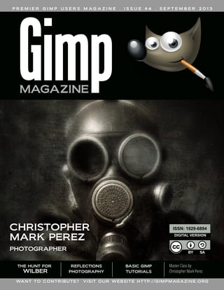
  • 1. P R E M I E R G I M P U S E R S M A G A Z I N E . I S S U E # 4 . S E P T E M B E R 2 0 1 3 REFLECTIONS PHOTOGRAPHY WANT TO CONTRIBUTE? VISIT OUR WEBSITE HTTP://GIMPMAGAZINE.ORG Master Class by Christopher Mark Perez THE HUNT FOR WILBER BASIC GIMP TUTORIALS CCHHRRIISSTTOOPPHHEERR MMAARRKK PPEERREEZZ PPHHOOTTOOGGRRAAPPHHEERR ISSN: 1929-6894 DIGITAL VERSION
  • 2. NEW DESKTOP PUBLISHING COURSE NOW AVAILABLE AS A DIGITAL DOWNLOAD. LEARN DESKTOP PUBLISHING USING FREE AND OPEN SOURCE SCRIBUS FROM THE MANAGING EDITOR OF GIMP MAGAZINE, STEVE CZAJKA.
  • 3. COMPLETE YOUR DIGITAL ARTS EXPERIENCE BY LEARNING GIMP AND INKSCAPE. VIEW STEVE'S PORTFOLIO AT: HTTP://FLICKR.COM/STEVECZAJKA. BOTH COURSES ARE AVAILABLE AT HTTP://GIMPMAGAZINE.ORG/COURSES
  • 4. M A G A Z I N E C O N T E N T S FEATURE 36 AN INTERVIEW WITH CHRISTOPHER MARK PEREZ After a long career in software engineering and being an active promoter of open source software since RedHat 5.0, Christopher Perez, photographer of the outré, is now retired and living his dream in Paris, France. 7 LETTER FROM THE EDITOR 53 THE HUNT FOR WILBER A graphic novel created by David Lepek and illustrated by Yeshua Nel. REFLECTIONS PHOTOGRAPHY BY IAN MUTTOO A photography article by Ian Muttoo, a regular contributor. Incorporating reflections into your photography can provide you with an interesting, alternative view on mundane scenes. 10 4 gimpmagazine.org
  • 5. 90 MASTER CLASS: PORTRAITURE BY CHRISTOPHER MARK PEREZ 96 BOOK REVIEW BY OMA DIAL: INSTANT GIMP STARTER 23 TUTORIAL: CREATION OF A TRIPTYCH A Basic GIMP Tutorial By Steve Czajka. 30 GIMP MAGAZINE - OUR FIRST YEAR BY STEVE CZAJKA In this article, the Managing Editor for GIMP Magazine looks back at this amazing journey and also takes a peek into the future of GIMP Magazine. 60 PHOTOGRAPHY GALLERY 68 DESIGN GALLERY 80 TUTORIAL: VIGNETTING BY CHRISTOPHER MARK PEREZ AND DEBI DALIO 5 gimpmagazine.org 84 TUTORIAL: CREATING THE LOOK OF A VINTAGE PHOTOGRAPH BY CHRISTOPHER MARK PEREZ AND DEBI DALIO
  • 7. LETTERFROMTHEEDITOR Welcome to Issue #4 of GIMP Magazine. This is quite possibly the best issue of GIMP Magazine thus far. And this is due to the outstanding contributions from so many people from all over the world. Featured in this issue are: Reflections Photography by Ian Muttoo; The Hunt for Wilber graphic novel by Dave Lepek, illustrated by Yeshua Nel; some GIMP Tutorials by Debi Dalio; a book review by Oma Dial; and our cover story by Christopher Mark Perez. I would also like to thank everyone who contributed to our galleries and of course Debi Dalio and Sandra Livingston, who work so hard on writing and editing this magazine. This magazine would simply not be possible if not for the efforts of all these people. As the managing editor for this magazine, I am absolutely blown away by the breadth and outstanding quality of the submissions from everyone. And this is only our fourth issue—we are just getting started. The potential here is incredible. Issue #4 also marks the one-year anniversary for GIMP Magazine. We have come so far from just an idea and a blank sheet of paper. And we have accomplished our initial goal of producing four issues within one year. We have crushed our early estimates by hitting over a half- million impressions on Issuu.com alone, and we have grown to over 10,000 followers. Read about our journey and the future of GIMP Magazine on page 30. We have had some struggles along the way, notably the delay of Issue #4 from June to September. Some of our contributors (including myself) were simply unable to hit our internal deadlines. Given the excellence in content for this issue, I didn’t want to rush it and compromise the quality in any way so I made the decision to delay the publication by a few months. I hope that this delay did not suggest that our publication was fading in any regard. GIMP Magazine is back, and stronger than ever. We are actively working on Issue #5 (tentatively planned for December) and we are already planning out and writing for Issue #6 (tentatively planned for March 2014). Thank you for being a part of this amazing journey with us. So now that we have achieved 10,000 followers let’s make a new challenge to double our group to 20,000. Please help us by spreading the word about GIMP Magazine. Follow us by: email subscription (on our website), on Twitter, on Google+, and on Issuu. Tell your friends and family about GIMP and, of course, GIMP Magazine. They will be forever in your debt. And please consider submitting your work for the next issue of GIMP Magazine, or joining our team. We are always looking for creative and talented people to help make our magazine better. Enjoy! Cheers Steve http://twitter.com/steveczajka http://flickr.com/steveczajka 7 gimpmagazine.org
  • 8. ISSUU HTTP://WWW.ISSUU.COM/GIMPMAGAZINE FREELY VIEW THE PDF ONLINE EMAIL NEWSLETTER FOLLOW US VIA EMAIL SUBSCRIPTION HTTP://GIMPMAGAZINE.ORG (CLICK SUBSCRIBE) TWITTER HTTP://WWW.TWITTER.COM/GIMPMAGAZINE GOOGLE+ FOLLOW +GIMP MAGAZINE BIT TORRENT PLEASE SHARE THIS PDF ON BIT TORRENT! WEBSITE HTTP://GIMPMAGAZINE.ORG YOUTUBE HTTP://WWW.YOUTUBE.COM/STEVECZAJKA 8 gimpmagazine.org FLICKR GROUP HTTP://WWW.FLICKR.COM/GROUPS/2173220@N23/
  • 9. ISSUE #4 . SEPTEMBER 2013 EDITORIAL TEAM: Steve Czajka, Managing Editor Design & Desktop Publishing Dave Lepek, Contributing Writer / Editing Assistance Oma Dial, All things Product Reviews Rolf Steinort, All things Web Sandra Livingston, All things Proof / Editing Debi Dalio, Contributing Writer / Editing / Submissions Ian Muttoo, Contributing Writer / Photography Yeshua Nel, Contributing Writer / Illustrator LEGAL: GIMP Magazine does not take any responsibility, express or implied, for the material and its nature or accuracy of the information which is published in this magazine. All the materials presented in this magazine have been produced with the express permission of their respective authors/owners. GIMP Magazine and the contributors disclaim all warranties, express or implied, including but not limited to implied warranties of merchantability or fitness for a particular purpose. All images and materials presented in this document are printed/reprinted with express permission from the authors and/or writers. The content responsibility lies completely with the contributing writer or the author of the article, and may not be representative of the views of the publisher. This PDF magazine is free and available from the GIMP Magazine website. GIMP Magazine is made available under Creative Commons "Attribution-Share Alike 2.5" license. GIMP Magazine trademark logo is copyright by the owner Steve Czajka. All advertisements are copyright by the respective owners. ADVERTISING: Please visit our website to view our advertising rate card and policies at http://gimpmagazine.org/about . HOW TO CONTACT GIMP MAGAZINE: Email: GIMPMagazine at hotmail dot ca Website: http://gimpmagazine.org Twitter: www.twitter.com/GIMPMagazine Google+: +GIMP Magazine Publication Origin: Mississauga, Ontario, Canada PRODUCTION NOTES: GIMP Magazine was created using Scribus 1.4.1, GIMP 2.6/2.8, Inkscape 0.47. Biondi was used for headlines, Open Sans and Open Sans Condensed for house typography. And we can't forget "the coolest mascot" ever, Wilber, adorning the front cover and various locations! ISSN 1929-6894 (online), ISSN 1929-8498 (print). A SPECIAL THANKS TO... HTTP://GIMP.ORG HTTP://GOOGLE+ GIMP HTTP://BLOG.MEETTHEGIMP.ORG HTTP://OPENSOURCE.COM HTTP://ISSUU.COM HTTP://GIMPUSERS.COM HTTP://IHEARTUBUNTU.COM HTTP://GIMPUSERS.DE HTTP://OPENSOURCE.ABOUT.COM HTTP://GIMPFR.ORG HTTP://OPENNET.RU HTTP://TUXMACHINES.ORG HTTP://GIMPOLOGY.COM HTTP://FLICKR.COM HTTP://GOOGLE.COM HTTP://ILOVEUBUNTU.NET HTTP://ABCLINUXU.CZ HTTP://LINUXZASVE.COM HTTP://TODOGIMP.COM HTTP://MAX3D.PL HTTP://HUP.HU HTTP://LIBREGRAPHICSWORLD.ORG HTTP://BLOG.DESDELINUX.NET HTTP://CHIP.DE HTTP://RAMONMIRANDA.COM HTTP://PHOTOGRAPHY-ON-THE.NET HTTP://EN.WIKIPEDIA.ORG HTTP://OMGUBUNTU.CO.UK HTTP://GRAPHICSPLANET.ORG HTTP://RU.WIKIPEDIA.ORG 9 gimpmagazine.org
  • 10.
  • 12. REFLECTIONS PHOTOGRAPHY by Ian Muttoo, Edited by Sandra Livingston Incorporating reflections into your photography can provide you with an interesting, alternative view on mundane scenes. Reflections can also serve as a catalyst, freeing you to think and compose more creatively.
  • 13. Reflection photography incorporates any reflective surface into your photograph. It might be shooting into a mirror, mixing the reflections on a shop window with the display within, reflections on water, or even reflections in polished building materials like marble or granite. Reflection shots can also create recursive, multiple images of your subject—for example, the effect you can get in a mirrored elevator. Composing reflection shots opens up new possibilities for visual effects, but remember to compose your photos in a way you’re comfortable with, a way that pleases you. The rules (or non-rules) of composition are the same. Reflections are just another tool in your toolkit.
  • 15. MIRRORS Keep an eye out for mirrors around you—the rearview mirror in your car, convex security mirrors near parking garage exits, even mirrors in stores that you frequent. There are good photo opportunities to be found by shooting directly into a mirror, or by juxtaposing what is reflected with the mirror’s surroundings. Mirrors also provide you with an opportunity to shoot a self-portrait once in a while! http://www.flickr.com/photos/imuttoo/6145293093/ http://www.flickr.com/photos/imuttoo/5642478532/ http://www.flickr.com/photos/imuttoo/4940809684/ PARALLEL UNIVERSES A photographer friend of mine came up with the term “parallel universes” to describe shots that include reflections on glass and objects behind the glass. Keep an eye out for this type of shot, and try to juxtapose the reflection with the portion of the image that is visible behind glass in a visually interesting way. http://www.flickr.com/photos/imuttoo/6066349127/ http://www.flickr.com/photos/imuttoo/4478171438/ http://www.flickr.com/photos/imuttoo/4816218853/ http://www.flickr.com/photos/imuttoo/5141355834/ http://www.flickr.com/photos/imuttoo/9130038703/ 15 gimpmagazine.org
  • 17. PUDDLES AND WET PAVEMENT Water can be an amazing reflective surface, transforming the everyday into the extraordinary. Shoot into puddles for interesting effects and different, distorted views of normal life. Also, shoot in or after the rain, especially at night, and take advantage of wonderful, colorful reflections on pavement and concrete. http://www.flickr.com/photos/imuttoo/6688061231/ http://www.flickr.com/photos/imuttoo/5034572275/ http://www.flickr.com/photos/imuttoo/8662264822/ http://www.flickr.com/photos/imuttoo/4814179384/ VANISHING POINTS Keep an eye out for vanishing points, especially those that are bounded by a wall of glass or another reflective surface. Shoot reflected vanishing points as you would normally, but take advantage of the reflected, repeated elements in your composition. Color can be a very strong element in these photos. http://www.flickr.com/photos/imuttoo/8641874848/ http://www.flickr.com/photos/imuttoo/4769936068/ http://www.flickr.com/photos/imuttoo/5460030776/ http://www.flickr.com/photos/imuttoo/3568746196/ http://www.flickr.com/photos/imuttoo/8025460454/ 17 gimpmagazine.org
  • 18. SYMMETRY Showing the “real” beside the reflected can produce good results. Look out for opportunities to bring these two elements together, especially in portraits. Good lighting can be key in this type of shot, as you will usually get less light reflected from the reflective surface than from your subject. Consider including a shot like this the next time you shoot portraits. http://www.flickr.com/photos/imuttoo/5688630615/ http://www.flickr.com/photos/imuttoo/8155191410/ http://www.flickr.com/photos/imuttoo/8526077954/ 18 gimpmagazine.org
  • 19. ARCHITECTURE A lot of modern architecture includes a great deal of glass or mirrored glass reflective surfaces. Look out for opportunities to include reflections of nearby buildings, blue sky, and clouds or even sunrises and sunsets in your architecture photography. http://www.flickr.com/photos/imuttoo/7816360080/ http://www.flickr.com/photos/imuttoo/5388390547/ http://www.flickr.com/photos/imuttoo/5042884933/ http://www.flickr.com/photos/imuttoo/5689204096/ http://www.flickr.com/photos/imuttoo/8078852498/ http://www.flickr.com/photos/imuttoo/7835432318/ http://www.flickr.com/photos/imuttoo/6297408292/ http://www.flickr.com/photos/imuttoo/5967849409/ http://www.flickr.com/photos/imuttoo/7680764854/ 19 gimpmagazine.org
  • 20. RECURSION Shooting inside a mirrored elevator can create a neat multiplicity effect. Take care with subject and camera placement and try to emphasize, as much as possible, the recursive effect. http://www.flickr.com/photos/imuttoo/2406768216/ SILHOUETTE Reflections can sometimes create a nifty effect where a portion of the image is reflected through a silhouette. http://www.flickr.com/photos/imuttoo/5763041507/ http://www.flickr.com/photos/imuttoo/5731994852/ 20 gimpmagazine.org
  • 21. STRAIGHT REFLECTIONS Often, depending on the surface that is reflective, the reflected image can be distorted or “filtered” by the reflective material. Granite, especially when wet, can produce an interesting reflective effect. Similarly some plastics, tiles, or even water can produce interesting and compelling results. http://www.flickr.com/photos/imuttoo/6043437500/ http://www.flickr.com/photos/imuttoo/4864537561/ http://www.flickr.com/photos/imuttoo/8222588128/ I hope that this article has provided you with some ideas to expand and enhance your reflection photography. Happy shooting. Join the GIMP Magazine flickr group that Ian moderates at http://www.flickr.com/groups/2173220@N23/ Ian can be reached at: http://flickr.com/imuttoo ■ 21 gimpmagazine.org
  • 22.
  • 23. TUTORIAL: CREATION OF A TRIPTYCH A Basic GIMP Tutorial By Steve Czajka, Edited by Debi Dalio This artwork was done by Chris Davis. It is a charcoal sketch of a girl named Amber. The likeness of Amber is incredible, and from the instant I viewed this artwork, I knew I had to work with it. I asked Chris if I could use this in combination with my calligraphy. She agreed, and now this piece, which was tucked away in her portfolio, has been seen by thousands of people, even being featured on Pinterest. INTRODUCTION A triptych ( /ˈtrɪptɪk/ trip-tik; Greek: τρίπτυχο, from tri- "three" + ptychē "fold") is a work of art (usually a panel painting) which is divided into three sections, or three carved panels which are hinged together and folded. It is therefore a type of polyptych, the term for all multi-panel works. The middle panel is typically the largest and is flanked by two smaller related works, although there are triptychs of equal-sized panels. This tutorial is loosely based on this idea. WATCH THE ACCOMPANYING 12 MINUTE VIDEO TUTORIAL FIRST http://youtu.be/kE4dNZ2yGXc DIFFICULTY LEVEL: NOVICE TO INTERMEDIATE TOOLS: GIMP (VERSION 2.6.8+) 23 gimpmagazine.org
  • 24. STEP 1 — PLANNING AND SETUP I recommend that you first take some time to plan out the final image in advance. I wanted to ultimately create a 1920 x 1080 px high-definition wallpaper image. I knew that I wanted three images, with the name in a watermark effect along with circular calligraphy in the middle. For your artwork, try sketching out your ideas on paper first before you start working on the image. When you're ready to begin, start GIMP. Open the File Manager on your computer and locate your base image. This can be a charcoal sketch, a photograph of someone, an illustration, or any other type of image. Once located, drag the image file into GIMP. Did you know that GIMP supports the drag and drop feature, which is much faster than using File > Open? Crop the image with the Crop Tool, which is located in GIMP's Toolbox, where many icons for frequently used tools are displayed. The Crop Tool's icon is a small pen knife. One of the options in the Crop Tool's options dialog is a crop ratio. Click on Fixed, select Aspect ratio, and enter 5.3:9 to ensure that the final triptych image has a 16:9 widescreen ratio. (We want three images with a final aspect ratio of 16:9; therefore, we divide the width of 16 by 3 images giving 5.3 as a width for each image.) Use a Guide — Rule of Thirds, Center Lines, or whichever one works best — to achieve a pleasing crop. I used an image that required some color processing as shown in the video. For the purpose of this exercise, I recommend that you use the Colors > Desaturate function and pick any of the three options to remove all color from your image. I used the Luminosity option. This is an important step that you must take to get the desired end result. HINT: I NORMALLY WORK AT A MUCH HIGHER RESOLUTION, THEN, AT THE LAST STEP, SCALE DOWN THE IMAGE TO 1920 X 1080 PX. THIS GIVES ME THE FLEXIBILITY OF RE-USING THE ORIGINAL IMAGE FOR PRINT, WHICH REQUIRES A HIGH IMAGE RESOLUTION. AFTER THIS, I ALSO TYPICALLY ADD THE IMAGE INTO A STANDARD WALLPAPER SIGNING BLOCK (NOT SHOWN) THAT INCLUDES MY SIGNATURE, WEBSITE ADDRESS, AND PHOTO CREDIT. IT’S FASTER THIS WAY. I ALWAYS KEEP THE ORIGINAL SIZE IMAGE AS A MASTER .XCF FILE. 24 gimpmagazine.org
  • 25. STEP 2 — CREATING A WIDER CANVAS We need to create a wider canvas size so that we can fit all three images. This step will be different for each person since it depends on the original image size. Select Image > Canvas Size to open the Set Image Canvas Size dialogue. Because the image will not be scaled proportionally, unlock the chain beside the Width and Height boxes by clicking on it until it shows a broken chain. Multiply the width of your cropped image by 3, type this new measurement into the Width box, and click the Resize button. STEP 3 — CREATING THREE IMAGES Since this is a triptych, we need three copies of the primary image. To create two more copies, duplicate the primary image twice using the Duplicate Layer icon found at the bottom of the Layers dialogue. Alternatively, you can right- click on the primary image and choose Duplicate Layer. Arrange the three images in a row side by side, using the Alignment Tool for perfect placement as follows. Click on the icon for the Alignment Tool to activate it (the square with four arrows in the Toolbox). Click on one of the image layers that you want to align (you should see a box appear at each corner of the selected image), then click on an alignment method in the Align options dialogue — either Align left edge of target, Align center of target, or Align right edge of target. Repeat this step for each image, each time choosing an alignment method that hasn't been used yet, until all three images abut each other and span the width of the canvas. HTTP://FLICKR.COM/STEVECZAJKA
  • 26. STEP 4 — ADDING COLOR Now it's time to add color to each of the three images. First we need to select the color we're going to use for the first image. I specifically use Hue Saturation Value (HSV) color mode to ensure consistency between colors. To set a color, click on the color palette (found below the icons in the Toolbox). Set the Hue to 240, the Saturation to 78, and the Value to 40. Create a new transparent layer either by clicking on the paper icon at the bottom of the Layers dialogue or by right-clicking in the Layers dialogue and selecting New Layer. Name it “blue” and choose the Transparency option in the dialogue box. Make sure this new layer is above the image layer(s) that it's going to color. Right click on the first (left) image and choose Alpha to Selection to create a selection around that image. This will ensure that color is added to only that image and not all three. Click on the “blue” layer in the Layers dialogue to make it active, then use the Bucket Fill Tool to fill the selected area. Finally, change the Layer Mode of the “blue” layer to Color. This allows the image below to show through the color layer. Optionally, you can fade this color-washed image by reducing the layer opacity. Do this by selecting the color layer and adjusting the opacity slider (found above the Layers list) to around 50%. Repeat the above steps for the other two layers, choosing green for the middle layer and red for the right layer. You can create a separate color layer for each separate image layer, or you can put all three colors on the same color layer. If you put the colors on separate layers, make sure that all three color layers have the same opacity setting. SUGGESTED COLOR VALUES: (COLOR - H, S, V)(LEFT IMAGE - BLUE - 240, 78, 40)(MIDDLE IMAGE - GREEN - 118, 78, 40)(RIGHT IMAGE - RED - 8, 78, 40) YOU CAN USE ANY COLORS YOU LIKE, BUT MAKE SURE YOU USE IDENTICAL SATURATION AND VALUE SETTINGS. THIS WILL ENSURE THAT THE COLOR, SATURATION, AND VALUE OF YOUR OVERALL IMAGE IS BALANCED. ALTERNATE METHOD: THERE ARE MANY WAYS YOU COULD ACHIEVE THIS IMAGE. I SOMETIMES USE COLORS > COLOR TINT (A SCRIPT I DOWNLOADED FROM WWW.GIMP.ORG) AND DUPLICATE THE TINTED IMAGE TO GIVE IT MORE DEPTH. TRY THIS IF YOU ARE A MORE ADVANCED USER OF GIMP. 26 gimpmagazine.org
  • 27. STEP 5 — ADDING AMBER'S NAME The next step is to add some artwork, in my case Amber's name, over the entire image. The calligraphy used in this piece was over 10 years old, yet it is reusable in this digital environment, which is why I never destroy my artwork. Artwork in the digital environment is completely reusable. Drag and drop your artwork onto your image, making sure it's at the top of the Layers list. Change the Mode of this new layer to Overlay. Change the layer opacity to about 80%, high enough to read, but not so high as to overpower the base images. Do this by making sure your artwork layer is selected, then sliding the opacity slider above the Layers list to adjust the percentage of opacity. This gives a washed appearance. If your artwork is black writing on white paper, do two additional steps. First, choose Colors > Color to Alpha to remove the white background. Second, choose Colors > Invert to change the writing from black to white. HINT: NEVER THROW AWAY ANY OF YOUR ART! YOU CAN ALWAYS DIGITIZE IT, EVEN REPAIR IT, AND YOUR ART CAN LIVE A NEW LIFE IN THE DIGITAL ENVIRONMENT. ALSO, IT'S A GOOD IDEA TO PROPERLY PHOTOGRAPH YOUR HAND-DRAWN OR PAINTED WORKS. I ALMOST LOST ONE OF MY PORTFOLIOS DURING A MOVE. LUCKILY I DIDN'T! NOW, ALL OF MY WORKS ARE PHOTOGRAPHED AND BACKED UP — YOU NEVER KNOW IF YOU ARE GOING TO HAVE A FIRE, WATER DAMAGE, OR EVEN THEFT. ART IS SOMETHING THAT IS SO DIFFICULT TO REPLACE. ONE LAST THING — REMEMBER TO BACK UP YOUR BACKUP COPY OFFSITE. PICK UP A PORTABLE DRIVE (1TB+) AND STORE IT IN A SAFE PLACE. 27 gimpmagazine.org
  • 28. STEP 6 — ADDING A CALLIGRAPHY CIRCLE As a final embellishment, I added a calligraphy circle over the center of the image. You don't need calligraphy for this step. You can use any other artwork or lettering you may have. Simply scan this artwork and drag and drop the image into GIMP, making sure it's the top layer. Scale this image using the Scale Tool (found in the Toolbox as an icon of a small rectangle stretching to a larger one), then center this artwork using the Alignment Tool. Use File > Save As to save your master .xcf file with an appropriate name. This will be the high resolution file that you can reuse later if you want to print the artwork. STEP 7 — SCALING THE IMAGE As a final step we'll create some wallpaper. 1920 x 1080 is a popular desktop wallpaper size and it is also 16:9 ratio. To scale down this image, choose Image > Scale Image and set the Width to 1920 and the Height to 1080. Now use image export (File > Export in v2.8.2) to save your image to a .jpg or .png format. Congratulations! You just learned how to crop, desaturate, align, and scale images; adjust the image size; fill an area with color; set layer modes and layer opacity; and work with transparency. MY THOUGHTS I like this piece. I like the texture of the paper on the charcoal sketch, I like the faint, almost watercolor effect of the calligraphy (Amber's name) washed over the image. I also like how the circle adds the final artistic touch. A special thanks to Chris Davis for allowing us to use her incredible charcoal sketch. ABOUT STEVE CZAJKA Be sure to watch this video tutorial and others on YouTube at http://www.youtube.com/user/steveczajka. Want to learn GIMP and Inkscape from Steve Czajka, the Managing Editor of GIMP Magazine? Try out the Digital Arts Course DVD. A 5hr 27min course that teaches various concepts using videos and exercises. There are 14 folders of GIMP and Inkscape project files (.xcf / .svg) and images that come with the DVD as exercises. $39.99 for a digital download. Visit http://gimpmagazine.org/courses to purchase your copy online via PayPal or Credit Card. Steve Czajka's digital art and calligraphy can be found at : http://flickr.com/steveczajka or at http://torontocalligraphyguild.org ■ SHARE YOUR TRIPTYCH: CREATE A TRIPTYCH OF YOUR OWN DESIGN AND SEND US A SUBMISSION. WE WOULD LOVE TO FEATURE IT IN AN UPCOMING GALLERY. OR SHARE YOUR ARTWORK ON OUR GIMP MAGAZINE FLICKR GALLERY AT HTTP://WWW.FLICKR.COM/GROUPS/2173220@N23/. 28 gimpmagazine.org
  • 29. Meet The GIMP! A Videopodcast about Free and Open Source Graphics Software http://meetthegimp.org
  • 31. OUR GOAL Issue #4 of GIMP Magazine marks a very significant milestone for our team. We set out to make the coolest GIMP Magazine ever. This included: • Promoting GIMP and related open source software • Promoting art and photography created using open source software • Providing this in a magazine with a high design value and visual interest • Appealing primarily to GIMP users, photographers, graphic designers, and artists Our goal, which was circulated as an original proposal to our team members, also communicated that we would give this a shot over four issues, then re-assess how to move forward. I felt that it would take this many issues to sort out and streamline our processes and workflows, and to learn from that. And now that we have reached our goal, it is time for the assessment to begin. OUR BEGINNING This magazine started from nothing. It began with an idea, and a conversation. And it has grown to this: • We have produced four very cool issues ranging from 50 to 100 pages in length that have been viewed well over a half-million times world-wide. • There are 10,000 followers of GIMP Magazine on Twitter, Google+, Issuu, and our website, gimpmagazine.org. • Our website has been visited several hundred thousand times in the first year alone. It has about 1,000 regular daily visits, reaching well over 10,000 visits on any magazine launch day. • In addition to a free magazine, we have extended into print-on-demand, and even tablet products such as a reader on the iPad. • Our donations fund helps cover our costs of running a free magazine. • We've produced a graphic novel spin-off titled "The Hunt for Wilber". • We've received thousands of blog posts, comments, and engagement from people of all languages. • We've had a TV appearance that has been shown in syndication all over the world. • A survey we did told us that 27% of our readers rated GIMP Magazine as 5 Stars, and that GIMP Magazine was rated 4 Stars (or above) by 70% of our readers surveyed. • And finally, through our efforts, we have generated a new awareness, appreciation, and enthusiasm for open source software, particularly GIMP. I hear this over and over again when people say I didn't realize GIMP could do that. GIMP MAGAZINE - OUR FIRST YEAR Written by Steve Czajka, Edited by Debi Dalio In this article, the Managing Editor for GIMP Magazine looks back at this amazing journey and also takes a peek into the future of GIMP Magazine. WE SET OUT TO MAKE THE COOLEST GIMP MAGAZINE EVER. 31 gimpmagazine.org
  • 32. OUR REACH The reach of GIMP Magazine has been far greater than any of us on our team ever expected. I remember sitting with Dave the day before the launch of Issue #1. I slipped him a piece of paper and asked him to write three numbers on it. His estimated first day views, first week views, and first year views. I did the same and we compared notes. While Dave was closer to reality than I was, both of our estimates were very far off. The first day launch of GIMP Magazine blew past both of our estimations, and this caught us by surprise, considering that GIMP Magazine is free and a community submissions-based magazine with zero advertising budget. So, in other words, our reach was (and still is) based on word of mouth from our community. OUR CONTENT Our team is really happy with the content submissions, some of which are jaw-dropping and incredibly inspirational, while others make it easy for new users of GIMP to get started. I feel that we have proudly displayed some of the most creative and innovative examples of what GIMP software is capable of worldwide. It is a balance of content that showcases the greatest works, as well as explaining basic concepts to new users, and I think this is a nice blend. This blend is at the heart of the goal of our publication. We are also open to anything. We very much encourage our readers to submit anything, however wild or bizarre. OUR COMMUNITY Our followers have grown from zero to about 10,000. This is significant for us, and the engagement on our website, Google+, Twitter and via email has been excellent. We had so many great comments from Issue #1 that we did a two page spread in Issue #2 about all of our comments from Issue #1. Our community rocks, and you drive us to do more. OUR QUALITY The quality of submissions has been improving. More and more people are becoming aware of GIMP Magazine and this is increasing the number of and quality of submissions. We have also been working hard to improve the quality of the magazine itself. In issue #2 we introduced a new writing style guide and typography style guide, and we have been refining the overall look of the magazine as we progress. We think this is important in meeting our goal. OUR ADS Magazine ads have not been performing as well as I'd like. Ad revenue would reduce or eliminate the need to request donations, and could potentially move us towards a level of commitment to produce more issues on a regular basis. There are operating costs for running a free magazine, even though we proudly utilize open source software to create the magazine, and the magazine is done completely by volunteers. Beyond operating costs, I would like to eventually reach more readers to better promote GIMP Magazine and open source software, and this also requires resources. My philosophy, which admittedly is different from the norm, is that if an individual or company wants to reach a 32 gimpmagazine.org
  • 33. large audience who use GIMP and related software, and they are willing to pay a fair price for this advertising, then I welcome the opportunity. Our team members are currently using this magazine ad-space to promote their own initiatives, and this is a way to give back to team members who contribute so much voluntarily. We also give back to each contributor by having an about statement that can promote their works. I believe that the magazine itself should remain free, and I will personally do everything I can to keep it this way. Having said all this, we have NOT actually spent any effort on going after ad sales, and we would entertain exploring sales relationships for people who want to sell our magazine ad-space. OUR PROCESSES We have made significant improvement in our internal processes. Everything from utilizing our web form for submissions, to our style guides and internal systems, to our editing and layout processes and workflows have been improved. This streamlining effort helps to focus more on great content and less on process. We are now at a point where we can sustain producing a 100 page magazine four times a year with exceptional quality. OUR TEAM We have a very strong team of committed people who genuinely care about making a great magazine. And this team has a mix of experiences that fit well with our needs to deliver. We have writers, editors, subject matter experts in photography, GIMP, PS, other open source software, operating systems, illustration, design, art, curation, graphic novels, and so much more. It is a great balance of expertise where we can answer just about any question that comes our way. And these people deliver every issue. Their commitment is outstanding. OUR FUN When starting this project, fun was the most important criteria for me. While there have been several technical challenges (and even illness and injury) that our team endured over the year, the feedback I continually get from team members is that this is fun to work on and they look forward to the next issue. This is so important for me, and I absolutely feel the same way. When we completed Issue #1, I wondered if we would ever be able to do WHEN STARTING THIS PROJECT, FUN WAS THE MOST IMPORTANT CRITERIA FOR ME. From left to right, Ian Muttoo, Dave Lepek, Steve Czajka, Sandra Livingston, Oma Dial. Not shown are Rolf Steinort, Yeshua Nel, and Debi Dalio. Photo Credit: Nico Muttoo. 33 gimpmagazine.org
  • 34. such a great issue again. Then Issue #2 came along and I felt that it was better than Issue #1. Then three, then four. It amazes me that this is getting better and better each time a new issue comes out. And I do find it fun to see this evolve and improve over time. There are three parts of this project that I enjoy the most. First, opening each and every submission. I look forward to this every day. I love the role of curator for this magazine. A difficult role, although it is just so much fun. Second, design and layout. I absolutely love creating the design and layout for GIMP Magazine. It is an honor for me to have such talented artists from all over the world trust me with the layout of their art — this is important to them, and I take a great deal of care in this area. And third, magazine launch days. We have melted a server on each launch day and this amazes us. Well over 10,000 people visit us on each launch day alone, and I am amazed this happens. Our community is so awesome! I would also add that I love the flexibility of GIMP Magazine. Dave Lepek reminded me of my quote in the Directors Cut / Commentary of Issue #2 where I said, "There are no rules at GIMP Magazine — well actually there are rules, but we break them regularly and that's OK." I love this level of flexibility around what we do and this free environment enhances our creative expression. Dave, "the idea man", ran this crazy idea by me about how he wanted to create a comic strip inside of GIMP Magazine. While we had one problem — no one to illustrate it, we eventually found a way to develop the idea from a comic strip into a graphic novel with a complete story arc, planned ending, and high level premise and beautiful illustrations. That's the beauty of this creative environment that we work in at GIMP Magazine. OUR FUTURE Many people have asked if we will move to a monthly magazine. Personally I would love to hit this goal eventually, but many things need to happen before we consider this, including: • Increased reach (we would need millions of viewers to get here) • Increased submissions and larger group of regular contributors • A significantly larger team (writers, editors, designers, and layout people) and more complex processes to manage it • Increased funding to help support the increase in traffic, staff dedication, and other services that we would naturally consume with a higher volume monthly magazine And the above assumes that we would keep to the same level of quality, design, and professionalism that I feel is the hallmark of our publication. We have also been asked to produce this magazine in many different languages. This goal is also very far away for us. Our vision for internationalization is very different than simply distributing a 1 GB Scribus publishing project to a group of translators. If we were to internationalize GIMP Magazine, we would want to get it right, and this would require a much larger investment in time and effort to achieve our goals. We will announce this if we choose to 34 gimpmagazine.org
  • 35. proceed along these lines, but there are no immediate plans to do this. We do, however, plan to continue GIMP Magazine into the foreseeable future with our quarterly publication, and to do our best to hit those quarterly dates more or less. We don't release a magazine until it is ready. In addition to our quarterly magazine, we may also do special editions. Say, for example, if the core GIMP team wanted us to do an in-depth story on GIMP 3.0, we would pull together a special edition around 3.0. That is possible and we would like to become more connected with the core GIMP team. MY THOUGHTS I vividly remember sitting back in my chair last spring when reading the response from Jorden (our former editor), when I asked "Is there a magazine for GIMP?" Jorden's response was "Why don't we create one?" My first thoughts were “Wow. No way. To do this well would be a huge task.” But with an incredible team and a great community it has happened. I have learned so much over this past year, but the lesson that stands out the most is "there is no such thing as failure." The largest shoe company in the world prides itself on and openly admits to the fact that they fail 120 shoe models for each model that makes it to production. This isn't to suggest that we at GIMP Magazine haven't made mistakes along the way (we have). Rather, that the fear of failure should never be a reason to not try a new project, provided the necessary research was reasonable. A perceived failure of one project can only lead to the success of another and this is what learning is all about. Thank you so much for riding along with us on this journey. I look forward to producing many more wonderful issues of GIMP Magazine for your enjoyment and ours. OUR NEXT GOAL We want to continue to grow our awareness, attract great content, and present this content in the most amazing way. We would like to work closer with the core GIMP development team to help them communicate key stories about future versions of GIMP and the road ahead. We would like to look into grant applications, as well as advertising arrangements and publishing arrangements, to better promote open source software, GIMP, and, of course, GIMP Magazine. And we want to do all of this while having some fun and learning along the way. ABOUT STEVE CZAJKA Steve Czajka can be found at http://twitter.com/steveczajka ■ THE LESSON THAT STANDS OUT THE MOST IS "THERE IS NO SUCH THING AS FAILURE." THE FEAR OF FAILURE SHOULD NEVER BE A REASON TO NOT TRY A NEW PROJECT, PROVIDED THE NECESSARY RESEARCH WAS REASONABLE. 35 gimpmagazine.org
  • 36. AA NN II NN TT EE RR VV II EE WW WW II TT HH
  • 37. Edited by Debi Dalio After a long career in software engineering and being an active promoter of open source software since RedHat 5.0, Christopher Perez, photographer of the outré, is now retired and living his dream in Paris, France. So, Christopher, how do you get the ideas for your work? I have used photography as a balance to the sometimes crazy- making culture of the job. Working first in aerospace, and later in high technology, I always found pleasure in creating an image. It was calming to the mind and spirit. Ten years ago I studied William Mortensen’s “Pictorial Lighting,” c.1931. It helped me realize that lighting a subject is very, very important, and the book gave me the tools I needed to manipulate light in a way that I found pleasing. William Mortensen also wrote a book on posing a model. The things he wrote about remain fundamental, useful, and important in the creative process. Other sources of ideas came from my reading (Terry Pratchett, Iain Banks, and Neil Gaiman), my wife’s belly-dancing lessons, and my occasional travels to India on business. To cap the list of influences, I learned that the city I was living in at the time (Portland, Oregon) had several steam locomotives, so I started making images of them, too. Ideas of history, time travel, living in a multiverse, steam power, people in period costume, and humans engaging in alternative histories all seemed to impress themselves on me in similar time. It was then that I fortunately discovered our richly populated creative community. I started to experience the excitement that comes from turning ideas into finished art. Who or what were the biggest influences for you? Early on, the photography of Edward Weston, Morley Baer, and Ansel Adams strongly influenced my thinking about image making. My family would go to Yosemite Valley each year, so it was hard not to be influenced by the Western Masters in the art of image making. In the past 10 years, I have moved away from the cold landscape styles, as I discovered I enjoy working with people. Stumbling across the images and instruction books of William Mortensen, I realized there could be a lot more to making images than hauling around very large format cameras (sometimes taking film as large as 12 x 20 inches) and praying the chemistry would work its magic during processing in the darkroom. People are a lot more fun to work with than landscapes. Standing out in the middle of an empty field somewhere, shivering as I waited for the sun to rise and be “just right” had grown old. I found I love themes of Steam, Noir Victorian Gothic, Time Travel, Tribal Fusion, and Historic Reenactment. When my wife and I lived in Portland, the creative community around us was incredible. They touched on nearly every theme I was interested in. Once we built mutual trust, we were able to pursue ideas and images and creativity
  • 38. C H R I S T O P H E R P E R E Z 38 gimpmagazine.org
  • 39.
  • 40.
  • 41.
  • 42. the likes of which I’m having a difficult time finding again. I continue to look for creative people to work with, but where we live now (Paris, France), it seems like these kinds of folk are more difficult to access. So I have begun talking with artists, actors, and neighbors. I have started reading books about the mysteries of the cathedrals, alchemy, sorcerers, and the danse macabre. I remain hopeful that some new image- making theme will emerge and that interesting people will be happy to come along for the ride. Have you ever taken formal lessons or are you self- taught? I wish I could say I was self-taught, but that’s not entirely correct. I took a few classes at the local community college even as I was at the university working on a Bachelor of Science degree in molecular biology and, later, computer science. I worked for a few years as a black-and-white print technician in Hollywood, and then in Irvine, California. For a short time I contributed photo illustrations to a motorcycle magazine and worked as an assistant to wedding photographers. My recent education in digital image manipulations has come through practical experience and reverse engineering images I like. There are some good online resources for learning how specific styles can be achieved. I’ve studied the ones that seem most useful to me and then adapted the processes or techniques to suit my needs. What is your process for creating an image? When I’m reading, I’m continually open to ideas or themes that make me stand up and take notice. The kinds of things that pique my interest probably could be filed under the heading of “odd” or “different.” I then search for people to work with who might express some or most of the idea that I’m looking to create. My wife and I then take my lighting equipment and backdrops into a room (it could be a dance studio, or someone’s living room, or just about any space that has an electrical outlet), where the primary images are made. It usually takes two to three hours of working a theme to feel like I get everything I want. For the textures I’m constantly wandering the world looking for something that interests me—weathered metal, concrete, tiles, clouds, timeworn glass, paper. From these I’ve built up a library of textures that I select from when processing an image. Presently, my favorite source for the textures I use are European cemeteries. As I work an image, I may have up to 30 layers in play at the same time. Each layer can be responsible for a specific effect or provide just the right hint of variation. Blend modes are very important to me and I am constantly working the combinations to drive toward the desired effects. When I manipulate a work into a state where things are looking good, I save a copy, then return to manipulating the blend modes to come up with another look. I quickly realized that if I don’t save something immediately, that I find it impossible to find my way back to an earlier image style. Many times I save 20 or 30 variations of a work.
  • 43.
  • 44. What kind of support team do you have? My wife, Judith, provides important support to me in the studio. Since she, too, is an artist, she is very good at keeping an eye on costuming, make-up, and posture, and helps with the setup and teardown. With her aid, attending to the backdrop system, lights, light modifiers, and power takes only 10 to 15 minutes. During a shoot, she sometimes suggests things, particularly after seeing how a shoot is proceeding. We “chimp” the shots from time to time to see how we’re doing. [“Chimping” means looking at the LCD display on a camera to review images.—Ed.] Judith reviews the images with the model and me, where we confirm things are looking good, or discuss setting a new image direction or changing a detail of the overall setup. For hair, makeup, clothing, and props I have relied heavily on the models who came out of the creative performance community to which I was fortunate enough to have access. In fact, I became quite used to my models coming pre-equipped. Though, in truth, I had a small collection of interesting things to choose from, too (like hats, goggles, silk gauze, skulls, bones, and the like). I have been more than a little surprised that creative people elsewhere are not quite as well stocked in fun image-enhancing talents or big boxes of wonderful things. It seems, instead, that I now have the opportunity to develop a deeper support team in our new home as I continue to work on the kinds of images I like. Each photoshoot must be a big event. How do you plan for one? Planning consists of working from a theme or core idea. I research art to see how other people have expressed these kinds of themes or ideas. This gives me a place to start and I know, having spent years engaged in these kinds of activities, that even though I may see something I like and borrow something, that the end product is always very unlike the inspiration. In this way, art easily becomes a very personal expression. I contact the performing arts community to see who might have something along the lines of what I'm looking for. It could be a simple request like setting up a shoot with “black on black” [a black(ened) subject on a black background—Ed.], or it could be something a bit more complex, say, of following a time traveller from across the seam between the multiverse. We typically book time in a dance studio. I've found these kinds of spaces are large enough to hold all the things that go into a photoshoot, including all the props and make-up kits, lights, backdrops, and, of course, humans. Sometimes we’ve worked in smaller spaces (like someone’s living room) when the need has arisen. Ten x 20 feet is a workable space much of the time. Ten x 10 feet can be a little cramped, but it’s workable. Being mobile means that I need to load the Elinchrom lights, stands, umbrellas, backdrop system, and cameras into a large sports duffel bag and strap it to a heavy-duty dolly that I can wheel around town. An older, sometimes kilted, many times top hatted, gentleman pushing around a dolly, accompanied by his photographer’s assistant wife, is quite the sight! We usually shoot for two or three hours. With this kind of time I’m able to get perhaps 1500 images “in the can” to choose from. ONLINE RESOURCES I FEEL THAT LIGHTING AND COMPOSITION ARE VERY IMPORTANT. AS SUCH, I TRY TO GET AS MUCH AS I CAN IN- CAMERA BEFORE CONTINUING TO WORK WITH GIMP. IT SPEEDS THE PROCESS. FOR LIGHTING, I’VE FOLLOWED DAVID HOBBY’S “STROBIST” BLOG AND FLICKR PAGES: HTTP://STROBIST.BLOGSPOT.FR/ HTTP://WWW.FLICKR.COM/GROUPS/STROBIST/ THESE KINDS OF GROUPS ON FLICKR REQUIRE PEOPLE TO REVEAL A LITTLE ABOUT WHAT PEOPLE DO TO MAKE AN IMAGE. IN THIS CASE, THE LIGHTING SETUP THAT PEOPLE USE. SOME OF MY FAVORITE ARTISTS INCLUDE: EUGENIO RECUENCO: HTTP://WWW.EUGENIORECUENCO.COM/ JOEL GRIMES (HE GIVES CLASSES AND HAS SOME ONLINE RESOURCES THAT CAN BE USEFUL): HTTP://WWW.FLICKRIVER.COM/PHOTOS/JOELGRIMESPHOTO GRAPHY/POPULAR-INTERESTING/ KIRSTY MITCHELL: HTTP://WWW.FLICKRIVER.COM/PHOTOS/KIRSTY841/POPULAR -INTERESTING/ PAOLO ROVERSI: HTTP://WWW.PAOLOROVERSI.COM/DIAPORAMA/PHOTOGRAP HS.HTML SIMILARLY, HERE’S A LINK TO A GROUP DEVOTED TO THE BRENIZER METHOD (BOKEH PANORAMA), WHICH CAN BE USEFUL: HTTP://WWW.FLICKR.COM/GROUPS/BRENIZERMETHOD/ HDR (HIGH DYNAMIC RANGE) WORK: HTTP://WWW.FLICKRIVER.COM/GROUPS/HDR/POOL/INTERES TING/ COUPLED WITH FLICKR’S INTERESTINGNESS ALGORITHM, A PERSON CAN QUICKLY FIND SOME PRETTY INTERESTING IMAGE STYLES TO CONSIDER. HTTP://WWW.FLICKRIVER.COM/GROUPS/STROBIST/POOL/INT ERESTING/ HTTP://WWW.FLICKRIVER.COM/EXPLORE/INTERESTING/24HO URS/ FOR WORKING WITH GIMP, THE TRADITIONAL TUTORIAL SITES ARE A GREAT PLACE TO START (THOUGH I’M SURE OTHERS HAVE COVERED THIS, TOO): HTTP://WWW.GIMP.ORG/TUTORIALS/ HTTP://GIMP-TUTORIALS.NET/ HTTP://WWW.GIMPOLOGY.COM/
  • 45.
  • 46.
  • 47. Do you ever use a green screen, or do you always use a textured background? I do not use green screens. It takes a careful lighting setup—that is, way too complex, with too many lights, and requiring far too much space to implement, particularly when using chiaroscuro or classic iconic lighting setups—to avoid bleeding the backdrop colors onto the main subject. I’ve tried using pure white backdrops, like those used by Joel Grimes. While the pure white is easily dropped out of a scene (GIMP makes this very easy indeed), I feel that it wraps too much light around the edges of my subject. I found I needed finer control than the green screened or pure white backdropped photos provide. Working with darker textured backdrops, I sometimes will enlarge an image to 200 per cent and carefully, with a 4 to 9 pixel diameter feathered brush, remove unwanted elements from an image layer. I do this sparingly since I like the way texture layers blend with the backgrounds I use. Do you pay your models? Do they get to use the images you create of them? And do you sell those images? When I’m desperate, I’ll post a request for models, and I’ve been known to pay for someone’s time. In those situations, though, I’ve found that models expect that I will provide the costuming, make-up, and hair stylist. Such things take time to organize and space to store props in. The older I get, the fewer of these I tend to have—time and space, that is. Instead, I prefer to find creative, expressive people with whom to work. I look for subjects who have deep wardrobes already, and sometimes have great boxes filled with fun goodies that can be used as props. These people express who they are by simply living as they are. They wear what they like. They look as they want. They live as they choose. I find these kinds of subjects very helpful, incredibly creatively fun, and many times excited to trade time for images. Their time. My images. I like it when both parties can agree to use the results of our photo sessions as we please. And I prefer situations where mutual credit is given. Taking this approach, much of our work together has been used on websites, published in international magazines, featured in blogs, and shown in international and rather traditional galleries. Which brings me to my goal for working in this manner. For me, it’s art for art beauty’s sake. Pure and simple. Though, of course, I’m open to paid opportunities to share my images where my style fits the needs of a client. To this end, I am constantly on the lookout for creative situations where two or more parties could benefit from diving into the studio for a few hours to make, hopefully, a few wonderful images together. My work is not typically for sale, though it has been in the past, when I sold a fair number of my hand-coated palladium prints. If someone wants an image, I’m happy to accept money for it. Though, again, my preferred approach is to find creative shared situations where money does not change hands. TOOLS IN PEREZ’S WORKFLOW CAMERAS AND EQUIPMENT: CANON FULL FRAME AND APS-C DSLRS CANON L-SERIES AND SIGMA EX HSM LENSES SONY NEX MIRRORLESS (RECENTLY PRESSED INTO SERVICE FOR COLLECTING INTERESTING TEXTURE IMAGES) ELINCHROM MONOLIGHTS WITH UMBRELLAS AND SOFTBOXES (PORTABLE) BACKDROP SYSTEM (PORTABLE) SOFTWARE: GIMP (USUALLY THE LATEST STABLE VERSION) CANON DIGITAL PHOTO PROFESSIONAL (DPP) FOR CANON RAW FILES HUGIN - PANORAMA PHOTO STITCHER (FOR STITCHING LARGE WORKS, WHEN APPROPRIATE) QTPFSGUI / LUMINANCE HDR (FOR HDR, WHEN APPROPRIATE. I DON’T KNOW WHAT’S HAPPENED TO THIS PROJECT, BUT IT SEEMS TO HAVE BECOME UNSTABLE AND UNPREDICTABLE, SO I STICK TO USING THE PRE-LUMINANCE QTPFSGUI SOFTWARE FOR CERTAIN FUNCTIONS.)
  • 48. Do you shoot in RAW mode? If so, which software do you use to process RAW files? With the Canon DSLRs I shoot RAW (Canon Raw 2 - CR2). I found that the processing of JPG files in-camera in the Canon EOS 5D Mark II smeared skin tones and made something of a mess of an otherwise nice portrait. Yet processing a RAW image outside of the camera worked great and did not limit the information stored in an image file. Add to this that UFRAW was a little slow in supporting the 5D Mark II and I had few choices. I use Canon’s DPP, the software that came with the camera. It does a fine job of converting RAW into JPG or whichever format I want. These problems have been corrected with the introduction of the 5D Mark III and 6D cameras, but I don’t own either one. Further, since I was shooting RAW in the 5D Mark II, I figured it couldn’t hurt when shooting the 7D, too. So, it’s RAW for me when I use the Canon cameras. Once DPP was part of my process flow, I had no desire to change to other software. When shooting the Sony NEX cameras, I shoot JPG, since the conversion engine in-camera does a fairly decent job of keeping the kinds of image details that are important to me. Why did you choose to use GIMP and which features do you use the most? I chose GIMP first and foremost because I’ve been a strong advocate of open source software and the Free Software Foundation’s General Public Licence v2.0 and Lesser General Public Licence v2.0. I have encouraged the deployment of OSS works for much of my professional career in software development and managing software engineers, as well as managing projects and product development. The reasons went well beyond cost and were based on the desire to free up common foundational functionality of things like the UNIX operating system, and, of course, network connectivity, libraries of functions, and software applications. This has freed developers to concentrate on developing intellectual property that adds to the vast body of knowledge and work. In other words, a team of developers can avoid reinventing the wheel with every product turn or software release while using common standards such that plug-and-play becomes possible across much of the computer-based universe. From a creative perspective, I use GIMP because it is, for the most part, more stable than competing for-profit, for-sale product offerings. Friends who use pay-for-play software seem to fight product licensing protection schemes when they upgrade to a new computer or simply try to reload the same software to an existing machine. They also complain a lot about being unable to control the pay-for-play offerings in a way that matches their workflow. It seems that people have had to adapt to the enforced workflow models instead. For me, these things are, as the French would say, insupportable. GIMP provides a rich set of tools from which a creative person can draw. For myself, I make heavy use of layers, masks, opacity, sample colorize, canvas size, layer size, and the layer blend modes. My favorite blend modes include multiply, overlay, divide, difference, hard light, grain merge, and grain extract. Additionally, I use dodge and burn tools as well as clone and healing.
  • 49. A short comment about brushes—they have been important to me to understand and manipulate. Before v2.8, I used to build my own brushes. Now I simply resize a single brush to the dimensions I need. I make heavy use of soft brushes where the hardness is set to 0.50. This gives me the control I need to blend the edges of masked layers, which helps make the transitions in an image appear seamless. This approach also helps make clone and healing tools easier to control. I can’t emphasize enough, however, the value of having a solid understanding of art, art history, lighting, composition, and pre-digital age fine art photography methods. In this way I have learned what I like, why I like it, and when and how to break the rules. Which features would you most want to see in upcoming versions of GIMP? I look forward to seeing how the 16- and 32-bit color depth processing works. I’d like the curves to not be so blocky when I work with the colors and contrast in an image. If you could go back in time, what advice would you give yourself? I wish I hadn’t gotten so wound up about darkroom processes and arcane camera equipment. I still shake my head at all the exotic equipment and specific knowledge I had of film, chemistry, optical design, and camera systems. No topic was too broad or too deep to pursue and understand. It took me a very long time to realize that tools are just that, tools. They typically lend no useful magic to a final image, and, in my case, distracted from the goal of photography, which is to make an image. I wish I had realized sooner that the vision of the nut behind the eyepiece was the most important aspect in making a pleasing image. Here’s a true story. I was packing my bags for yet another business trip to India. I intended to haul a 4 x 5 inch Speed Graphic, Kodak Readyload film holder, six boxes of T-MAX 100 Readyloads, Polaroid Type 55 film, three small lenses, and tripod. Into the suitcase they went, only to leave me knowing there was no way I could carry the equipment and my clothes on the same trip. There was an obvious gap between desire and reality. The cameras were not that important because my business was in technology, not photography. All I was looking to do was to come back with a few nice images from having made the very long trek halfway around the world. So I went to the store and bought my first digital camera. The rest, as they say, is history, and with it went any hope of registering the domain name “nodigitalforever.com”. What are your future plans? After 30 years in making and managing software and software engineers, I was laid off. The company I worked for had been acquired by an aggressive roll-up company that knew the best way to “improve” near-term stock option performance for their executives was to
  • 50.
  • 51. downsize, downsize, downsize their acquired businesses. So, I was out the door and on the street faced with the options of either moving out of the area in search of work (an image from The Grapes of Wrath comes to mind) or retiring early (the image of a beggar on the sidewalk toting a sign that read “Will Craft Software for Food” was what I wanted to avoid). Believing that when the opportunity arises we should respond accordingly, my wife and I recently did something rather big with our lives. My wife suggested that we sell the house, put the money in the bank, and go live One Last Dream. We are now firmly installed in our favorite city on Planet Earth. Paris. You know the one. Baguettes, the likes of which are impossible to make anywhere else. Butter that just can’t be missed (there is a very special variety here that is very simply the nectar of the gods). Cheese that, as someone once said on Rick Steves’ Europe, smells like the feet of angels. Wine that need not cost much, but is biodynamic/organic, widely available, and so, so tasty. Food that has real honest-to-the-gods knock-your-socks- off flavor. Belgian beer brewed by Trappist or Benedictine monks that is strong enough to fuel rocket ships. Great people who love to talk about politics the way Americans like to talk about sports. Museums that provide lavish, sometimes decadent, voluminous sources of inspiration for my next art projects. A city where great passions and big things to do are only limited to how large a person can dream. In this way, our future was presented to us. Perhaps some might say it was presented on a silver platter? Now that we’re here, I’m looking forward to restarting the creative process. I want to make a few more images from ideas and themes that sneak out from around the edges of culture and life and living, which would give me a good reason to haunt the catacombs, medical museums, old bookstores, cathedrals, and taxidermy shops. I WISH I HAD REALIZED SOONER THAT THE VISION OF THE NUT BEHIND THE EYEPIECE WAS THE MOST IMPORTANT ASPECT IN MAKING A PLEASING IMAGE. Where can your work be found? My current portfolio is on Flickr: http://www.flickr.com/photos/christophersoddsandsods/sets/72157624879973554/ My images have been published worldwide in the following locations and publications: 1000 Steampunk Creations: Neo-Victorian Fashion, Gear, & Art, curated and presented by Dr. Grymm, with Barbe Saint John, copyright 2011 by Quarry Books, pages 60 and 61 (USA) “Victorian Gothic,” images published across 16 pages of Silvershotz Magazine, January 2011 (Great Britain) “In the Railyard,” selections from a larger work published in The Center for Fine Art Photography’s Portfolio Showcase, Volume 3 (USA) “Age of Steam” - New Visions, published in November 2009, Photo Life Magazine (Canada) “In the Railyard,” LensWork Magazine, extended issue #78 (USA) I have a video on YouTube showing how a photo session proceeds: http://www.youtube.com/watch?v=IMeT-MyANdQ And one showing the kinds of results we get: http://www.youtube.com/watch?v=dVPEZDkwogk I run a photography blog: http://photosketchpad.blogspot.fr/ Having retired outside of America, I also run a blog about living in Paris, France: http://beinginparisfrance.blogspot.fr/ ■
  • 52. FOLLOW DAVE LEPEK ON TWITTER @ACCORDING2DAVE
  • 53.
  • 54.
  • 55.
  • 56.
  • 57.
  • 58.
  • 59.
  • 60. G I M P P H O T O G R A P H Y G A L L E R Y 60 gimpmagazine.org
  • 61. IF YOU’D LIKE TO HAVE YOUR WORK CONSIDERED FOR THE NEXT ISSUE OF GIMP MAGAZINE, SEND YOUR SUBMISSIONS TO HTTP://GIMPMAGAZINE.ORG/SUBMISSIONS A Gallery of Works from our GIMP User Community 61 gimpmagazine.org Calligraphy: Steve Czajka
  • 62. ROLF STEINORT Title for the series: Access Control About: I am a science teacher in Berlin, trying to be a photographer in my spare time and to promote Free and Open Source Software. I am the producer of the "Meet the GIMP!" Video tutorial series (http://meetthegimp.org) and also involved with GIMP Magazine. Description: This is part of a series of images of "technical measures to control the access to something", mostly locks of any kind. I set myself some rules for this project, always keep the same perpective and aspect ratio and get rid of the context as much as possible. 62 gimpmagazine.org
  • 63.
  • 66. ROLF STEINORT Title for the series: Traces of use About: I am a science teacher in Berlin, trying to be a photographer in my spare time and to promote Free and Open Source Software. I am the producer of the "Meet the GIMP!" Video tutorial series (http://meetthegimp.org) and also involved with the GIMP Magazine. Description: This is part of a series of images of graffiti on walls and other urban things. I close in so much that the context is lost on the graffiti and the wall. Only structure, light and color remains. For those who need context: These were simple, crude spray tags on walls in the former GDR State Security Headquarters compound in East Berlin. 66 gimpmagazine.org
  • 68. G I M P D E S I G N G A L L E R Y 68 gimpmagazine.org
  • 69. 69 gimpmagazine.org IF YOU’D LIKE TO HAVE YOUR WORK CONSIDERED FOR THE NEXT ISSUE OF GIMP MAGAZINE, SEND YOUR SUBMISSIONS TO HTTP://GIMPMAGAZINE.ORG/SUBMISSIONS A Gallery of Works from our GIMP User Community 69 gimpmagazine.org Calligraphy: Steve Czajka
  • 70. MARIJA MAROSEVIC Title: The Ambiguous Siblings About: I am a self-taught digital artist and photographer based in Croatia. In 2008 I switched to Linux and have been working with GIMP ever since. Most of my work is dark, symbolic and surreal. I use my own photographs and resources exclusively. Website: http://www.bloodpaperink.com Description: This artwork was made in GIMP 2.6.12 using my own photographs and custom-made brushes. 70 gimpmagazine.org
  • 71. BARBARA NINES Title: Dreamsleep About: I am a self-taught artist who was turned on to the GIMP a few years ago. I use version 2.2.17. I am 53 and bought my first computer at age 46. I was thrilled to find I could use it to create images! It has been an adventure. Description: This began as a line drawing of a skull. I used Kward's glass script and airbrush to highlight the form. I layered this over a scaled and blurred flame image after which I applied smudging, swirl brushes, sparkle brushes and soft glow effects. I was pleased with the results! 71 gimpmagazine.org
  • 72. YESHUA NEL Title: Big Foot About: I'm Yeshua Nel, a digital artist from South Africa. Contact: DeviantArt: http://yeshuanel.deviantart.com/ Twitter: https://twitter.com/unnamedArt Facebook: https://www.facebook.com/pages/Unnamed-Art/155739901112016?ref=hl Youtube: http://www.youtube.com/user/unnamedArt/ Website: http://www.unnamed.co.za/ Description: A Big Foot type ape drawn with GIMP. 72 gimpmagazine.org
  • 73. YESHUA NEL Title: HD Face About: A hobbyist artist from South Africa. Contact: DeviantArt: http://yeshuanel.deviantart.com/ Twitter: https://twitter.com/unnamedArt Facebook: https://www.facebook.com/pages/Unnamed-Art/155739901112016?ref=hl Youtube: http://www.youtube.com/user/unnamedArt/ Website: http://www.unnamed.co.za/ Description: This image was made a little while ago. I decided to crop the face and add some detail to it. I used GIMP 2.8 with stock brushes. 73 gimpmagazine.org
  • 74.
  • 75. MR.BLACK About: I am digital artist come from Taiwan , and i alaways use GIMP to do my any artwork, examples of which are illustration , surreal painting, poster design, T-shirt design, and CD cover design Contact: https://www.facebook.com/pages/Black-Cross-studio/283052425067094 Titles: Deceased of Wandering, Memories of Vernicia fordii, Temple of Time, and Fantasy Creature Description: I always use GIMP 2.6.11 to do my artwork and surreal painting. I used GIMP 2.6.11 with the colorize filter to create this artwork. 75 gimpmagazine.org
  • 77. STELA CANGA Title: Art by Stela Canga including: Too Shy, Sweet Candy, Meeting Hearts, and Dreams of Real Feelings About: I'm an Albanian illustrator and mangaka. I started by writing poems and stories when I was little (around 8-9 years old) and illustrating them using traditional methods. Started drawing/writing manga around 12 years old. In 1998 I also came third in a drawing competition (in Tirana, Albania). Since 1998 I live in Athens, Greece. I've worked as an illustrator in various positions (foreign language books, a manga-style magazine, etc). In 2006 I won the first prize for ages above 18 years old in the "Akasuki" manga/anime magazine (in Greece). I've used GIMP since around 2000 and continue to use it in the majority of my digital works. In 2012 I self-published two books: "Meeting Hearts", a collection of three one-shot manga stories, and "Dreams of Real Feelings" (a poetry collection). Description: All of these images are done 100% in GIMP (including sketching, coloring, effects). I use a (Wacom) tablet for most of my work. 77 gimpmagazine.org
  • 78. JEREMY GOOCH Title: Zero-K Battle About: I created this Image using GIMP 2.6. I had a few submissions included in Issue 2, and I've completed this artwork since then. My blog is at jeremygooch.blogspot.com, my deviantart page is jeremygooch.deviantart.com, and my cghub page is jeremygooch.cghub.com/images. Description: RKA: Concept art created using GIMP 2.6. Zero-K Battle: Full battle scene created for the free, open-source, rts game Zero-K.
  • 80.
  • 81. TUTORIAL: VIGNETTING by Christopher Mark Perez and Debi Dalio The word “vignette” comes from French, originally meaning small vine, and coming from the use of vine tendrils in decorative borders, such as those placed at the beginning or end of a book or chapter or along the border of a page. The term has also come to be used for the effect where an engraving or photograph shades off gradually into the surrounding paper or where the edges of an image are darker than the centre. Though often an unintended and undesired effect caused by camera settings or lens limitations, this effect is sometimes used intentionally by artists and photographers to direct the viewer’s eye to what they feel is important while muting less important details. The result is that the emphasized subject is brought forward in the image. INTRODUCTION In this tutorial we’ll show how to direct the viewer’s eye toward Fracture’s face, hair, and upper torso by using a very simple vignetting technique involving layers and masks. While there are several ways of achieving this effect, the one illustrated here is a great way to get started. Note that the vignetting effect need not be dramatic to be effective. STEP 1 — CREATE THE VIGNETTE LAYER All of the work for the vignette will be done on a separate layer, so the first thing we’ll do after opening our image in GIMP is duplicate the image. Select the Layers dialog [1] in the Toolbox, then either right-click in the Layers dialog and select Duplicate Layer [2] or left-click on the doubled image icon [3] in the row of icons along the bottom of the Layers dialog. The vignette layer will be added above the original image layer. It is good practice to name each layer so you can keep track of which layer is doing what. Double-click on the name of the new layer and change it to “vignette”. LEVEL OF DIFFICULTY: NOVICE SOFTWARE VERSION: GIMP 2.8 (OR ANY VERSION 2.X) 81 gimpmagazine.org
  • 82. STEP 2 — ADD A MASK Next, we’ll add a mask to the vignette layer to control how much of the layer is visible. Right-click on the vignette layer and select Add Layer Mask [4]. In the dialog box that pops up [5], select White (full opacity) and click the Add button. The mask appears as a white box to the right of the image box for the vignette layer in the Layers dialog. The mask should be active by default. You can tell which part of a layer is active by seeing that it has a white border around the image box. If you’re not sure if the mask is active, left-click on the white box. STEP 3 — ADD A GRADIENT Now we’ll add a gradient to the mask that will define the area and edges of the vignette. Set your foreground color to black and your background color to white [6]. Left-click on the Blend Tool [7], then select the Tool Options dialog [8]. Left-click on the Shape drop-down box [9] and choose Radial. Note that when the cursor is over the image it appears with a gradient box. Move the cursor to a point roughly at the center of the area you wish to highlight; in this case, the edge of Fracture’s mouth. Left-click and hold the mouse button, drag the cursor to a corner of the image, then release the mouse button. Note that the mask in the Layers dialog now has a fuzzy black circle in it. Clicking the eye on the original image layer to hide it shows the effect the mask has on the vignette layer. 82 gimpmagazine.org
  • 83. STEP 4 — ADJUST THE COLOR Finally, we’ll adjust the color levels of the vignette image to affect how the vignette border appears. Left-click on the image part (left block) of the vignette layer [10] to make it active. Click on Colors > Levels [11] to open the Adjust Color Levels dialog box. There are three triangles just below the Input Levels graph. Grab the center grey triangle [12] with the left mouse button and drag it to the right a little bit. This will darken the edges of the image. When you find a pleasing level of vignetting, click on the OK button. SUMMARY What we’ve done here is created a mask on an image layer that was copied from an original image. The mask contains a large, feathered region where the black area allows the lower, original image to show through and the white area shows the changes made in the upper, duplicated image where color level adjustments were made to darken the image. The overall effect is to darken the edges of the image, thereby drawing attention to the point of interest. ■ TIPS, TRICKS, AND TECHNIQUES — FINDING THE CENTRE OF AN IMAGE IF THE WIDTH AND HEIGHT OF THE IMAGE ARE EASILY DIVISIBLE BY TWO (AS IN THE HALFWAY POINTS ARE ACTUAL MARKS ON THE RULERS), SIMPLY EYEBALL THE CURSOR X AND Y POSITIONS ALONG THE HORIZONTAL AND VERTICAL RULERS. IF THE RULERS AREN’T BEING DISPLAYED, TURN THEM ON VIA VIEW > SHOW RULERS (SHORTCUT CTRL+SHIFT+R). ALTERNATIVELY, WATCH THE CURSOR’S CURRENT POSITION IN THE LOWER LEFT CORNER OF THE IMAGE WINDOW. THIS REQUIRES A VERY STEADY HAND AND IS EASIER TO MANAGE THE MORE YOU ZOOM IN. IF YOU WOULD PREFER AN ACTUAL CROSSHAIR, SELECT IMAGE > GUIDES > NEW GUIDE (BY PERCENT), CHOOSE HORIZONTAL FOR THE DIRECTION AND 50 FOR THE POSITION (IN %), AND CLICK OK. DO THE SAME FOR THE VERTICAL DIRECTION. 83 gimpmagazine.org
  • 84. TUTORIAL: CREATING THE LOOK OF A VINTAGE PHOTOGRAPH A GIMP Sample Colorize Tutorial by Christopher Mark Perez and Debi Dalio Have you ever wanted to modify an image to give it a vintage look like that of an old monochrome sepia photograph? GIMP’s Sample Colorize function allows you to do just that, quickly and easily, by taking tones and tints you like from one image and applying them to another. INTRODUCTION This is a two-phase process. The first phase involves creating a color sample. The second involves applying the color sample to an image. PHASE ONE: CREATING A COLOR SAMPLE STEP 1 – SET UP A CANVAS FOR THE COLOR SAMPLE The first thing to do is set up a canvas to hold the colors being sampled, so start GIMP, select File > New, set the Width to 256 and the Height to 100, and press OK. Select the Blend Tool [1]. Set the Shape field to Linear [2] and make sure that the Gradient is “FG to BG” [3], pure black to pure white. If the Gradient box does not say “FG to BG”, click on the gradient image to the left of the box and select “FG to BG (RGB)”. If the foreground and background colors are not black and white respectively, change them by clicking on the appropriate part of the “Foreground & background colors” icon [4] and making the necessary changes. Left-click and hold on the left edge of the color sample canvas, drag to the right edge, and release the mouse button. You should now see a black to white, left to right gradient. LEVEL OF DIFFICULTY: NOVICE SOFTWARE VERSION: GIMP (ANY VERSION; THIS TUTORIAL USES V2.8.2) REQUIRED MATERIALS: A NON-BLACK-AND- WHITE MONOCHROME IMAGE AND AN IMAGE TO BE COLORED 84 gimpmagazine.org
  • 85. STEP 2 – SAMPLE A MONOCHROME IMAGE Next, find a nice monochrome image and load it into GIMP, then click on the window for the color sample to reactivate it. Select Colors > Map > Sample Colorize to open the Sample Colorize dialogue. You will see two panes. The color sample should be in the left pane and the monochrome image should be in the right pane. If this is not the case, use the Destination drop-down list to choose the color sample and the Sample drop-down list to choose the monochrome image. Make sure that the boxes for Use Subcolors and Smooth Samples are checked, then press the Get Sample Colors button. After a short time the color sample will show a gradient of the colors in the monochrome image. Press the Apply button to apply the colors to the color sample canvas, then press the Close button. Use File > Export to save the color sample to an appropriately named PNG file. You now have a color sample that can be used to colorize other images. PHOTO CREDITS: URN PHOTO COMPLIMENTS OF CHRISTOPHER MARK PEREZ REDSCALE STONE BUILDING COMPLIMENTS OF WIKIPEDIA.ORG (HTTP://EN.WIKIPEDIA.ORG/WIKI/FILE:REDSCALE.JPG) 85 gimpmagazine.org
  • 86. PHASE TWO: COLORING AN IMAGE STEP 3 – APPLY THE COLOR SAMPLE TO AN IMAGE Now it’s time to find an image you’d like to colorize and load it into GIMP. If your color sample is not still in GIMP, then load it also. Make sure the window for the image to be colored is active, then select Colors > Map > Sample Colorize to open the Sample Colorize dialogue. The image to be colored should be showing on the left side. On the right side, use the Sample drop-down list to select the color sample. Make sure that the boxes for Use Subcolors and Smooth Samples are checked, then press the Get Sample Colors button. After a short time the image on the left will be colored with the colors from the color sample. Press the Apply button to apply the colors to the image canvas, then press the Close button. Use File > Export to save your newly colored image. CONCLUSION In this tutorial you learned an easy process for creating and using monochrome color samples with one simple but powerful function: Sample Colorize. This process can be used to apply color to any image, be it black and white or color. Christopher has used this method to create a rather large library of color samples which he uses in processing his images. His library contains warm tones, chocolate tones, and gold and silver tones, as well as alternative early photography processed-image tones of a very wide variety. Christopher Perez’s photography portfolio can be found at http://www.flickr.com/photos/christophersoddsandsods/sets/ 72157624879973554/ Debi Dalio can be found at http://clownfishcafe.blogspot.com ■ 86 gimpmagazine.org
  • 87.
  • 89.
  • 90. PORTRAITURE A Master Class by Christopher Mark Perez Edited by Debi Dalio Christopher Mark Perez, a master photographer and enthusiastic supporter of open source software for many years, enjoys using GIMP to put the finishing touches on his beautiful photographs that depict themes such as Steampunk and Noir Victorian Gothic. This master class is a high-level, step-by-step guide about aging and texturing a fine portrait that includes not only some techniques that can be used, but also the artistic theory behind them. STEP ONE – FINDING A MUSE My work is informed by the books I read and the creative people I engage. I look for themes and ideas that might lead to making interesting images. I also talk with people in the creative community where we can share ideas and develop themes together. This image was a result of a shared effort. The model for this image was Russell Bruner. He was part of the Bogville series of plays that were based in Portland, Oregon, and headed by Tiare Tashnick. The plays were dark, late 1800s French Louisiana themed, richly wardrobed in swampy, tattered, torn, and multilayered songs, sets, and attire. These ideas fit nicely with my favorite themes of Steampunk, Noir Victorian Gothic, Tribal Fusion (belly dance), and Les Sorciers. It is from this work that the opportunity to photograph the Bogville troupe arose. I studied lighting, composition, and processing that might fit the darkness Tiare and I were hoping to achieve in the images. The goal was to make sure I captured as much as I could in-camera so that I could select from nearly 2,000 images and quickly process the 100 or so photographs desired as quickly as possible. I had only two weeks from the time of the shoot to the time the first press materials were needed by the Bogville staff. PREREQUISITES MODEL SPACE IN WHICH TO WORK WITH A MODEL HARDWARE CAMERA THREE-LIGHT STROBE SYSTEM BACKDROP SYSTEM COMPUTER (FOR POST-PROCESSING) SOFTWARE RAW TO JPG/TIFF/PNG CONVERTER (OFTEN SUPPLIED WITH THE CAMERA) GIMP (ANY STABLE 2.X VERSION) LIBRARY OF TEXTURE IMAGES (TO AVOID COPYRIGHT ISSUES, I SUGGEST PEOPLE PHOTOGRAPH THEIR OWN TEXTURE IMAGES AND BUILD THEIR OWN LIBRARIES). 90 gimpmagazine.org
  • 91. STEP TWO – MAKING A FINE PORTRAIT After converting the RAW image to JPG, I loaded it into GIMP. The image size was 3744 x 5616 pixels at 300 dpi. This is important to note as subsequent layered images needed to be scaled up or down to fit the base image size. I worked the image in a classic portrait manner. That is to say, I vignetted the edges to direct the eye to the subject and corrected any skin problems using the either the Clone or Healing tool. The Clone tool works well when you don’t want surrounding contrast to affect the clone outcome. The Healing tool works well for broader regions with less contrast. Using the Dodge/Burn tool, I enhanced or subdued parts of the image either to make something pop or to hide a potentially distracting element. For this image, I dodged the feathers in Mr. Bruner’s hat and burned certain portions of his coat. Using GIMP’s Dodge/Burn tool requires a delicate hand. I use feathered brushes when working with it. The delicate hand includes, primarily, two things to pay attention to. The first is brush opacity. I turn the opacity way down to 10 per cent. The second is to move the brush slowly, if at all. Moving a brush too quickly has the tendency to leave sharply defined edges of a region where the brush was applied. Many times I don’t move the brush at all. I just dab at areas one click at a time. If this is too time-consuming (and these things do take time), I copy the image into a new layer, adjust the tones of this layer using the Curves function, add a white full-opacity mask, and then, using a feathered black brush on the mask and paying attention to the brush’s opacity setting (usually 30 per cent), reveal only the portions of the image that were to be dodged or burned. READ GIMP MAGAZINE ON YOUR APPLE IPAD AND HELP TO SUPPORT GIMP MAGAZINE HTTP://GIMPMAGAZINE.MAGCLOUD.COM
  • 92. STEP THREE – AGING THE PORTRAIT Because I wanted this image to look aged, I dug deep into photographic history and decided to use tones collected from a scanned archival palladium gum-bichromate coated photograph. I love the warmth of these tones and hoped that I could create a digital approximation of the early photographic process. This was accomplished using the Sample Colorize function (Colors > Map > Sample Colorize). The Sample Colorize capability of GIMP is a wonderment to mankind. It slurps up the range of colors from an image and allows you to save the palette wedge (from dark to light) and then to apply that range of tones back onto an image, again using Sample Colorize. For my image, I copied the base image to a new layer, then used Sample Colorize to color this new layer with the palladium gum- bichromate color palette wedge I had previously created and saved. I then added a white full-opacity mask to the new layer. Using a feathered black brush of varying diameters, and setting the brush opacity to around 10 per cent, I slowly worked and reworked portions of the mask to reveal more color from the original base image. I used a narrow brush to reveal the reds in the coat and a larger brush to unmask hints of grey in different regions of the image. Working in this way, I added variability to the image. Digital capture can be too perfect for my tastes. By varying tone and intensity, I hope to create the feeling of an image from the appropriate time period. STEP FOUR – ADDING A SCRATCHED METAL TEXTURE To further enhance the effect of age, I added two texture layers. This is where a nice large library of texture images helps. For the first texture layer I chose scratched metal. It came from a series of images I made of copper table tops from a local brewpub. It helped to have a few pints of Hopworks Urban Brewery organic Survival Stout onboard, if for no other reason than I suddenly noticed the way the light and scratches played off the copper. For texture images I’ve found I like old metal, concrete, fabric, tile flooring, and fading urban walls. There are times when I will do nothing but make texture images with the express intent of adding them later to images I’m working on. For the brewery table top metal layer I added the image without modification. I wanted to keep the warm tones of the copper and the tonal variability of the scene. However, I did resize it to fit the base image. I then set the layer mode to Grain Merge and played with the opacity of the merge layer until I saw what I was hoping to see. Adding a white full-opacity mask to this layer, choosing a big feathered black brush, and setting the brush opacity to around 10 per cent allowed me to slowly and carefully remove the stronger scratches and tonal variations from the important parts of the scene. I was concerned that too strong a texture would hide Mr. Bruner’s face, and hide some of the great details in his hat, too.92 gimpmagazine.org
  • 93. A note about layer modes: It took me a while to feel like I understood what each of the layer modes does, how they do it, and how I could predict their behavior. It’s valuable knowledge that helps speed an image’s processing. Playing with them to learn their effects is time well spent. STEP FIVE – ADDING A SHOPPING BAG TEXTURE I’ve found that paper sacks are a good source of textures. For the second texture layer, I cut a side out of a heavy paper shopping bag, folded it, then scanned it with a flatbed scanner. Since the original scan was quite large, I needed to downsize it to fit the image of Mr. Bruner. Once anchored in place, I again selected the Grain Merge layer blend mode, set the layer opacity to around 80 per cent, and added a white full-opacity mask to it. Then I very carefully feather-brushed a very small portion of the hard fold texture away from the face. I like using white full-opacity masks on texture layers. Selecting black feathered brushes of an appropriate size and setting the brush opacity to a sufficiently low value provides the kind of image manipulation control that I could only dream of back when wet darkroom chemical image processing was the only way to create magic. I never know where I will find interesting patterns, some of which might come in colors that would not work well with an image. Therefore, I often use Sample Colorize on texture layers. This adds additional variability to an image. In the case of this image, however, the tones of the texture layer images were warm and added to the overall effect I was striving for, so I didn’t change their colors. I’ve found that some textures seem to need a greyscale copy mask of the layer. This kind of mask works particularly well with scratched surface texture images. Using Curves to tighten up the contrast range on the mask can help isolate just the scratches overlaying a base image. Taking this a step further, applying the mask to the layer, adding a white full-opacity mask to the same layer, and using black feathered brushes can help you control which areas of a scene will be scratched and which won’t. For myself, I don’t like too much texture overlaying people’s faces, nor do I like it hiding too much detail in regions of an image I find interesting. 93 gimpmagazine.org DID YOU KNOW? GIMP 2.8.6 IS NOW AVAILABLE! THIS IS THE LATEST VERSION OF GIMP. READ ABOUT IT AND DOWNLOAD IT FROM HTTP://GIMP.ORG 93 gimpmagazine.org
  • 94. STEP SIX – FINISHING WITH A FLOURISH Published works from the 1800s sometimes included scrolled edge art around a page of text or etched plates or images. We certainly see this in official documents from the period, like stock certificates, bond certificates, and professional diplomas. The image of Mr. Bruner, to my way of thinking, would not have been complete without a nice scrolled edge. To me it is an official document from the swampy humid backwaters of the deep, deep south that spans ages and histories. To implement this I used two layers. The first scroll border layer contained the raw scrolled image resized to fit the canvas. The layer was the typical black art on white page, so I inverted it using Colors > Invert. Now I had white art on a black page. I then added a copy of the layer image as the mask on that layer. Since the background was now black, the mask dropped out everything but the white scroll border. The second layer was created by duplicating the previous layer. This layer was blurred using a Gaussian blur of around 70 pixels radius. The blurred layer was then moved under the original scroll layer. The layer mode of the upper sharp layer was set to Grain Merge while the layer mode of the lower blurred layer was set to Grain Extract. I then tweaked the opacity of both layers to achieve the effect I desired. This created an opposing action on the layers that outlined the sharp layer nicely. I now had a finished product. I started with a perfectly acceptable portrait. Through the use of layers, masks, feathered brushes, manipulation of opacity and layer blend modes, and the addition of textures and border art, I created an image that, in my mind’s eye, felt like something that might have been created in the late 1800s. Christopher Perez’s photography portfolio can be found at http://www.flickr.com/photos/christophersoddsandsods/sets/7215762 4879973554/. ■ HTTP://YOUTUBE.COM/STEVECZAJKA Leather texture by bm.iphone on flickr CC-BY.
  • 95.
  • 97. INSTANT GIMP STARTER Book Review by Oma Dial This is probably one of the friendliest little books on GIMP you’ll come across. It has no pretensions and is disarming in its simplicity. It is easily digestible, gets straight to the point, and will have beginners performing GIMP tasks with confidence. Instant GIMP Starter is a great resource for the uninitiated. The author, Fazreil Amreen, doesn’t spend a ton of time introducing all the tools in depth, and the first chapter jumps right in by teaching you how to create and use layers to color in an image. By employing this method, the GIMP palette is presented in a manner that manages to avoid frustration. Readers are spared the irritation of having to flip through pages of preliminary blurb (pages that tend to be scanned and skipped anyway) when they are just itching to begin playing with GIMP tools. The author sections the book into a number of assignments for readers to perform. You get to build multiple graphics, such as a cartoon boy or an image of a dinosaur rampaging through a cityscape. You have to take a look at some of these images. They are so delightfully camp that you can definitely identify with them, because this is exactly the sort of thing you’d do when doodling on a pad—only now you’d be doing it in GIMP! Amreen has some pretty impressive skills he introduces you to. One example is the creation of a speedometer from scratch. This might seem like a simple task, but the way he demonstrates his method and introduces you to the functionality of the software is something readers will appreciate. He also provides a useful introduction to a variety of effects and styles that can be used on images. The layout of Instant GIMP Starter is more like a manual than a book, in that it has a minimum of text and a multitude of images to demonstrate its points. This makes it a wonderful grab-and-go book for beginners because sometimes you really can become lost or intimidated by text-heavy how-to volumes. And if you need to access more in-depth techniques in a hurry, Amreen generously lists other sites for users to expand their GIMP horizons. There are a few minor detractions from the user experience. For instance, instructions are sometimes awkwardly phrased and thus confusing. As well, the images found throughout the manual are unfailingly referred to as the “following screenshot.” Captions might have proven a better alternative. In spite of these drawbacks, this book is perfect for someone who dabbles in image manipulation but uses something like MS Paint along with other image-sizing software to cobble together their image. The discovery of GIMP is akin to finding a treasure chest, because as this book competently illustrates, GIMP consolidates all the tasks that the novice would normally accomplish using a number of programs—and it’s all done without having to purchase Photoshop! ■ PLACE YOUR AD HERE! FIND OUT HOW AT HTTP://GIMPMAGAZINE.ORG/ABOUT
  • 98. • YOUR BEST PHOTOGRAPHY POST PROCESSED IN GIMP / UFRAW ETC. • YOUR MOST AWESOME GRAPHIC ART DESIGN CREATED IN GIMP • YOUR GIMP TUTORIALS • YOUR TIPS & TRICKS • YOUR LIST OF FAVOURITE GIMP RESOURCES (WEBSITE URLS) • YOUR NEW COOLEST SCRIPTS AND PLUGIN DESCRIPTIONS • YOUR OTHER OPEN SOURCE SOFTWARE REVIEWS • YOUR FAVOURITE HARDWARE REVIEWS • AND YOUR MOST REQUESTED FUTURE GIMP UPGRADES / FEATURE REQUESTS WANT TO MAKE THE COVER OF GIMP MAGAZINE? We need your help to contribute to this magazine! Promote your amazing works with GIMP or related open source graphics software to the world. SUBMIT AN IMAGE FOR OUR DESIGN / PHOTOGRAPHY GALLERY Visit http://gimpmagazine.org/submissions and fill out the form at the bottom of the page. All we need is a little information about you, a few words about the submission (e.g., I used GIMP 2.8 with the colorize filter to create this image), and the submission itself. The submission needs to be a high resolution image – 4″ wide @ 300 dpi (minimum size). We prefer as large as you can make it. OR SUBMIT A FEATURE ARTICLE (E.G., COVER STORY, TUTORIAL, MASTER CLASS, ARTIST FEATURE, ETC.) These are a little more complicated in terms of requirements. Here is what we need from you: • Send the story text clearly written in English (we will help with minor editing). • Send one or more feature images of high-quality – 8.5″ wide @ 300 dpi (minimum size, 17″ wide @ 300 dpi is the preferred size). Make sure that all images are properly cropped and void of copyright marks. • If you are doing a tutorial-style article, provide the step- by-step images properly cropped (each 2.5″ wide @ 300 dpi minimum) with files named step1.png, step2.png etc. • Optional - Send a high quality head shot, 2″ wide @ 300 dpi (minimum). Fill out the form at http://gimpmagazine.org/submissions. Who knows, maybe you will be featured on the cover of GIMP Magazine? SUBMIT A SUGGESTION Email us at GIMPMagazine at hotmail dot ca with the details. You can also follow us on Twitter at www.twitter.com/GIMPMagazine or on Google+ name GIMP Magazine. 98 gimpmagazine.org
  • 99. WANT TO JOIN THE GIMP MAGAZINE TEAM? We are currently seeking contributing story writers, people with a strong knowledge of GIMP and related software. We are also looking for digital artists and Scribus publishers to help with the layout. Have you researched stories, interviewed people, and written articles? Do you have skills in desktop publishing (Scribus)? Are you a digital artist or photographer? Do you have a passion for GIMP or related open source software? Let us know by sending us an email with your credentials and interest to GIMPMagazine at hotmail dot ca. INTERESTED IN ADVERTISING WITH US? We are considering publishing corporate advertising in upcoming issues. We are looking for organizations from the following areas who are interested in reaching potentially millions of interested GIMP users: • Specialty computer hardware, printers, monitors, pen tablets, etc. • Specialty cameras, lenses, filters, lighting, accessories, etc. • Specialty print and imaging services • Stock photography, textures, font collections, etc. • Artists, photographers, models, creatives, etc. • Software / photography / graphic design courses, conferences, etc. • Specialty software filters, plugins, apps etc. • Instructional books, DVDs, videos, etc. Our Advertising Rate Card can be found at http://gimpmagazine.org/about STORIES WE ARE WORKING ON FOR UPCOMING ISSUES: • FEATURE MASTER CLASS FROM PAT DAVID • FEATURE ON PHOTOGRAPHER AARON TYREE • FEATURE ON ILLUSTRATIONS BY TURI SCANDURRA • FEATURE ON ALEX STANDIFORD - GIMPED! GIMP TUTORIALS • CHRIS MCCLANAHAN - GRADIENT LAYER MASKS TUTORIAL • FEATURE STORY ABOUT THE PEOPLE WHO MAKE GIMP • CONTINUATION OF THE HUNT FOR WILBER ADVENTURE • AND MUCH MORE . . . 99 gimpmagazine.org