
Empfohlen
Weitere ähnliche Inhalte
Was ist angesagt?
Was ist angesagt? (20)
Ähnlich wie Incidious poster
Ähnlich wie Incidious poster (20)
Mehr von johanna-asmedia
Mehr von johanna-asmedia (20)
Incidious poster
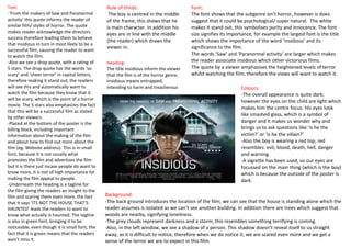
- 1. Text: Rule of thirds: Font: -‘From the makers of Saw and Paranormal The boy is centred in the middle The font shows that the subgenre isn’t horror, however is does activity’ this quote informs the reader of of the frame; this shows that he suggest that it could be psychological/ super natural. The white similar film/ styles of horror. The quote is main character. In addition his makes it stand out, this symbolises purity and innocence. The font makes reader acknowledge the directors eyes are in line with the middle size signifies its importance, for example the largest font is the title success therefore leading them to believe (the reader) which draws the which shows the importance of the word ‘insidious’ and its that insidious in turn in most likely to be a viewer in. significance to the film. successful film, causing the reader to want to watch the film. The words ‘Saw’ and ‘Paranormal activity’ are larger which makes -Also we see a drop quote, with a rating of Heading: the reader associate insidious which other victorious films. 5 stars. The drop quote has the words ‘so The title Insidious inform the viewer The quote by a viewer emphasises the heightened levels of terror scary’ and ‘sheer terror’ in capital letters, that the film is of the horror genre, whilst watching the film, therefore the views will want to watch it. therefore making it stand out, the readers insidious means entrapped, will see this and automatically want to intending to harm and treacherous Colours: watch the film because they know that it -The overall appearance is quite dark; will be scary, which is the point of a horror however the eyes on the child are light which movie. The 5 stars also emphasizes the fact makes him the centre focus. His eyes look that this will be a successful film as stated like smashed glass, which is a symbol of by other viewers. -Placed at the bottom of the poster is the danger and it makes us wonder why and billing block, including important brings us to ask questions like ‘is he the information about the making of the film victim?’ or ‘is he the villain?’ and about how to find out more about the -Also the boy is wearing a red top, red film (eg. Website address). This is in small resembles: evil, blood, death, hell, danger font, because it is not usually what and warning. promotes the film and advertises the film -A vigrette has been used, so our eyes are but it is there just incase people do want to focussed on the main thing (which is the boy) know more, it is not of high importance for which is because the outside of the poster is making the film appeal to people. dark. -Underneath the heading is a tagline for the film giving the readers an insight to the film and scaring them even more, the fact Background: that it says ‘ITS NOT THE HOUSE THAT’S -The back ground introduces the location of the film; we can see that the house is standing alone which the HAUNTED’ leads the readers to want to reader assumes is isolated as we can’t see another building. In addition there are trees which suggest that know what actually is haunted. The tagline woods are nearby, signifying loneliness. is also in green font, bringing it to be -The grey clouds represent darkness and a storm, this resembles something terrifying is coming. noticeable, even though it is small font, the -Also, in the left window, we see a shadow of a person. This shadow doesn’t reveal itself to us straight fact that it is green means that the readers away, as it is difficult to notice, therefore when we do notice it, we are scared even more and we get a won’t miss it. sense of the terror we are to expect in this film.