
Empfohlen
Weitere ähnliche Inhalte
Was ist angesagt?
Was ist angesagt? (20)
Andere mochten auch
Andere mochten auch (15)
Ähnlich wie 1st front cover analysis done
Ähnlich wie 1st front cover analysis done (20)
Mehr von johanna-asmedia
Mehr von johanna-asmedia (20)
Kürzlich hochgeladen
Kürzlich hochgeladen (20)
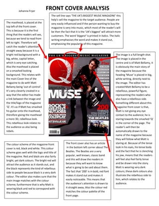
1st front cover analysis done
- 1. Johanna Fryer FRONT COVER ANALYSIS The sell line says ‘THE UK’S BIGGEST MUSIC MAGAZINE’ this help’s sell the magazine to the target audience. People are The masthead, is placed at the very easily influenced and if the person wanting to buy the top left of the front cover. magazine is very into music, which most of the reader’s will This is because it is the first be then the fact that it is the ‘UK’s biggest’ will attract more thing that the readers will see, customers. The word ‘biggest’ is printed in italics. The italic because we tend to read from writing emphasises the word and makes it stand out, left to right. Therefore will emphasising the popularity of this magazine. catch the reader’s attention straight away because it is a bright red background with a The image is a full length shot. big, white, capital letter, The image is placed in the which is very eye-catching. centre and is of Matt Bellamy, it Also the masthead is placed is obviously the main story of on a smashed looking the magazine because the background. This relates with heading ‘Muse’ is placed in big, the main Cover line of the white writing, directly next to magazine to do with Matt the image. The editor has Bellamy being ‘out of control’. created Matt Bellamy to be a It’s very cleverly created in a rebellious, powerful figure, way that the editor has made representing the readers who a link between the image and also have a rebellious side. the title/logo of the magazine Something different about this ‘Q’. It’s as if Matt has smashed magazine front cover is that, his guitar onto the masthead, Matt is not giving any eye therefore giving the masthead contact to the audience; he is a more 3D, rebellious look. staring towards the smashed ‘Q’ This rebellious look relates to in the corner of the page. The the audience as also being reader’s will then be rebels. automatically drawn to the name of the magazine because they will follow what Matt is The colour scheme of the magazine front The front cover also has an article staring at. Because of the tense cover is red, black and white. This colour in the bottom left corner about The look in his eyes, his tense body scheme goes well with the logo and title of Beatles. The Beatles are a very and the fact that he is clenching the magazine. Red and black are also fairly popular, well known, classic band his jaw, means that the readers bright, yet dark colours. The bright red will and this will draw the readers in will feel also feel fairly tense attract the audience as it stands out, and because they will want to know and be drawn into the story. the black represents the kind of rebellious what is going to be said about them. Matt is wearing very dark side to people because black is a very dark The fact that ‘200’ is in bold, red font colours; these dark colours also colour. The editor also makes sure that the makes it stand out and makes it illustrate the rebellious side to main image matches with the colour easily noticeable. This means that him, which relates to the scheme; furthermore that is why Matt is the audience’s attention is drawn to audience. wearing black and red to correspond with it straight away. Also the colour red the colour scheme. matches the colour palette of the front page.