
Empfohlen
Weitere ähnliche Inhalte
Was ist angesagt?
Was ist angesagt? (12)
Ähnlich wie Presentation
Ähnlich wie Presentation (20)
Kürzlich hochgeladen
Kürzlich hochgeladen (20)
Presentation
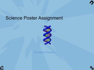
- 1. Science Poster Assignment By Jasper Cheyney
- 2. What was the brief? • To Design a Science recruitment poster for college in the style of steampunk, pop art or similar. • With the objective of making students choose science as an A-level course • Male and Female, however more females due to low number currently taking science
- 3. Different Art styles • Steampunk • 20th century sci-fi • Pop art • Victoriana • Cover book art
- 4. Steampunk images contain a strong main focal point usually a person or machine. Surrounding the focal point is a contrasting background to make the person stand out. Quirky gold, machinery on Victorian style actors Posing like they are having a painting of themselves.
- 5. Early 20th Century Sci-fi These Sci-fi posters all have quiet light pastel colours that reflect the era that they were made in. They all have a big evenT, flying train, rocket, king kong, huge man. The posters also have big title texts “King kong” and “URANUS” makes it stand out
- 6. Pop art consists of bright, contrasting colours Simple strokes of colour can Give numerous effects Comic book effect gives it a modern and appealing look for younger audiences Good for advertising as it is visually appealing and quick to read
- 7. Steam punk Brainstorm Machinery Jules verne Western STEAM POWERED Post-apocalyptic STEAMPUNK VICTORIANA FANTASY Industrial revolution
- 8. SCI-FI movie posters BRAINSTORM Fantasy ROBOTS METROPOLIS SOFT COLOURS SCI-FI MOVIE POSTERS invisibility LAND OF OZ H. G. WELLS Flying saucers (UFO)
- 9. POP ART BRAINSTORM Cartoon Comic strip Contrast Bright colours Eye catching Pop art Roy lichtenstein Iconic pop Figures Andy warhol 1950’s
- 10. POP ART SKETCHES
- 12. CHOSEN ART STYLE WHY? I chose… And a little bit of Steampunk Why?...... Bright colourful, eye catching, appealing to younger audiences Execution… Popart is bright, steampunk is dark, combination will be effective Darker backgrounds with bright foregrounds will make poster stand out…..
- 13. Examples of colour POP ART STYLE STEAMPUNK INFLUENCE
- 14. colour I’m going to use a combination of soft, and bright colours Here’s a couple of ideaS… + Pop art poster Combination of these colours With darker tones.
- 15. Examples of typography In these pop art related adverts they all share certain aspects • THICK, EASY TO READ SANS SERIF FONT • LARGE SIZED TITLE POSITIONED EITHER AT THE TOP OF THE PAGE, OR BOTTOM. • Main slogal short, relevant and simple and catchy (ABsOLUT WARHOL).
- 16. T pography Here are some similar typography styles used in the posters I acquired: Simple, sans serif & playful Bold, clear and striking Neat, minimalistic and professional Relevant, futuristic feel and legible However..
- 17. SLOGANS These are some slogans I thought of that could send the message across quickly and effectively • Get Serious, Get Science. • Whatever you’re into, get into science • You've Got Questions. We've Got Science • Is science in you? • COME TO LIFE, COME TO SCIENCE • Science Proves. • Stop asking and start answering, science.
- 18. Proposal I propose to use a Pop art + steampunk design style that will grab the students attention. + The colour scheme I will be using has been justified from my research + The typography that I intent to use will be Steampunk
Hinweis der Redaktion
- I really like the fact that it has a main focal point.
- Why.. Why.. Why…. And ‘Execution’ more people see it = more people choose science (in theory)
- Pastel colours will print well, and look professional
- I think that this (and next slide would be a good combination