
Recommended
More Related Content
What's hot
What's hot (18)
Viewers also liked
Viewers also liked (20)
Similar to Anaysis of contents page
Similar to Anaysis of contents page (20)
More from jamieleacrane
More from jamieleacrane (14)
Recently uploaded
Recently uploaded (20)
Anaysis of contents page
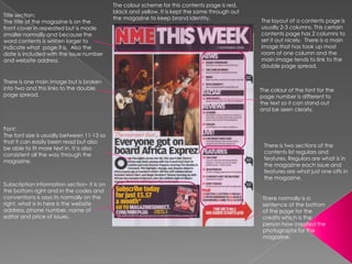
- 1. The colour scheme for this contents page is red, black and yellow. It is kept the same through out Title section: the magazine to keep brand identity. The layout of a contents page is The title of the magazine is on the front cover in repeated but is made usually 2-3 columns. This certain smaller normally and because the contents page has 2 columns to word contents is written larger to set it out nicely. There is a main indicate what page it is. Also the image that has took up most date is included with the issue number room of one column and the and website address. main image tends to link to the double page spread. There is one main image but is broken into two and this links to the double The colour of the font for the page spread. page number is different to the text so it can stand out and be seen clearly. Font: The font size is usually between 11-13 so that it can easily been read but also There is two sections of the be able to fit more text in. It is also contents list regulars and consistent all the way through the features. Regulars are what is in magazine. the magazine each issue and features are what just one offs in the magazine. Subscription information section- it is on the bottom right and in the codes and conventions is says its normally on the There normally is a right, what is in here is the website sentence at the bottom address, phone number, name of of the page for the editor and price of issues. credits which is the person how created the photographs for the magazine.