1. TOUCH Guidance WINDOWS 8
Use Windows 8 touch language
Windows 8 provides a concise set of touch interactions used consistently throughout the system.
Applying this language consistently makes your app feel familiar to what users already know. This
increases user confidence by making your app easier to learn and use.
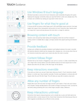
Use fingers for what they’re good at
VS.
A mouse and pen are precise, while fingers aren’t, and small targets require precision. Use large
targets that support direct manipulation and provide rich touch interaction data. Swiping down
on a large item is quick and easy because the entire item is a target for selection.
A B C Browsing content with touch
Semantic zoom and panning make reading and navigating content fast and fluid. Instead of
putting content in multiple tabs or pages, use large canvases that support panning and Semantic
ABC Zoom.
Provide feedback
Increase user confidence by providing immediate visual feedback whenever the screen is touched.
All interactive elements should react by changing color, changing size, or by moving. Items that are
not interactive should show system touch visuals only when the screen is touched.
Content follows finger
Elements that can be moved or dragged by a user, such as a canvas or a slider, should follow the
user’s finger when moving. Buttons and other elements that do not move should return to their
default state when the user slides or lifts their finger off the element.
Keep interactions reversible
If you pick up a book, you can put it back down where you found it. Touch interactions should
behave in a similar way—they should be reversible. Provide visual feedback to indicate what will
happen when the user lifts their finger. This will make your app safe to explore using touch.
Allow any number of fingers
People often touch with more than one finger and don’t even realize it. That’s why touch interac-
tions shouldn’t change radically based on the number of fingers touching the screen. Just like the
real world, sliding something with one or three fingers shouldn’t make a difference.
Keep interactions untimed
Interactions that require compound gestures such as double tap or press and hold need to be
performed within a certain amount of time. Avoid timed interactions like these because they are
often triggered accidentally and are difficult to time correctly.
2. TOUCH Language WINDOWS 8
Press and hold to learn
This touch interaction causes detailed information or teaching visuals (for example, a tooltip or
context menu) to be displayed without a commitment to an action. Anything displayed this way
should not prevent users from panning if they begin sliding their finger.
Tap for primary action
Tapping on an element invokes its primary action, for instance launching an application or
executing a command.
Slide to pan
Slide is primarily used for panning interactions but can also be used for moving, drawing or
writing. Slide can also be used to target small, densely packed elements by scrubbing (sliding
the finger over related objects such as radio buttons).
Swipe to select, command, and move
Sliding the finger a short distance, perpendicular to the panning direction, selects objects in a
list or grid (ListView and GridLayout controls). Display the AppBar with relevant commands when
objects are selected.
Pinch and stretch to zoom
While the pinch and stretch gestures are commonly used for resizing, they also enable jumping
to the beginning, end, or anywhere within content with Semantic Zoom. A SemanticZoom control
provides a zoomed out view for showing groups of items and quick ways to dive back into them.
Turn to rotate
Rotating with two or more fingers causes an object to rotate.
Swipe from edge for app commands
App commands are revealed by swiping from the bottom or top edge of the screen. Use the
AppBar to display app commands.
Swipe from edge for system commands
Swiping from the right edge of the screen reveals the charms which contain system commands.
Swiping from the left edge switches to previously used apps. Swiping from the top edge toward
the bottom edge of the screen lets you dock or close apps.
3. TOUCH Posture WINDOWS 8
Designing for touch is more than designing what’s displayed on which grip is used. However, the immediate environment and
the screen. It requires designing for how the device will be held physical comfort also affect how long a grip is used and how often
(grip). it’s changed.
Typically, different people have a few favorite grips when holding a Try optimizing your app for different kinds of grips. But if an
tablet. The current task and how it’s presented usually determines interaction naturally lends itself to a specific grip, optimize for that.
Interaction areas Reading areas
OK Best
Better Better
Best OK
Because slates are most often held along the side, the bottom Content in the top half of the screen is easier to see than content
corners and sides are ideal locations for interactive elements. in the bottom half, which is often blocked by the hands or ignored.
Four most common ways to hold a tablet:
GRIP AND INTERACTION DESIGN CONSIDERATIONS
One hand holding, one hand ◾ Right or bottom edges offer quick interaction
interacting with light to medium ◾ Lower right corner might be occluded by hand and wrist
interaction ◾ Limited reaching makes touching more accurate
◾ Reading, browsing, email, and light typing
Two hands holding, thumbs interact- ◾ Lower left and right corners offer quick interaction
ing with light to medium interaction ◾ Anchored thumbs increase touching accuracy
◾ Anything in the middle of the screen is difficult to reach
◾ Touching middle of screen requires changing posture
◾ Reading, browsing, light typing, gaming
Device rests on table or legs, two ◾ Bottom of the screen offers quick interaction
hands interacting with light to ◾ Lower corners might be occluded by hands and wrists
heavy interaction ◾ Reduced need for reaching makes touching more accurate
◾ Reading, browsing, email, heavy typing
Device rests on table or stand, ◾ Bottom of screen offers quick interaction
with or without interaction ◾ Touching top of the screen occludes content
◾ Touching top of screen might knock a docked device off balance
◾ Interaction at a distance reduces readability and accuracy
◾ Increase target size to improve readability and precision
◾ Watching a movie, listening to music
4. TOUCH Targets WINDOWS 8
Size vs. Efficiency: Target size influences error rate Fat fingers?
There’s no perfect size for touch targets. Different sizes work for different situations. Actions with People often blame themselves for
severe consequences (such as delete and close) or frequently used actions should use large touch having “fat fingers.” But even baby
targets with enough padding to avoid accidental taps. Infrequently used actions with minor conse- fingers are wider than most touch
quences can use small targets. targets.
% OF MISSED TAPS
Baby
25% 1 in 30 taps (3%) 1 in 100 (1%) 1 in 200 (0.5%)
will miss the target
20%
15%
8 mm
10%
9
5%
◾
◾ ◾
10
Target size 3 mm 5 mm 7 mm 9 mm 11 mm 13 mm
Average 11
index finger
width
12
7x7 mm: Recommended minimum size 13
7x7 mm is a good minimum size if touching the wrong target can be corrected in one or two
gestures or within five seconds. Padding between targets is just as important as target size. 14
7
15
7 mm = 40 pixels
16
2mm padding (10 pixels) between targets
17
18
WHEN ACCURACY MATTERS WHEN IT JUST WON’T FIT
19 mm
Close, delete, and other actions with severe If you find yourself cramming things to
consequences can’t afford accidental taps. fit, it’s okay to use 5x5 mm targets as
Use 9x9 mm targets if touching the wrong long as touching the wrong target can Basketball player
target requires more than two gestures, be corrected with one gesture. Using
five seconds, or a major context change to 2 mm of padding between targets is
correct. extremely important in this case.
9
5
9 mm = 50 pixels
5 mm = 30 pixels
2mm padding (10 pixels) between targets 2mm padding (10 pixels) between targets
Most people are right handed
Most people hold a slate with their left hand and touch it with their
vs.
right. In general, elements placed on the right side are easier to
touch, and putting them on the right prevents occlusion of the main
area of the screen.