
Recommended
More Related Content
What's hot
What's hot (20)
Similar to Ancillary Product 1 - Poster Textual Analysis
Similar to Ancillary Product 1 - Poster Textual Analysis (20)
More from gbarnstable
More from gbarnstable (20)
Recently uploaded
Recently uploaded (20)
Ancillary Product 1 - Poster Textual Analysis
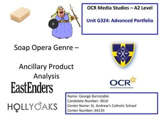
- 1. Soap Opera Genre – Ancillary Product Analysis Name: George Barnstable Candidate Number: 3010 Center Name: St. Andrew’s Catholic School Center Number: 64135 OCR Media Studies – A2 Level Unit G324: Advanced Portfolio
- 2. Tagline – The tagline is short and mysterious. The use of punctuation creates a pause as the reader reads the tagline. The verbal code “Forever” demonstrates that things will never be the same. Lastly, the importance of the verbal code location “Walford” is that it connotes to the viewer of the place in the show, EastEnders where the action is occurring. Main Image – The main image within this is very simple and plain. There is a grainy filter placed on the whole image to create a ghostly atmosphere. The image doesn’t give away much to the reader, once again creating a mysterious scenario. Synergy with social media – The use of the verbal code “#EastEnders” allows viewers to connect with the TV Drama through social media sites such as Twitter, where the Hashtag was popularized. This therefore engages the audience by allowing them to contribute and voice their opinion. It is also a good example of brand identity, therefore making the reader more likely to understand what show it is, if they had not seen EastEnders before. Institution Logo – the effectiveness of the BCC One logo is that it allows the audience to believe the poster is authentic and also lets the reader understand where to find the series. It is also a good example of Brand Identity.
- 3. Main Image – this image has clearly been edited and manipulated. The flame effect on each character determines that there is some ‘hot’ news that will ‘change Hollyoaks forever’. Institution Logo – The Channel 4 logo is effective in stating the authenticity of the poster as well as directing readers of where to view the show. The tagline also informs the audience about the start of the series, therefore they have everything they need simply by this poster. Tagline – The verbal code ‘forever’ denotes how the change is final and it will never revert back to normal. Additionally, the verbal code ‘change’ suggests nothing is going to be the same again. The use of this language creates suspense and tension and wants the audience wanting more.
- 4. Title – The title is bold, central and eye capturing. It is presented in a silver font with a shine in the centre. The importance of it being dead in the middle of the page is that it will be the first thing that readers see and therefore will become a recognisable series. Main image – The main image denotes each character in front of a road full of cars, denoting the location of the filming. This creates a good identity of the location where filming occurs. Tagline – The tagline “No one is safe” is in a smaller, more dark font compared to the title. The verbal code of ‘No one is safe’ connotes how each character is in danger which therefore causes suspense and tension. Social media – The poster also denotes how the show is socially active which allows the audience to connect with it online and voice their opinions about the series. Brand identity – The effectiveness of the BBC Two logo placed at the bottom left of the poster is that it informs the readers where the show is available and also what time to watch it when it is partnered with the verbal code “Weekdays at 8:30” Critical reviews – The 4 star reviews located at the top of the poster inform the audience of how good the series is. T also tells new readers who have never watched the show that it is a good watch and therefore they are more likely to watch it because of its good reviews.
- 5. Conclusion • In my Soap Opera promotional poster I would like to ‘repeat’ (Steve Neale – 1980) the use of social media. This is because social media is increasingly important in promoting posters and content. The use of social media also allows the audience to voice their opinion and connect with one and other. • I would also like to ‘repeat’ the position and effect used on the title and tagline in the poster. This is because this will be the first thing that the audience see and therefore creates recognisability. The dark effect on the tagline also creates a mysterious atmosphere. • Lastly, I would like to ‘repeat’ I would use the addition of brand identity in my poster, positioned at the bottom of the page. This is important because it informs the reader about where to view the series. I would partner this with the date and time the series begins.