2. HISTORY
The principle was developed by Vilfredo Pareto, an Italian economist and
sociologist who conducted a study in Europe in the early 1900s on wealth
and poverty.
He found that wealth was concentrated in the hands of the few and
poverty in the hands of the many.
The principle is based on the unequal distribution of things in the
universe.
Cim,Delhi-Ncr,Gzb
2
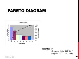
3. PARETO DIAGRAM
Pareto analysis is a technique for recording and analyzing
information relating to a problem or cause, which easily enables the
most significant aspects to be identified.
A Pareto diagram is a special form of vertical bar chart, or column
chart, which allows the information to be visually displayed.
This principle effectively states that the majority of errors come from
only a handful of causes. Or, in ratio terms, 80 percent of the
problems are linked to 20 percent of the causes. So, the point of this
tool is to focus on that 20 percent that causes the problems.
Cim,Delhi-Ncr,Gzb
3
4. WHEN TO USE A PARETO CHART
• When analyzing data about the frequency of problems or
causes in a process.
• When there are many problems or causes and you want to
focus on the most significant.
• When analyzing broad causes by looking at their specific
components.
• When communicating with others about your data.
Cim,Delhi-Ncr,Gzb
4
5. IT SHOWS HOW MANY CUSTOMER COMPLAINTS WERE
RECEIVED IN EACH OF FIVE CATEGORIES.
Cim,Delhi-Ncr,Gzb
5
6. Cim,Delhi-Ncr,Gzb
6
It takes the largest category, “documents,” from previous Example , breaks it
down into six categories of document-related complaints, and shows
cumulative values.
If all complaints cause equal distress to the customer, working on
eliminating document-related complaints would have the most impact,
and of those, working on quality certificates should be most fruitful.