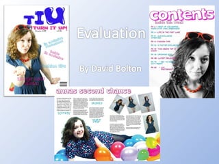
15. When creating my contents page I decided to challenge typical magazine conventions by having the picture on the contents page ‘dominating’ the page When creating this page I decided to use the same colours I have done for the front page and the double page, so it didn’t look odd. I also followed the typical music magazine conventions by highlighting the best articles and using these on the contents page, this encourages the reader to carry on reading the magazine and turn to that page.
16. For my double page spread I have written the artists name at the top of the page and I have also done a paragraph introducing the artist which music magazines regularly do, this also follows the conventions of a typical music magazine. When I was adding my article to my page on ‘InDesign’ I split the article up into different columns and picked out some words that will make the reader interested and want to read on, this follows the conventions of a music magazine. When I was creating this page I tried to use mainly the same colour I used in previous pages to keep the house style going, I used the same blue and pink colour to do this. The picture across the bottom of the magazine of my artist also dominates the page, which follows the typical conventions of a music magazine.
![[object Object],[object Object],[object Object]](data:image/gif;base64,R0lGODlhAQABAIAAAAAAAP///yH5BAEAAAAALAAAAAABAAEAAAIBRAA7)