Empfohlen

Empfohlen
Weitere ähnliche Inhalte
Mehr von dalbysiani
Mehr von dalbysiani (18)
Kürzlich hochgeladen
Kürzlich hochgeladen (20)
Graph
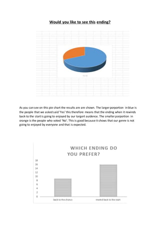
- 1. Would you like to see this ending? As you can see on this pie chart the results are are shown. The larger porportion in blue is the people that we asked said ‘Yes’ this therefore means that the ending when it rewinds back to the start is going to enjoyed by our targert auidence. The smaller porportion in orange is the people who voted ‘No’. This is good because it shows that our genre is not going to enjoyed by everyone and that is expected.