SlideShare a Scribd company logo
Contents page
11/12/13
I used the font "Morris" for the title of my contents page and decreased the tracking to make the text more
compact. I have chosen this font because not all the letters look a bit messy whilst still being clear and readable.
16/12/13
I've left some space at the top of the page for the main picture of my contents page which will be a picture of the
band Imperium. Underneath that, I've placed my headings: Features, News, Reviews, Regulars and Competitions
using the same font as the title, only in a smaller size. I have also started writing out my article titles and their
accompanying text in "Alte Haas Grotesk". For the article titles I've made the font bold and the size a little bit
smaller than the headings. As for the little bit of information underneath, I have used a slightly smaller font size than
the article title and kept the font style to regular.
16/12/13
Then I finished adding all the article information to the page and arranged the layout properly to accommodate the
texts and images present. I have also added a border and drop shadow to my images to make them stand out more
against the plain background.
19/12/13
I added more colour to the page by making the page numbers red and adding a red line under the headings. I have
made the lines slightly slanted so that it looks more creative and not too ordinary. Changing the colour of the page
numbers gives a very clear and visual separation between the pieces of written information which are close to each
other.
08/01/14
Through playing around and trying out different fonts, I have decided to change the fonts of my title and headings to
“Punk Rock Show”. I think this font gives more of a rock genre vibe because of the punk-style black blocks behind
each letter. I also changed the font of the issue information under the title, the headlines and the page numbers to
“Dirty Headline”. I had to increase the tracking of the letters, otherwise some particular letters would look like they
were stuck together and be very difficult to read. Finally, I added a small masthead to beside the title of the page,
and the page number at the corner of the page.
16/01/14
I placed all of my images on the page and moved around some of the text on the page. I added some black bars
behind the headings which I found particularly useful when I still hadn’t added on my main image. Because there
was a lot of empty space at the top right, I added the magazine’s website information there and edited the colour
scheme of the page. Firstly, I made the some parts of the website information red to highlight the magazine’s name.
Then I also changed the colour of the masthead from black to red, as well as the headings of each section from black
to red.
22/01/14
I changed the background colour of the page to black, therefore I had to also change the font colours in order for
them to be seen. I changed all the previously black text to white and all the other previously black shapes to white.

I also dragged the images out to the very edge of the pages and added captions and page numbers next to each
picture. For the page number, I used the font “Future Rot” in a size 12 font and for the captions I used “Alte Haas
Grotesk” in a size 7 font.
23/01/14
I switched the font colour of the title of the page to red and the masthead colour to white.
Then I added the subscription information at the top right of the page using the font “Broken Detroit”. To highlight
some of the key information, I made them red, and as for the “Subscribe Now” title, I made the size of it bigger so
that it stands out more.
I also moved the contact information and issue information to the right of the title, to make space for the
subscription information.
29/01/14
I added an image of the band in my double-page spread to this page and moved the articles around.
I also centred the subscription information at the top right of the page.
30/01/14
I moved the title and other information at the top of the page higher so that I could make more room for articles.
Then I removed the image of Nothing Yet and also decreased the size of Jakob Brennan’s image.

More Related Content

What's hot

Lesson 1_Website production 1_Research
Lesson 1_Website production 1_ResearchLesson 1_Website production 1_Research
Lesson 1_Website production 1_Research
bigtone2
 
Analysis of my front cover, contents page and double page spread - Progressio...
Analysis of my front cover, contents page and double page spread - Progressio...Analysis of my front cover, contents page and double page spread - Progressio...
Analysis of my front cover, contents page and double page spread - Progressio...
Amira Abdi
 
Textual analysis of ‘i do’ wedding page
Textual analysis of ‘i do’ wedding pageTextual analysis of ‘i do’ wedding page
Textual analysis of ‘i do’ wedding page
_kyramai
 
Drafts and analysis for magazine
Drafts and analysis for magazineDrafts and analysis for magazine
Drafts and analysis for magazine
asmediae12
 
Contents pages
Contents pagesContents pages
Contents pages
milliee16
 

What's hot (20)

Lesson 1_Website production 1_Research
Lesson 1_Website production 1_ResearchLesson 1_Website production 1_Research
Lesson 1_Website production 1_Research
 
Content page analysis (1)
Content page analysis (1)Content page analysis (1)
Content page analysis (1)
 
Content page analysis (1)
Content page analysis (1)Content page analysis (1)
Content page analysis (1)
 
Analysis of my front cover, contents page and double page spread - Progressio...
Analysis of my front cover, contents page and double page spread - Progressio...Analysis of my front cover, contents page and double page spread - Progressio...
Analysis of my front cover, contents page and double page spread - Progressio...
 
Magazine analysis
Magazine analysisMagazine analysis
Magazine analysis
 
Nme contents
Nme contentsNme contents
Nme contents
 
Feedback
FeedbackFeedback
Feedback
 
Media
MediaMedia
Media
 
Magazine analysis
Magazine analysisMagazine analysis
Magazine analysis
 
Textual analysis of ‘i do’ wedding page
Textual analysis of ‘i do’ wedding pageTextual analysis of ‘i do’ wedding page
Textual analysis of ‘i do’ wedding page
 
Contents page analysis
Contents page analysisContents page analysis
Contents page analysis
 
Drafts and analysis for magazine
Drafts and analysis for magazineDrafts and analysis for magazine
Drafts and analysis for magazine
 
Double page spreads
Double page spreadsDouble page spreads
Double page spreads
 
Double page spreads
Double page spreadsDouble page spreads
Double page spreads
 
Deconstructions
Deconstructions Deconstructions
Deconstructions
 
Textual analysis (student work)
Textual analysis (student work)Textual analysis (student work)
Textual analysis (student work)
 
Media Double Page Spread Analysis
Media Double Page Spread AnalysisMedia Double Page Spread Analysis
Media Double Page Spread Analysis
 
Contents pages
Contents pagesContents pages
Contents pages
 
Magazine analysis
Magazine analysisMagazine analysis
Magazine analysis
 
Changes
ChangesChanges
Changes
 

Viewers also liked

Viewers also liked (6)

That Thing Analysis
That Thing AnalysisThat Thing Analysis
That Thing Analysis
 
Article research
Article researchArticle research
Article research
 
Question 3
Question 3Question 3
Question 3
 
Types of Documentaries
Types of DocumentariesTypes of Documentaries
Types of Documentaries
 
Questionnaire Screenshots
Questionnaire ScreenshotsQuestionnaire Screenshots
Questionnaire Screenshots
 
Technologies2
Technologies2Technologies2
Technologies2
 

Similar to Making Contents Page (20)

Making DPS
Making DPSMaking DPS
Making DPS
 
Making DPS
Making DPSMaking DPS
Making DPS
 
Q1
Q1Q1
Q1
 
Construction part 1
Construction part 1Construction part 1
Construction part 1
 
Contents page analysis
Contents page analysisContents page analysis
Contents page analysis
 
Double page spread development diary
Double page spread development diaryDouble page spread development diary
Double page spread development diary
 
Music Magazine Screen Grabs
Music Magazine Screen GrabsMusic Magazine Screen Grabs
Music Magazine Screen Grabs
 
Front cover print screens
Front cover print screensFront cover print screens
Front cover print screens
 
Front cover analysis
Front cover  analysisFront cover  analysis
Front cover analysis
 
Double page spread development diary
Double page spread development diaryDouble page spread development diary
Double page spread development diary
 
Double Page Feature Analysis
Double Page Feature Analysis Double Page Feature Analysis
Double Page Feature Analysis
 
Double page spread production
Double page spread productionDouble page spread production
Double page spread production
 
Front cover (2)
Front cover (2)Front cover (2)
Front cover (2)
 
Double Page Spread Drafts
Double Page Spread DraftsDouble Page Spread Drafts
Double Page Spread Drafts
 
Contents page making
Contents page makingContents page making
Contents page making
 
Double page spread
Double page spreadDouble page spread
Double page spread
 
Creating my contents page
Creating my contents pageCreating my contents page
Creating my contents page
 
Production
ProductionProduction
Production
 
Editing Process
Editing ProcessEditing Process
Editing Process
 
Double Page Spread Processes
Double Page Spread ProcessesDouble Page Spread Processes
Double Page Spread Processes
 

More from ct04929306

More from ct04929306 (11)

Question 3
Question 3Question 3
Question 3
 
Question 3
Question 3Question 3
Question 3
 
Questionnaire Results
Questionnaire ResultsQuestionnaire Results
Questionnaire Results
 
Codes and Conventions of Interviews
Codes and Conventions of InterviewsCodes and Conventions of Interviews
Codes and Conventions of Interviews
 
The Music Biz Analysis
The Music Biz AnalysisThe Music Biz Analysis
The Music Biz Analysis
 
Types of Documentaries
Types of DocumentariesTypes of Documentaries
Types of Documentaries
 
Technologies2
Technologies2Technologies2
Technologies2
 
Audience feedback
Audience feedbackAudience feedback
Audience feedback
 
Who would be the audience
Who would be the audienceWho would be the audience
Who would be the audience
 
Questionnaire results
Questionnaire resultsQuestionnaire results
Questionnaire results
 
Contents Page Analysis
Contents Page AnalysisContents Page Analysis
Contents Page Analysis
 

Recently uploaded

IATP How-to Foreign Travel May 2024.pdff
IATP How-to Foreign Travel May 2024.pdffIATP How-to Foreign Travel May 2024.pdff
IATP How-to Foreign Travel May 2024.pdff
17thcssbs2
 

Recently uploaded (20)

An Overview of the Odoo 17 Discuss App.pptx
An Overview of the Odoo 17 Discuss App.pptxAn Overview of the Odoo 17 Discuss App.pptx
An Overview of the Odoo 17 Discuss App.pptx
 
IATP How-to Foreign Travel May 2024.pdff
IATP How-to Foreign Travel May 2024.pdffIATP How-to Foreign Travel May 2024.pdff
IATP How-to Foreign Travel May 2024.pdff
 
B.ed spl. HI pdusu exam paper-2023-24.pdf
B.ed spl. HI pdusu exam paper-2023-24.pdfB.ed spl. HI pdusu exam paper-2023-24.pdf
B.ed spl. HI pdusu exam paper-2023-24.pdf
 
Post Exam Fun(da) Intra UEM General Quiz 2024 - Prelims q&a.pdf
Post Exam Fun(da) Intra UEM General Quiz 2024 - Prelims q&a.pdfPost Exam Fun(da) Intra UEM General Quiz 2024 - Prelims q&a.pdf
Post Exam Fun(da) Intra UEM General Quiz 2024 - Prelims q&a.pdf
 
Incoming and Outgoing Shipments in 2 STEPS Using Odoo 17
Incoming and Outgoing Shipments in 2 STEPS Using Odoo 17Incoming and Outgoing Shipments in 2 STEPS Using Odoo 17
Incoming and Outgoing Shipments in 2 STEPS Using Odoo 17
 
Telling Your Story_ Simple Steps to Build Your Nonprofit's Brand Webinar.pdf
Telling Your Story_ Simple Steps to Build Your Nonprofit's Brand Webinar.pdfTelling Your Story_ Simple Steps to Build Your Nonprofit's Brand Webinar.pdf
Telling Your Story_ Simple Steps to Build Your Nonprofit's Brand Webinar.pdf
 
Post Exam Fun(da) Intra UEM General Quiz - Finals.pdf
Post Exam Fun(da) Intra UEM General Quiz - Finals.pdfPost Exam Fun(da) Intra UEM General Quiz - Finals.pdf
Post Exam Fun(da) Intra UEM General Quiz - Finals.pdf
 
Application of Matrices in real life. Presentation on application of matrices
Application of Matrices in real life. Presentation on application of matricesApplication of Matrices in real life. Presentation on application of matrices
Application of Matrices in real life. Presentation on application of matrices
 
Salient features of Environment protection Act 1986.pptx
Salient features of Environment protection Act 1986.pptxSalient features of Environment protection Act 1986.pptx
Salient features of Environment protection Act 1986.pptx
 
UNIT – IV_PCI Complaints: Complaints and evaluation of complaints, Handling o...
UNIT – IV_PCI Complaints: Complaints and evaluation of complaints, Handling o...UNIT – IV_PCI Complaints: Complaints and evaluation of complaints, Handling o...
UNIT – IV_PCI Complaints: Complaints and evaluation of complaints, Handling o...
 
Danh sách HSG Bộ môn cấp trường - Cấp THPT.pdf
Danh sách HSG Bộ môn cấp trường - Cấp THPT.pdfDanh sách HSG Bộ môn cấp trường - Cấp THPT.pdf
Danh sách HSG Bộ môn cấp trường - Cấp THPT.pdf
 
Championnat de France de Tennis de table/
Championnat de France de Tennis de table/Championnat de France de Tennis de table/
Championnat de France de Tennis de table/
 
Open Educational Resources Primer PowerPoint
Open Educational Resources Primer PowerPointOpen Educational Resources Primer PowerPoint
Open Educational Resources Primer PowerPoint
 
How to the fix Attribute Error in odoo 17
How to the fix Attribute Error in odoo 17How to the fix Attribute Error in odoo 17
How to the fix Attribute Error in odoo 17
 
How to Manage Notification Preferences in the Odoo 17
How to Manage Notification Preferences in the Odoo 17How to Manage Notification Preferences in the Odoo 17
How to Manage Notification Preferences in the Odoo 17
 
Pragya Champions Chalice 2024 Prelims & Finals Q/A set, General Quiz
Pragya Champions Chalice 2024 Prelims & Finals Q/A set, General QuizPragya Champions Chalice 2024 Prelims & Finals Q/A set, General Quiz
Pragya Champions Chalice 2024 Prelims & Finals Q/A set, General Quiz
 
....................Muslim-Law notes.pdf
....................Muslim-Law notes.pdf....................Muslim-Law notes.pdf
....................Muslim-Law notes.pdf
 
PART A. Introduction to Costumer Service
PART A. Introduction to Costumer ServicePART A. Introduction to Costumer Service
PART A. Introduction to Costumer Service
 
[GDSC YCCE] Build with AI Online Presentation
[GDSC YCCE] Build with AI Online Presentation[GDSC YCCE] Build with AI Online Presentation
[GDSC YCCE] Build with AI Online Presentation
 
The Benefits and Challenges of Open Educational Resources
The Benefits and Challenges of Open Educational ResourcesThe Benefits and Challenges of Open Educational Resources
The Benefits and Challenges of Open Educational Resources
 

Making Contents Page

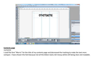
  • 1. Contents page 11/12/13 I used the font "Morris" for the title of my contents page and decreased the tracking to make the text more compact. I have chosen this font because not all the letters look a bit messy whilst still being clear and readable.
  • 2. 16/12/13 I've left some space at the top of the page for the main picture of my contents page which will be a picture of the band Imperium. Underneath that, I've placed my headings: Features, News, Reviews, Regulars and Competitions using the same font as the title, only in a smaller size. I have also started writing out my article titles and their accompanying text in "Alte Haas Grotesk". For the article titles I've made the font bold and the size a little bit smaller than the headings. As for the little bit of information underneath, I have used a slightly smaller font size than the article title and kept the font style to regular.
  • 3. 16/12/13 Then I finished adding all the article information to the page and arranged the layout properly to accommodate the texts and images present. I have also added a border and drop shadow to my images to make them stand out more against the plain background.
  • 4. 19/12/13 I added more colour to the page by making the page numbers red and adding a red line under the headings. I have made the lines slightly slanted so that it looks more creative and not too ordinary. Changing the colour of the page numbers gives a very clear and visual separation between the pieces of written information which are close to each other.
  • 5. 08/01/14 Through playing around and trying out different fonts, I have decided to change the fonts of my title and headings to “Punk Rock Show”. I think this font gives more of a rock genre vibe because of the punk-style black blocks behind each letter. I also changed the font of the issue information under the title, the headlines and the page numbers to “Dirty Headline”. I had to increase the tracking of the letters, otherwise some particular letters would look like they were stuck together and be very difficult to read. Finally, I added a small masthead to beside the title of the page, and the page number at the corner of the page.
  • 6. 16/01/14 I placed all of my images on the page and moved around some of the text on the page. I added some black bars behind the headings which I found particularly useful when I still hadn’t added on my main image. Because there was a lot of empty space at the top right, I added the magazine’s website information there and edited the colour scheme of the page. Firstly, I made the some parts of the website information red to highlight the magazine’s name. Then I also changed the colour of the masthead from black to red, as well as the headings of each section from black to red.
  • 7. 22/01/14 I changed the background colour of the page to black, therefore I had to also change the font colours in order for them to be seen. I changed all the previously black text to white and all the other previously black shapes to white. I also dragged the images out to the very edge of the pages and added captions and page numbers next to each picture. For the page number, I used the font “Future Rot” in a size 12 font and for the captions I used “Alte Haas Grotesk” in a size 7 font.
  • 8. 23/01/14 I switched the font colour of the title of the page to red and the masthead colour to white. Then I added the subscription information at the top right of the page using the font “Broken Detroit”. To highlight some of the key information, I made them red, and as for the “Subscribe Now” title, I made the size of it bigger so that it stands out more. I also moved the contact information and issue information to the right of the title, to make space for the subscription information.
  • 9. 29/01/14 I added an image of the band in my double-page spread to this page and moved the articles around. I also centred the subscription information at the top right of the page.
  • 10. 30/01/14 I moved the title and other information at the top of the page higher so that I could make more room for articles. Then I removed the image of Nothing Yet and also decreased the size of Jakob Brennan’s image.