Poster analysis girl with the dragon tattoo
•Als PPT, PDF herunterladen•
0 gefällt mir•638 views

Coursework

Empfohlen
Weitere ähnliche Inhalte
Was ist angesagt?
Was ist angesagt? (20)
Andere mochten auch
Andere mochten auch (20)
Ähnlich wie Poster analysis girl with the dragon tattoo
Ähnlich wie Poster analysis girl with the dragon tattoo (20)
Mehr von Matthew Cooper
Kürzlich hochgeladen
Kürzlich hochgeladen (20)
Poster analysis girl with the dragon tattoo
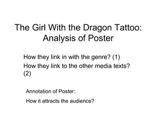
- 1. The Girl With the Dragon Tattoo: Analysis of Poster How they link in with the genre? (1) How they link to the other media texts? (2) Annotation of Poster: How it attracts the audience?
- 2. Poster Analysis Layout Colour Scheme (1)- The layout links in with the thriller/noire genre as it is quite simple yet effective as it is bleak and (1)- The genre is shown through the colours misty which gives the impression of the mystery which show the show and tell the audience and the confusion of the film which entices and that this film is going to be a very dark and excites the audience. The layout focus’s on the gritty film. Also with the shade on the characters which intrigues the audience and make characters faces shows that these them want to learn more about them. Clearly characters will be in danger and that the shows the genre with colouring and the bleakness central plotline will revolve around them. of the poster. (2)-The colour scheme of the poster (2)- Links with the poster as the same layout and matches that of the magazine cover in the colour scheme in the senses that it focus’s on the sense that it uses the grey tone which two characters with there facial expressions shows a sense of bleakness and danger virtually the same. The colour scheme is like the within the film. This is similar to the Empire poster in the sense that it continues the theme of magazine cover which uses the dark, bleak the bleak nature and the dark gritty nature which colours to portray the grittiness of the film. shows the thriller/noire genre. Image (1)-The image represents the genre well as it has both the characters on the poster but one looking away from the other which suggests that there is some friction between the two characters- relationship dynamic between the two detectives is crucial in thrillers and noire genre films as it is a central plotline for the audience to follow. Also the characters being shrouded in darkness also links in with the genre. (2)-The poster continues what the magazine cover did with the two characters appearing on the poster with serious expressions. This shows the film product is showing is consistency of the product by having the same characters and incorporating the same images into the different types of media. Image at bottom of the poster links in with trailer.
- 3. Annotation of Poster Layout Colour Scheme Simple and easy to understand. It attracts the audience with the Colour scheme is consistent simplicity of the poster by having and easy. The colour is used the image of the characters with in particularly to portray the genre the film and having simple colours. of the film. It is easy for the By having a relatively unknown audience to recognise and easy face in Rooney Mara in gives a for the audience to know the sense of mystery to the audience genre of the film and the tone but by having the well known face and setting of the film. of Daniel Craig it balances it out so audience can know information about the film. Image The image in the middle of the poster again shows off the simplicity which appears to be a target for the company as they want to make the audience be able to easily understand the product. As mentioned before, the poster is balanced by having a unknown face coupled with a well known face which works well and attracts the audience.