1. Preliminary Task Final version of coursework
What my developments were:Preliminary Task
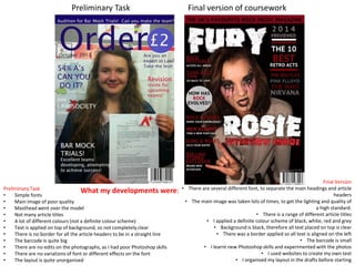
• Simple fonts
• Main image of poor quality
• Masthead went over the model
• Not many article titles
• A lot of different colours (not a definite colour scheme)
• Text is applied on top of background, so not completely clear
• There is no border for all the article headers to be in a straight line
• The barcode is quite big
• There are no edits on the photographs, as I had poor Photoshop skills
• There are no variations of font or different effects on the font
• The layout is quite unorganised
Final Version
• There are several different font, to separate the main headings and article
headers
• The main image was taken lots of times, to get the lighting and quality of
a high standard.
• There is a range of different article titles
• I applied a definite colour scheme of black, white, red and grey
• Background is black, therefore all text placed on top is clear
• There was a border applied so all text is aligned on the left
• The barcode is small
• I learnt new Photoshop skills and experimented with the photos
• I used websites to create my own text
• I organised my layout in the drafts before starting
2. Preliminary Task Final version of coursework
What my developments were:
Preliminary Task
• There was only two images of my model that I used
• There isn’t variation between the photos on the front cover
• My layout is not planned, a photograph goes out of the border
• There is text of both sides, instead of being aligned on the left
• It is quite plain and empty
• There are too many page numbers shown, instead of important ones
• The article titles are long, rather than short and snappy
• There are no details about the articles
• There are 3 colours used for the text, instead of 1 or 2
• There is not much space for advertisements in the page ordering
Final Version
• I used four different photographs of my model showing different emotions
• The colours and the poses change in the photographs, from the front cover
• I applied a border again to align all the contents
• All contents is aligned on the text on the left hand side
• I added editors notes, regulars, exclusives and subscriptions so it wasn’t plain
• I highlighted the important page numbers, instead of every page of the magazine
• The titles are short, snappy and conventional
• I added extra information about the articles
• The text was black and I highlighted important text red
• I made sure the page numbering was realistic, so there was space for
advertisements