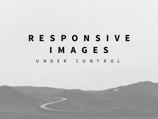
Responsive Images Under Control - Drupal Developer Days Seville 2017

Optimizing images can drastically decrease the page load time because, on average, 60% of a website’s page weight is made up of them. Responsive Web Design has changed how the web is built and that includes images too, because the aim is to deliver the highest quality image supported and nothing more. So today we have new standard elements and attributes to work with images widely supported by browsers (and polyfills for the rest) and Drupal has incorporated them. In Drupal 8 the Responsive Image module is in core and is prepared to solve a wide range of needs. And, as usually happens in Drupal, there are several contributed modules that help us to improve the basic needs or to solve the special ones, like <strong>Art Direction</strong>. I’ll start this session with a quick introduction about the different existing solutions for responsive images to be sure we are all at the same page. I’ll explain the difference between viewport sizing and Art Direction and how we are supposed to work with Drupal for each one, including demos. I’ll share tips and contrib modules that can make the developer and the final user live easier. When you leave this session you’ll have an idea about the options offered for Drupal and enough knowledge to choose the correct one for your project.

Recommended
Recommended
More Related Content
Viewers also liked
Recently uploaded
Recently uploaded (20)
Responsive Images Under Control - Drupal Developer Days Seville 2017
- 1. R E S P O N S I V E I M A G E S U N D E R C O N T R O L
- 2. T H A N K S !
- 3. T H A N K S !
- 4. @ c h u m i l l a s # d r u p a l d e v d a y s C R I S T I N A C H U M I L L A S D E S I G N E R & D R U P A L F R O N T E N D @chumillas ckrina
- 5. T H E B A S I C S R E S P O N S I V E I M A G E S I N D R U PA L A R T D I R E C T I O N W Y S I W Y G R E S P O N S I V E I M A G E S
- 6. @ c h u m i l l a s # d r u p a l d e v d a y s P A G E W E I G H T A V E R A G E 2016 2015 2014 2,26Mb 1,95Mb 2,48Mb +16% +15% +10%
- 7. @ c h u m i l l a s # d r u p a l d e v d a y s 6 1 % web traffic A S Y N C H R O N O U S request T O O B I G for the device F A C T S
- 8. @ c h u m i l l a s # d r u p a l d e v d a y s D E L I V E R T H E H I G H E S T Q U A L I T Y I M A G E S U P P O R T E D A N D N O T H I N G M O R E .
- 9. T H E B A S I C S
- 10. Variables known by: AUTHOR when she’s writing the code? BROWSER when it’s loading the page? viewport dimensions x YES image size relative to the viewport YES YES via sizes! screen density x YES source files’ dimensions YES YES via srcset! SOURCE https://ericportis.com/posts/2014/srcset-sizes S C A L E D I M A G E
- 11. srcset=“large.jpg 1440w, medium.jpg 960w, small.jpg 480w” sizes=“(min-width: 36em) 33.3vw, src=“medium.jpg” alt=“A road”> 100vw” <img S C A L E D I M A G E
- 12. srcset=“large.jpg 1440w, medium.jpg 960w, small.jpg 480w” W I D T H I N P I X E L Sw (1440px) (960px) (480px) <img
- 13. sizes=“(min-width: 36em) 33.3vw, 100vw” image { width: 100vw; } @media (min-width: 36em) { width: 33.3vw; } srcset=“large.jpg 1440w, medium.jpg 960w, small.jpg 480w” <img C S S M E D I A Q U E R I E Ssizes
- 14. srcset=“large.jpg 1440w, medium.jpg 960w, small.jpg 480w” sizes=“(min-width: 36em) 33.3vw, src=“medium.jpg” alt=“A road”> 100vw” <img S C A L E D I M A G E
- 15. S C A L E D I M A G E S
- 16. A R T D I R E C T I O N
- 17. <picture> @ c h u m i l l a s # d r u p a l d e v d a y s
- 18. <source srcset=“image-small.jpg 1x, image-small2x.jpg 2x” <img src=“image-big.jpg 180w” /> media=“(min-width: 0px) and (max-width: 29.99em)”> <source srcset=“image-big.jpg 1x, media=”(min-width: 30em)”> image-big2x.jpg 2x” </picture> sizes=”(min-width: 30em) 33vw”> <picture>
- 19. @ c h u m i l l a s # d r u p a l d e v d a y s P I C T U R E B R O W S E R S U P P O R T Same for srcret and sizes
- 20. @ c h u m i l l a s # d r u p a l d e v d a y s P I C T U R E F I L L B R O W S E R S U P P O R T A R E S P O N S I V E I M A G E P O L Y F I L L http://scottjehl.github.io/picturefill/
- 21. D R U P A L R E S P O N S I V E I M A G E S I N
- 22. @ c h u m i l l a s # d r u p a l d e v d a y s R E S P _ I M G > P I C T U R E B R E A K P O I N T D R U P A L 7 A D A P T I V E I M A G E S A I S ( A D A P T I V E I M A G E S T Y L E S ) C L I E N T- S I D E A D A P T I V E I M A G E C O M M I T E R S : J e l l e _ S , a t t i k s , …
- 23. @ c h u m i l l a s # d r u p a l d e v d a y s R E S P O N S I V E I M A G E S ( P i c t u r e ) B R E A K P O I N T Image,File,Field M O D U L E S
- 24. @ c h u m i l l a s # d r u p a l d e v d a y s Import/ create breakpoints Create Image styles Create Responsive Images Apply Responsive Images 1 2 3 4 P R O C E S S
- 25. @ c h u m i l l a s # d r u p a l d e v d a y s 1 W H E R E T H E M E S M O D U L E S B R E A K P O I N T S
- 26. @ c h u m i l l a s # d r u p a l d e v d a y s @media all and (min-width:851px) {/*CSS*/} 1 B R E A K P O I N T S W H A T A R E
- 27. I M A G E S T Y L E S By @marcdrummond https://www.youtube.com/watch?v=3BF5WE_NOIU P L A N 385px 480px +25% +25% 300px 385px 480px 240px 300px +25% 300px480px 385px 240px +25% 240px 385px 480px 2
- 28. @ c h u m i l l a s # d r u p a l d e v d a y s Import/ create breakpoints Create Image styles Apply Responsive Images 1 2 3 4 3 SCALED IMG PICTURE R E S P O N S I V E I M A G E S C R E A T E 3
- 29. @ c h u m i l l a s # d r u p a l d e v d a y s srcset=“large.jpg 1440w, medium.jpg 960w, small.jpg 480w” sizes=“(min-width: 36em) 33.3vw, src=“medium.jpg” alt=“A road”> 100vw” <img S C A L E D I M A G E
- 32. <img src=“image-big.jpg 180w” /> <source srcset=“image-big.jpg 1x, media=”(min-width: 30em)”> image-big2x.jpg 2x” </picture> sizes=”(min-width: 30em) 33vw”> <picture> A R T D I R E C T I O N
- 34. A R T D I R E C T I O N
- 35. @ c h u m i l l a s # d r u p a l d e v d a y s
- 36. @ c h u m i l l a s # d r u p a l d e v d a y s A R T D I R E C T I O N R E S P O N S I V E I M A G E S https://www.drupal.org/project/crop
- 37. @ c h u m i l l a s # d r u p a l d e v d a y s I M A G E W I D G E T C R O P https://www.drupal.org/project/image_widget_crop F U L L C O N T R O L
- 39. F U L L C O N T R O L L O N G I M P L E M E N T A T I O N G I V E S R E Q U I R E S
- 40. @ c h u m i l l a s # d r u p a l d e v d a y s https://www.drupal.org/project/focal_point F O C A L P O I N T A U T O M A T E D
- 41. @ c h u m i l l a s # d r u p a l d e v d a y s https://vimeo.com/204517287
- 42. B A S I C A R T D I R E C T I O N L O W E F F O R T G I V E S R E Q U I R E S ( R E A L L Y )
- 43. W Y S I W Y G
- 44. @ c h u m i l l a s # d r u p a l d e v d a y s I N S I D E W Y S I W Y G R E S P O N S I V E I M A G E S https://www.drupal.org/project/inline_responsive_images *https://www.drupal.org/node/2061377
- 45. @ c h u m i l l a s # d r u p a l d e v d a y s • Plan your Responsive Images before implementing. • Use Focal Point if you don’t need full control. C O N C L U S I O N S
- 46. T H A N K S ! @ c h u m i l l a s
- 47. Q U E S T I O N S