
Recommended
More Related Content
What's hot
Viewers also liked
Viewers also liked (20)
Similar to Web Design Evaluation.doc
Similar to Web Design Evaluation.doc (20)
More from butest
More from butest (20)
Web Design Evaluation.doc
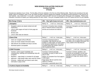
- 1. EDT 321 Web Design Evaluation WEB DESIGN EVALUATION CHECKLIST In-class Activity 5 Points Evaluate two websites of your choice. Put the URLs of the two websites in the first row of the following table. Rate the site according to the web design criteria of navigation, ease of use, the CRAP principles, audience appeal and suitability, and general overall impression in the columns for each website. Use a scale from 1 to 10, with 1 meaning the criteria was NOT met and 10 meaning the criteria was met completely. Please enter evaluation comments to explain your Rating decisions for each criteria. Post your completed project to your AFS space and link it to your website. Web Design Criteria URL: http://g3k.livejournal.com/ URL: http://yaledailynews.com 1. Navigation Rating: 10 (1=NOT met.. 10=Met totally) Rating: 10 (1=NOT met.. 10=Met totally) Navigation options are clearly marked and self- Comment: Innovative menu includes Comment: Navigation and links functional explanatory links on relevant words of song lyrics and helpful Links to other pages and back to home page are All links are functional and relevant functional All links work Links to other sites are relevant 2. Ease of Use Rating: 7 (1=NOT met.. 10=Met totally) Rating: 7 (1=NOT met.. 10=Met totally) Users can navigate without difficulty Comment: Download speed is Comment: Site is mostly easy to navigate Users can locate needed information easily acceptable. Help features are only and offers a lot of related information, but located on inside pages, but that’s where I was unable to find help features. Help features are available and easy to access the interactive features are. Information Download speed is acceptable is located below first screen’s worth of site for graphical effect. 3. CRAP Principles Rating: 6 (1=NOT met.. 10=Met totally) Rating: 8 (1=NOT met.. 10=Met totally) Contrast –colors support readability and Comment: Contrast generally Comment: Contrast, repetition, and understanding, headings and subheadings help with acceptable, but gray on black not as proximity are acceptable, but text does navigation easy to read. not stay in columns marked by colors. Repetition – page design is consistent for all pages Design not consistent from front page to Background image also repeats when it inside pages. shouldn’t. Alignment – page design helps users read the content Proximity – related items are close to each other, Page design OK but could be more information is easy to find helpful for reading. Information is generally easy to find. 4. Audience Appeal and Suitability Rating: 9 (1=NOT met.. 10=Met totally) Rating: 7 (1=NOT met.. 10=Met totally) Web design evaluation activity.doc Fall 04 Page 1
- 2. EDT 321 Web Design Evaluation Text is readable and in an appropriate font for the Comment: Text is generally readable but Comment: Advertisements a bit intended audience somewhat small, and media elements distracting, but most media elements Media elements enhance the content add to the content, spurring exploration. enhance the content. Text is readable, but the site could be more inviting. Advertising does not interfere with content The site invites the user to explore Web design evaluation activity.doc Fall 04 Page 2