Global income inequality 1700-2012: divergence then convergence
•
1 like•477 views

Compilation of Slides from Thomas Picketty, French Economist whose work focuses on wealth and income inequality. He argues a.o. that rates of return on capital in developed countries are persistently greater than economic growth rates, which results in increasing inequalities.

Recommended
Recommended
More Related Content
Similar to Global income inequality 1700-2012: divergence then convergence
Similar to Global income inequality 1700-2012: divergence then convergence (20)
More from Bruno Gremez
More from Bruno Gremez (16)
Recently uploaded
Recently uploaded (20)
Global income inequality 1700-2012: divergence then convergence
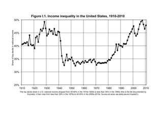
- 1. 25% 30% 35% 40% 45% 50% 1910 1920 1930 1940 1950 1960 1970 1980 1990 2000 2010 Shareoftopdecileinnationalincome Figure I.1. Income inequality in the United States, 1910-2010 The top decile share in U.S. national income dropped from 45-50% in the 1910s-1920s to less than 35% in the 1950s (this is the fall documented by Kuznets); it then rose from less than 35% in the 1970s to 45-50% in the 2000s-2010s. Sources and series: see piketty.pse.ens.fr/capital21c.
- 2. 30% 40% 50% 60% 70% 80% 90% 100% Figure 1.1. The distribution of world output 1700-2012 Asia America Africa 0% 10% 20% 1700 1820 1870 1913 1950 1970 1990 2012 Europe's GDP made 47% of world GDP in 1913, down to 25% in 2012. Sources and series: see piketty.pse.ens.fr/capital21c. Europe
- 3. 0% 10% 20% 30% 40% 50% 60% 70% 80% 90% 100% 1700 1820 1870 1913 1950 1970 1990 2012 Europe's popula,on made 26% of world popula,on in 1913, down to 10% in 2012. Sources and series: see piketty.pse.ens.fr/capital21c. Figure 1.2. The distribution of world population 1700-2012 Asia Europe America Africa
- 4. 0% 25% 50% 75% 100% 125% 150% 175% 200% 225% 250% 1700 1820 1870 1913 1950 1970 1990 2012 PercapitaGDP(%ofworldaverage) Per capita GDP in Asia-Africa went from 37% of world average in 1950 to 61% in 2012. Sources and series: see piketty.pse.ens.fr/capital21c. Figure 1.3. Global inequality 1700-2012: divergence then convergence? Europe-America World Asia-Africa
- 5. Per capita GDP Equivalent per capita monthly income World 7,050 100% 71,200 100% 10,100 € 760 € Europe 740 10% 17,800 25% 24,000 € 1,800 € incl. European Union 540 8% 14,700 21% 27,300 € 2,040 € incl. Russia/Ukraine 200 3% 3,100 4% 15,400 € 1,150 € America 950 13% 20,600 29% 21,500 € 1,620 € incl. United States/Canada 350 5% 14,300 20% 40,700 € 3,050 € incl. Latin America 600 9% 6,300 9% 10,400 € 780 € Africa 1,070 15% 2,800 4% 2,600 € 200 € incl. North Africa 170 2% 1,000 1% 5,700 € 430 € incl. Subsaharan Africa 900 13% 1,800 3% 2,000 € 150 € Asia 4,290 61% 30,000 42% 7,000 € 520 € incl. China 1,350 19% 10,400 15% 7,700 € 580 € incl. India 1,260 18% 4,000 6% 3,200 € 240 € incl. Japan 130 2% 3,800 5% 30,000 € 2,250 € incl. Other 1,550 22% 11,800 17% 7,600 € 570 € Sources: see piketty.pse.ens.fr/capital21c. Table 1.1: Distribution of world GDP, 2012 World GDP, estimated in purchasing power parity, was about 71 200 billion euros in 2012. World population was about 7.050 billion inhabitants, hence a per capita GDP of €10 100 (equivalent to a monthly income of about €760 per month). All numbers were rounded to the closed dozen or hundred (euros 2012) Population (million inhabitants) GDP (billion euros 2012)
- 6. 0 1,000 2,000 3,000 4,000 5,000 6,000 7,000 1700 1820 1870 1913 1950 1970 1990 2012 Worldpopulation(millionsinhabitants) World population rose from 600 million inhabitants in 1700 to 7 billion in 2012. Sources ans series: see piketty.pse.ens.fr/capital21c. Figure 2.1. The growth of world population 1700-2012 Asia Europe America Africa
- 7. 0,6% 0,8% 1,0% 1,2% 1,4% 1,6% 1,8% 2,0% Worldpopulationgrowthrate Figure 2.2. The growth rate of world population from Antiquity to 2100 UN projections (central scenario) Observed growth rates 0,0% 0,2% 0,4% 0,6% 0-1000 1000- 1500 1500- 1700 1700- 1820 1820- 1913 1913- 1950 1950- 1970 1970- 1990 1990- 2012 2012- 2030 2030- 2050 2050- 2070 2070- 2100 Worldpopulationgrowthrate The growth rate of world population was above 1% per year from 1950 to 2012 and should return toward 0% by the end of the 21st century. Sources and series: see piketty.pse.ens.fr/capital21c.
- 8. 1,5% 2,0% 2,5% 3,0% 3,5% 4,0% 4,5% 5,0%GrowthrateofpercapitaGDP Figure 2.3. The growth rate of per capita output since the industrial revolution Western Europe North America 0,0% 0,5% 1,0% 1,5% 1700-1820 1820-1870 1870-1913 1913-1950 1950-1970 1970-1990 1990-2012 GrowthrateofpercapitaGDP The growth rate of per capita output surpassed 4% per year in Europe between 1950 and 1970, before returning to American levels. Sources and series: see piketty.pse.ens.fr/capital21c
- 9. 0.0% 0.5% 1.0% 1.5% 2.0% 2.5% 3.0% 3.5% 4.0% 4.5% 5.0% 0-1000 1000-1500 1500-1700 1700-1820 1820-1913 1913-1950 1950-1990 1990-2012 2012-2030 2030-2050 2050-2070 2070-2100 GrowthrateofworldGDP The growth rate of world output surpassed 4% from 1950 to 1990. If the convergence process goes on it will drop below 2% by 2050. Sources and series: see piketty.pse.ens.fr/capital21c. Figure 2.5. The growth rate of world output from Antiquity until 2100 Projections (central scenario) Observed growth rates
- 10. -2% 0% 2% 4% 6% 8% 10% 12% 14% 16% 18% 20% 1700-1820 1820-1870 1870-1913 1913-1950 1950-1970 1970-1990 1990-2012 Inflationrate(consumerpriceindex) Inflation in rich countries was null during 18th-19th centuries, high during 20th century, and is about 2% per year since 1990. Sources and series: see piketty.pse.ens.fr/capital21c. Figure 2.6. Inflation since the industrial revolution France Germany United States Britain
- 11. Average annual growth rate World output World population Per capita output 0-1700 0.1% 0.1% 0.0% 1700-2012 1.6% 0.8% 0.8% incl.: 1700-1820 0.5% 0.4% 0.1% 1820-1913 1.5% 0.6% 0.9% 1913-2012 3.0% 1.4% 1.6% Table 2.1: World growth since the industrial revolution Between 1913 and 2012, the growth rate of world GDP was 3.0% per year on average. This growth rate can be broken down between 1.4% for world population and 1.6% for per capita GDP. Sources: see piketty.pse.ens.fr/capital21c.
- 12. 200% 300% 400% 500% 600% 700% 800% Valueofprivateandpubliccapital(%nationalincome) Figure 5.1. Private and public capital: Europe and America, 1870-2010 United States Europe Public Private capital -100% 0% 100% 200% 1870 1890 1910 1930 1950 1970 1990 2010 Valueofprivateandpubliccapital(%nationalincome) The fluctuations of national capital in the long run correspond mostly to the fluctuations of private capital (both in Europe and in the U.S.). Sources and series: see piketty.pse.ens.fr/capital21c. Public capital
- 13. 100% 200% 300% 400% 500% 600% 700% 800% 1970 1975 1980 1985 1990 1995 2000 2005 2010 Valueofprivatecapital(%nationalincome) Private capital is worth between 2 and 3.5 years of national income in rich countries in 1970, and between 4 and 7 years of national income in 2010. Sources and series: see piketty.pse.ens.fr/capital21c. Figure 5.3. Private capital in rich countries, 1970-2010 U.S. Japan Germany France U.K. Italy Canada Australia
- 14. -100% 0% 100% 200% 300% 400% 500% 600% 700% 800% 1970 1975 1980 1985 1990 1995 2000 2005 2010 Valueofcapital(%nationalincome) In Italy, private capital rose from 240% to 680% of national income between 1970 and 2010, while public capital dropped from 20% to -70%. Sources and series: see piketty.pse.ens.fr/capital21c. Figure 5.5. Private and public capital in rich countries, 1970-2010 U.S. Japan Germany France U.K. Italy Canada Australia Public capital Private capital
- 15. 4.6% 3.1% 60% 40% 6.8% 7.8% 47% 53% 9.4% 2.8% 77% 23% 9.0% 2.1% 81% 19% 2.8% 4.6% 38% 62% 14.6% 0.4% 97% 3% 7.2% 4.9% 60% 40% 5.9% 3.9% 60% 40% Table 5.2. Private saving in rich countries, 1970-2010 U.S. 7.7% Japan incl. Corporate net saving (net retained earnings) Private saving (net of depreciation) (% national income) France 11.1% incl. Household net saving Canada 14.6% Germany 12.2% Sources: see piketty.pse.ens.fr/capital21c Italy 15.0% U.K. Australia 9.9% 12.1% 7.4% A large part (variable across countries) of private saving comes from corporate retained earnings (undistributed profits).
- 16. 0% 20% 40% 60% 80% 100% 120% 140% 160% 1970 1975 1980 1985 1990 1995 2000 2005 2010 Ratiobetweenmarketvalueandbookvalueofcorporations Tobin's Q (i.e. the ratio between market value and book value of corporations) has risen in rich countries since the 1970s-1980s. Sources and series: see piketty.pse.ens.fr/capital21c. Figure 5.6. Market value and book value of corporations U.S. Japan Germany France U.K. Canada
- 17. 400% 500% 600% 700% 800% Valueofprivatecapital(%nationalincome) Figure 5.8. The world capital/income ratio, 1870-2100 Observed series Projections (central scenario) 100% 200% 300% 1870 1890 1910 1930 1950 1970 1990 2010 2030 2050 2070 2090 Valueofprivatecapital(%nationalincome) According to simulations (central scenario), the world capital/income ratio could be near to 700% by the end of the 21st century. Sources and series: see piketty.pse.ens.fr/capital21c.
- 18. 12.1% -2.0% U.S. 5.2% 14.6% Germany 10.2% 14.5% 7.6% 12.2% 11.1% -1.9% -2.4% France 9.2% Japan -2.0% 0.1% Table 5.4. Private and public saving in rich countries, 1970-2010 National saving (private + public) (net of depreciation) (% national income) incl. Private saving incl. Public saving Sources: voir piketty.pse.ens.fr/capital21c U.K. 5.3% Italy 8.5% Canada Australia 8.9% 15.0% A large part (variable across countries) of private saving is absorved by public deficits, so that national saving (private + public) is less than private saving. 10.1% 9.8% 7.3% -2.0% -6.5% -0.9%
- 19. including: the top 1% ("dominant class") including: the next 9% ("well- to-do class") 30% Share of different groups in total capital 20% The top 10% "Upper class" Medium- high inequality (≈ Europe 2010) 60% 35% 5% Medium inequality (≈ Scandinavia, 1970s-1980s) 50% 20% 30% Table 7.2. Inequality of capital ownership across time and space 35% Very high inequality (≈ Europe 1910) High inequality (≈ U.S. 2010) Low inequality (never observed; ideal society?) 10% 40% 25% 90%70% 50% 45% 40% 10% 5% 5%25% 35% 5% 35% The middle 40% "Middle class" The bottom 50% "Lower class" 25% In societies with "medium" inequality of capital ownership (such as Scandinavian countries in the 1970s-1980s), the top 10% richest in wealth own about 50% of aggregate wealth, the bottom 50% poorest about 10%, and the middle 40% about 40%. The corresponding Gini coefficient is equal to 0.58. See technical appendix. 0.33 0.73 0.85 Corresponding Gini coefficient (synthetic inequality index) 0.58 0.67
- 20. 25% 30% 35% 40% 45% 50% 1910 1920 1930 1940 1950 1960 1970 1980 1990 2000 2010 Shareoftopdecileinnationalincome The top decile income share rose from less than 35% of total income in the 1970s to almost 50% in the 2000s-2010s. Sources and series: see piketty.pse.ens.fr/capital21c. Figure 8.5. Income inequality in the United States, 1910-2010 Share of top decile in total income (incl. capital gains) Excl. capital gains
- 21. 20% 25% 15% 35% 25% 30% 40% 30%18% 30%45% including: the next 9% ("well-to-do class") Table 7.3. Inequality of total income (labor and capital) across time and space 25% Very high inequality (≈ U.S. 2030 ?) Medium inequality (≈ Europe 2010) Low inequality (≈ Scandinavia, 1970s- 80s) 7% 25% Share of different groups in total income (labor + capital) High inequality (≈ U.S. 2010, Europe 1910) 60%35% The top 10% "Upper class" 50% 10% including: the top 1% ("dominant class") The middle 40% "Middle class" 20% 0.49 In societies where the inequality of total income is relatively low (such as Scandinavian countries during the 1970s-1980s), the 10% highest incomes receive about 20% of total income, the 50% lowest income receive about 30%. The corresponding Gini coefficient is equal to 0.26. See technical appendix. 0.26 0.36 0.58 Corresponding Gini coefficient (synthetic inequality index) 25% The bottom 50% "Lower class"
- 22. 0% 2% 4% 6% 8% 10% 12% 14% 16% 18% 20% 22% 24% 1910 1920 1930 1940 1950 1960 1970 1980 1990 2000 2010 Shareoftoppercentileintotal(incomesorwages) The rise in the top 1% highest incomes since the 1970s is largely due to the rise in the top 1% highest wages. Sources and series: see piketty.pse.ens.fr/capital21c. Figure 8.8. The transformation of the top 1% in the United States Share of top income percentile in total income Excl. capital gains Share of top wage percile in total wage bill
- 23. 0% 1% 2% 3% 4% 5% 6% 7% 8% 9% 10% 11% 12% 1910 1920 1930 1940 1950 1960 1970 1980 1990 2000 2010 Shareoftop0.1%intotalincome The share of the top 0.1% highest incomes in total income rose sharply since the 1970s in all Anglo-saxon countries, but with varying magnitudes. Sources and series: see piketty.pse.ens.fr/capital21c. Figure 9.5. The top 0.1% income share in Anglo-saxon countries, 1910-2010 U.S. U.K. Canada Australia
- 24. 25% 30% 35% 40% 45% 50% 1900 1910 1920 1930 1940 1950 1960 1970 1980 1990 2000 2010 Shareoftopdecileintotalincome The top decile income share was higher in Europe than in the U.S. in 1900-1910; it is a lot higher in the U.S. in 2000-2010. Sources and series: see piketty.pse.ens.fr/capital21c. Figure 9.8. Income inequality: Europe vs. the United States, 1900-2010 U.S. Europe
- 25. 0% 1% 2% 3% 4% 5% 6% 0-1000 1000-1500 1500-1700 1700-1820 1820-1913 1913-1950 1950-2012 2012-2050 2050-2100 Annualrateofreturnorrateofgrowth The rate of return to capital (after tax and capital losses) fell below the growth rate during the 20th century, and may again surpass it in the 21st century. Sources and series : see piketty.pse.ens.fr/capital21c Figure 10.10. After tax rate of return vs. growth rate at the world level, from Antiquity until 2100 Pure rate of return to capital (after tax and capital losses) Growth rate of world output g
- 26. 0 400 800 1,200 1,600 2,000 2,400 0 1,000 2,000 3,000 4,000 5,000 6,000 1987 1990 1993 1996 1999 2002 2005 2008 2011 Between 1987 and 2013, the number of $ billionaires rose according to Forbes from 140 to 1400, and their total wealth rose from 300 to 5 400 billion dollars. Sources and series: see piketty.pse.ens.fr/capital21c. Figure 12.1. The world billionaires according to Forbes, 1987-2013 Total wealth of billionaires (billion of $) (left hand scale) Number of $ billionaires in the world (right hand scale) ,
- 27. 0% 100% 200% 300% 400% 500% 600% 700% 800% 1870 1890 1910 1930 1950 1970 1990 2010 2030 2050 2070 2090 Valueofprivatecapital(%nationalincome) According to the central scenario, Asian countries should own about half of world capital by the end of the 21st century. Sources and series: see piketty.pse.ens.fr/capital21c. Figure 12.5. The distribution of world capital 1870-2100 Asia Europe America Africa
- 28. 20% 30% 40% 50% 60% Totaltaxrevenues(%nationalincome) Figure 13.1. Tax revenues in rich countries, 1870-2010 Sweden France U.K. U.S. , 0% 10% 1870 1890 1910 1930 1950 1970 1990 2010 Totaltaxrevenues(%nationalincome) Total tax revenues were less than 10% of national income in rich countries until 1900-1910; they represent between 30% and 55% of national income in 2000-2010. Sources and series: see piketty.pse.ens.fr/capital21c.
- 29. 40% 50% 60% 70% 80% 90% 100% Marginaltaxrateapplyingtothehighestincomes Figure 14.1. Top income tax rates, 1900-2013 U.S. U.K. 0% 10% 20% 30% 1900 1910 1920 1930 1940 1950 1960 1970 1980 1990 2000 2010 Marginaltaxrateapplyingtothehighestincomes The top marginal tax rate of the income tax (applying to the highest incomes) in the U.S. dropped from 70% in 1980 to 28% in 1988. Sources and series: see piketty.pse.ens.fr/capital21c. U.K. Germany France
- 30. 40% 50% 60% 70% 80% 90% 100% Topmarginaltaxrateapplyingtothehighestinheritances Figure 14.2. Top inheritance tax rates, 1900-2013 U.S. U.K. Germany France 0% 10% 20% 30% 1900 1910 1920 1930 1940 1950 1960 1970 1980 1990 2000 2010 Topmarginaltaxrateapplyingtothehighestinheritances The top marginal tax rate of the inheritance tax (applying to the highest inheritances) in the U.S. dropped from 70% in 1980 to 35% in 2013. Sources and series: see piketty.pse.ens.fr/capital21c.