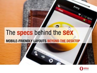
The specs behind the sex, mobile-friendly layout beyond the desktop
•
1 gefällt mir•2,357 views


Empfohlen
Empfohlen
Weitere ähnliche Inhalte
Was ist angesagt?
Was ist angesagt? (20)
Andere mochten auch
Ähnlich wie The specs behind the sex, mobile-friendly layout beyond the desktop
Ähnlich wie The specs behind the sex, mobile-friendly layout beyond the desktop (20)
Mehr von betabeers
Mehr von betabeers (20)
The specs behind the sex, mobile-friendly layout beyond the desktop
- 1. The specs behind the sex MOBILE-FRIENDLY LAYOUTS BEYOND THE DESKTOP
- 2. Zeldman pic by Tony Quartarolo
- 14. 1. Special mobile site 2. Do nothing at all 3. Optimise for mobile
- 15. 1. Special mobile site 2. Do nothing at all 3. Optimise for mobile
- 16. refactored for small screen, not dumbed down for mobile
- 17. offer users choice: desktop or mobile?
- 18. beware browser sniffing photo: http://www.flickr.com/photos/timdorr/2096272747/
- 19. 1. Special mobile site 2. Do nothing at all 3. Optimise for mobile
- 20. not WAP or text anymore...
- 21. 1. Special mobile site 2. Do nothing at all 3. Optimise for mobile
- 23. CSS 2 Media Types
- 24. Media types all braille embossed handheld print projection screen speech tty tv
- 25. CSS 3 Media Queries “...the new hotness” Jeffrey Zeldman http://www.zeldman.com/2010/04/08/best-aea-yet/
- 26. CSS 3 Media Queries ● builds on CSS 2.1 Media Types concept ● more granular control (not just screen, print...) http://www.w3.org/TR/css3-mediaqueries/
- 27. Media features width color height color-index device-width monochrome device-height resolution orientation scan aspect-ratio grid device-aspect-ratio
- 28. CSS 3 Media Queries <link rel="stylesheet" ... media="screen and (max-width:480px)" href="..."> @import url("...") screen and (max-width:480px); @media screen and (max-width:480px) { // insert CSS rules here }
- 29. Multiple expressions – and keyword @media screen and (min-width:180px) and (max- width:480px) { // screen device and width > 180px // and width < 480px }
- 30. Multiple expressions – comma separated @media screen and (min-width:800px), print and (min-width:20em) { // screen device with width > 800px // or print device with width > 20em }
- 31. Negative expressions – not keyword @media not screen and (min-width:800px) { // not applied to screen device // with width > 800px }
- 32. Exclusive expressions – only keyword @media only screen and (min-width:800px) { // only applied to screen device // with width > 800px }
- 33. Multiple media queries /* “The absence of a media query is the first media query” Bryan Rieger */ @media screen and (max-width:480px) { // screen device and width < 480px } @media screen and (max-width:980px) { // screen device and width < 980px } @media screen and (min-width:980px) { // screen device and width > 980px }
- 41. viewport meta suggests an initial layout viewport and zoom
- 42. physical vs virtual pixels
- 45. viewport meta <meta name="viewport" content="width=device-width"> <meta name="viewport" content="width=320, initial- scale=2.3,user-scalable=no"> http://developer.apple.com/safari/library/documentation/AppleApplications/Reference/SafariWebContent/UsingtheViewport/UsingtheViewport.html
- 49. If you're using Media Queries: <meta name="viewport" content="width=device-width"> If you have an explicit width: <meta name="viewport" content="width=550">
- 50. Viewport properties width initial-scale height minimum-scale user-scalable maximum-scale
- 51. high-dpi devices lie twice
- 53. CSS Device Adaptation @viewport { width: 320px; zoom: 2.3; user-zoom: fixed; } www.w3.org/TR/css-device-adapt only works in Opera Mobile 11+ at the moment, with -o- prefix dev.opera.com/articles/view/an-introduction-to-meta-viewport-and-viewport
- 54. Viewport properties width / min-width / max-width user-zoom height / min-height / max-height orientation zoom / min-zoom / max-zoom resolution
- 55. <meta name="viewport" content="width=550"> @-o-viewport { width: 550px; }
- 56. <meta name="viewport" content="width=550,maximum-scale=1.0, target-densitydpi=device-dpi"> @-o-viewport { width: 550px; max-zoom: 1; resolution: device; }
- 57. /* selective viewport via CSS */ @media … { @-o-viewport { … /* for propellerheads */ } }
- 58. <meta name="viewport" content="width=550,maximum- scale=1.0,target-densitydpi=device-dpi"> @media screen { @-o-viewport { /* undo meta viewport settings */ width: auto; max-zoom: auto; } } @media screen and (max-device-width: 550px) { @-o-viewport { /* 550px viewport on small screen devices */ width: 550px; } }
- 62. <meta name="viewport" content="width=550,maximum- scale=1.0,target-densitydpi=device-dpi"> @media screen { @-o-viewport { /* undo meta viewport settings */ width: auto; max-zoom: auto; } } @media screen and (max-device-width: 550px) { @-o-viewport { /* 550px viewport on small screen devices */ width: 550px; } }
- 63. @-o-viewport { /* minimum of 550px viewport width */ width: 550px auto; max-zoom: auto; }
- 64. The future
- 65. matchMedia if (window.matchMedia("(min-width: 400px)").matches) { /* the view port is at least 400 pixels wide */ } else { /* the view port is less than 400 pixels wide */ } For IE9+ and Opera, polyfill github.com/paulirish/matchMedia.js/
- 67. lowsrc <img src=hires.jpg lowsrc=lores.jpg alt="blah"> Both images are download; never in spec
- 68. Apple way <img src=lores.jpg data-src=hires.jpg alt="blah"> Both images are download; requires JS for hires image
- 69. adaptive-images.com Add .htaccess and adaptive-images.php to your document- root folder. Add one line of JavaScript into the <head> of your site. Add your CSS Media Query values into $resolutions in the PHP file.
- 70. Super WebKit-tastic CSS selector {background: image-set (url(foo-lowres.png) 1x, url(foo-highres.png) 2x) center;} selector {background: image-set (url(foo-lowres.png) 1x low-bandwidth, url(foo-highres.png) 2x high-bandwidth);} http://lists.w3.org/Archives/Public/www-style/2012Feb/1103.html
- 71. .. extrapolate to HTML? <img src=foo-lowres.png set="foo-lowres.png 1x, foo-highres.png 2x" alt="blah"> "I'll post something to the whatwg thread referencing this proposal."
- 72. video and Responsive Web Design <video> <source … media="(min-width:1000px)"> <source … media="(max-width:1000px)"> </video>
- 73. Adaptive Image Element <picture> <source … media="(min-width:1000px)"> <source … media="(max-width:1000px)"> </picture> www.brucelawson.co.uk/2011/notes-on-adaptive-images-yet-again/ http://www.w3.org/community/respimg/
- 74. <picture alt=… > <source … media="(min-width:1000px)"> <source … media="(max-width:1000px)"> <img src=… alt=…> </picture>
- 75. “not a magic bullet...”
- 76. Good or evil? Florian Rivoal
- 77. Note to people who weren't at the talk: following slides are strawman ideas for the next iteration of Media Queries (CSS 4) and are almost certainly to be completely different if they ever make it into the specification. (CSS 3 MQs became a "Proposed Recommendation", eg a "Standard" week of 23 April 2012, so very early days!)
- 78. @media screen and (script) {...} @media screen and not (script) {…} http://lists.w3.org/Archives/Public/www-style/2012Jan/0034.html
- 79. @media (paged) and (interactive:0) { // I am like a printer } @media (paged) and (interactive) { // I'm a projector, or like a Kindle } @media (paged) and (interactive) and (touch) { // I'm like a touch-screen Kindle }
- 80. @media (touch) and (max-width: 480) { // looks like an smart phone } @media (touch) and (keyboard) and (min-width:600) { // looks like a touch-screen laptop }
- 81. @media (remote) { // TV or set-top box? } @media (remote) and (hover) { // Wii? }
- 83. @media (network: v-slow) {..} Florian: "It has been proposed. Most people agree that it would be cool, nobody has a clue about how to spec it in a way that is useful and implementable. If you find people with a clue, encourage them to submit proposals to me or to www-style@w3.org. Use [css4-mediaqueries] in the subject line, and read lists.w3.org/Archives/Public/www- style/2012Mar/0691.html first."
- 84. “embrace the fluidity, don't fight it”