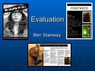
2. Conventions This is my front cover for my music magazine as you can see the picture is not the most conventional as it has a black and white medium close-up for the photo for the background. This is not done on many music magazine but I wanted to do it as I think black and white colours can link with the genre of the music magazine. I got the idea of the picture and the border going around it from a picture I liked on Google of Dizzee rascal. I used this picture for a prelim which I did for my front cover and I liked the way it was set out. The title which I used is conventional and I got the idea from one of the kerrang covers. I liked this because I thought the title standout out and added a conventional title to the magazine cover. Kerrang is also a rock magazine so I thought it was a good idea to use the same idea. I added a barcode to my music magazine which is very conventional because all music magazine have them they do this to make them look professional I also wanted my barcode on the side which is conventional because most magazines barcodes are on there side. The border at the bottom of the page which I used is also conventional because magazines such has Q have them to show the reader that there are more artist in this weeks magazine. Another conventional thing I have done is put the sub headings down the left hand side which a lot of music magazines do such as blender.
3.
4. Conventions I have gone for a conventional double page spread which has an interview form a music artist on and pictures of them on the pages. I decided to go for this approach because a lot of music magazines do this and I thought it would work well. I have also decided to go for another conventional thing which music magazines use when doing an interview which is picking a quote from the interview and making it bigger to make it stand out and catch the readers eye. The pictures I have used are also conventional and I got the idea from the music magazine radar. The title I used also came from the magazine radar. I thought it linked the picture with the interview and linked both pages together which is very conventional because a lot of music magazines do this. I have tried to keep the colour scheme the same all the way through which a lot of magazine do to make them more professional.
5.
6.
7.
8.
9.
10.
11.
12. Front Cover Prelim To Final Product This is my final music magazine and my prelim which I did at the very start. I have developed me music magazine a lot from the prelim. I have added borders around the edge of the page which I learnt to do from layering on firework. I think that this makes the picture which I have used on my magazine stand out a lot more than on my prelim. I have also added a price on my music magazine to make it look more professional which I found out a lot of music magazines have form the research I did. The fonts I have used for my masthead and sub headings are totally different to the ones on my prelim I have tried to use fonts which can link to the genre of music my magazine is. I got these fonts from da font a new website which I learnt about my doing the project. On my prelim I have used two pictures which I didn’t think looked very good after I had finished my prelim so on my final front cover I used one picture which Is a medium close up instead of a two shot which I used on my prelim. Another thing which I have changed from my prelim is where the subheadings are placed I have put them going down the side instead of in the middle. I have done this because most magazines are set out like this and I wanted my magazine to look as professional as possible. The border which I have done at the bottom of the page for my final product is also something which I added from looking at more music magazines because I wanted to add as much information as possible and thought it was a good idea because it doesn’t take up much space and can still get the information across. One thing I have kept the same from my prelim is having a barcode I added this on both designs because most magazines have them, but I wanted it In a different position because I think it looked more proffesional placed vertical than horizontal.
13. Contents Prelim To Final Product This is my prelim and my final product for my contacts page. I have developed my final product a lot from my prelim. I have used a border on my final product to make the page stand out and kept consistency from my front cover. On my prelim I didn’t put that much information on so for my final product I wanted to add more information about what is in the magazine. I also added sub heading titles to split the sections up in the magazine where on my prelim they all went straight down the page. The fonts I have used are also different to my prelim, I changed these because I wanted the fonts to try and link with the genre of music the magazine was about. I thought the fonts I used in my prelim where unprofessional and looked tacky. The colour scheme I used on my prelim has totally changed on my final product because I wanted it to be darker with it being a rock magazine and If I would of kept with the same colours as my prelim it would have looked more like a pop magazine. I have put borders around my pictures on my final product whereas on my prelim I just stuck them on the page. I did the borders around the pictures to make them stand out more and knew how to do this as I learned more about fireworks. One thing I have kept the same is the title how it is on top of another colour to make it stand out more.