SlideShare a Scribd company logo
1 of 11
Evaluation
IN WHAT WAYS DOES YOUR MEDIA PRODUCT USE, DEVELOP, OR CHALLENGE FORMS AND CONVENTIONS OF REAL MEDIA PRODUCTS? I have challenged forms and conventions of real magazine products, by using the typical conventions that are used in every magazine, but making it my own. Throughout all three pages of the magazine, I have stuck to a similar layout. This convention is very simple, yet effective. It gives the magazine a clear image to prevent confusion, and to give a ‘neat’ touch.    The layout conveys a very similar, structured convention to any magazine. On the front cover, the masthead is placed at the top. This is an important convention so that it is the first thing that people will see when it is on the shelves. I wanted my magazine to look feminine and attractive, so that it would fit in well with the genre in order to appeal to my target audience.   My magazine is based on the genre pop. A typical convention of a pop magazine usually consists of a ‘messy’ layout, filling the page up, in order to appeal to the target audience. I challenged this form into my own magazine by using a variety of fonts in order to gain this ‘full’ effect. Magazines usually consist of no more than 3 different fonts on the front over. I however, decided to go against this rule, as I myself used a total of 5 fonts. I wanted to achieve a ‘crowded’ look to make the page look full. I also wanted to use a variety of different fonts, consisting of both fancy fonts, and simple fonts. I used a range of attractive fonts that were both fancy and plain, yet all fit in with the genre in order to attract the target audience. I used a separate font for the masthead, to make it clear that this is different to the rest of the page, making the title individual and unique. The masthead consists of a fancy font, to give that feminine appeal. I came up with the title ‘Muze’ for my magazine by shortening and abbreviating the word 'Music', so that it linked to my magazine as it is a music magazine.    Although I originally wanted to use a wide range of bright, yet different colours, I decided to change this and stick to a colour scheme of three colours. This way, it stuck to the typical convention that is generally used for magazines; a 3-based colour scheme. I based the colours around pink, using two different coloured pinks (one lighter and one darker) in order to give that feminine touch that I wanted. These colours also went well with the models clothing. I decided to use the colour black, mainly for the fonts, so that they could stand out against the pink colours, whilst also matching to the colour scheme at the same time.   The model’s clothing fits in with the colour scheme. On the front cover image, the top is a pale pink colour, worn with a black skirt to match the rest of the page. The effect I wanted to achieve here was to use a pale colour, yet different to the colours I would be using on Photoshop, so that the image of the model didn’t blend in with the background. By using a pale colour, allowed me to focus more on the editing of the make-up, by using a bright lip colour to make this part stand out most, by attracting most attention. On the contents page and double-page spread, my model is wearing two different black dresses. I wanted my model to look rather formal to achieve a stylish, yet elegant image. This again allows the editing effect of the make-up to stand out most.
HOW DOES YOUR MEDIA PRODUCT REPRESENT PARTICULAR SOCIAL GROUPS? I aimed my magazine towards people aged between 15-21, for the teenage, female social group. This is because the genre I am using is pop which is mainly aimed at people this age. Pop is aimed towards this particular social group, as this age group tends to have a bigger interest in this genre, compared to adults. this is because the teenage social group are the new generation and are more interested in the current charts, of which pop tends to be on because it is a modern genre.
WHAT KIND OF MEDIA INSTITUTION MIGHT DISTRIBUTE YOUR MEDIA PRODUCT AND WHY? IPC Media produces over 60 iconic media brands, with print alone reaching almost two thirds of UK women and 42% of UK me. This would be ideal to publish my magazine as my magazine is aimed towards females.  However, it is more aimed towards adults – almost 26 million adults in the UK. As my music magazine is specifically aimed towards the younger teenage generation, IPC Media may not have a particular interest in distributing Muze.
WHO WOULD BE THE AUDIENCE FOR YOUR PRODUCT? My magazine is generally aimed towards females. Although it could also be aimed towards males due to the male artists/bands featured in the magazine, it is more biased towards females. This is because of the feminine colours such as pink, and feminine fonts. My magazine would appeal to people such as Emily. Emily is a 17 year old female, from Countesthorpe in Leicester. She has a very individual style, and likes to wear anything as long as it looks nice. She likes to wear quite smart, casual clothes and loves to dress up with the latest trends. She has a particular interest in both music and fashion and enjoys looking at both fashion and music magazines to get inspiration from clothes on the high street. She is currently a range of subjects at A level including music, textiles and drama. She currently holds a job at Topshop in Highcross. Being a student, she doesn’t always have the most of money, due to her only working part-time and having to pay for her music career. Muze magazine would be affordable at just a monthly cost of £3.40. Emily would be ideal for the audience of my media music magazine as she loves fashion, and is very feminine. I have kept my magazine very up-to-date with fashion trends to keep it modern and fashionable, to appeal to my audience. Her interests are ideal for my magazine, as my magazine focuses on both music and fashion. I wanted to base my magazine on fashion aswell as music in order to appeal to the female audience, but I wanted to achieve an ‘image’ that everyone would look up to. The use of formal, stylish clothing would appeal to a wider audience as it conveys a very simple look, yet glamorous at the same time. It would also attract the audience by giving them inspiration and ability to look at through the fashion examples I have given they can then use these styles as a base to create their own individual style.
HOW DID YOU ATTRACT/ADDRESS YOUR AUDIENCE? In order to attract my audience I took up a lot of research in order to find out everything I needed to know. I researched a variety of magazines, and pop artists including both a pop band ‘The Saturdays’ and a solo artist ‘Rihanna’. This enabled me to choose the genre and models that I wanted for my final magazine. Although I originally wanted to do a band, as I thought this would be a perfect opportunity to interpret a range of different colours through the use of clothes, I used a solo artist for my final magazine. Both ways would attract the audience, and were both suitable for my magazine. I used a bright colour scheme to attract my audience by making it look more appealing to the eye. I chose to use pink colours in order to attract the audience as it is a very feminine colour, suitable for my target audience. I chose a range of fonts that had a ‘pop’ feel to it. I think most of the fonts give off a very feminine vibe as they tend to have a ‘curls’ and joined up, slanted, writing. I used clothes and accessories specifically to attract my audience. I wanted it to look slightly formal and dressed up, to give an attractive appearance. I also styled how I wanted my models hair and make-up specifically to the theme of my magazine in order to fit in with the pop genre. From the use of clothes, make-up and hair, my magazine gives off a stylish and trendy impression so that it is modern which would attract the target audience.
Black to stand out against the bright pink background, and also match the colour scheme. Heading – specific to pop so that it is suitable for the audience to attract the young teenage target market, Big, bold masthead with a fancy, pretty font. This suits the teenage, girly target market to give a more feminine vibe or look to the magazine.  Bold font and capitalization – stand out, noticeable (attracts audience by gaining attention) The use of make-up and edits bring out the fullness in eyes, and the colour of lips. Make-up attracts the young, feminine audience. Takes up the width of the top part of the magazine, which is a typical convention for a magazine, so that it is the first thing that the reader will see when it is on the shelves. A bright pink/purple background to match the colourscheme, with a darker tinted colour. The bright allows it to stand out, whilst giving the magazine a ‘poppy’ feel. These colours go well together in order to match (so that they don’t clash) and go well against the black. A  brand ‘new’ magazine  attracts the audience by gaining their attention - something new, different, modern and ‘fresh’.  Complex, busy design with lots of detail and information which makes the page look crowded to give the idea that it is ‘full’, by making it seem that there is more going on. Names of famous pop bands and artists featured in the magazine attracts the audience Elegant, stylish pose – looking to the side, away from camera, makes the magazine seem less intimidating and makes the reader feel more confident, hand on hip to accentuate the body and posture, with other hand on head, different, more individual pose.  Star ‘bubble’ to draw more attention to the most important/interesting information. It attracts the audience by allowing them to immediately focus on the best storyline.  Good looking, attractive model to suit the ‘poppy’ look, female to attract the target audience Fashionable, trendy clothes to make the magazine more appealing to target market
Fonts  have a ‘poppy’ look to attract audience The name of the magazine ‘Muze’ to attract the audience to this magazine Clear, understandable layout Big, bold title ‘contents’ – stands out, clear, readable Special effect –different and eye-catching to stand out Clear image of cover artist featured in the magazine, takes up a third of the page – noticeable, attracts reader/draws most attention – eye catching Bright pink colours to add to the feminine look Contents information spread out under the headings, with bigger number pages to stand out  Images of other band, both female and male artists to attract both males and females Boxed headings to make it stand out and capitalization of the letters – important information Similar layout – same stars used on front cover –stands out - important information Image of front cover to attract them to subscribe Full-body shots – attracts audience by showing all the clothing – fashionable, inspires females Page number where page is turned Bar across the bottom of the page – FIRST EVER EDITION – attracts audience by something new and modern Music symbols – ‘poppy’
Interview with new pop artist Hanna – someone ‘new’ and different to attract audience, makes them ask ‘whose that?’ – intrigues them Big, colourful title ‘Hanna’ – stands out, clear, readable Plain, simple font – clear and easy to read, understandable Big photo, takes up half of the page - noticeable, attracts reader/draws most attention, eye catching Interesting storyline to attract audience Bright pink colours to add to the feminine look Bold questions to stand out Photos - different angled shots and effects – interesting Full-body shots – attracts audience by showing all the clothing – fashionable, inspires females Capitalization to stand out to attract audience’s attention – noticeable Bar across the bottom of the page (suits layout of magazine)  ‘HOT NEW POP SENSATION’ – attracts audience by something new and modern Photo of CD cover to promote album – attracts audience to buy album Similar layout – same stars used on contents page to show page number– important information, so stands out
WHAT HAVE YOU LEARNT ABOUT THE TECHNOLOGIES FROM THE PROCESS OF CONSTRUCTING THIS PRODUCT? To make my magazine, I used a programme called Adobe Photoshop Elements 5.0. This programme is a professional programme, which was suitable for what I wanted to do in order to create my magazine. This allowed me to edit photos, add layers and achieve the effects that I wanted. Throughout the process, I developed my Photoshop skills and experimenting using a variety of different techniques. This enabled me to edit the colours of skin tones, and also make-up effects. Eaditingis used in media industry for magazines to blemish aspects to make images look of high quality.  For my photos, I used my own Casio, Exilim camera with 8.1mega pixels. Although I got some reasonably good quality pictures overall, they are not as professional as the high standard that are in magazines. This is because in the media industry, they use professional cameras to give that extra high quality that is needed. I found that using this camera sometimes gave a ‘speckly’ appearance to the photos.  I took enough photos as I could to ensure that I got a variety of acceptable photos to use. Unlike some cameras, I couldn’t use many editing techniques on the camera itself, so I decided to just take the photos and then edit them later using Photoshop. I took the photos against a plain white background so that I could edit my model out easily, as I didn’t want a background for my magazine. In order to take the photos straight to prevent blurring, I used a tripod. This allowed me to put the camera onto the tripod so that I could take the photos easily. I researched for ideas and inspiration using websites such as www.dafont.com and www.lookbook.nu. Dafont allowed me to find a variety of attractive fonts to use for my magazine. this enabled me to achieve a much more effective look than using the fonts on Photoshop, as dafont had a much bigger variety which gave me a much bigger choice in order to get the exact look that I wanted. Lookbook gave me inspiration for poses for my model. I also used google images to search for other model poses.
LOOKING BACK AT YOUR PRELIMINARY TASK (THE SCHOOL MAGAZINE TASK), WHAT DO YOU FEEL YOU HAVE LEARNT IN THE PROGRESSION FROM IT TO THE FULL PRODUCT? From since I started using Photoshop for the school magazine, my knowledge has developed increasingly. I have gained much more experience of how to format the layout of the page with a variety of fonts and images, whilst also improving my techniques to edit photos. I have learnt how to use the quick selection tool in order to cut things out, so that it gets rid of the background. By doing this, it gives a completely different effect and allowed me to overlap images professionally. I have gained other different skills such as how to edit the colours. I did this to skin tones, to brighten the colour of the skin. By doing this, it makes the photos look much more professional than the ones in the preliminary, where I hadn’t done any editing as I didn’t quite work out how to by that point. I also experimented using the artistic effects. Although I didn’t use these on my final magazine, I think they looked very effective, but they just didn’t achieve the look I wanted. I learnt how to use these effects to completely change the photo. Also, I have found that I have become much more understanding with how to use Photoshop, something which I struggled with when I first started my preliminary magazine. I have now become confident using layers and how to adjust them to layer how I want it.  On the whole, I think that my knowledge has improved considerably, which is shown from the differences between the preliminary and my final magazines. My preliminary magazine looks barer than my final magazine, as it hasn’t got as much on it. Also, the use of fonts and images don’t look very professional, giving a tacky look to it. My final magazine looks much more professional, due to the new skills that I gained along the process. From doing a preliminary, it gave me some good practice which helped when making my final magazine, and allowed me to experiment effectively.

More Related Content

What's hot

Evaluation media cousework 2
Evaluation media cousework 2Evaluation media cousework 2
Evaluation media cousework 2Mel Kala
 
Evaluation media cousework 2
Evaluation media cousework 2Evaluation media cousework 2
Evaluation media cousework 2Mel Kala
 
Exam evaluation 2
Exam evaluation 2Exam evaluation 2
Exam evaluation 2Shahnaaz96
 
Codes and conventions
Codes and conventionsCodes and conventions
Codes and conventionsbhatty97
 
Proposal of the magazine2
Proposal of the magazine2Proposal of the magazine2
Proposal of the magazine2samsamleyton6
 
Music magazine evaluation
Music magazine evaluationMusic magazine evaluation
Music magazine evaluationabipeake
 
Evaluation
EvaluationEvaluation
EvaluationAdella1
 
Evaluation
EvaluationEvaluation
EvaluationAdella1
 
Media Evaluation
Media EvaluationMedia Evaluation
Media Evaluationannakings
 

What's hot (17)

Evaluation(Q5)
Evaluation(Q5)Evaluation(Q5)
Evaluation(Q5)
 
Evaluation media cousework 2
Evaluation media cousework 2Evaluation media cousework 2
Evaluation media cousework 2
 
Evaluation media cousework 2
Evaluation media cousework 2Evaluation media cousework 2
Evaluation media cousework 2
 
Exam evaluation 2
Exam evaluation 2Exam evaluation 2
Exam evaluation 2
 
Evaluation
EvaluationEvaluation
Evaluation
 
Evaluation
EvaluationEvaluation
Evaluation
 
Evaluation1
Evaluation1Evaluation1
Evaluation1
 
Codes and conventions
Codes and conventionsCodes and conventions
Codes and conventions
 
Proposal of the magazine2
Proposal of the magazine2Proposal of the magazine2
Proposal of the magazine2
 
Question 1
Question 1Question 1
Question 1
 
Music magazine evaluation
Music magazine evaluationMusic magazine evaluation
Music magazine evaluation
 
Evaluation
EvaluationEvaluation
Evaluation
 
Evaluation
EvaluationEvaluation
Evaluation
 
Evaluation
EvaluationEvaluation
Evaluation
 
Detailed analysis
Detailed analysisDetailed analysis
Detailed analysis
 
Media Evaluation
Media EvaluationMedia Evaluation
Media Evaluation
 
Evaluation.
Evaluation.Evaluation.
Evaluation.
 

Viewers also liked

жанна анна
жанна аннажанна анна
жанна аннаmilena007
 
Aprendizaje colaborativo diseño
Aprendizaje colaborativo diseñoAprendizaje colaborativo diseño
Aprendizaje colaborativo diseñoYANETH CABELLO
 
朱岱松毕业设计中期答辩演示文稿
朱岱松毕业设计中期答辩演示文稿朱岱松毕业设计中期答辩演示文稿
朱岱松毕业设计中期答辩演示文稿usheriounex
 
Erica lewis brandidentity
Erica lewis brandidentityErica lewis brandidentity
Erica lewis brandidentityErica Lewis
 
Media Photo Shoot: Content's Photos
Media Photo Shoot: Content's PhotosMedia Photo Shoot: Content's Photos
Media Photo Shoot: Content's Photosbeckypoynor
 

Viewers also liked (8)

жанна анна
жанна аннажанна анна
жанна анна
 
Aprendizaje colaborativo diseño
Aprendizaje colaborativo diseñoAprendizaje colaborativo diseño
Aprendizaje colaborativo diseño
 
朱岱松毕业设计中期答辩演示文稿
朱岱松毕业设计中期答辩演示文稿朱岱松毕业设计中期答辩演示文稿
朱岱松毕业设计中期答辩演示文稿
 
Evaluation
EvaluationEvaluation
Evaluation
 
Photo shoot
Photo shootPhoto shoot
Photo shoot
 
Erica lewis brandidentity
Erica lewis brandidentityErica lewis brandidentity
Erica lewis brandidentity
 
Hudson and Drupal
Hudson and DrupalHudson and Drupal
Hudson and Drupal
 
Media Photo Shoot: Content's Photos
Media Photo Shoot: Content's PhotosMedia Photo Shoot: Content's Photos
Media Photo Shoot: Content's Photos
 

Similar to Evaluation (20)

Media evaluation
Media evaluationMedia evaluation
Media evaluation
 
Evaluation
EvaluationEvaluation
Evaluation
 
Evaluation
Evaluation Evaluation
Evaluation
 
Evaluation question five
Evaluation question fiveEvaluation question five
Evaluation question five
 
Evaluation
EvaluationEvaluation
Evaluation
 
Evaluation
EvaluationEvaluation
Evaluation
 
Evaluation
EvaluationEvaluation
Evaluation
 
evaluation
evaluationevaluation
evaluation
 
Evaluation - james pinnock
Evaluation -  james pinnockEvaluation -  james pinnock
Evaluation - james pinnock
 
Evaluation
EvaluationEvaluation
Evaluation
 
Evaluation
EvaluationEvaluation
Evaluation
 
Media Evaluation
Media EvaluationMedia Evaluation
Media Evaluation
 
My eveluation
My eveluationMy eveluation
My eveluation
 
Media evaluationnnn
Media evaluationnnnMedia evaluationnnn
Media evaluationnnn
 
Exam evaluation 2
Exam evaluation 2Exam evaluation 2
Exam evaluation 2
 
Evaluation
EvaluationEvaluation
Evaluation
 
Evaluation - Question 1
Evaluation - Question 1 Evaluation - Question 1
Evaluation - Question 1
 
Evaluation Question 1 Media
Evaluation Question 1 MediaEvaluation Question 1 Media
Evaluation Question 1 Media
 
Media Evaluation
Media EvaluationMedia Evaluation
Media Evaluation
 
Question 2
Question 2Question 2
Question 2
 

Evaluation

  • 2. IN WHAT WAYS DOES YOUR MEDIA PRODUCT USE, DEVELOP, OR CHALLENGE FORMS AND CONVENTIONS OF REAL MEDIA PRODUCTS? I have challenged forms and conventions of real magazine products, by using the typical conventions that are used in every magazine, but making it my own. Throughout all three pages of the magazine, I have stuck to a similar layout. This convention is very simple, yet effective. It gives the magazine a clear image to prevent confusion, and to give a ‘neat’ touch.   The layout conveys a very similar, structured convention to any magazine. On the front cover, the masthead is placed at the top. This is an important convention so that it is the first thing that people will see when it is on the shelves. I wanted my magazine to look feminine and attractive, so that it would fit in well with the genre in order to appeal to my target audience.   My magazine is based on the genre pop. A typical convention of a pop magazine usually consists of a ‘messy’ layout, filling the page up, in order to appeal to the target audience. I challenged this form into my own magazine by using a variety of fonts in order to gain this ‘full’ effect. Magazines usually consist of no more than 3 different fonts on the front over. I however, decided to go against this rule, as I myself used a total of 5 fonts. I wanted to achieve a ‘crowded’ look to make the page look full. I also wanted to use a variety of different fonts, consisting of both fancy fonts, and simple fonts. I used a range of attractive fonts that were both fancy and plain, yet all fit in with the genre in order to attract the target audience. I used a separate font for the masthead, to make it clear that this is different to the rest of the page, making the title individual and unique. The masthead consists of a fancy font, to give that feminine appeal. I came up with the title ‘Muze’ for my magazine by shortening and abbreviating the word 'Music', so that it linked to my magazine as it is a music magazine.   Although I originally wanted to use a wide range of bright, yet different colours, I decided to change this and stick to a colour scheme of three colours. This way, it stuck to the typical convention that is generally used for magazines; a 3-based colour scheme. I based the colours around pink, using two different coloured pinks (one lighter and one darker) in order to give that feminine touch that I wanted. These colours also went well with the models clothing. I decided to use the colour black, mainly for the fonts, so that they could stand out against the pink colours, whilst also matching to the colour scheme at the same time.   The model’s clothing fits in with the colour scheme. On the front cover image, the top is a pale pink colour, worn with a black skirt to match the rest of the page. The effect I wanted to achieve here was to use a pale colour, yet different to the colours I would be using on Photoshop, so that the image of the model didn’t blend in with the background. By using a pale colour, allowed me to focus more on the editing of the make-up, by using a bright lip colour to make this part stand out most, by attracting most attention. On the contents page and double-page spread, my model is wearing two different black dresses. I wanted my model to look rather formal to achieve a stylish, yet elegant image. This again allows the editing effect of the make-up to stand out most.
  • 3. HOW DOES YOUR MEDIA PRODUCT REPRESENT PARTICULAR SOCIAL GROUPS? I aimed my magazine towards people aged between 15-21, for the teenage, female social group. This is because the genre I am using is pop which is mainly aimed at people this age. Pop is aimed towards this particular social group, as this age group tends to have a bigger interest in this genre, compared to adults. this is because the teenage social group are the new generation and are more interested in the current charts, of which pop tends to be on because it is a modern genre.
  • 4. WHAT KIND OF MEDIA INSTITUTION MIGHT DISTRIBUTE YOUR MEDIA PRODUCT AND WHY? IPC Media produces over 60 iconic media brands, with print alone reaching almost two thirds of UK women and 42% of UK me. This would be ideal to publish my magazine as my magazine is aimed towards females. However, it is more aimed towards adults – almost 26 million adults in the UK. As my music magazine is specifically aimed towards the younger teenage generation, IPC Media may not have a particular interest in distributing Muze.
  • 5. WHO WOULD BE THE AUDIENCE FOR YOUR PRODUCT? My magazine is generally aimed towards females. Although it could also be aimed towards males due to the male artists/bands featured in the magazine, it is more biased towards females. This is because of the feminine colours such as pink, and feminine fonts. My magazine would appeal to people such as Emily. Emily is a 17 year old female, from Countesthorpe in Leicester. She has a very individual style, and likes to wear anything as long as it looks nice. She likes to wear quite smart, casual clothes and loves to dress up with the latest trends. She has a particular interest in both music and fashion and enjoys looking at both fashion and music magazines to get inspiration from clothes on the high street. She is currently a range of subjects at A level including music, textiles and drama. She currently holds a job at Topshop in Highcross. Being a student, she doesn’t always have the most of money, due to her only working part-time and having to pay for her music career. Muze magazine would be affordable at just a monthly cost of £3.40. Emily would be ideal for the audience of my media music magazine as she loves fashion, and is very feminine. I have kept my magazine very up-to-date with fashion trends to keep it modern and fashionable, to appeal to my audience. Her interests are ideal for my magazine, as my magazine focuses on both music and fashion. I wanted to base my magazine on fashion aswell as music in order to appeal to the female audience, but I wanted to achieve an ‘image’ that everyone would look up to. The use of formal, stylish clothing would appeal to a wider audience as it conveys a very simple look, yet glamorous at the same time. It would also attract the audience by giving them inspiration and ability to look at through the fashion examples I have given they can then use these styles as a base to create their own individual style.
  • 6. HOW DID YOU ATTRACT/ADDRESS YOUR AUDIENCE? In order to attract my audience I took up a lot of research in order to find out everything I needed to know. I researched a variety of magazines, and pop artists including both a pop band ‘The Saturdays’ and a solo artist ‘Rihanna’. This enabled me to choose the genre and models that I wanted for my final magazine. Although I originally wanted to do a band, as I thought this would be a perfect opportunity to interpret a range of different colours through the use of clothes, I used a solo artist for my final magazine. Both ways would attract the audience, and were both suitable for my magazine. I used a bright colour scheme to attract my audience by making it look more appealing to the eye. I chose to use pink colours in order to attract the audience as it is a very feminine colour, suitable for my target audience. I chose a range of fonts that had a ‘pop’ feel to it. I think most of the fonts give off a very feminine vibe as they tend to have a ‘curls’ and joined up, slanted, writing. I used clothes and accessories specifically to attract my audience. I wanted it to look slightly formal and dressed up, to give an attractive appearance. I also styled how I wanted my models hair and make-up specifically to the theme of my magazine in order to fit in with the pop genre. From the use of clothes, make-up and hair, my magazine gives off a stylish and trendy impression so that it is modern which would attract the target audience.
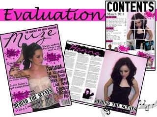
  • 7. Black to stand out against the bright pink background, and also match the colour scheme. Heading – specific to pop so that it is suitable for the audience to attract the young teenage target market, Big, bold masthead with a fancy, pretty font. This suits the teenage, girly target market to give a more feminine vibe or look to the magazine. Bold font and capitalization – stand out, noticeable (attracts audience by gaining attention) The use of make-up and edits bring out the fullness in eyes, and the colour of lips. Make-up attracts the young, feminine audience. Takes up the width of the top part of the magazine, which is a typical convention for a magazine, so that it is the first thing that the reader will see when it is on the shelves. A bright pink/purple background to match the colourscheme, with a darker tinted colour. The bright allows it to stand out, whilst giving the magazine a ‘poppy’ feel. These colours go well together in order to match (so that they don’t clash) and go well against the black. A brand ‘new’ magazine attracts the audience by gaining their attention - something new, different, modern and ‘fresh’. Complex, busy design with lots of detail and information which makes the page look crowded to give the idea that it is ‘full’, by making it seem that there is more going on. Names of famous pop bands and artists featured in the magazine attracts the audience Elegant, stylish pose – looking to the side, away from camera, makes the magazine seem less intimidating and makes the reader feel more confident, hand on hip to accentuate the body and posture, with other hand on head, different, more individual pose. Star ‘bubble’ to draw more attention to the most important/interesting information. It attracts the audience by allowing them to immediately focus on the best storyline. Good looking, attractive model to suit the ‘poppy’ look, female to attract the target audience Fashionable, trendy clothes to make the magazine more appealing to target market
  • 8. Fonts have a ‘poppy’ look to attract audience The name of the magazine ‘Muze’ to attract the audience to this magazine Clear, understandable layout Big, bold title ‘contents’ – stands out, clear, readable Special effect –different and eye-catching to stand out Clear image of cover artist featured in the magazine, takes up a third of the page – noticeable, attracts reader/draws most attention – eye catching Bright pink colours to add to the feminine look Contents information spread out under the headings, with bigger number pages to stand out Images of other band, both female and male artists to attract both males and females Boxed headings to make it stand out and capitalization of the letters – important information Similar layout – same stars used on front cover –stands out - important information Image of front cover to attract them to subscribe Full-body shots – attracts audience by showing all the clothing – fashionable, inspires females Page number where page is turned Bar across the bottom of the page – FIRST EVER EDITION – attracts audience by something new and modern Music symbols – ‘poppy’
  • 9. Interview with new pop artist Hanna – someone ‘new’ and different to attract audience, makes them ask ‘whose that?’ – intrigues them Big, colourful title ‘Hanna’ – stands out, clear, readable Plain, simple font – clear and easy to read, understandable Big photo, takes up half of the page - noticeable, attracts reader/draws most attention, eye catching Interesting storyline to attract audience Bright pink colours to add to the feminine look Bold questions to stand out Photos - different angled shots and effects – interesting Full-body shots – attracts audience by showing all the clothing – fashionable, inspires females Capitalization to stand out to attract audience’s attention – noticeable Bar across the bottom of the page (suits layout of magazine) ‘HOT NEW POP SENSATION’ – attracts audience by something new and modern Photo of CD cover to promote album – attracts audience to buy album Similar layout – same stars used on contents page to show page number– important information, so stands out
  • 10. WHAT HAVE YOU LEARNT ABOUT THE TECHNOLOGIES FROM THE PROCESS OF CONSTRUCTING THIS PRODUCT? To make my magazine, I used a programme called Adobe Photoshop Elements 5.0. This programme is a professional programme, which was suitable for what I wanted to do in order to create my magazine. This allowed me to edit photos, add layers and achieve the effects that I wanted. Throughout the process, I developed my Photoshop skills and experimenting using a variety of different techniques. This enabled me to edit the colours of skin tones, and also make-up effects. Eaditingis used in media industry for magazines to blemish aspects to make images look of high quality. For my photos, I used my own Casio, Exilim camera with 8.1mega pixels. Although I got some reasonably good quality pictures overall, they are not as professional as the high standard that are in magazines. This is because in the media industry, they use professional cameras to give that extra high quality that is needed. I found that using this camera sometimes gave a ‘speckly’ appearance to the photos. I took enough photos as I could to ensure that I got a variety of acceptable photos to use. Unlike some cameras, I couldn’t use many editing techniques on the camera itself, so I decided to just take the photos and then edit them later using Photoshop. I took the photos against a plain white background so that I could edit my model out easily, as I didn’t want a background for my magazine. In order to take the photos straight to prevent blurring, I used a tripod. This allowed me to put the camera onto the tripod so that I could take the photos easily. I researched for ideas and inspiration using websites such as www.dafont.com and www.lookbook.nu. Dafont allowed me to find a variety of attractive fonts to use for my magazine. this enabled me to achieve a much more effective look than using the fonts on Photoshop, as dafont had a much bigger variety which gave me a much bigger choice in order to get the exact look that I wanted. Lookbook gave me inspiration for poses for my model. I also used google images to search for other model poses.
  • 11. LOOKING BACK AT YOUR PRELIMINARY TASK (THE SCHOOL MAGAZINE TASK), WHAT DO YOU FEEL YOU HAVE LEARNT IN THE PROGRESSION FROM IT TO THE FULL PRODUCT? From since I started using Photoshop for the school magazine, my knowledge has developed increasingly. I have gained much more experience of how to format the layout of the page with a variety of fonts and images, whilst also improving my techniques to edit photos. I have learnt how to use the quick selection tool in order to cut things out, so that it gets rid of the background. By doing this, it gives a completely different effect and allowed me to overlap images professionally. I have gained other different skills such as how to edit the colours. I did this to skin tones, to brighten the colour of the skin. By doing this, it makes the photos look much more professional than the ones in the preliminary, where I hadn’t done any editing as I didn’t quite work out how to by that point. I also experimented using the artistic effects. Although I didn’t use these on my final magazine, I think they looked very effective, but they just didn’t achieve the look I wanted. I learnt how to use these effects to completely change the photo. Also, I have found that I have become much more understanding with how to use Photoshop, something which I struggled with when I first started my preliminary magazine. I have now become confident using layers and how to adjust them to layer how I want it. On the whole, I think that my knowledge has improved considerably, which is shown from the differences between the preliminary and my final magazines. My preliminary magazine looks barer than my final magazine, as it hasn’t got as much on it. Also, the use of fonts and images don’t look very professional, giving a tacky look to it. My final magazine looks much more professional, due to the new skills that I gained along the process. From doing a preliminary, it gave me some good practice which helped when making my final magazine, and allowed me to experiment effectively.