2. Q1. In what ways does your media
product use, develop or challenge
forms and conventions of real life
media products?
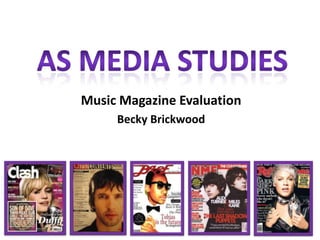
3. Q1. Front Covers
VIBE– magazine (official media product) Masthead
AMP – magazine (my magazine)
Reader’s can usually recognize the
magazine through the font of the
masthead (especially if the picture
covers the wording).
Main image
The main image is the central image
which helps attract the readers and
is usually associated with the main
article/topic with the magazine issue
Website
Used as an extra form of advertising.
Gives more information which the
magazine does not.
Barcode
Shows the importance of the retailer,
these details make the magazine
look more professional.
Date & Pricing
Usually are there to show what time
period the information has come
from, so people know if they have
the latest issue.
Cover lines Colour Scheme Strap line
The essential articles Red Magazines have between 2-5 Pink
Black Cream Underneath the
inside the magazine colours, too many can make the page
Grey look confused. Bright bold colours Aqua/Blue masthead, this gives
are stated through an insight to the
the sell lines. White (background) can attract a reader into buying the Green (background leaves)
issue. magazine without
turning a page.
4. Q1. Contents page
Page numbers
Most magazines have over 80
pages of content.
Main Article
The main article sometimes has a
picture on the contents page to
highlight the importance of the
feature. The main feature article is
anchorage to the picture . The
artist in the article will have some
sort of story (controversial or
emotional), are famous or are very
talented.
Layout
Most magazines have columns of
text to keep the look professional
and organised. This makes it easier
to find a specific article. Most
magazine content is split into
Feature and Regular sections.
Contents pages don't have any
empty space on the page,
therefore the audience will think
the magazine is a good investment
as the magazine is packed of
information
Font
Bright, bold font is usually used to gain Editors note Text
the readers attention onto specific Some magazines have an editors Magazines lure in the readers with text by
articles. The contents page font section where the editor can write using onomatopoeia’s and other words
resembles the front cover. about the weeks issue highlighting such as ‘Exclusive’ and ‘Extra’
the importance of anything
specific within the magazine.
5. Q1. Double Page Spread Article
Main Image
The main image of an article can be used in many different
ways for example as the background with text over the image
or as a bold posed picture with little writing.
Text & Font
The text in the article is no larger then 10pt (apart from
headings or subheadings). The font needs to be easy to read
and the language needs to reflect the type of magazine for
example ‘Formal or informal’ The Article title should invite the
reader to come and read, or make the reader want to know
more.
Colour Scheme
the colour Scheme in the article still has no more than five
colours. It should be consistent throughout the article.
Target audience
The target audience needs to be reflected in the magazine, for
example if the audience is young, there couldn’t be any swearing or
difficult words.
Columns
The text should be organised into columns to make the magazine
look professional and to make it easier for the audience to read and
understand. Should also contain quotes that stand out from the
article.
Article Introduction
The article should have an introduction and lure the audience into
reading. It should be catchy and appealing.
6. Q1. Summary
I believe that my media product (a music magazine) develops the codes
and conventions of a media product rather than challenging them. I
developed my ideas throughout the process of creating the magazine
and generally stuck with the media conventions in design of my
magazine.
Hopefully my magazine will appeal to the target audience of 16-25 year
olds as I have altered the text, language and images to suit the
audience.
One area my product does go against media conventions is with the
genre of the magazine, as my magazine is based on talented unsigned
music artists from all different music genres, whilst most mainstream
magazines only focus on one specific genre such as Kerrang magazine is
based on rock. However, I believe my magazine provides a unique
selling point in filling a gap in the music magazine industry.
I chose the name AMP as I believe it represents my magazine well, AMP
is short for amplifier which is a key part of live music. An amplifier
makes music louder and I wanted to use it as a way for making a ‘noise’
about unsigned musicians. I think because my target audience are more
likely to be of an age to go and see musicians perform they will be able
to understand the hidden meaning.
I think my target audience will also be different from the usual readers
of music magazines in the sense that my magazine focuses on new and
interesting unsigned artists rather than focusing on mainstream trending
musicians.
Because my magazine won’t attract people through the content
(because there is no mainstream artists such as Rihanna and You Me At
Six) I used bold colours to get the audience’ attention. The blue and pink
contrast well together, and capture the eye. The model on the front is
also wearing blue and has an interesting makeup design therefore
people may be intrigued to see what that is all about.
The front of my cover on the third left has all the top information in the
magazine. I believe the conventions of the text are all present, as it is
catchy and upbeat as well as informal and a little bit unusual.
7. Q2. How Does Your Media
Product Represent Particular
Social Groups?
8. Q2. Music Fans
My magazine contains all sorts of genres, from Rock to R’n’B so
therefore my magazine has a wide range of people that it
represents.
In my feature article the artist covers a wide range of music
genres in her music so therefore my magazine (especially the
particular article) represents a lot of people who enjoy different
styles of music. More people can read my magazine and enjoy a
particular aspect of it.
Extract from my DPS
9. Q2. Age and Gender
My media product represents females between the ages of 16 and 25 who have an interest in music.
Also I think that my magazine also represents people who maybe be looking to read something a bit
more unique and less ‘mainstream’
For example...
As you can see, the people in the photographs fit into my target audience. They are all different
females between the ages of 16 and 25 who basically like to have fun. Fun is a key theme within my
magazine as the text, layout and images I’ve used all represent this.
My magazine doesn’t represent younger and older ages, because I don't think the text/articles would
appeal to them. The ages of 16 to 25 are the years in someone's life where they determine what they
want to do in the future. My articles within my magazine are there to inspire and give information
about the music industry, I would say people over the age of 25 have already set their goal in life.
10. Q2. Social Class
My magazine isn’t focused on how much or little money someone has.
It’s not about someone's social background or upbringing. Its for people who enjoy music and like to read about
different genres. My magazine represents the poorest and richest within society and doesn’t create social
divisions.
Although some features within my magazine may appeal to people with more money such as certain concerts
which may have a higher cost. However, there are some features in my magazine where people with less money
can enjoy as well, such as local music venues which are significantly lower priced than ‘headlining’ stars.
Also, the price of my magazine is a little higher than some other
magazines in the industry but compared to other music magazines,
it is reasonably priced at £2.95.
I believe people with less money would be willing to pay that price to
read something they enjoy. Extract from my front cover
I think because most people in the ages of 16-25 will have pocket money from parents or a job of sorts, paying
for the magazine won’t be an issue. Especially
because the magazine is released fortnightly. Also, you
can subscribe to the magazine and save ‘48%’ so that
may be a more appropriate money saving option for
some readers such as college or university students
who want to save money. Extract from my contents page
11. Q2. Race and Ethnicity
Although all the pictures within the front cover, contents page and article of
my magazine are all of white people. The magazine would have feature
articles of non-white musicians as well. Also, my magazine does have a
section on the UK/US top 40 which many non-white musicians do appear so I
would be incorporating different ethnicities and races into my magazine that
way (if not through pictures).
For example musicians with different races and ethnicities are:
Snoop Dogg - California
Rihanna -Barbados Rizzle Kicks - Brighton
Nicki Minaj -Trinidad
David Guetta - France
12. Q2. Sexuality
Anybody can read my magazine, no matter what sexuality can read my magazine. It’s
primarily aimed at women but does not specify weather they are straight or gay. My
magazine doesn’t have any influencing factors that would deter straight or gay people
from reading it.
In my magazine the musicians sexuality in the feature article
isn’t portrayed. However her poses on the front cover and
within the article could be seen as flirtatious and sexualised
which may attract some female, but mainly male readers.
Extract from the Front cover and DPS
The ‘artist’ does not have any stereotypical gay features such as:
No makeup Therefore I don’t
Very short hair cut
think my magazine
Doesn’t care
about fashion targets any particular
Big Tattoo on arm sexuality, straight or
gay.
Deep Voice Overweight or have
muscles
13. Q3. What kind of media institution
might distribute your media
product and why?
14. Q3. Magazine Publishers
Q3. Rhinegold http://www.rhinegold.co.uk
Rhinegold is one of the leading UK publishers for music and the performing arts. Although
Rhinegold has a wide portfolio of magazines the key reason would be to introduce a new
magazine that would reach a wider audience. They also provide a range of supplements that
my magazine could be included as a new addition
Rhinegold also publishes a series of directories including the renowned British and
International Music Yearbook, together with a wide range of supplements which provide
information and useful contact details for music festivals, scholarships, summer schools,
competitions and more.
15. Q3. ICP Media http://www.ipcmedia.com
The reason for approaching ICP Media is that it
produces over 60 iconic media brands, with print
alone reaching almost two thirds of UK women and
42% of UK men – almost 26 million UK adults – while
our websites collectively reach over 20 million users
every month. The company offers a diverse print and
digital portfolio which covers something for
everyone, with a focus on three core audiences:
men, mass market women and upmarket women.
They produce famous women's weeklies including
Look, Now, Chat and Woman; TV entertainment
brands including What's on TV, TV Times and TV &
Satellite Week.
The key interest in this publisher is that they produce
New Musical Express (NME) which means that they
understand the music market and all the new trends.
16. Q3. UK Magazines
http://www.ukmagz.co.uk
UK Magazines contains more than 2,000 magazines. UK Magazines
provides you with the information about art, music, movies, food, travel,
concerts, movies, videos, CD's, lifestyles, reviews and essays on music,
television, films, books, video games, sports, comics, travel, Internet and
almost about every topic.
UK Magazines does not provide the service of subscribing to a magazine,
but provides you the link where you can get the subscription of any of the
UK magazines; and most important UK Magazines will give you the
cheapest subscription link (up to 98% off normal retail price). This guide to
cheaper subscriptions may be of benefit to my magazine. As people may
be lured into buying because of the cheaper price.
17. Q3. Places That Might Distribute
My magazine will be sold is Britain so therefore I would need to target large stores that are well know
throughout the country and also where my target audience (Females 16-25) would shop
such as:
Supermarkets
My magazine
High street Music Stores would be
distributed in
these places
because they
are reasonably
Online Shops/Music Stores priced and
well known
around the
UK.
18. Q4. Who Would Be The
Audience For Your Media
Product.
19. Character Profiles
Females My product is aimed at woman, and I think the picture
represents that.
The picture shows a female studying I think the picture
resembles my target audience for my media product the
best, as my magazine could maybe provide some light relieve
from hard day of work, university or college.
As you can see in the picture, the girl is dressed casually, my
magazine is about having fun and taking some time to relax
and read about music and get to know some new music
artists.
Also, she is working on a laptop so she can easily listen to
music and explore social networking sites such as twitter and
Facebook, my magazine works closely to incorporate and
promote social networking . For example my magazine has
information on the contents page.. .
Extract from my contents page
20. Q4. Ages 16-25
This picture represents people between the ages of 16-
25 like to go out to parties and clubs to have a fun
time.
The hairstyles and clothing of the girls in the picture
shows that they care about their appearance and like
to make an effort. My magazine contains tips to how to
get the best fashion.
Also, all the images in the magazine the models are dressed
nicely and are have made an effort with their hair and makeup.
I think people in the age group will appreciate the models making
an effort as it gives themselves something to aspire to look like. Extract from my contents page
Although many people think models are all airbrushed and to skinny, I also will include plus
size musicians and advice on being happy the way you are. So people can read my
magazine and feel comfortable. However these messages will be subtle as my magazine is
basically about music.
21. Q4. Musicians
My magazine is also targeted at musicians because it contains
lots of different musical aspects.
The person you see on the picture represents people who are
interested in or play music. The woman's fashion sense is quite
quirky but I don't think that matters to much as it is her musical
interest that counts.
My magazine includes all sorts of different music genres so many
music fans can enjoy something within the magazine. My
magazine isn’t just specifically focused on one genre such as
Kerrang! which focuses on Rock music.
My magazine also helps musicians to learn more about instruments for example there is a
section in my magazine which helps people to learn the guitar.
Therefore people who are looking to take there music interest a step further can with the
help on my magazine.
Extract from my contents page
22. Q5. How Did You
Attract/Address Your Target
Audience
23. Technology
I wanted my magazine to be modern and up to date. So therefore I made
sure I included lots of ways to keep in touch and updated such as twitter
and Facebook.
Most people between the ages of 16-25 do spend a lot of time online on
social networking sites, listening to music or watching videos. I researched
the top 10 most visited websites in 2011 - here are my findings
As you can see many of the websites are based on
communication, therefore I also thought it would be important for my
magazine to help keep people connected.
Because most people now have an iPod/iTunes I thought it would be a
good idea to keep my music magazine linked with a music download site. I
think this would promote the magazine and encourage the target
audience to read it.
Extract from my contents page
Extract from my contents page
24. Mise-en-scene
I tried to make everything in my magazine aesthetically pleasing so I would
engage the target audience.
For the front cover I chose quite a feminine colour scheme such as a
turquoise blue, hot pink, cream and black, however I felt I stayed away from
stereotypical colours associated with females such as pastel colours because I
wanted to make sure my magazine was modern rather than traditional.
The language I’ve used in my magazine pages is informal and friendly. I think
my target audience would be hard workers (either from college or work) and
would read my magazine for fun rather than anything else.
I think the puffs on the front cover are appealing to my target audience it
gives the reader a sneak preview and I think would make them ultimately buy
the magazine.
For example:
25. Fashion
Today more and more people are fashion
conscious and like to follow trends within the
fashion industry. Fashion plays a big part in
someone's life as they feel they are being
judged on what they wear. In my magazine I
decided to make my models wear high street
clothing that was in trend. I did want to make
my model look glamorous so therefore I
made her make up bold.
I also created pages in my magazine that
would give out tip on fashion to my target
audience as something extra for them to
enjoy reading.
Extract from my music magazine photos
Extract from my contents page
Extract from my front cover
26. Video Interview
Click the title I interviewed a 16 year old female who
and open fitted into my target audience.
hyperlink to
view the video
on YouTube. She said she liked my magazine pages
and said that the magazine would be
something she would be interested in
reading. She said is also looked
professional and modern which she
likes to see within a magazine.
Therefore, personally I think I used
appropriate methods of attracting my
interviewee
target audience.
27. Q6. What have you learnt about
technologies from the process
of constructing this product?
28. In the process of creating my media product I
used a variety of different technologies to get
the outcome I wanted.
I have learnt a lot about different software,
equipment and editing techniques which have
helped me improve my music magazine.
29. What I used?
I used a variety of different technologies when
making my media product
for example:
- Quark Xpress,
-Adobe Photoshop,
-Internet,
(Picnik, Blogger and numerous other research
websites)
-Microsoft word and PowerPoint,
-Digital camera,
-Pen drive
30. Quark Xpress
I used Quark Xpress to create my DPS article.
To begin with I found using this software difficult to
get the effect I wanted. However after practising and
learning about the different tools put it to my
advantage and hopefully created a successful piece of
work.
One thing I did like about the software was the way
you could neatly organise all the text into columns so
you didn't have to measure anything using the
ruler, like you do on Photoshop.
There was a pre-set A4 magazine layout which I
chose for the basis of my work After applying the
columns I added my text, I had written quite a long
article so I wanted to make sure everything did fit. I
made it size 10 and changed the font to Arial.
I then added pictures and worked with the layout and
changed some of the text to get the desired outcome
for my DPS.
31. Photoshop
I used Photoshop for my front cover and Contents
page.
I found Photoshop really easy to use as the tools
were very simple but effective. I had used
Photoshop once before and really enjoyed working
with the software I liked the lasso tool where you
could cut around people to get rid of any of the
picture background you didn't want. Original image
The images could be transformed into something
completely different using Photoshop. For example
you could crop, resize without ruining the
pixilation, change the brightness and contrast,
change the colour and crop images.
Personally, I found manipulating the images easier
on Photoshop than on any other software.
However, I did prefer using Quark for layout of the
magazine pages because I felt it gave my magazine Edited image on contents page
more of a professional publishing style to it.
32. The Internet
The internet helped me a lot during the process
of creating my magazine pages. It gave me
relevant research and ideas for me to create my
media product.
YouTube
Research
33. Picnik
Picnik is an editing website for pictures. I used Picnik a lot
for personal use so I was familiar with the ins and outs of
the programme. It can help enhance pictures or make
them more professional by having tools such as
airbrush, teeth whitening and blemish fixer. I applied
these certain tools to my model to make her look flawless
on my magazine pages. Most magazines do this to their
models so I thought it gave my magazine more of a
professional finish.
Screen shot of Picnik
Original image Edited image on Picnik
34. Blogger
I used blogger to create my blog about my media
product. I found blogger easy to use and the process of
writing and posting a page was quite fun. Sometimes I
found it hard to keep on top of but it was easy enough to
post from anywhere. I especially liked the way the posts
saved after a few seconds. This helped me a lot and I
didn’t lose any work.
Screen shot of blog posts from blogger.com
35. Camera
I used a 16 megapixel Fujifilm
camera to take my photographs. I enjoyed using
my own personal camera because I knew all the
functions it had and how it worked already.
Because the camera is 16 megapixels I knew the
resolution wouldn't be a problem when using
my photos in my magazine.
I will definitely use this camera for any other
production work because I feel it is a high
quality good piece of equipment.
36. Overall I feel that all of the technology that I used
helped me to gather new skills as well as helping
me find easier and more professional way of doing
things such as; editing pictures. I think without
some of the professional software that I used I
would have a less successful and professional
looking magazine and I think it would have bad pixel
quality of the pictures and the outcome would have
been a little bit messy.
37. Q7. Looking back at your preliminary
task, what do you feel you have learnt
in the progression from it to the full
product?
39. Layout
College magazine
I quite liked the layout of my college magazine front cover, I
like the way the picture is positioned on the page in the
centre. However I do not like the way the sub-articles cover
the models head in some places. I think this looks
unprofessional and draws the attention away from the image.
Music magazine
I think the layout of my magazine is a bit different from other
magazines. I put a triangular blue side banner on the cover to
break up the picture and text, I felt by doing this the text
stands out more but doesn’t distract your eyes from the main
image. I used anchorage to the main image by using a speech
bubble I think this makes the magazine look more fun and
informal.
40. Colour Scheme
College magazine
For my college magazine I used 4 colours, I thought the
colours stood out on the cover but didn’t look very good
together. The target audience for my college magazine was
males and females ages 16-19 I don’t feel the colours reflect
the male side of the audience as I think they look quite
feminine.
Music magazine
I used 4 colours on my front cover like the college magazine
however I felt they contrasted together well for example I
used black and cream which are fairly neutral so the blue and
pink could add brightness to the page. My target audience
was females ages 16-25 so I think the colours are appropriate
by being modern but not too ‘girly’.
41. Font
College magazine
I used about 10 fonts on my cover page ranging from
Arial Black to . which looking back
I think it looks messy and like there is too much going
on.
Music Magazine
I have used 3 fonts on my font cover the main one
being “Tahoma” which I felt was easy to read and
more modern looking. I have also added shadows
behind the text to make it stand out more from the
pictures which also, makes it easier to read.
42. Photography
College magazine
In my college magazine I felt I had quite a high
standard of pictures. I used a model and chose
clothes and applied her hair and makeup. I used
a high megapixel camera as well so the pictures
had a good resolution.
College magazine
Music magazine
In my music magazine I felt the pictures were of
good standard. I used the same camera and
again, chose her clothes and did her hair and
makeup. I made the music magazine photos
more glamorous than the college magazine
photos but I feel both sets of photos were equal
in quality.
Music magazine
43. College magazine
Editing
I used little editing when choosing which photos to use. For
the main image on the front cover I cut around it using a
tool on Photoshop, looking at the finished front cover I could
have done a better job as I feel the cutting is not up to a
good quality.
Music magazine
I used a website called ‘picnik’
which has photo editing tools for
example on my magazine front
cover I
changed, contrast, brightness, teet
h whitening, reduced redeye and Original image Edited image
reduces blemishes this gave my
images more of a professional
44. Writing Style
College magazine
When I produced my college magazine I didn’t take my
audience into consideration as I didn’t realise how
relevant it was to think about them. I mainly thought
about making the magazine sound fun and lively.
Music Magazine
For my music magazine I did have a greater
understanding of how important it is to make sure the
magazine appeals to my audience. I did this by making
sure that all the wording was fun and catchy, but also by
using slang words such as ‘LOL’. I felt this would make my
magazine appeal to a younger audience (under 19) but
still get the older target audience to enjoy the magazine.
45. Research
I used both market and audience research to find out what I needed to include in my music
magazine.
To do this I created a questionnaire which I gave to 20 people. I analysed the data I had
received. This helped with the development and design of the magazine. For example the
responses to the questionnaire helped me choose the name for my magazine (AMP).
Using the responses from the market and audience provided me with a better insight of
peoples needs and wants for a music magazine. This then helped me to come up with my
niche market for my magazine. This being a focused on unsigned music artists, which is
different from any other music magazine. It gave me an idea of what catches their eye
when looking at a magazine stand (mainly bright colours)
For my market research I search for music magazine online websites to look for what there
regular content was and also how they promoted feature articles.
I also bought a few magazines such as NME and Kerrang to see how they appealed to their
target audience. This gave me better understanding of how to use font, colour and language
to attract my target audience.
46. Overall
In comparison to my music magazine, my college magazine does not
look very professional. It looks very simple and is not of a high
standard. Although I had the basic knowledge of what to include on
the things I should and should not do, it seems I did not fully
understand how to create a successful magazine. There were aspects
of magazine production that I had not learnt. However in constructing
my music magazine I was able to apply the skills I have obtained.
In the production of the music magazine I experimented with the
technology available to me to introduce different styles and features. I
used QuarkXPress and would certainly like to develop my skills further
if time allowed.
In following a planned process I was able to gather information and
understand the aspects of magazine production which helped me
develop my music magazine. In the preliminary task I wanted to create
a college magazine that I thought would be fun. In the production of
the music magazine I created a product that was more focused on the
audience having fun.