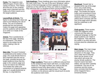
1. Fonts; The magazine uses
different types of fonts with a
variety of colours. This makes
all of the text on the contents
page seem important and this
makes all of them stand out to
the target audience.
Masthead; 'Smash hits' is
situated at the top of the page
but in very small writing
compared to the rest of the
page. This breaks the typical
codes and conventions of any
contents page in a magazine.
However, the text is in a bright
yellow which contrasts with the
rest of the page which denotes
that the masthead is still
significant.
Grab quotes; These quotes
make the magazine seem
comical and they also use
colloquial language so that the
target audience can relate to
the magazine. They will draw
the reader in as they will want
to know what the celebrities are
saying.
Sub-headings; These headings give more information about
the main cover lines. The use of the word 'Whatever' adds a
sense of informal language so that it appeals to the target
audience as they will feel as if they can relate to magazine as
they will know that it is targeted at them (young females).
Main title; The word 'Contents'
is positioned at the bottom of the
page, this could denote that it is
less important than the rest of
the page, possibly because the
target audience know that this
page is the contents page and
so do not need to be informed.
This breaks the codes and
conventions of a typical contents
page as it usually positioned at
the top, in a big bold font.
Main image; The main image
is centred and is the main
attraction on the page. They
use a wide shot so that the
band can be shown in full
view which will excite the
young, female audience. The
mise-en-scene has been
edited, and has been carefully
considered. The use of t he
snowman and the snowy
trees connotes that this part
of the magazine has a
Christmas theme.
Page numbers; These are in a different coloured font
to the sentences that match with them, to make them
stand out. The page numbers are used so that the
audience know more about what is inside the
magazine, making them want to buy it. The page
numbers on the pictures add the visual touch to excite
the audience even more.
Layout/Rule of thirds; The
layout is very busy but it does not
seem to be following the rule of
thirds. The use of randomly
positioned text and pictures
makes the page look appealing
and the audience will be intrigued
as to what is in inside of the
magazine.
Article; This is positioned at
the top of the page, denoting
it's importance. The article
seems to be written by the
editor, making it like an
editorial.