SlideShare ist ein Scribd-Unternehmen logo
1 von 4
Downloaden Sie, um offline zu lesen
How does my media
product use, develop
or change forms and
conventions of real
media products?
Anya Wagstaff
Comparison of Cover
Main Image
Like the piece I have used to re-create I have two models showing the main
parts of the ‘band’ which is shown at the bottom. I have placed my lead singer
slightly in front of the other to show their dominance. There is just a plain white
backing to show the main feature. I have also copied the professional magazine
in overlapping the left models hair on the logo.
I chose my main model (Marcus) very carefully because I wanted someone with the
‘short back and sides’ look with long hair on top that is once again coming back into
fashion. I wanted two males to re-create the professional magazine shown.
The second model (Will) I chose because he reminded me of a member from a well
known ‘indie’ band; ‘Pumped Up Kicks’ and I thought this was appropriate the genre.
Mast Head
The ‘NME’ title stands out a lot
because of the colours and bold font.
To Re-create this I have used similar
colours and again a bold font.
However I wanted a font with a ‘twist’
to represent the indie genre, and to
reinforce the arrowed centre I placed
a red line behind it. On the NME font
it has an ‘inner-shadow’ on the stroke,
however I have put an effect on the
outer block to separate in from the
top band where NME has the black
stroke to do this.
Like the NME magazine I have
used a circular black and yellow
sell line/offer. Using these
colours I have moved away
from the repeated colours to
give it another look and widen
what I can use throughout the
magazine, not restricting myself
to much but still keeping house
colours.
Sell Lines
I have shown the sell lines as they are on the professional
magazine with alternation between black and red with lines to
separate them. I would like to have done more as the area
around the models looks bare and boring. I have also used
boxes to show some more important features of the magazine,
this I have taken from other magazines such as this NME one.
If I were to re-do it I would like
to include a text across the
middle like the professional one
to fill more space and make it
more interesting. I would also
use brighter colours but due to
the colour of my models
jumper that I wanted I could
not contrast the different
shades to much. It would be
useful to, to include a bar code,
however this might interrupt
the other texts and blocks.
Other Images
The other images I have used are the ‘full band’ and a female
model by herself, she is later featured on the double page
spread. She is smoking in this image and I got this idea from
another magazine and I feel it shows the independence of
the genre and how indie people don’t always play by the
rules. Both images are against a brick wall this is because for
both I wanted a plain back ground but not a white, studio, I
also wanted them to be the same because photos from both
shoots are then featured on the double page, and blend into
the back ground of each other.
Contents Page Main Image
I have used the main image similar to the one of a professional magazine because it is outside and
relaxed and as if the group are not working. I have also used a banner along the top of a view which
backs up the outside feel.
I chose this model (Beth) because I thought her fringe was appropriate to the genre, and the dark colour didn’t
contrast with the house colours. Having this model in front and another behind in a different colour shows their
statues and that she is the lead singer. I also had her smoking again to show how ‘indie’ people are independent
and don’t always play by the rules. Through doing audience research I found that people of this genre often wear
label clothes, this is why I chose to have her Vans/shoes in more focus and front than her face.
Other Image
I wanted to show the ‘new album’
mentioned on the front page but I
could not re-create the Arctic
Monkeys band or the album cover
so I took a picture od the album
logo t-shirt.
Here I have included
a grey box with an
offer in like on this
professional
magazine. I have also
included a logo type
block the start the
box, copying the
stamp on the cover
promoting this offer.
Like the professional magazine I
have separated and headed each list
with a line however I have not split
my pages into categories. However
instead of using bigger blocks rather
than lines to split them I have used
a backing block on the number. I
have also used a bold font for the
main title of the pages then a small
summary or caption in the ‘light’
font. The page numbers are also in
the ‘blacklisted’ font just add
diversity and change but it is my
house font and hadn’t been used
much on this page.
To improve this I would add a small article on this page like the
one on the professional page. It would also have to be about
the main image on this page, so I would either have to take a
new image for this story or write about the story on my double
page spread and find another for that, because currently it is
advertising the double page spread.
Double Page Spread
Main Image and Layout
This is the professional double page spread
that I have tried to re-create. Like this I have
used one main image that take just over half
the two pages with a block with the story in.
The image I have used was against a brick
wall because I didn’t want any action behind
but I wanted a pattern or something
consistent behind. I chose to have my
models hood up because I thought it would
represent the genre through having her
hiding herself and being independent. She
needed to be smiling because the quote in
bold and blue stuck out from the rest of the
story is ‘Best experience of my life’.
I added in the shapes because I liked the
effect it had on the professional page,
however I don’t think the mainly house
colours I used had the same effect.
Although the blocks on the brick wall are
effective because they look as if they
belong with it. I have also separated the
columns with a line and begun the text
with a larger, blue capital letter.
The title of my page does not standout as much as
the professional one, however I think starting each
word with the ‘Blacklisted’ font was effective. Using
black for the title was effective against the red
backing and the white main text colour. Using the
blue and the white bolder text was effective in
catching the readers eye, as it does on the
professional page.
Using two small images was effective because it showed the other bands that would be featured in the story and
showed that there wouldn’t just be one. Using the one with the same brick backing was effective because it blended
with the other. The studio photo is from the same shoot as the cover image so this shows where it is relevant.
The models in the studio image are pointing and in a draft I placed a text next to it saying ‘We Need You’. This was to promote
ticket sales or band entries, however it did not fit with the layout and in trying to re-create the professional one it meant there was
to much on the page.
Although this album may
not be considered ‘indie’ I
felt the wall background
was very effective and
inspired my main image.

Weitere ähnliche Inhalte

Was ist angesagt?

In what ways does your media product use, develop or challenge forms and conv...
In what ways does your media product use, develop or challenge forms and conv...In what ways does your media product use, develop or challenge forms and conv...
In what ways does your media product use, develop or challenge forms and conv...jhalsallchs
 
Anciliary text front cover screen shots
Anciliary text front cover screen shotsAnciliary text front cover screen shots
Anciliary text front cover screen shotsnusuribibi
 
Evaluation Activity 1
Evaluation Activity 1Evaluation Activity 1
Evaluation Activity 1lbarsby
 
Evaluaton qestion 7 (power point)
Evaluaton qestion 7 (power point) Evaluaton qestion 7 (power point)
Evaluaton qestion 7 (power point) Sophie Spink
 
Final contents page analysis
Final contents page analysisFinal contents page analysis
Final contents page analysisIsabelle Humm
 
Final double page analysis
Final double page analysisFinal double page analysis
Final double page analysisIsabelle Humm
 
Question 7. Looking back at your preliminary task, what do you feel you have ...
Question 7. Looking back at your preliminary task, what do you feel you have ...Question 7. Looking back at your preliminary task, what do you feel you have ...
Question 7. Looking back at your preliminary task, what do you feel you have ...georgiaburgess
 

Was ist angesagt? (17)

In what ways does your media product use, develop or challenge forms and conv...
In what ways does your media product use, develop or challenge forms and conv...In what ways does your media product use, develop or challenge forms and conv...
In what ways does your media product use, develop or challenge forms and conv...
 
Anciliary text front cover screen shots
Anciliary text front cover screen shotsAnciliary text front cover screen shots
Anciliary text front cover screen shots
 
Q1
Q1Q1
Q1
 
Evaluation Activity 1
Evaluation Activity 1Evaluation Activity 1
Evaluation Activity 1
 
Question 1 evaluation
Question 1 evaluationQuestion 1 evaluation
Question 1 evaluation
 
My Music Magazine
My Music MagazineMy Music Magazine
My Music Magazine
 
Evaluaton qestion 7 (power point)
Evaluaton qestion 7 (power point) Evaluaton qestion 7 (power point)
Evaluaton qestion 7 (power point)
 
Evaluation
EvaluationEvaluation
Evaluation
 
Final contents page analysis
Final contents page analysisFinal contents page analysis
Final contents page analysis
 
Final double page analysis
Final double page analysisFinal double page analysis
Final double page analysis
 
Contents Planning
Contents PlanningContents Planning
Contents Planning
 
Evaluation q1
Evaluation q1Evaluation q1
Evaluation q1
 
Question 7. Looking back at your preliminary task, what do you feel you have ...
Question 7. Looking back at your preliminary task, what do you feel you have ...Question 7. Looking back at your preliminary task, what do you feel you have ...
Question 7. Looking back at your preliminary task, what do you feel you have ...
 
Primary and secondary
Primary and secondaryPrimary and secondary
Primary and secondary
 
Primary and secondary
Primary and secondaryPrimary and secondary
Primary and secondary
 
Primary and secondary
Primary and secondaryPrimary and secondary
Primary and secondary
 
Primary and secondary
Primary and secondaryPrimary and secondary
Primary and secondary
 

Andere mochten auch

Nov16_Updated Resume_BHOLAKUMAR SONAR
Nov16_Updated Resume_BHOLAKUMAR SONARNov16_Updated Resume_BHOLAKUMAR SONAR
Nov16_Updated Resume_BHOLAKUMAR SONARBholakumar Sonar
 
Boost your revenue with music!
Boost your revenue with music! Boost your revenue with music!
Boost your revenue with music! beatvyne
 
Join the music revolution!
Join the music revolution! Join the music revolution!
Join the music revolution! beatvyne
 
Frans Kujwana Health & Safety Documents
Frans Kujwana Health & Safety DocumentsFrans Kujwana Health & Safety Documents
Frans Kujwana Health & Safety DocumentsMatome Kujwana
 
Unterschiedliche Ansichtsweisen eines Titels
Unterschiedliche Ansichtsweisen eines TitelsUnterschiedliche Ansichtsweisen eines Titels
Unterschiedliche Ansichtsweisen eines Titelsedelweiss_Deutschland
 
Forms of story_telling
Forms of story_tellingForms of story_telling
Forms of story_tellingDeclan Brophy
 
Global Pack Hungary Presentation DE-AT - Tape & Go Klebebänder
Global Pack Hungary Presentation DE-AT  - Tape & Go KlebebänderGlobal Pack Hungary Presentation DE-AT  - Tape & Go Klebebänder
Global Pack Hungary Presentation DE-AT - Tape & Go KlebebänderDragana Jokic Babic
 
Graphic Design Portraits
Graphic Design PortraitsGraphic Design Portraits
Graphic Design PortraitsBailey Hall
 
Session viii(state mngtserver)
Session viii(state mngtserver)Session viii(state mngtserver)
Session viii(state mngtserver)Shrijan Tiwari
 
Perangkat keras-internet1
Perangkat keras-internet1Perangkat keras-internet1
Perangkat keras-internet1Adam51000
 
Adiviñas ilustracións
Adiviñas ilustraciónsAdiviñas ilustracións
Adiviñas ilustraciónseduc-arte
 
Press Release - Announcement of 2015-16 Insurance Diversity Task Force
Press Release - Announcement of 2015-16 Insurance Diversity Task ForcePress Release - Announcement of 2015-16 Insurance Diversity Task Force
Press Release - Announcement of 2015-16 Insurance Diversity Task ForceMark Morales
 

Andere mochten auch (20)

Nov16_Updated Resume_BHOLAKUMAR SONAR
Nov16_Updated Resume_BHOLAKUMAR SONARNov16_Updated Resume_BHOLAKUMAR SONAR
Nov16_Updated Resume_BHOLAKUMAR SONAR
 
Evaluation 3
Evaluation 3Evaluation 3
Evaluation 3
 
Boost your revenue with music!
Boost your revenue with music! Boost your revenue with music!
Boost your revenue with music!
 
வெற்றி
வெற்றிவெற்றி
வெற்றி
 
Join the music revolution!
Join the music revolution! Join the music revolution!
Join the music revolution!
 
Frans Kujwana Health & Safety Documents
Frans Kujwana Health & Safety DocumentsFrans Kujwana Health & Safety Documents
Frans Kujwana Health & Safety Documents
 
Unterschiedliche Ansichtsweisen eines Titels
Unterschiedliche Ansichtsweisen eines TitelsUnterschiedliche Ansichtsweisen eines Titels
Unterschiedliche Ansichtsweisen eines Titels
 
Forms of story_telling
Forms of story_tellingForms of story_telling
Forms of story_telling
 
Creative strategies to ensure deeper student engagement
Creative strategies to ensure deeper student engagementCreative strategies to ensure deeper student engagement
Creative strategies to ensure deeper student engagement
 
Global Pack Hungary Presentation DE-AT - Tape & Go Klebebänder
Global Pack Hungary Presentation DE-AT  - Tape & Go KlebebänderGlobal Pack Hungary Presentation DE-AT  - Tape & Go Klebebänder
Global Pack Hungary Presentation DE-AT - Tape & Go Klebebänder
 
Graphic Design Portraits
Graphic Design PortraitsGraphic Design Portraits
Graphic Design Portraits
 
Session viii(state mngtserver)
Session viii(state mngtserver)Session viii(state mngtserver)
Session viii(state mngtserver)
 
Hello everyone
Hello everyoneHello everyone
Hello everyone
 
Perangkat keras-internet1
Perangkat keras-internet1Perangkat keras-internet1
Perangkat keras-internet1
 
Dados de Mercado outubro de 2016
Dados de Mercado outubro de 2016Dados de Mercado outubro de 2016
Dados de Mercado outubro de 2016
 
Kowshikaa consultancy overseas
Kowshikaa consultancy overseas Kowshikaa consultancy overseas
Kowshikaa consultancy overseas
 
Adiviñas ilustracións
Adiviñas ilustraciónsAdiviñas ilustracións
Adiviñas ilustracións
 
9tex BD Profile
9tex BD Profile9tex BD Profile
9tex BD Profile
 
Typography terms
Typography termsTypography terms
Typography terms
 
Press Release - Announcement of 2015-16 Insurance Diversity Task Force
Press Release - Announcement of 2015-16 Insurance Diversity Task ForcePress Release - Announcement of 2015-16 Insurance Diversity Task Force
Press Release - Announcement of 2015-16 Insurance Diversity Task Force
 

Ähnlich wie Question 1

Evaluation question 5
Evaluation  question 5Evaluation  question 5
Evaluation question 5meena_j
 
Holly Corden's Evaluation
Holly Corden's EvaluationHolly Corden's Evaluation
Holly Corden's Evaluationmrsmwlms
 
Evaluation
EvaluationEvaluation
Evaluationmediafan
 
Question1 evaluation Chris
Question1 evaluation ChrisQuestion1 evaluation Chris
Question1 evaluation ChrisChrisAMedia
 
Double Page Spread 2
Double Page Spread 2Double Page Spread 2
Double Page Spread 2chloeee
 
evalutaion question 1
evalutaion question 1evalutaion question 1
evalutaion question 1joeharvey94
 
Cellar Door Analysing Print Screens During Construction
Cellar Door   Analysing Print Screens During ConstructionCellar Door   Analysing Print Screens During Construction
Cellar Door Analysing Print Screens During Constructionrebeccabardwell
 
Evaluation powerpoint
Evaluation powerpointEvaluation powerpoint
Evaluation powerpointAlice Bates
 
Photoshoot- Raw Photo Analysis
Photoshoot- Raw Photo AnalysisPhotoshoot- Raw Photo Analysis
Photoshoot- Raw Photo Analysiscowlingalice
 
Evaluation powerpoint
Evaluation powerpointEvaluation powerpoint
Evaluation powerpointRezamarmulak
 
R&b magazine evaluation
R&b magazine evaluationR&b magazine evaluation
R&b magazine evaluationMiz_A
 
Evaluation Question 1
Evaluation Question 1Evaluation Question 1
Evaluation Question 1taylzz1
 
Music Magazine evaluation
Music Magazine evaluationMusic Magazine evaluation
Music Magazine evaluationvinaykilaire652
 

Ähnlich wie Question 1 (20)

Evaluation question 5
Evaluation  question 5Evaluation  question 5
Evaluation question 5
 
Question 1 evaluation
Question 1 evaluationQuestion 1 evaluation
Question 1 evaluation
 
Question 1
Question 1Question 1
Question 1
 
Holly Corden's Evaluation
Holly Corden's EvaluationHolly Corden's Evaluation
Holly Corden's Evaluation
 
Presentation1
Presentation1Presentation1
Presentation1
 
Evaluation
EvaluationEvaluation
Evaluation
 
Question1 evaluation Chris
Question1 evaluation ChrisQuestion1 evaluation Chris
Question1 evaluation Chris
 
Double Page Spread 2
Double Page Spread 2Double Page Spread 2
Double Page Spread 2
 
E7
E7E7
E7
 
QUESTION 1
QUESTION 1QUESTION 1
QUESTION 1
 
evalutaion question 1
evalutaion question 1evalutaion question 1
evalutaion question 1
 
Evaluation q1
Evaluation q1Evaluation q1
Evaluation q1
 
Cellar Door Analysing Print Screens During Construction
Cellar Door   Analysing Print Screens During ConstructionCellar Door   Analysing Print Screens During Construction
Cellar Door Analysing Print Screens During Construction
 
Evaluation powerpoint
Evaluation powerpointEvaluation powerpoint
Evaluation powerpoint
 
Photoshoot- Raw Photo Analysis
Photoshoot- Raw Photo AnalysisPhotoshoot- Raw Photo Analysis
Photoshoot- Raw Photo Analysis
 
Evaluation powerpoint
Evaluation powerpointEvaluation powerpoint
Evaluation powerpoint
 
R&b magazine evaluation
R&b magazine evaluationR&b magazine evaluation
R&b magazine evaluation
 
Question 1
Question 1 Question 1
Question 1
 
Evaluation Question 1
Evaluation Question 1Evaluation Question 1
Evaluation Question 1
 
Music Magazine evaluation
Music Magazine evaluationMusic Magazine evaluation
Music Magazine evaluation
 

Mehr von Anya Wagstaff (15)

Evaluation 2
Evaluation 2Evaluation 2
Evaluation 2
 
Evaluation 3
Evaluation 3Evaluation 3
Evaluation 3
 
Evaluation 1
Evaluation 1Evaluation 1
Evaluation 1
 
Evaluation 3
Evaluation 3Evaluation 3
Evaluation 3
 
Question 4 technology
Question 4  technologyQuestion 4  technology
Question 4 technology
 
Call sheets
Call sheetsCall sheets
Call sheets
 
Storyboard
StoryboardStoryboard
Storyboard
 
Questionnaire
QuestionnaireQuestionnaire
Questionnaire
 
Digipak research
Digipak researchDigipak research
Digipak research
 
Digipak research
Digipak researchDigipak research
Digipak research
 
Pitch
PitchPitch
Pitch
 
Presentation of gender
Presentation of genderPresentation of gender
Presentation of gender
 
Skills development
Skills developmentSkills development
Skills development
 
Evaluation 3
Evaluation 3Evaluation 3
Evaluation 3
 
Genre Research
Genre ResearchGenre Research
Genre Research
 

Kürzlich hochgeladen

BÀI TẬP BỔ TRỢ TIẾNG ANH 11 THEO ĐƠN VỊ BÀI HỌC - CẢ NĂM - CÓ FILE NGHE (GLOB...
BÀI TẬP BỔ TRỢ TIẾNG ANH 11 THEO ĐƠN VỊ BÀI HỌC - CẢ NĂM - CÓ FILE NGHE (GLOB...BÀI TẬP BỔ TRỢ TIẾNG ANH 11 THEO ĐƠN VỊ BÀI HỌC - CẢ NĂM - CÓ FILE NGHE (GLOB...
BÀI TẬP BỔ TRỢ TIẾNG ANH 11 THEO ĐƠN VỊ BÀI HỌC - CẢ NĂM - CÓ FILE NGHE (GLOB...Nguyen Thanh Tu Collection
 
BÀI TẬP BỔ TRỢ 4 KĨ NĂNG TIẾNG ANH LỚP 8 - CẢ NĂM - GLOBAL SUCCESS - NĂM HỌC ...
BÀI TẬP BỔ TRỢ 4 KĨ NĂNG TIẾNG ANH LỚP 8 - CẢ NĂM - GLOBAL SUCCESS - NĂM HỌC ...BÀI TẬP BỔ TRỢ 4 KĨ NĂNG TIẾNG ANH LỚP 8 - CẢ NĂM - GLOBAL SUCCESS - NĂM HỌC ...
BÀI TẬP BỔ TRỢ 4 KĨ NĂNG TIẾNG ANH LỚP 8 - CẢ NĂM - GLOBAL SUCCESS - NĂM HỌC ...Nguyen Thanh Tu Collection
 
4.11.24 Poverty and Inequality in America.pptx
4.11.24 Poverty and Inequality in America.pptx4.11.24 Poverty and Inequality in America.pptx
4.11.24 Poverty and Inequality in America.pptxmary850239
 
31 ĐỀ THI THỬ VÀO LỚP 10 - TIẾNG ANH - FORM MỚI 2025 - 40 CÂU HỎI - BÙI VĂN V...
31 ĐỀ THI THỬ VÀO LỚP 10 - TIẾNG ANH - FORM MỚI 2025 - 40 CÂU HỎI - BÙI VĂN V...31 ĐỀ THI THỬ VÀO LỚP 10 - TIẾNG ANH - FORM MỚI 2025 - 40 CÂU HỎI - BÙI VĂN V...
31 ĐỀ THI THỬ VÀO LỚP 10 - TIẾNG ANH - FORM MỚI 2025 - 40 CÂU HỎI - BÙI VĂN V...Nguyen Thanh Tu Collection
 
CLASSIFICATION OF ANTI - CANCER DRUGS.pptx
CLASSIFICATION OF ANTI - CANCER DRUGS.pptxCLASSIFICATION OF ANTI - CANCER DRUGS.pptx
CLASSIFICATION OF ANTI - CANCER DRUGS.pptxAnupam32727
 
BÀI TẬP BỔ TRỢ TIẾNG ANH 8 - I-LEARN SMART WORLD - CẢ NĂM - CÓ FILE NGHE (BẢN...
BÀI TẬP BỔ TRỢ TIẾNG ANH 8 - I-LEARN SMART WORLD - CẢ NĂM - CÓ FILE NGHE (BẢN...BÀI TẬP BỔ TRỢ TIẾNG ANH 8 - I-LEARN SMART WORLD - CẢ NĂM - CÓ FILE NGHE (BẢN...
BÀI TẬP BỔ TRỢ TIẾNG ANH 8 - I-LEARN SMART WORLD - CẢ NĂM - CÓ FILE NGHE (BẢN...Nguyen Thanh Tu Collection
 
Tree View Decoration Attribute in the Odoo 17
Tree View Decoration Attribute in the Odoo 17Tree View Decoration Attribute in the Odoo 17
Tree View Decoration Attribute in the Odoo 17Celine George
 
Q-Factor General Quiz-7th April 2024, Quiz Club NITW
Q-Factor General Quiz-7th April 2024, Quiz Club NITWQ-Factor General Quiz-7th April 2024, Quiz Club NITW
Q-Factor General Quiz-7th April 2024, Quiz Club NITWQuiz Club NITW
 
MS4 level being good citizen -imperative- (1) (1).pdf
MS4 level   being good citizen -imperative- (1) (1).pdfMS4 level   being good citizen -imperative- (1) (1).pdf
MS4 level being good citizen -imperative- (1) (1).pdfMr Bounab Samir
 
Q-Factor HISPOL Quiz-6th April 2024, Quiz Club NITW
Q-Factor HISPOL Quiz-6th April 2024, Quiz Club NITWQ-Factor HISPOL Quiz-6th April 2024, Quiz Club NITW
Q-Factor HISPOL Quiz-6th April 2024, Quiz Club NITWQuiz Club NITW
 
CHUYÊN ĐỀ ÔN THEO CÂU CHO HỌC SINH LỚP 12 ĐỂ ĐẠT ĐIỂM 5+ THI TỐT NGHIỆP THPT ...
CHUYÊN ĐỀ ÔN THEO CÂU CHO HỌC SINH LỚP 12 ĐỂ ĐẠT ĐIỂM 5+ THI TỐT NGHIỆP THPT ...CHUYÊN ĐỀ ÔN THEO CÂU CHO HỌC SINH LỚP 12 ĐỂ ĐẠT ĐIỂM 5+ THI TỐT NGHIỆP THPT ...
CHUYÊN ĐỀ ÔN THEO CÂU CHO HỌC SINH LỚP 12 ĐỂ ĐẠT ĐIỂM 5+ THI TỐT NGHIỆP THPT ...Nguyen Thanh Tu Collection
 
Beauty Amidst the Bytes_ Unearthing Unexpected Advantages of the Digital Wast...
Beauty Amidst the Bytes_ Unearthing Unexpected Advantages of the Digital Wast...Beauty Amidst the Bytes_ Unearthing Unexpected Advantages of the Digital Wast...
Beauty Amidst the Bytes_ Unearthing Unexpected Advantages of the Digital Wast...DhatriParmar
 
Unit :1 Basics of Professional Intelligence
Unit :1 Basics of Professional IntelligenceUnit :1 Basics of Professional Intelligence
Unit :1 Basics of Professional IntelligenceDr Vijay Vishwakarma
 
DBMSArchitecture_QueryProcessingandOptimization.pdf
DBMSArchitecture_QueryProcessingandOptimization.pdfDBMSArchitecture_QueryProcessingandOptimization.pdf
DBMSArchitecture_QueryProcessingandOptimization.pdfChristalin Nelson
 
Indexing Structures in Database Management system.pdf
Indexing Structures in Database Management system.pdfIndexing Structures in Database Management system.pdf
Indexing Structures in Database Management system.pdfChristalin Nelson
 
Decoding the Tweet _ Practical Criticism in the Age of Hashtag.pptx
Decoding the Tweet _ Practical Criticism in the Age of Hashtag.pptxDecoding the Tweet _ Practical Criticism in the Age of Hashtag.pptx
Decoding the Tweet _ Practical Criticism in the Age of Hashtag.pptxDhatriParmar
 

Kürzlich hochgeladen (20)

prashanth updated resume 2024 for Teaching Profession
prashanth updated resume 2024 for Teaching Professionprashanth updated resume 2024 for Teaching Profession
prashanth updated resume 2024 for Teaching Profession
 
BÀI TẬP BỔ TRỢ TIẾNG ANH 11 THEO ĐƠN VỊ BÀI HỌC - CẢ NĂM - CÓ FILE NGHE (GLOB...
BÀI TẬP BỔ TRỢ TIẾNG ANH 11 THEO ĐƠN VỊ BÀI HỌC - CẢ NĂM - CÓ FILE NGHE (GLOB...BÀI TẬP BỔ TRỢ TIẾNG ANH 11 THEO ĐƠN VỊ BÀI HỌC - CẢ NĂM - CÓ FILE NGHE (GLOB...
BÀI TẬP BỔ TRỢ TIẾNG ANH 11 THEO ĐƠN VỊ BÀI HỌC - CẢ NĂM - CÓ FILE NGHE (GLOB...
 
BÀI TẬP BỔ TRỢ 4 KĨ NĂNG TIẾNG ANH LỚP 8 - CẢ NĂM - GLOBAL SUCCESS - NĂM HỌC ...
BÀI TẬP BỔ TRỢ 4 KĨ NĂNG TIẾNG ANH LỚP 8 - CẢ NĂM - GLOBAL SUCCESS - NĂM HỌC ...BÀI TẬP BỔ TRỢ 4 KĨ NĂNG TIẾNG ANH LỚP 8 - CẢ NĂM - GLOBAL SUCCESS - NĂM HỌC ...
BÀI TẬP BỔ TRỢ 4 KĨ NĂNG TIẾNG ANH LỚP 8 - CẢ NĂM - GLOBAL SUCCESS - NĂM HỌC ...
 
4.11.24 Poverty and Inequality in America.pptx
4.11.24 Poverty and Inequality in America.pptx4.11.24 Poverty and Inequality in America.pptx
4.11.24 Poverty and Inequality in America.pptx
 
31 ĐỀ THI THỬ VÀO LỚP 10 - TIẾNG ANH - FORM MỚI 2025 - 40 CÂU HỎI - BÙI VĂN V...
31 ĐỀ THI THỬ VÀO LỚP 10 - TIẾNG ANH - FORM MỚI 2025 - 40 CÂU HỎI - BÙI VĂN V...31 ĐỀ THI THỬ VÀO LỚP 10 - TIẾNG ANH - FORM MỚI 2025 - 40 CÂU HỎI - BÙI VĂN V...
31 ĐỀ THI THỬ VÀO LỚP 10 - TIẾNG ANH - FORM MỚI 2025 - 40 CÂU HỎI - BÙI VĂN V...
 
CLASSIFICATION OF ANTI - CANCER DRUGS.pptx
CLASSIFICATION OF ANTI - CANCER DRUGS.pptxCLASSIFICATION OF ANTI - CANCER DRUGS.pptx
CLASSIFICATION OF ANTI - CANCER DRUGS.pptx
 
BÀI TẬP BỔ TRỢ TIẾNG ANH 8 - I-LEARN SMART WORLD - CẢ NĂM - CÓ FILE NGHE (BẢN...
BÀI TẬP BỔ TRỢ TIẾNG ANH 8 - I-LEARN SMART WORLD - CẢ NĂM - CÓ FILE NGHE (BẢN...BÀI TẬP BỔ TRỢ TIẾNG ANH 8 - I-LEARN SMART WORLD - CẢ NĂM - CÓ FILE NGHE (BẢN...
BÀI TẬP BỔ TRỢ TIẾNG ANH 8 - I-LEARN SMART WORLD - CẢ NĂM - CÓ FILE NGHE (BẢN...
 
Tree View Decoration Attribute in the Odoo 17
Tree View Decoration Attribute in the Odoo 17Tree View Decoration Attribute in the Odoo 17
Tree View Decoration Attribute in the Odoo 17
 
Q-Factor General Quiz-7th April 2024, Quiz Club NITW
Q-Factor General Quiz-7th April 2024, Quiz Club NITWQ-Factor General Quiz-7th April 2024, Quiz Club NITW
Q-Factor General Quiz-7th April 2024, Quiz Club NITW
 
MS4 level being good citizen -imperative- (1) (1).pdf
MS4 level   being good citizen -imperative- (1) (1).pdfMS4 level   being good citizen -imperative- (1) (1).pdf
MS4 level being good citizen -imperative- (1) (1).pdf
 
Q-Factor HISPOL Quiz-6th April 2024, Quiz Club NITW
Q-Factor HISPOL Quiz-6th April 2024, Quiz Club NITWQ-Factor HISPOL Quiz-6th April 2024, Quiz Club NITW
Q-Factor HISPOL Quiz-6th April 2024, Quiz Club NITW
 
CHUYÊN ĐỀ ÔN THEO CÂU CHO HỌC SINH LỚP 12 ĐỂ ĐẠT ĐIỂM 5+ THI TỐT NGHIỆP THPT ...
CHUYÊN ĐỀ ÔN THEO CÂU CHO HỌC SINH LỚP 12 ĐỂ ĐẠT ĐIỂM 5+ THI TỐT NGHIỆP THPT ...CHUYÊN ĐỀ ÔN THEO CÂU CHO HỌC SINH LỚP 12 ĐỂ ĐẠT ĐIỂM 5+ THI TỐT NGHIỆP THPT ...
CHUYÊN ĐỀ ÔN THEO CÂU CHO HỌC SINH LỚP 12 ĐỂ ĐẠT ĐIỂM 5+ THI TỐT NGHIỆP THPT ...
 
Beauty Amidst the Bytes_ Unearthing Unexpected Advantages of the Digital Wast...
Beauty Amidst the Bytes_ Unearthing Unexpected Advantages of the Digital Wast...Beauty Amidst the Bytes_ Unearthing Unexpected Advantages of the Digital Wast...
Beauty Amidst the Bytes_ Unearthing Unexpected Advantages of the Digital Wast...
 
Unit :1 Basics of Professional Intelligence
Unit :1 Basics of Professional IntelligenceUnit :1 Basics of Professional Intelligence
Unit :1 Basics of Professional Intelligence
 
DBMSArchitecture_QueryProcessingandOptimization.pdf
DBMSArchitecture_QueryProcessingandOptimization.pdfDBMSArchitecture_QueryProcessingandOptimization.pdf
DBMSArchitecture_QueryProcessingandOptimization.pdf
 
Indexing Structures in Database Management system.pdf
Indexing Structures in Database Management system.pdfIndexing Structures in Database Management system.pdf
Indexing Structures in Database Management system.pdf
 
Spearman's correlation,Formula,Advantages,
Spearman's correlation,Formula,Advantages,Spearman's correlation,Formula,Advantages,
Spearman's correlation,Formula,Advantages,
 
Introduction to Research ,Need for research, Need for design of Experiments, ...
Introduction to Research ,Need for research, Need for design of Experiments, ...Introduction to Research ,Need for research, Need for design of Experiments, ...
Introduction to Research ,Need for research, Need for design of Experiments, ...
 
Decoding the Tweet _ Practical Criticism in the Age of Hashtag.pptx
Decoding the Tweet _ Practical Criticism in the Age of Hashtag.pptxDecoding the Tweet _ Practical Criticism in the Age of Hashtag.pptx
Decoding the Tweet _ Practical Criticism in the Age of Hashtag.pptx
 
Chi-Square Test Non Parametric Test Categorical Variable
Chi-Square Test Non Parametric Test Categorical VariableChi-Square Test Non Parametric Test Categorical Variable
Chi-Square Test Non Parametric Test Categorical Variable
 

Question 1

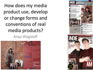
  • 1. How does my media product use, develop or change forms and conventions of real media products? Anya Wagstaff
  • 2. Comparison of Cover Main Image Like the piece I have used to re-create I have two models showing the main parts of the ‘band’ which is shown at the bottom. I have placed my lead singer slightly in front of the other to show their dominance. There is just a plain white backing to show the main feature. I have also copied the professional magazine in overlapping the left models hair on the logo. I chose my main model (Marcus) very carefully because I wanted someone with the ‘short back and sides’ look with long hair on top that is once again coming back into fashion. I wanted two males to re-create the professional magazine shown. The second model (Will) I chose because he reminded me of a member from a well known ‘indie’ band; ‘Pumped Up Kicks’ and I thought this was appropriate the genre. Mast Head The ‘NME’ title stands out a lot because of the colours and bold font. To Re-create this I have used similar colours and again a bold font. However I wanted a font with a ‘twist’ to represent the indie genre, and to reinforce the arrowed centre I placed a red line behind it. On the NME font it has an ‘inner-shadow’ on the stroke, however I have put an effect on the outer block to separate in from the top band where NME has the black stroke to do this. Like the NME magazine I have used a circular black and yellow sell line/offer. Using these colours I have moved away from the repeated colours to give it another look and widen what I can use throughout the magazine, not restricting myself to much but still keeping house colours. Sell Lines I have shown the sell lines as they are on the professional magazine with alternation between black and red with lines to separate them. I would like to have done more as the area around the models looks bare and boring. I have also used boxes to show some more important features of the magazine, this I have taken from other magazines such as this NME one. If I were to re-do it I would like to include a text across the middle like the professional one to fill more space and make it more interesting. I would also use brighter colours but due to the colour of my models jumper that I wanted I could not contrast the different shades to much. It would be useful to, to include a bar code, however this might interrupt the other texts and blocks. Other Images The other images I have used are the ‘full band’ and a female model by herself, she is later featured on the double page spread. She is smoking in this image and I got this idea from another magazine and I feel it shows the independence of the genre and how indie people don’t always play by the rules. Both images are against a brick wall this is because for both I wanted a plain back ground but not a white, studio, I also wanted them to be the same because photos from both shoots are then featured on the double page, and blend into the back ground of each other.
  • 3. Contents Page Main Image I have used the main image similar to the one of a professional magazine because it is outside and relaxed and as if the group are not working. I have also used a banner along the top of a view which backs up the outside feel. I chose this model (Beth) because I thought her fringe was appropriate to the genre, and the dark colour didn’t contrast with the house colours. Having this model in front and another behind in a different colour shows their statues and that she is the lead singer. I also had her smoking again to show how ‘indie’ people are independent and don’t always play by the rules. Through doing audience research I found that people of this genre often wear label clothes, this is why I chose to have her Vans/shoes in more focus and front than her face. Other Image I wanted to show the ‘new album’ mentioned on the front page but I could not re-create the Arctic Monkeys band or the album cover so I took a picture od the album logo t-shirt. Here I have included a grey box with an offer in like on this professional magazine. I have also included a logo type block the start the box, copying the stamp on the cover promoting this offer. Like the professional magazine I have separated and headed each list with a line however I have not split my pages into categories. However instead of using bigger blocks rather than lines to split them I have used a backing block on the number. I have also used a bold font for the main title of the pages then a small summary or caption in the ‘light’ font. The page numbers are also in the ‘blacklisted’ font just add diversity and change but it is my house font and hadn’t been used much on this page. To improve this I would add a small article on this page like the one on the professional page. It would also have to be about the main image on this page, so I would either have to take a new image for this story or write about the story on my double page spread and find another for that, because currently it is advertising the double page spread.
  • 4. Double Page Spread Main Image and Layout This is the professional double page spread that I have tried to re-create. Like this I have used one main image that take just over half the two pages with a block with the story in. The image I have used was against a brick wall because I didn’t want any action behind but I wanted a pattern or something consistent behind. I chose to have my models hood up because I thought it would represent the genre through having her hiding herself and being independent. She needed to be smiling because the quote in bold and blue stuck out from the rest of the story is ‘Best experience of my life’. I added in the shapes because I liked the effect it had on the professional page, however I don’t think the mainly house colours I used had the same effect. Although the blocks on the brick wall are effective because they look as if they belong with it. I have also separated the columns with a line and begun the text with a larger, blue capital letter. The title of my page does not standout as much as the professional one, however I think starting each word with the ‘Blacklisted’ font was effective. Using black for the title was effective against the red backing and the white main text colour. Using the blue and the white bolder text was effective in catching the readers eye, as it does on the professional page. Using two small images was effective because it showed the other bands that would be featured in the story and showed that there wouldn’t just be one. Using the one with the same brick backing was effective because it blended with the other. The studio photo is from the same shoot as the cover image so this shows where it is relevant. The models in the studio image are pointing and in a draft I placed a text next to it saying ‘We Need You’. This was to promote ticket sales or band entries, however it did not fit with the layout and in trying to re-create the professional one it meant there was to much on the page. Although this album may not be considered ‘indie’ I felt the wall background was very effective and inspired my main image.