
Empfohlen
Weitere ähnliche Inhalte
Was ist angesagt?
Andere mochten auch
Ähnlich wie Presentation6
Ähnlich wie Presentation6 (20)
Mehr von andrebryce
Mehr von andrebryce (20)
Presentation6
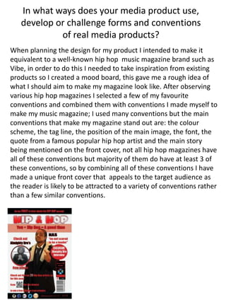
- 1. In what ways does your media product use, develop or challenge forms and conventions of real media products? When planning the design for my product I intended to make it equivalent to a well-known hip hop music magazine brand such as Vibe, in order to do this I needed to take inspiration from existing products so I created a mood board, this gave me a rough idea of what I should aim to make my magazine look like. After observing various hip hop magazines I selected a few of my favourite conventions and combined them with conventions I made myself to make my music magazine; I used many conventions but the main conventions that make my magazine stand out are: the colour scheme, the tag line, the position of the main image, the font, the quote from a famous popular hip hop artist and the main story being mentioned on the front cover, not all hip hop magazines have all of these conventions but majority of them do have at least 3 of these conventions, so by combining all of these conventions I have made a unique front cover that appeals to the target audience as the reader is likely to be attracted to a variety of conventions rather than a few similar conventions.
- 2. Here are 2 of the sources I used as inspiration for my magazine cover. the layout for the text and the sizes of the different fonts and styles are closely mirrored in my cover, this is to create an identity of a general Hip-Hop magazine. However, the image I have used in my cover is slightly different from a typical hip hop magazine. This offers my magazine the uniqueness required in order for a new magazine to be picked off from the shelves. It also challenges the stereotypes of the way Hip-Hop artists are represented in magazine covers. Sports cars, jewellery, guns and half-naked girls are very common in these magazines, which portray achievements/desires. Therefore the image I have used represents a new generation of hip hop as it converts from the normal dress code. By this, I hope my front cover will help unveil another side of the Hip-Hop world.